MEDIMPACT

Designing the MedImpact member portal for desktop and mobile

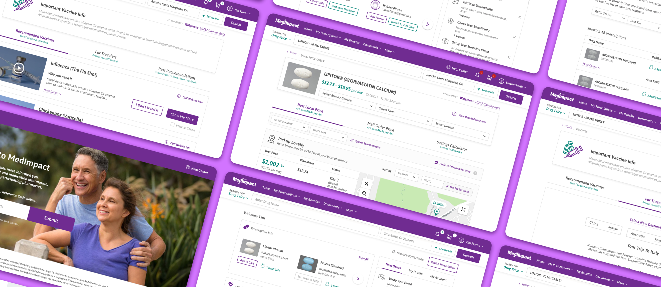
MedImpact member portal, desktop and mobile screens

ABOUT THE PROJECT

A member portal for pharmacy benefits

MedImpact is one of the largest independent pharmacy benefit managers in the United States. Members use its portal to check drug prices, refill prescriptions, review claims, schedule vaccines, and choose a plan during open enrollment.

I worked as a Senior UX Designer on this project through Photon, on a remote contract. I met with the product team every day and worked alongside product managers, researchers, visual designers, and developers throughout.

The work covered the UX design of the portal: scoping and defining features, information architecture, design patterns, and task flows, along with the hi-fidelity mockups and UI specifications for desktop and mobile. I collected and analyzed user needs, worked with researchers to incorporate their findings, and reviewed work from other designers and the development team.

The product is a prescription drug pricing platform, so a central goal was to show members what a drug would cost, across pharmacies, before they filled it.
ROLE

Senior UX Designer

CLIENT

MedImpact

AGENCY

Photon

YEAR

2020


The Problem

A pharmacy plan involves cost, health information, and plan rules at the same time, which makes it easy for members to lose track of what matters to them. The design had to take that complexity and present it in a way that answered the member's immediate question.

Three problems were central to the work.

Problem 01: Costs were not shown before a prescription was filled

Members could not see what a medication would cost, or compare pharmacies and mail order, before filling. The cost appeared only after the transaction.

Problem 02: Prescription information was spread out

Refill status, auto-refill settings, and upcoming refills were located in different places. Members were often unsure what to reorder or when.

Problem 03: Claims and benefit details were hard to read

Claims history and benefit information used plan terminology and dense layouts, which made it difficult to answer basic questions such as what was paid and why.

What we observed

When members were unsure what something meant or what it would cost, they often contacted support instead of continuing in the portal. Reducing that uncertainty became a primary focus of the redesign.


Design Requirements

Show drug costs before the member fills

Members should be able to see plan-specific costs before filling a prescription, including a comparison across pharmacies and mail order.

Lead with the most likely next action

The tasks a member is most likely to need should be visible first, rather than located behind menus.

Use plain language

Interface text should avoid plan jargon where possible and explain required terms clearly.

Design desktop and mobile together

Every task should function the same way on mobile as it does on desktop.

Make dense information scannable

Claims, prescriptions, and price comparisons should be easy to sort, filter, and scan.

Present plan details openly

Disclaimers, coverage details, and plan status should be shown where they are relevant, rather than hidden.


My Design Process

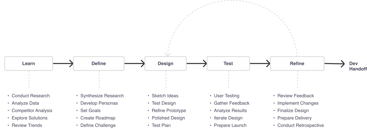
The same process runs through every project I take on. Learn, define, design, test, refine, then hand off. The loop from refine back to design is the part that matters most: nothing here is a straight line, and the portal took several passes before the screens showed members what they needed at each step.

Design process: Learn, Define, Design, Test, Refine, then Dev Handoff, with an iteration loop from Refine back to Design. Each step lists its tasks below it.

How I Worked

I worked as a Senior UX Designer through Photon, on a remote contract. I met with the product team every day and worked with product managers, researchers, visual designers, and developers throughout. Part of the role was reviewing work from the development team and other designers.

Each area followed the same process: define the task, design it for desktop and mobile, review it with the team, and revise. Much of the work involved keeping plan logic, eligibility, pricing tiers, and coverage rules, accurate in the background while keeping the interface straightforward.


Market Research

Comparing the Competition

MedImpact's Drug Price Check competes on the job members care about most: finding out what a prescription will actually cost. Two very different kinds of tools were already doing part of that job, and neither did all of it.

We looked at both fronts:

  • GoodRx and SingleCare, the consumer prescription-discount leaders
  • Blink Health and RxSaver, other discount-card tools
  • CVS Caremark, Express Scripts, and OptumRx, the “Big Three” PBM member portals

What We Were Looking For

Real Cost

Does it show the member's actual price under their plan, not just a cash coupon?

Price Before Filling

Can a member see the cost before they commit to a prescription?

Across Pharmacies

Can they compare the price across nearby pharmacies and mail order?

Connected to Benefits

Is pricing tied to the member's claims, refills, and coverage?

Where They Fell Short

Consumer discount cards

  • Show cash and coupon prices, not the member's plan-specific copay
  • Aren't tied to the member's actual coverage, claims, or refills
  • A separate errand from actually managing the prescription

Discount marketplaces

  • Same coupon model, a different storefront
  • Prices swing pharmacy to pharmacy with no plan context
  • Nothing a member saves carries back into their benefit

The “Big Three” PBM portals

  • Plan-integrated, but owned by insurers or pharmacy chains
  • Dense portals, heavy on benefit jargon
  • Real cost is hard to see before filling, and tools lean toward affiliated pharmacies

That mapped the opening. The discount cards were transparent but disconnected from the plan; the incumbent portals were connected but hard to read. MedImpact could be both, showing real, plan-specific prices across pharmacies before a member fills.


User Research

Competitor research told me what the category had settled on. It could not tell me why MedImpact’s own members hesitated or called support. For that I combined a short member survey to size the problem with follow-up conversations to understand it.
Member survey responses from people who had filled a prescription through their plan in the previous few months, plus follow-up conversations and daily input from Photon’s product team, who fielded the questions members were calling in about.

What the Survey Told Us

The survey was deliberately short, focused on why members open the portal and where the pharmacy benefit gets confusing, because that is where the support calls clustered.

What do you use the pharmacy portal for most?

  • 42%Checking what a drug will cost
  • 31%Refilling a prescription
  • 18%Checking benefits or deductible
  • 9%Something else

What is the hardest part of managing your pharmacy benefit?

  • 46%Knowing what a drug will cost before I fill
  • 24%Understanding my plan and deductible
  • 19%Keeping track of refills
  • 11%Finding an in-network pharmacy

How do you decide where to fill a prescription?

  • 38%Whatever pharmacy is closest
  • 34%The lowest price I can find
  • 21%I always use the same pharmacy
  • 7%Mail order

Two numbers reframed the project. 46% said the hardest part was knowing what a drug would cost before filling, and 42% came to the portal mainly to check a price. Members were not asking for more features. Cost was the reason they showed up, and the portal was making them guess.

What We Asked in Interviews

The survey said where members struggled. The conversations said why. I kept the questions behavioral, asking what people actually did last time rather than what they think of the product.

  1. Walk me through the last time you filled a prescription. How did you decide where?
  2. Before you fill, do you know what it will cost? How do you find out?
  3. When was the last time you looked at your benefits, and what were you trying to figure out?
  4. How do you keep track of refills for yourself or your family?
  5. What do you handle on your phone versus a computer?

What They Told Us

Different words, same handful of frustrations, and each one maps to a theme that came out of the affinity map.

I never know what a drug is going to cost until I’m standing at the counter.
Plan memberCost transparency
I have three prescriptions and I can never remember which one is due for a refill.
Plan memberManaging prescriptions
I just use whatever pharmacy is closest. I didn’t know I could compare prices.
Plan memberWhere to fill

Key Findings

The design was informed by the plan tasks themselves and by daily input from Photon's product team, who had visibility into where members had difficulty and what generated support calls. Several patterns were consistent:

  • Not knowing a drug's cost in advance was the most common reason members hesitated.
  • Information shown without explanation was more likely to prompt a support call than an action.
  • Members tended to scan rather than read, so long blocks of plan text were often skipped.
  • A significant portion of members used the portal only on mobile.

Affinity Mapping

We gathered notes from member interviews, Photon’s support-call input, and early usability tests, then grouped them to find the patterns.

Members described their frustrations differently, but the underlying themes were consistent. Whether they were talking about cost, refills, or benefits, the same questions kept surfacing.

Once we clustered everything, it became clear: we weren’t just solving for layout. We were solving for a member being able to answer “what will this cost, and what do I do next?”

Common Themes We Found

Cost transparency

  • "I never know what it’ll cost until I pay."
  • "Is there a cheaper version of this drug?"

Managing prescriptions

  • "Which refill is due next?"
  • "Can I set this to fill automatically?"
  • "Where’s my order right now?"

Understanding benefits

  • "How much of my deductible is left?"
  • "Is this drug even covered?"
  • "What tier is it, and why?"

Mobile first

  • "I check this on my phone, not a computer."
  • "The dose reminder is the main thing I use."
  • "I want to handle it all from the app."

What This Told Us

Members didn’t want more features. They wanted to know what things cost and what to do next, before they committed. So every design decision from here on, plan-specific prices, a savings calculator, inline refill status, plain-language benefits, was built to answer one question: “What will this cost me, and what should I do?”

Cost transparency
“I never know what it’ll cost until I pay.”
“Is there a cheaper version of this drug?”
“Which pharmacy is cheapest for me?”
Cash price and my copay are totally different.
Managing prescriptions
“Which refill is due next?”
“Can I set this to fill automatically?”
“Where’s my mail-order shipment?”
I manage my kids’ prescriptions too.
Understanding benefits
“How much of my deductible is left?”
“Is this drug even covered?”
“What tier is it, and why?”
The plan language is hard to follow.
Mobile first
“I check this on my phone, not a computer.”
“The dose reminder is the main thing I use.”
“I want to handle it all from the app.”
It should work the same on mobile.

Feature Prioritization

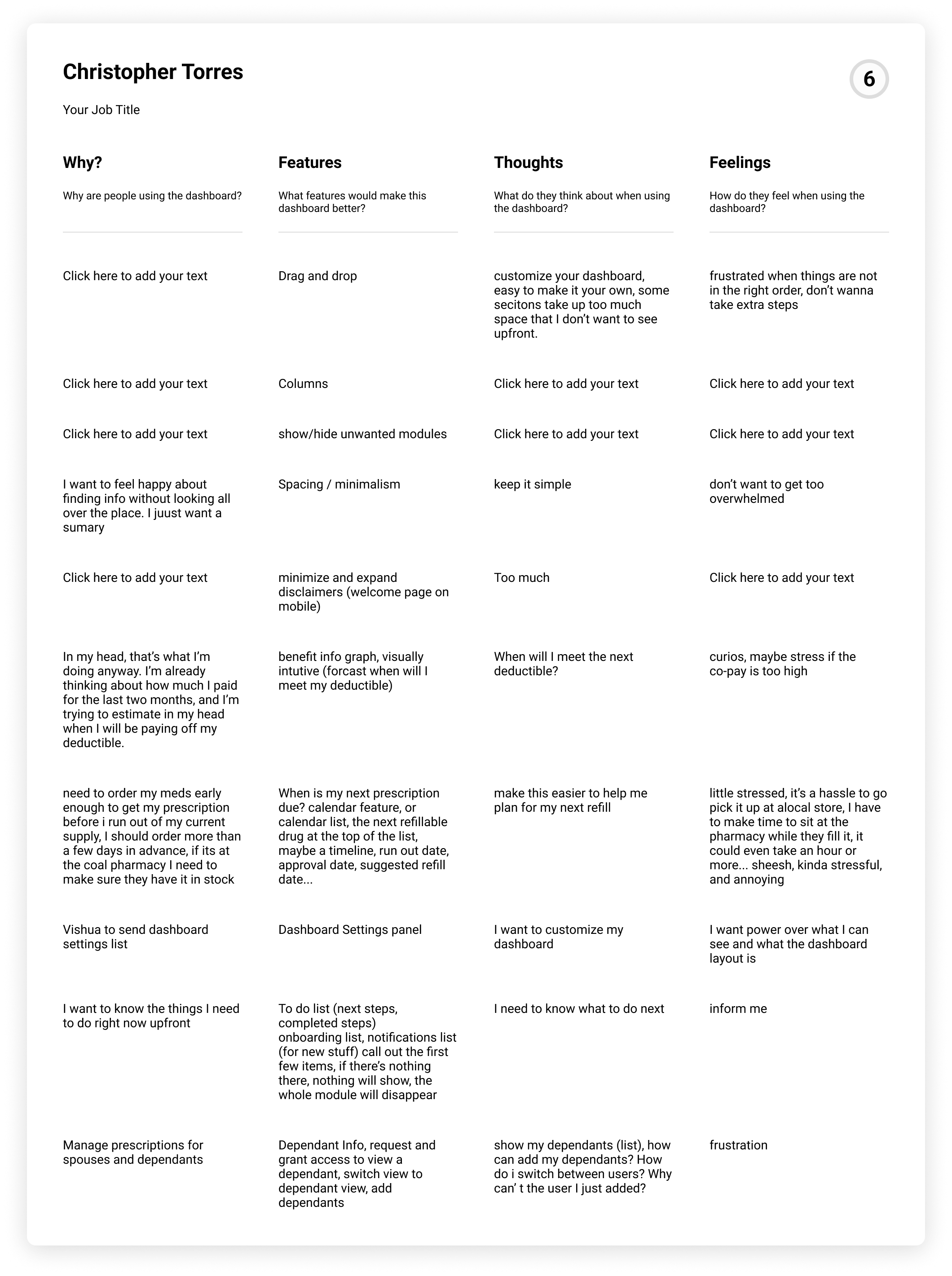
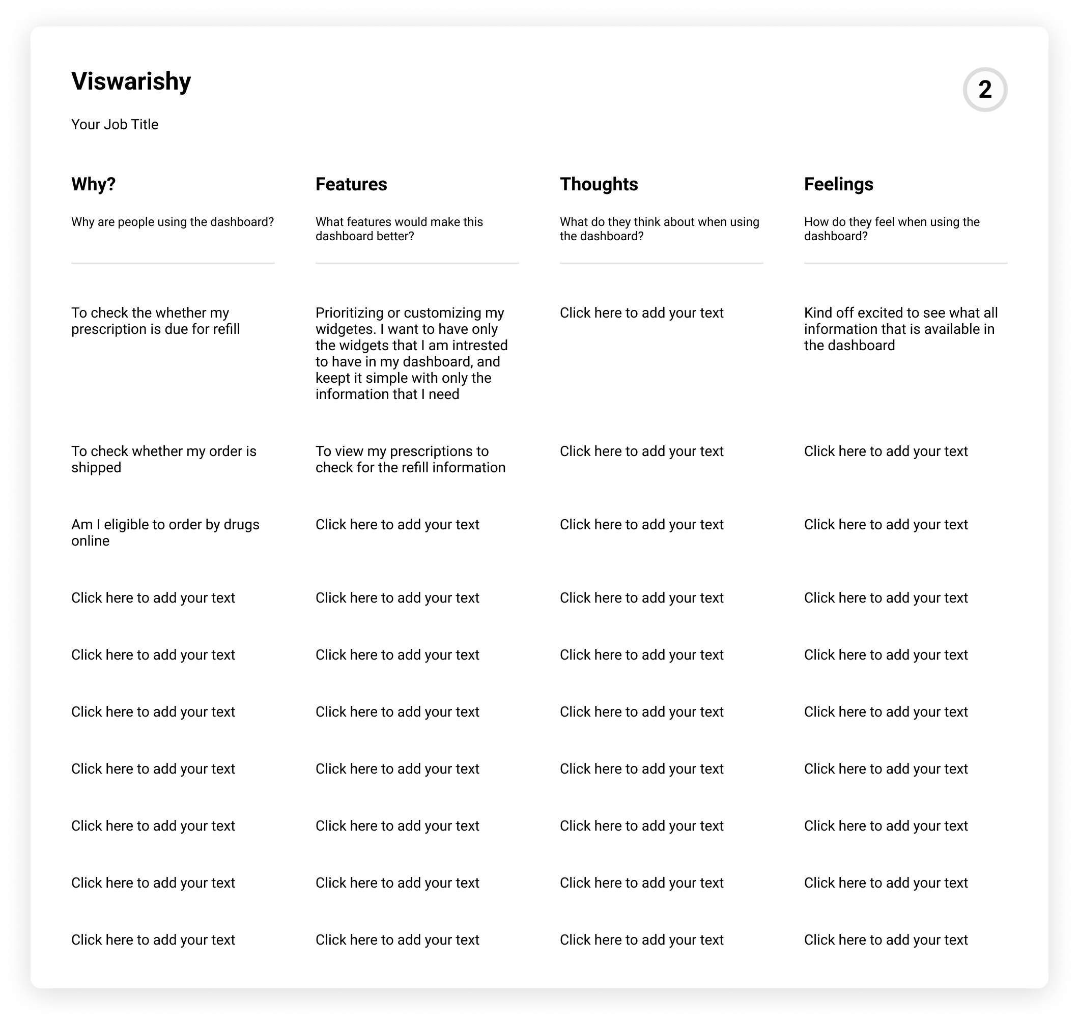
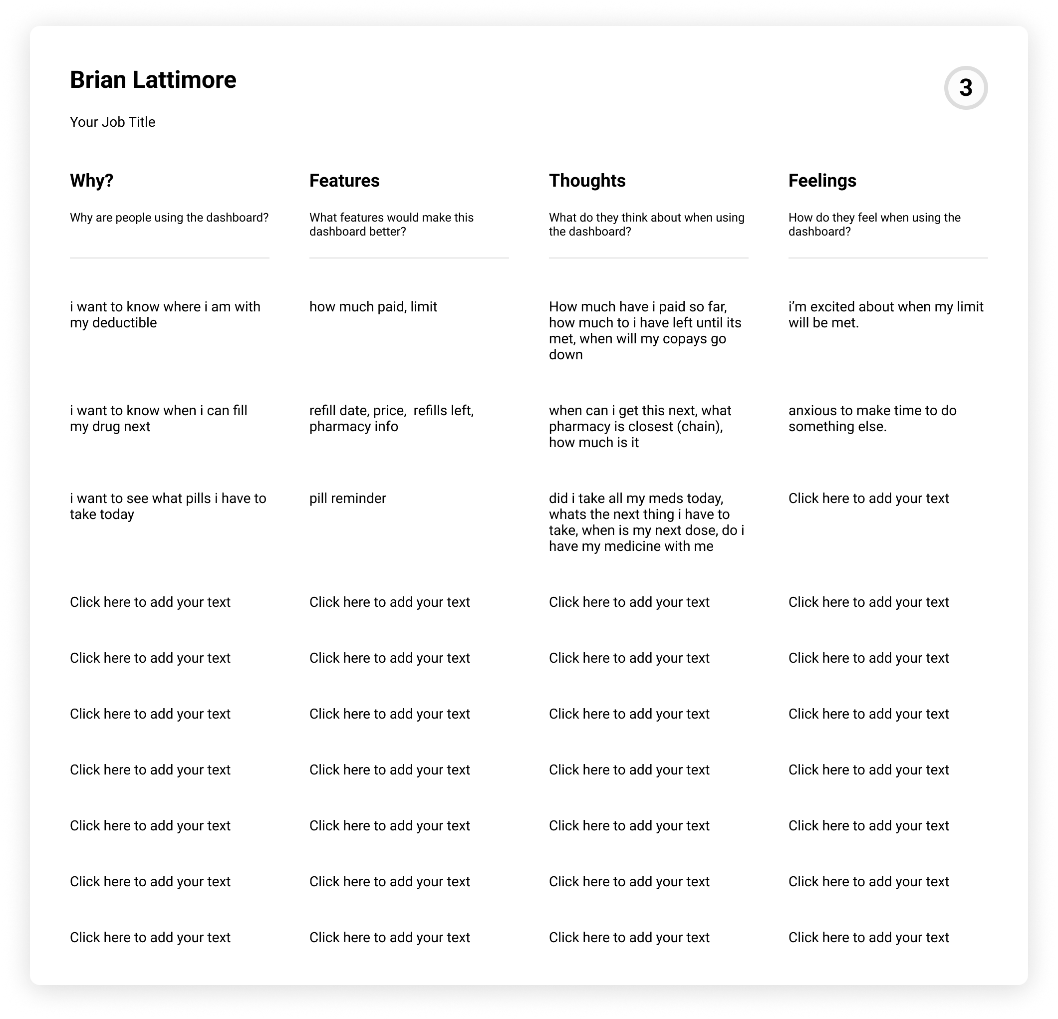
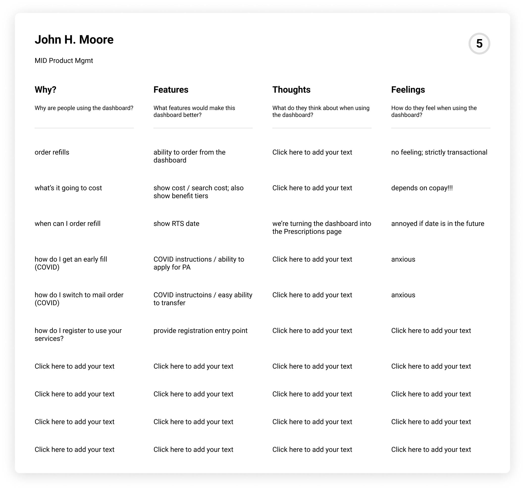
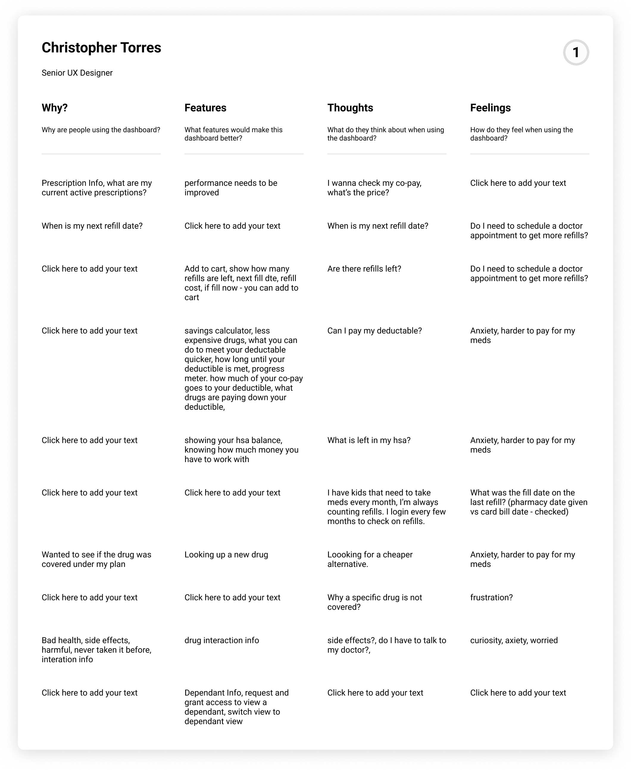
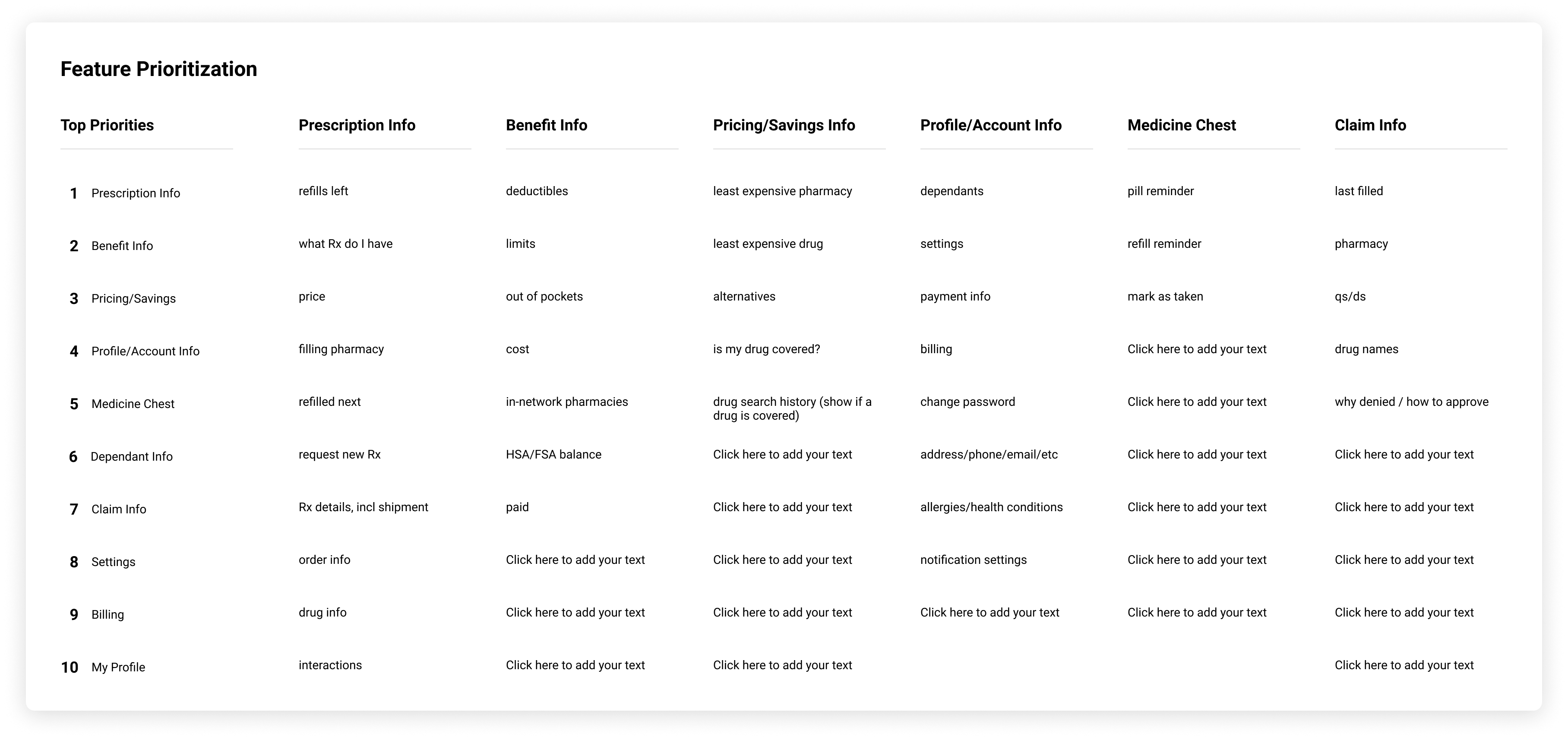
Before grouping features, I ran a prioritization session with Photon’s product team in Figma. Each participant worked on their own card and answered, for the dashboard, why members open it, what features would make it better, what they think about while using it, and how they feel. We then ranked the features together.

What we ranked, most important first

  1. Prescription Info
  2. Benefit Info
  3. Pricing / Savings
  4. Profile / Account Info
  5. Medicine Chest
  6. Dependant Info
  7. Claim Info
  8. Settings
  9. Billing
  10. My Profile

Why they open it

Order a refill, see what a drug will cost, check when they can fill next, handle early-fill and mail-order questions, see what to take today, and manage prescriptions for dependents.

Features they asked for

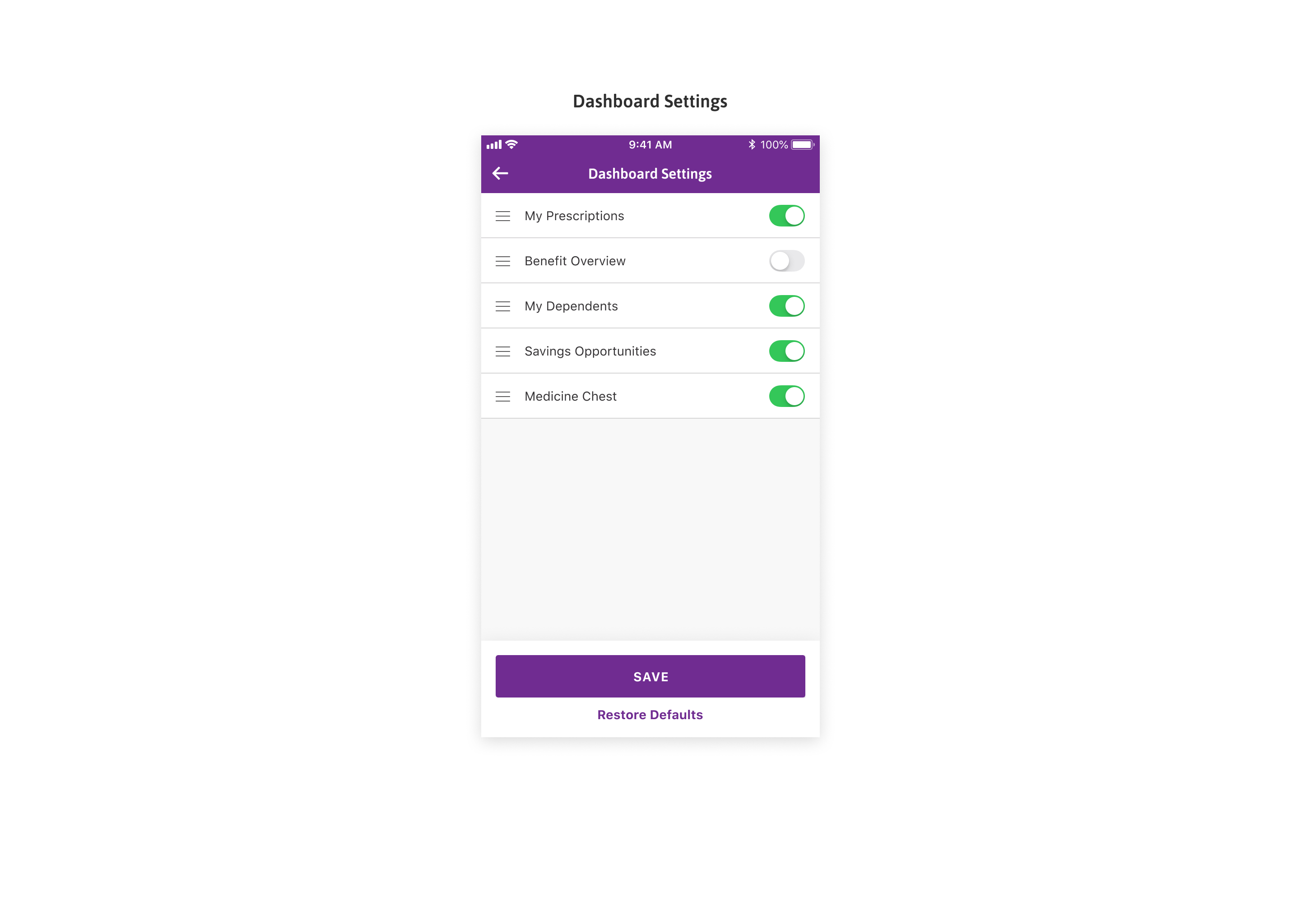
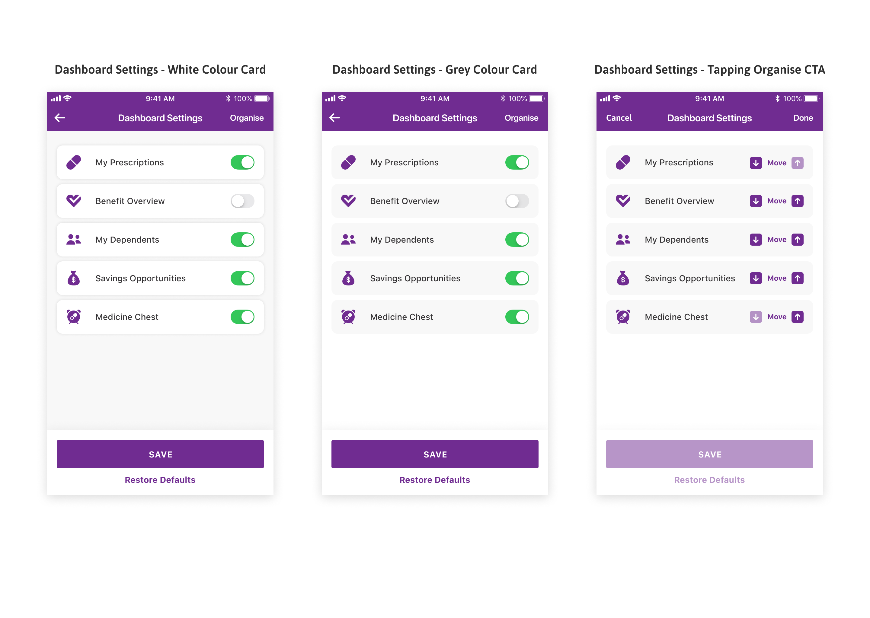
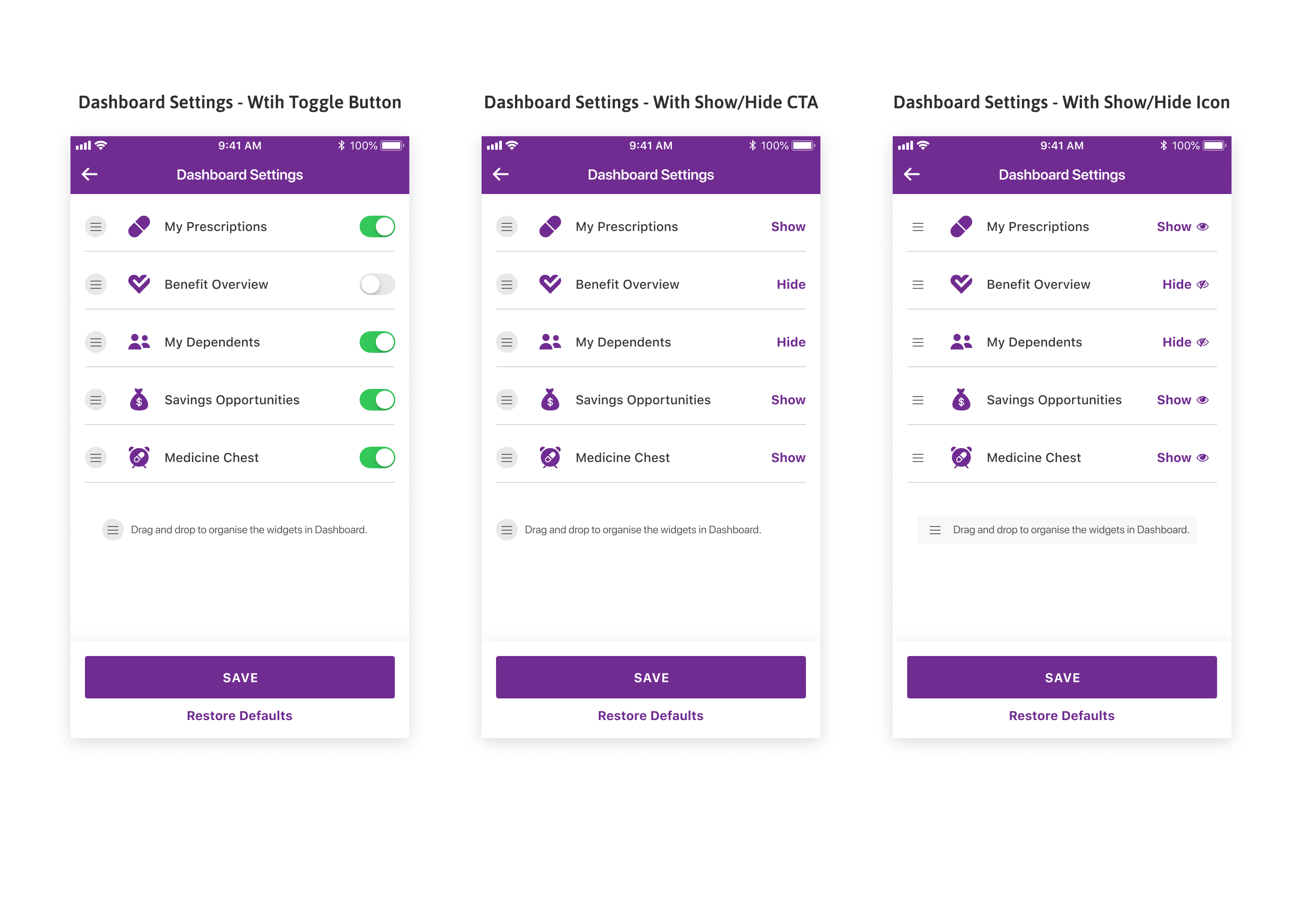
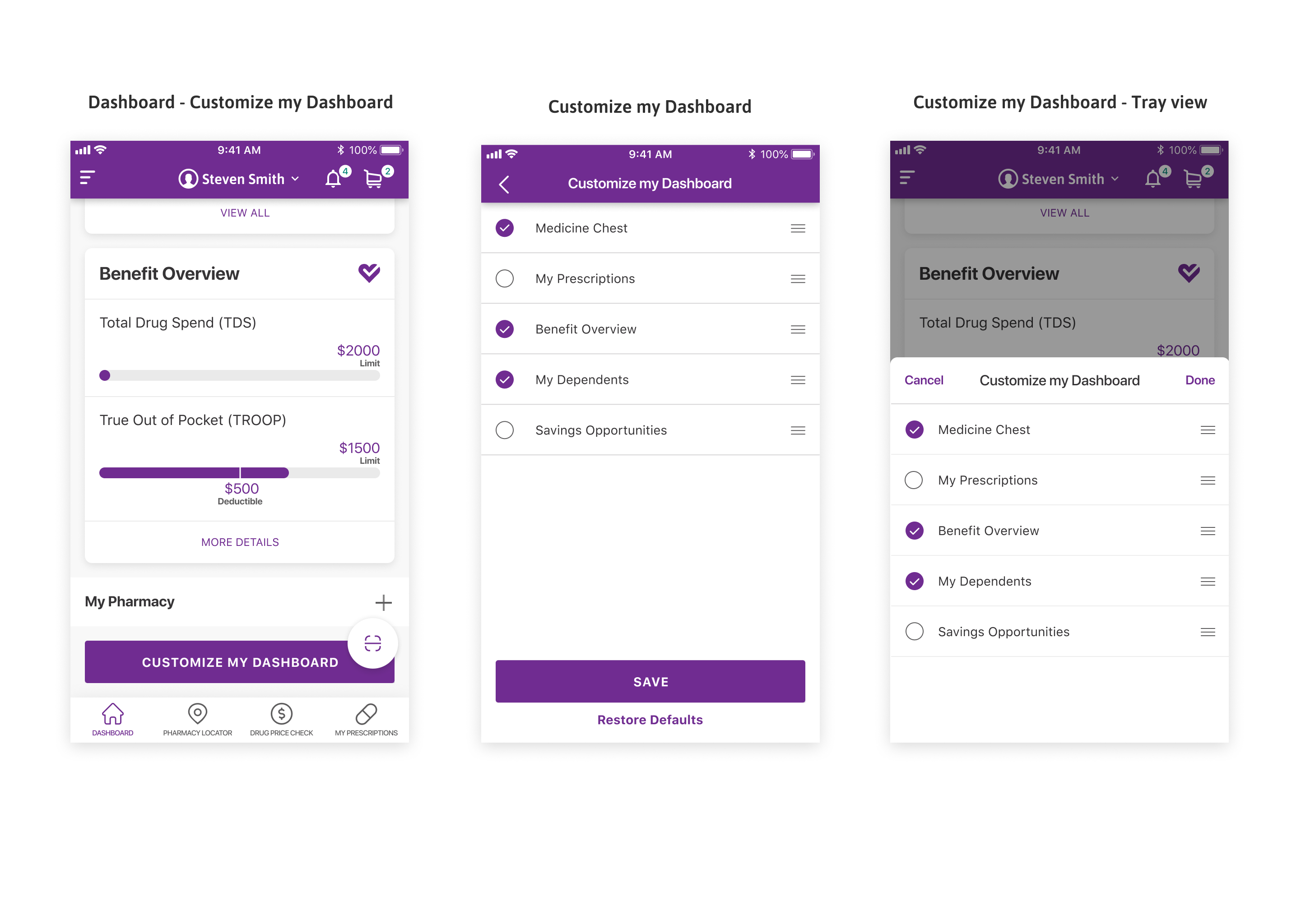
Order from the dashboard, show cost and benefit tiers, ready-to-ship dates, pill and refill reminders, a to-do list, and drag-and-drop customization to show or hide modules.

What they think about

How much they have paid and how much is left on the deductible, when they can refill, whether they took their meds today, and whether a drug is covered.

How they feel

Anxious about paying for medications and stressed about pharmacy trips; frustrated when information is scattered or out of order; reassured when the deductible limit is close.

The Session Boards

The prioritization matrix and each participant's notes from the live Figma session.

Feature prioritization ranking matrix
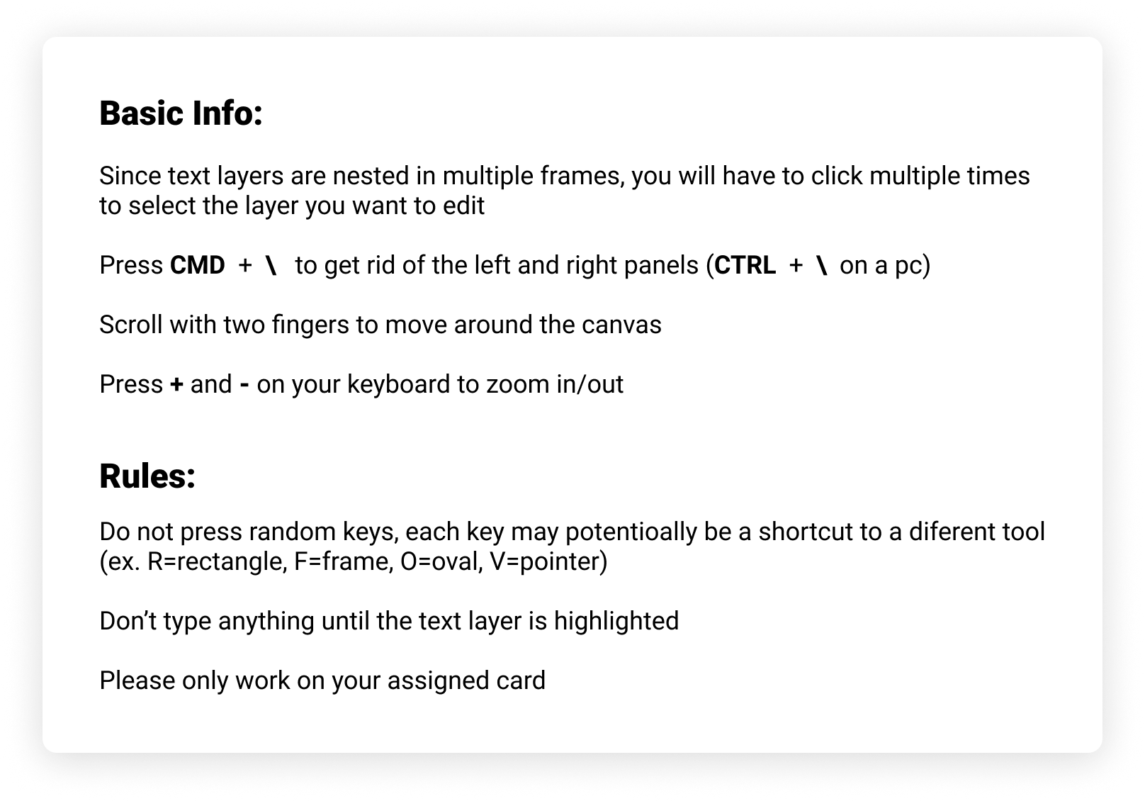
Session rules and instructionsParticipant session cardParticipant session cardParticipant session cardParticipant session cardParticipant session card

What made the cut

Must-have

  • Drug Price Check with plan-specific pricing
  • My Prescriptions and refills in one place
  • A dashboard focused on the next task
  • Claims History with search and filters

Nice-to-have

  • Vaccine recommendations and scheduling
  • Savings calculator and mail-order comparison
  • Dependent and profile switching

Not in this release

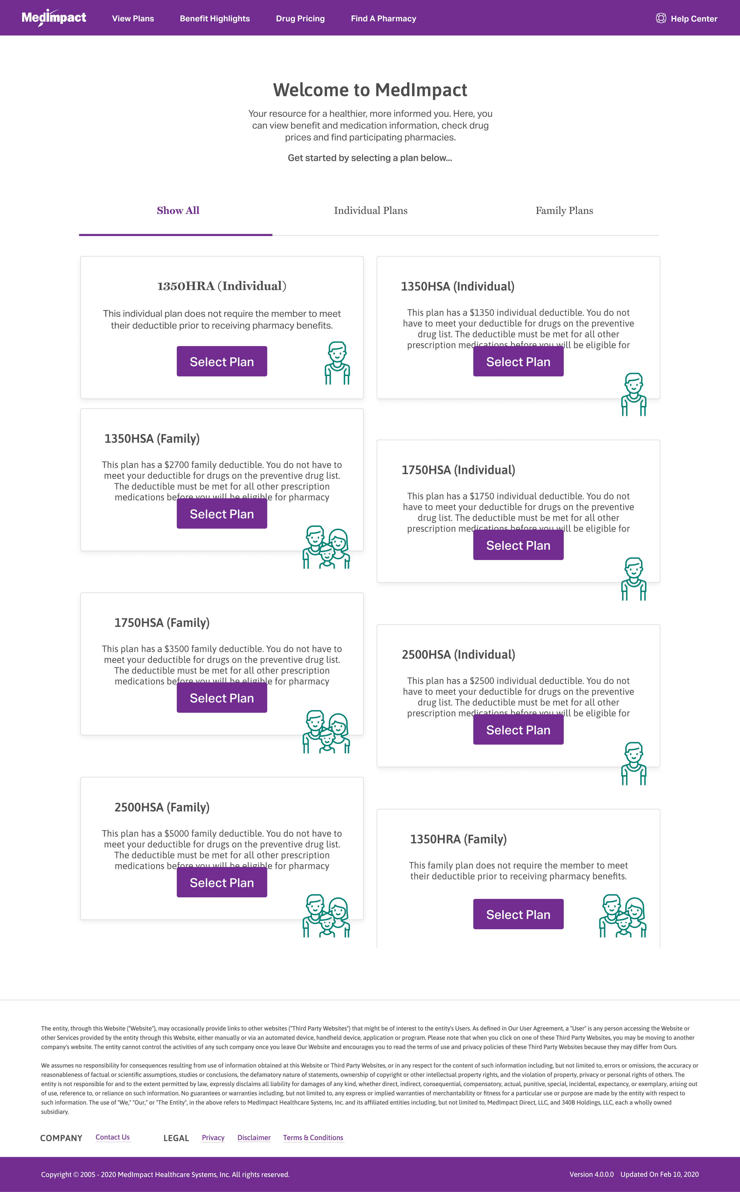
  • A full plan-selection wizard beyond benefit highlights
  • Provider- or pharmacy-side tools
  • Features that depended on data the plan could not yet provide

User Flows

These are the main tasks a member comes to the portal to do. Each flow starts from the dashboard and ends where the task is done, so the whole path is visible in one place.

Checking a drug price

Start a price check → From the dashboard, search a drug by name → Choose the specific drug, form, and dosageBest Local Price → See nearby pharmacies and their price for the drug → The lowest local price is highlighted and pinned on the mapCompare the options → Switch to Mail Order Price to see the mail-order cost in the same layout → Open the Savings Calculator to estimate savings by adjusting the drug or pharmacyAct on it → Pick a pharmacy from the map → Add the medication to the cart

The three pricing views sit under one set of tabs, so a member can compare the best local price, mail order, and potential savings without leaving the page.

DashboardSearch a drugLocal or mail?Mail Order PriceNoYesBest Local PriceSavingsCalculatorAdd to cart

Refilling a prescription

Open prescriptions → From the dashboard, go to My Prescriptions → Active prescriptions list the drug, last fill date, pharmacy, and prescriberChoose a prescription → Refill and auto-refill status show inline → Select the prescription that needs a refillSet the refill → Request a one-time refill, or turn on auto-refill → Confirm the pharmacy and day supplyCheck out → Add the refill to the cart → Review quantity, day supply, and estimated copay → Complete checkout

Refill and auto-refill status show inline on the prescription list, so a member can act without opening each prescription first.

DashboardMy PrescriptionsSelect aprescriptionRefills left?Request a new RxNoYesRefillAdd to cartCheckout

Getting a recommended vaccine

See recommendations → From the dashboard, open Recommended Vaccines → Each vaccine shows eligibility and a short, plain-language summaryRead the details → Open a vaccine for why it is recommended and who needs it → Read-more expands the clinical detail without leaving the screenHow to get it → See the nearest pharmacy with address, hours, and phone → Covers walk-in options and how to scheduleTake the next step → Schedule an appointment, get directions, or call a ride → Mark the vaccine as taken once done

The clinical detail is written in plain language, and the next steps sit on the same screen instead of being links away.

DashboardRecommendedvaccinesVaccine infoNeed it?Mark not neededNoYesHow to get itSchedule

Comparing plans at open enrollment

Review benefits → From the dashboard, open Benefit Highlights → A plain-language summary of what the plan coversPick plans to compare → Select up to three plans → Each plan card summarizes its deductible and pharmacy rules before it is addedCompare side by side → Plans are shown next to each other across benefits and cost → The differences are visible in one viewChoose a plan → Select the plan that fits → Continue with enrollment

Each plan is summarized in plain language before it is added, then plans are compared next to each other rather than reviewed one at a time.

DashboardBenefithighlightsSelect up to 3plansCompare side bysideRight fit?Adjust selectionNoYesChoose a plan

Reviewing and sharing claims

Open claims → From the dashboard, go to Claims History → Claims list the drug, date, pharmacy, and costNarrow the list → Filter claims; active filters appear as removable keyword pills → Adjust exactly which filters are onShare → Invite someone by email, or copy a shareable link → Used to send records to a caregiver or providerControl access → Set what the recipient can do, such as view-only → Revoke access when it is no longer needed

Active filters appear as removable pills, and sharing lets a member send records to a caregiver or provider with controlled, view-only access.

DashboardClaims HistoryFilter with pillsShare it?Print or downloadNoYesEmail or linkSet access

Legend

StartScreenDecisionGoalFlow

The Solution

The redesign is organized around member tasks. Each area of the portal addresses a specific need.

Summary of changes

Drug price comparison

Drug Price Check displays plan-specific costs across pharmacies, with mail order and local pickup shown together, so members can compare before filling.

Consolidated prescriptions

Active prescriptions, refill status, and auto-refill settings are shown in one place.

Task-focused dashboard

The dashboard shows to-do items, savings, and prescription status on the first screen.

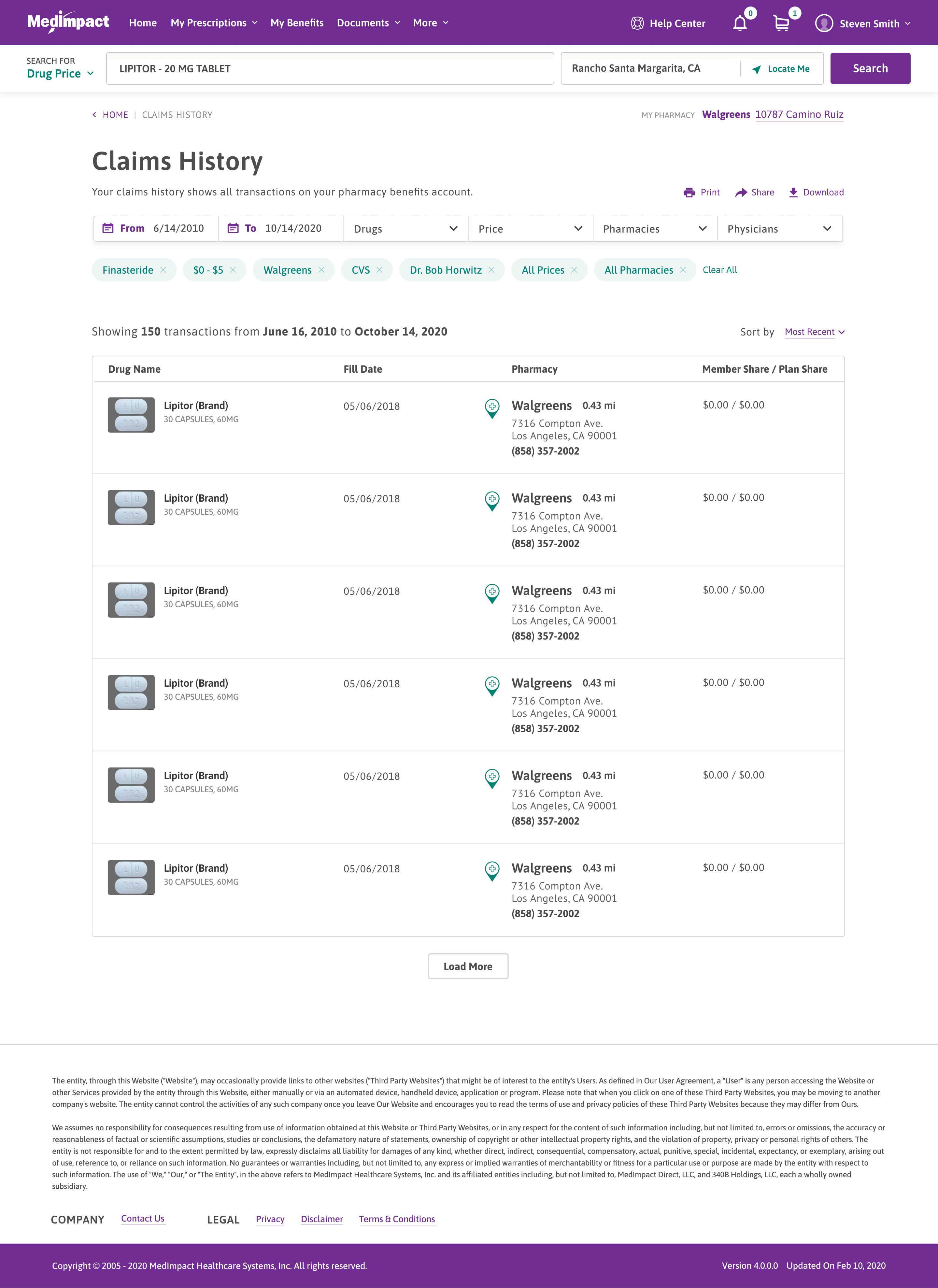
Searchable claims

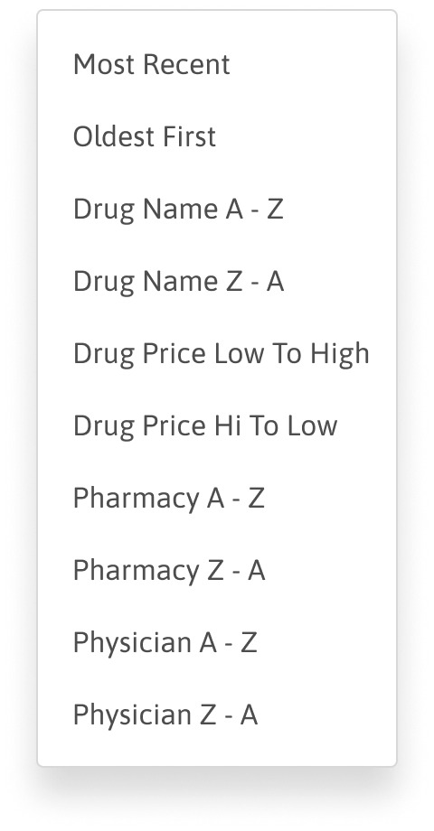
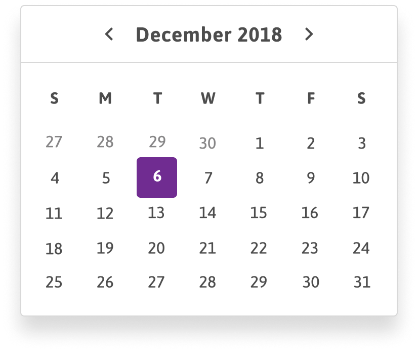
Claims history can be filtered by drug, pharmacy, physician, and date, with active filters shown as removable pills.

Guided vaccine and enrollment flows

The vaccine and open enrollment modules were built as step-by-step flows.

Mobile parity

Each task was designed for mobile as well as desktop.


Stylized UI Components

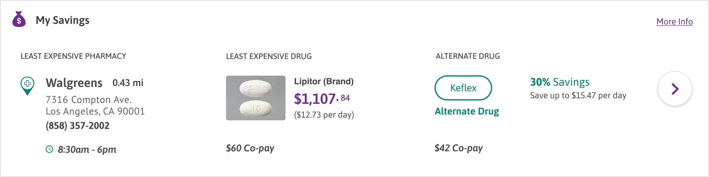
My Savings

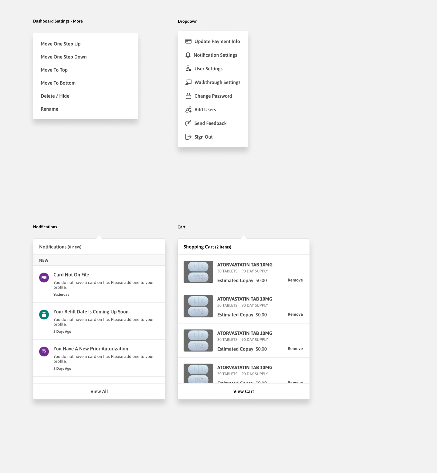
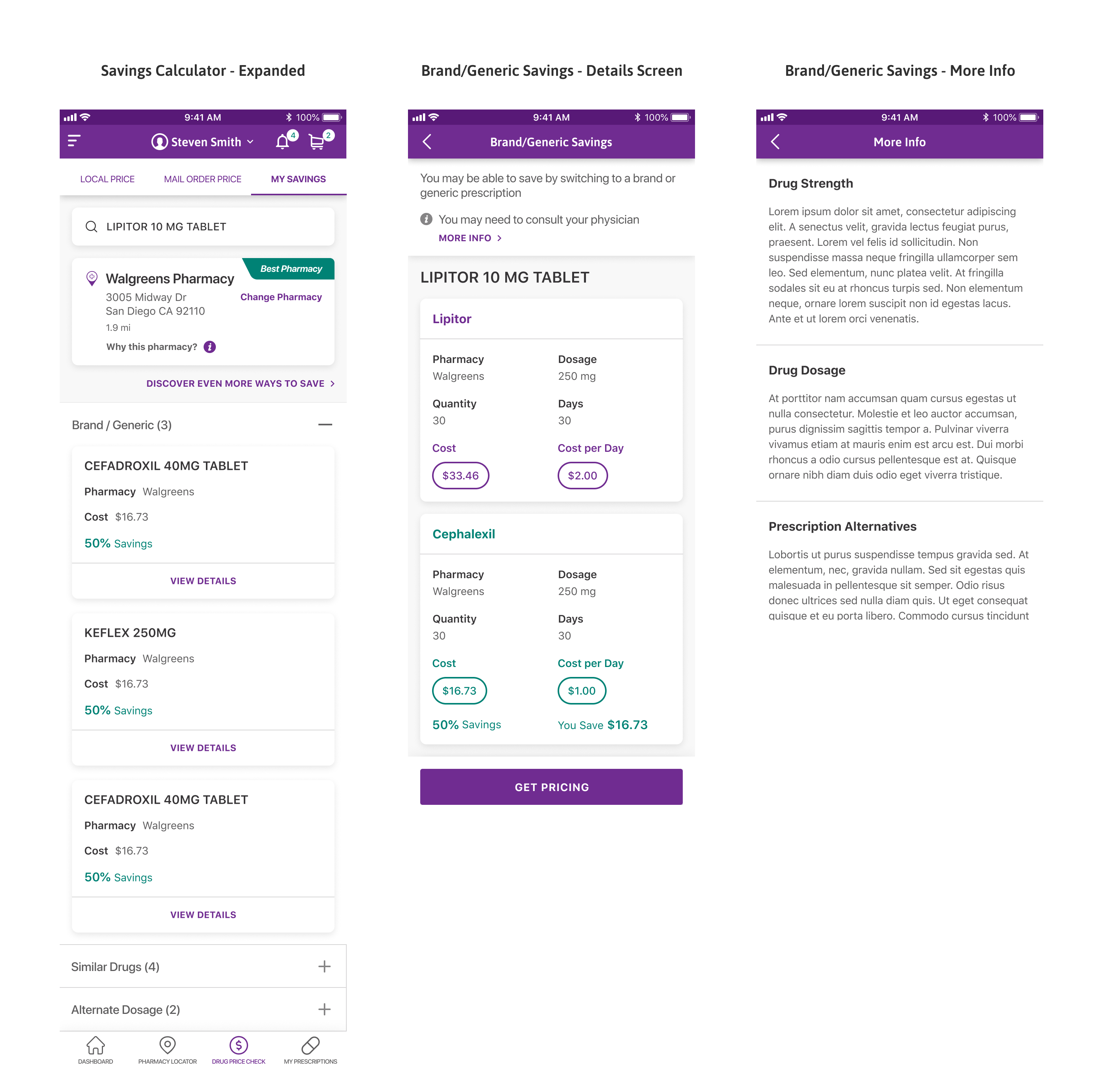
The My Savings widget surfaces the cheapest pharmacy for a member's drug, the least expensive version of it, and a lower-cost alternate drug with the potential savings.

Key Details

  • Points to the least expensive pharmacy and drug
  • Suggests a lower-cost alternate drug with the percentage saved
  • Shows the co-pay for each option
My Savings

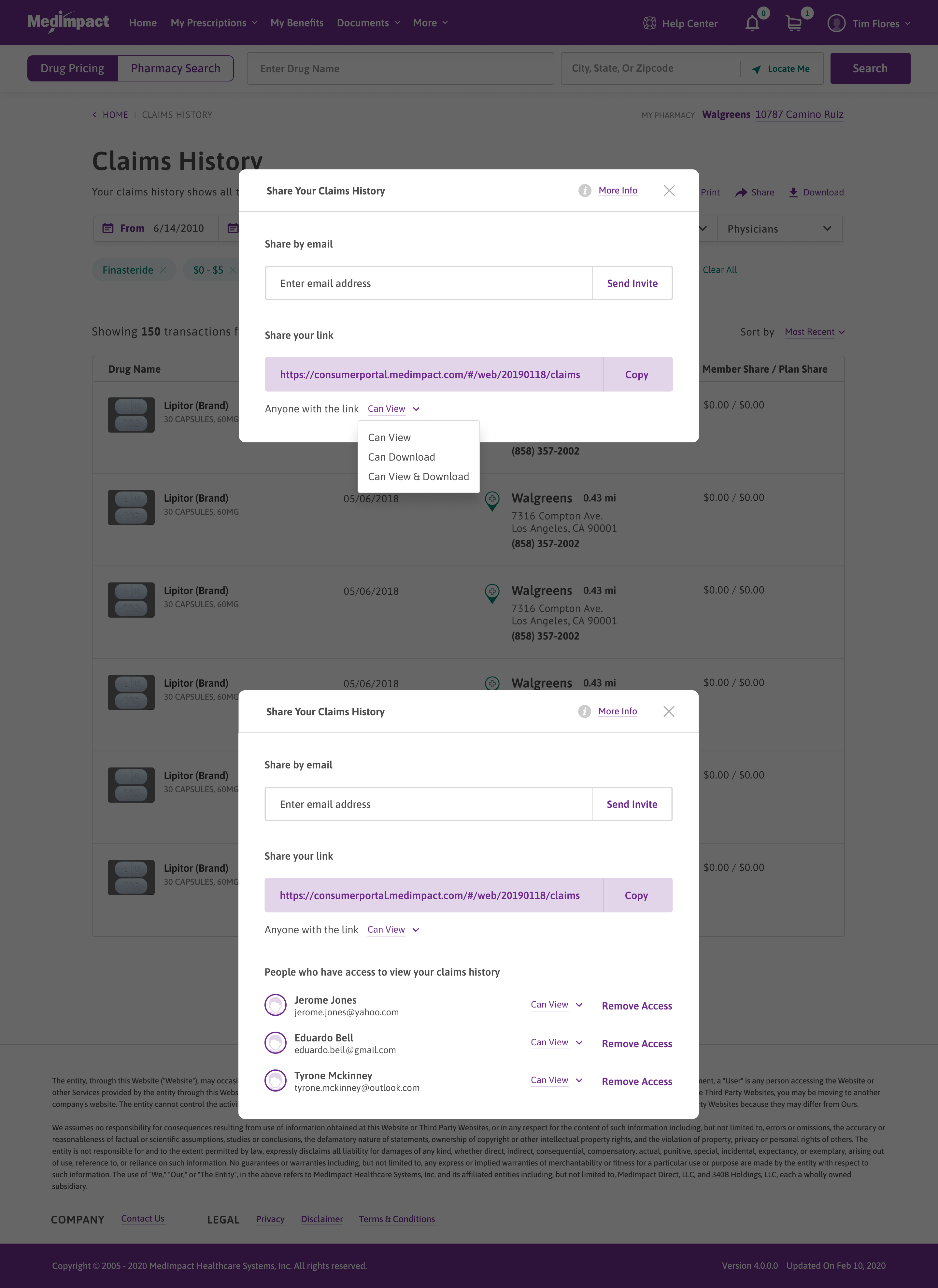
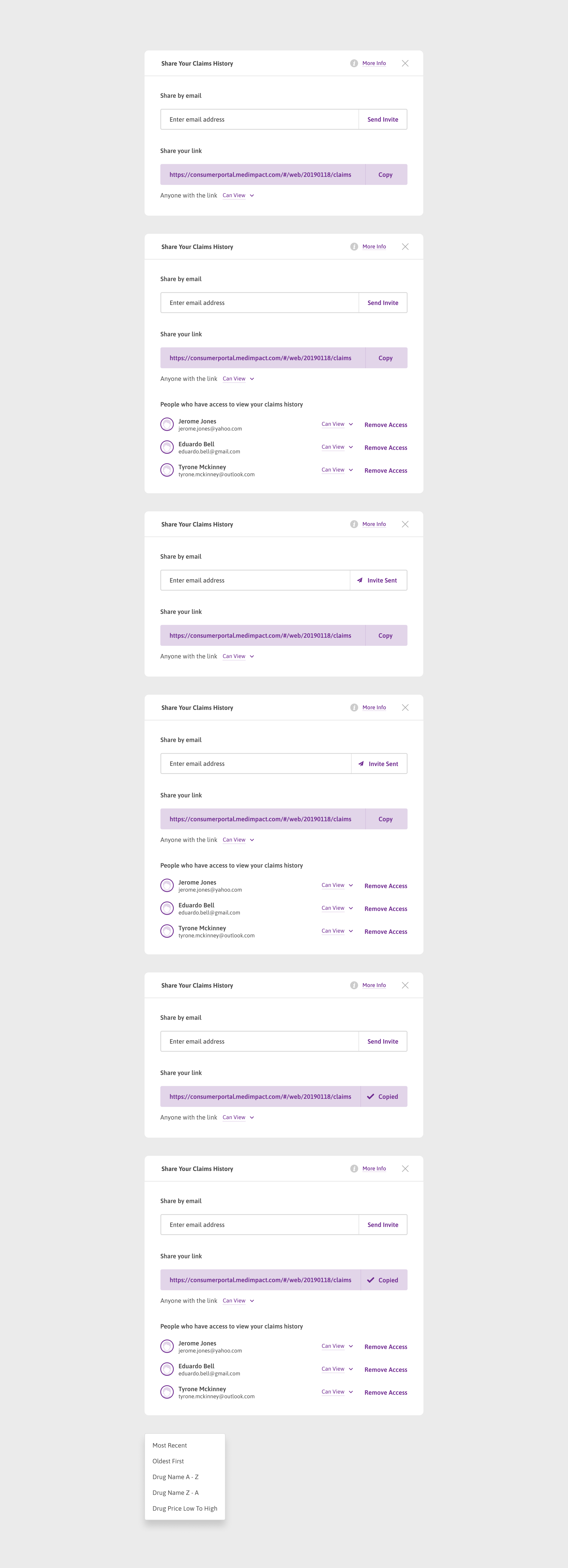
Share Claims History

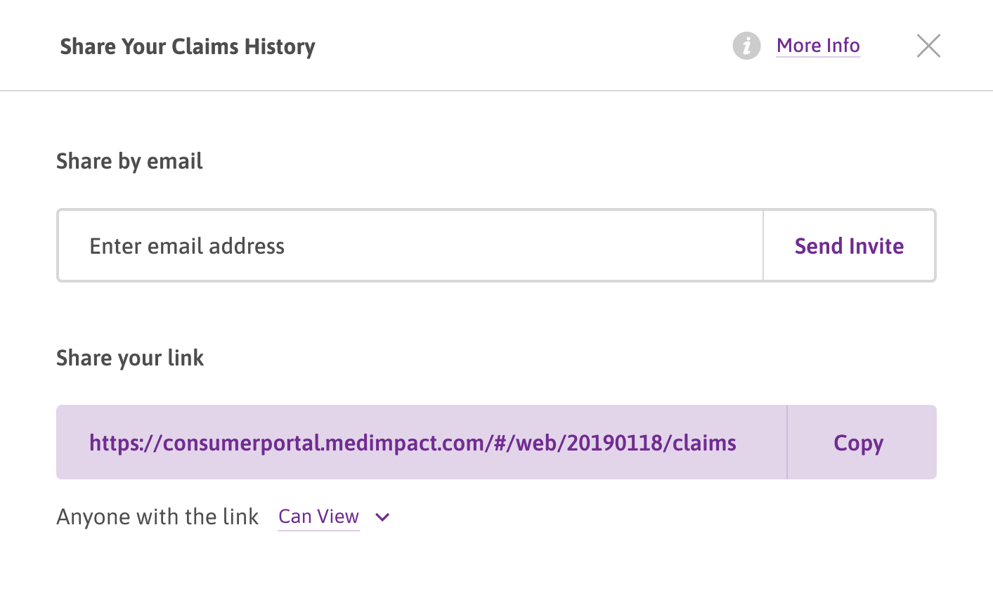
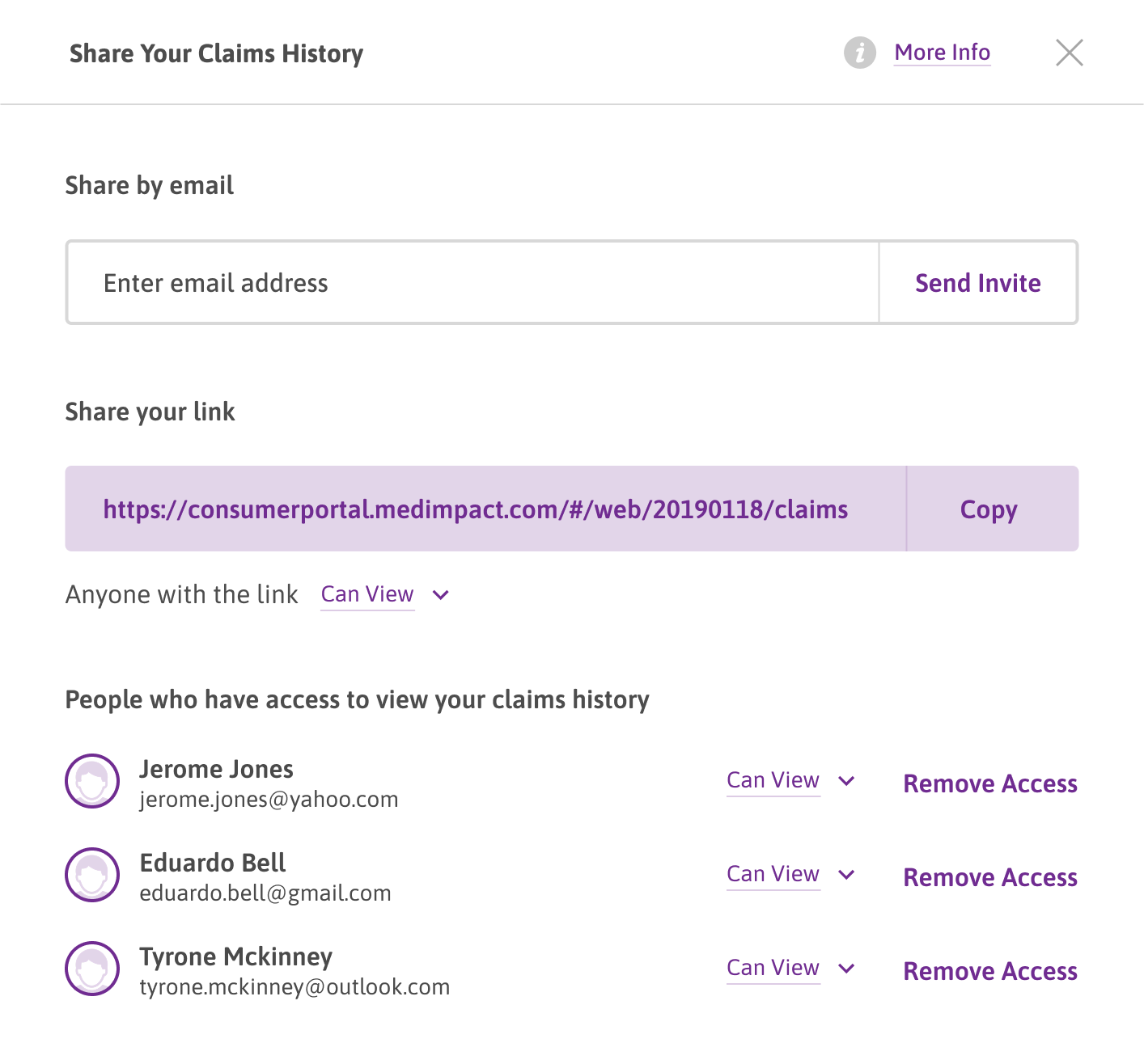
Members can share their claims history by email invite or by link, and control what a recipient is able to do with it.
Key Details

  • Invite someone by email, or copy a shareable link
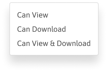
  • Set link access, such as view-only
  • Used when a member needs to send records to a caregiver or provider
Share Claims History

How To Get This Vaccine

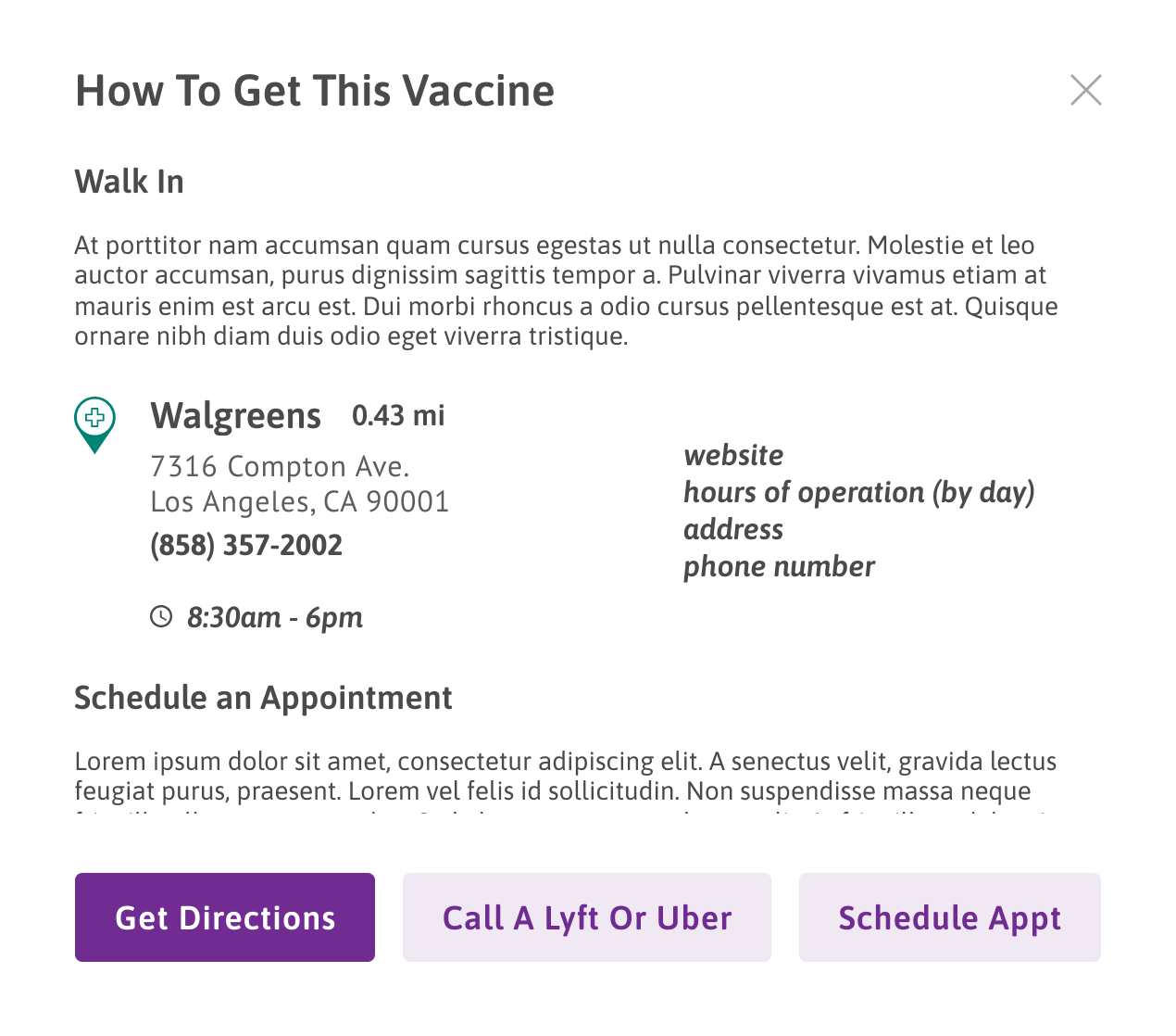
For a recommended vaccine, this module explains how to get it, shows a nearby pharmacy with hours and contact details, and provides next-step actions.

Key Details

  • Covers walk-in options and how to schedule
  • Shows the nearest pharmacy with address, hours, and phone
  • Actions include get directions, call a ride, and schedule an appointment
How To Get This Vaccine

Plan Comparison Selector

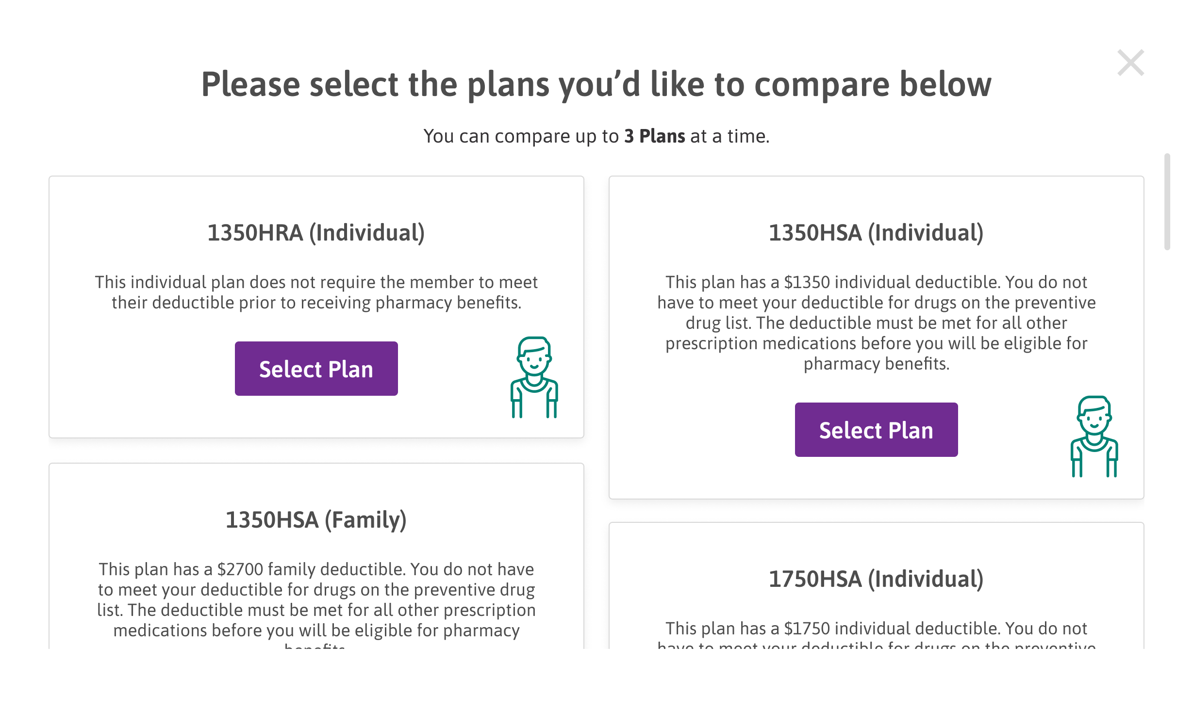
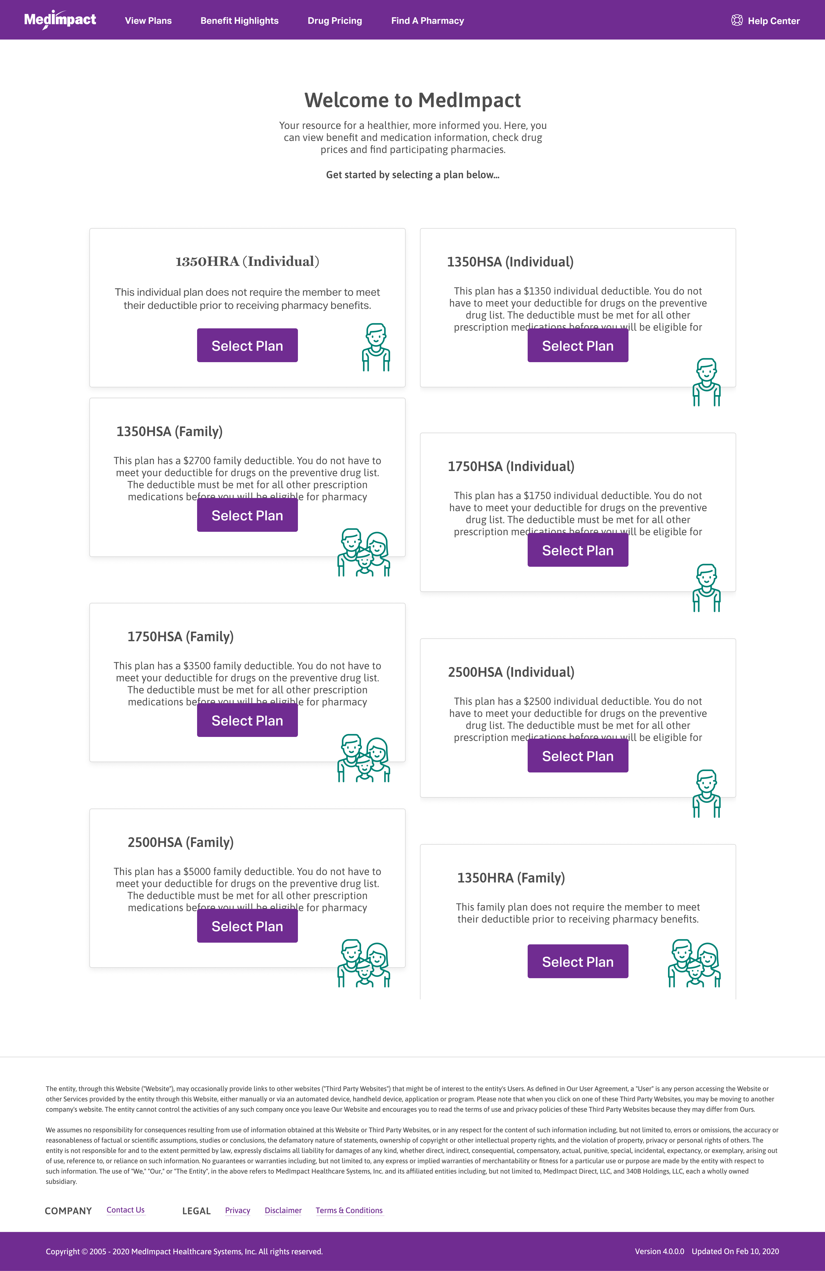
During open enrollment, members select up to three plans to compare. Each plan card summarizes its deductible and pharmacy-benefit rules in plain language before it is added to the comparison.

Key Details

  • Members can compare up to three plans at a time
  • Each plan is summarized in plain language
  • Selecting a plan adds it to the side-by-side comparison
Plan Comparison Selector

Notifications

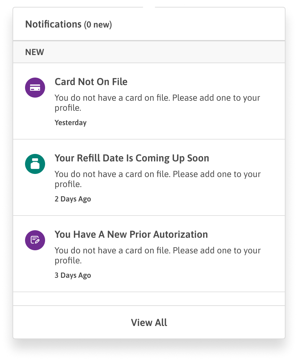
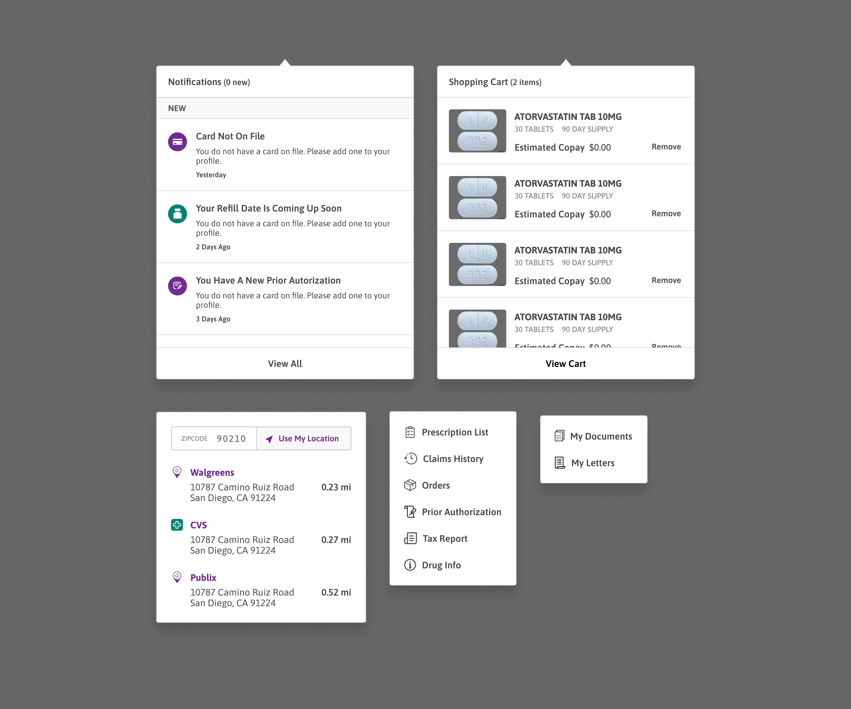
Notifications are grouped by status, each pairing an icon, a short message, and a timestamp, with a link to the full list.

Key Details

  • New notifications are grouped at the top
  • Each item has an icon, message, and timestamp
  • Links out to the full notifications list
Notifications

Shopping Cart

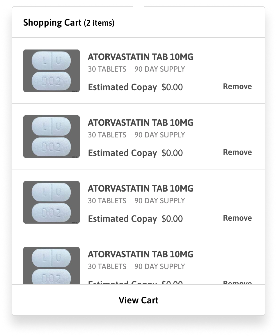
The cart lists the medications a member has added, with quantity, day supply, and estimated copay, and lets them remove an item or open the full cart.

Key Details

  • Shows quantity, day supply, and estimated copay per item
  • Items can be removed inline
  • Links to the full cart
Shopping Cart

Navigation

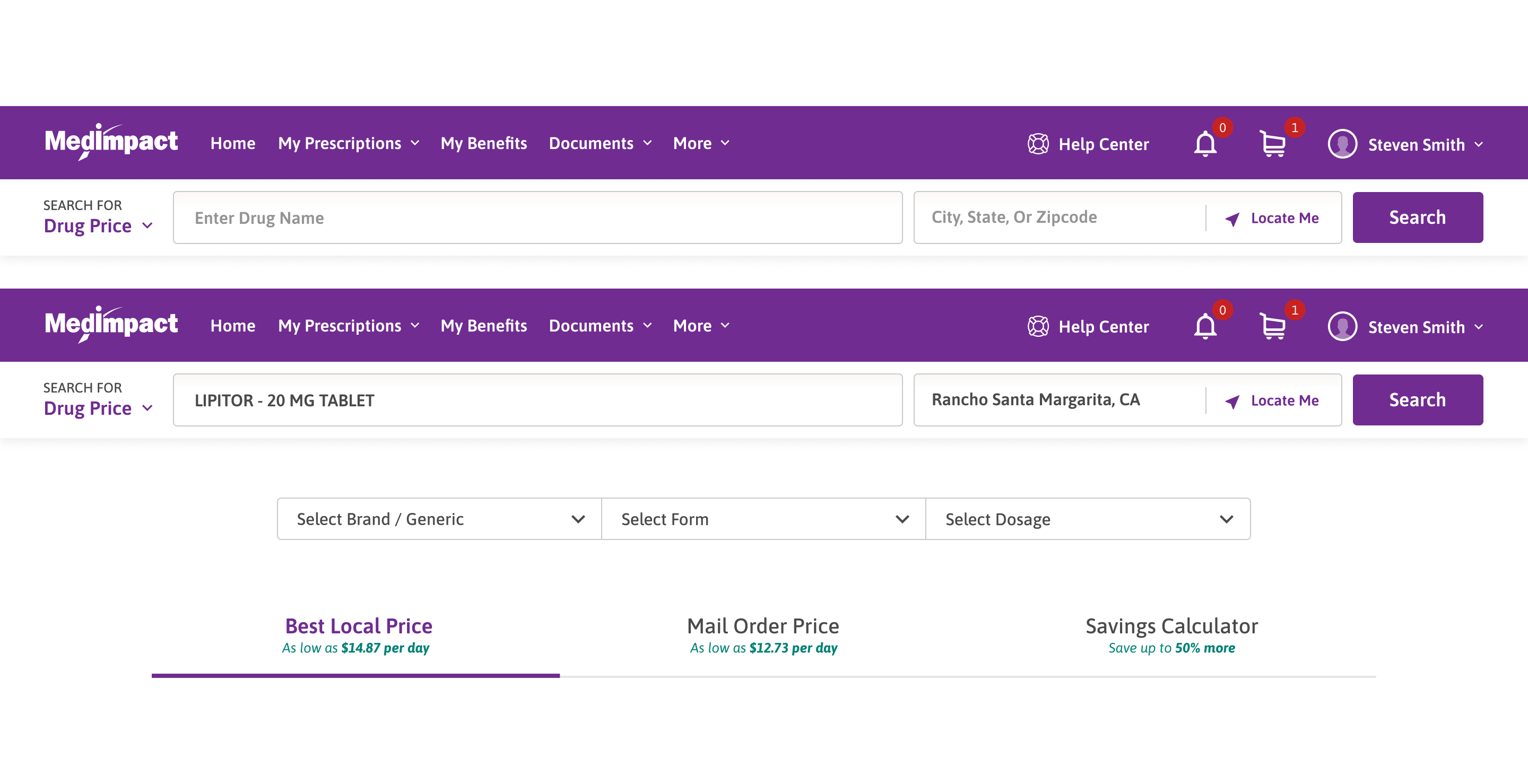
The desktop top bar keeps the main sections and the drug-price search one click away. On mobile, a top bar and a footer menu put the same destinations within thumb reach.

Desktop

MedImpact desktop navigation bar

Mobile

MedImpact mobile top navigation barMedImpact mobile footer menu

The Mobile App

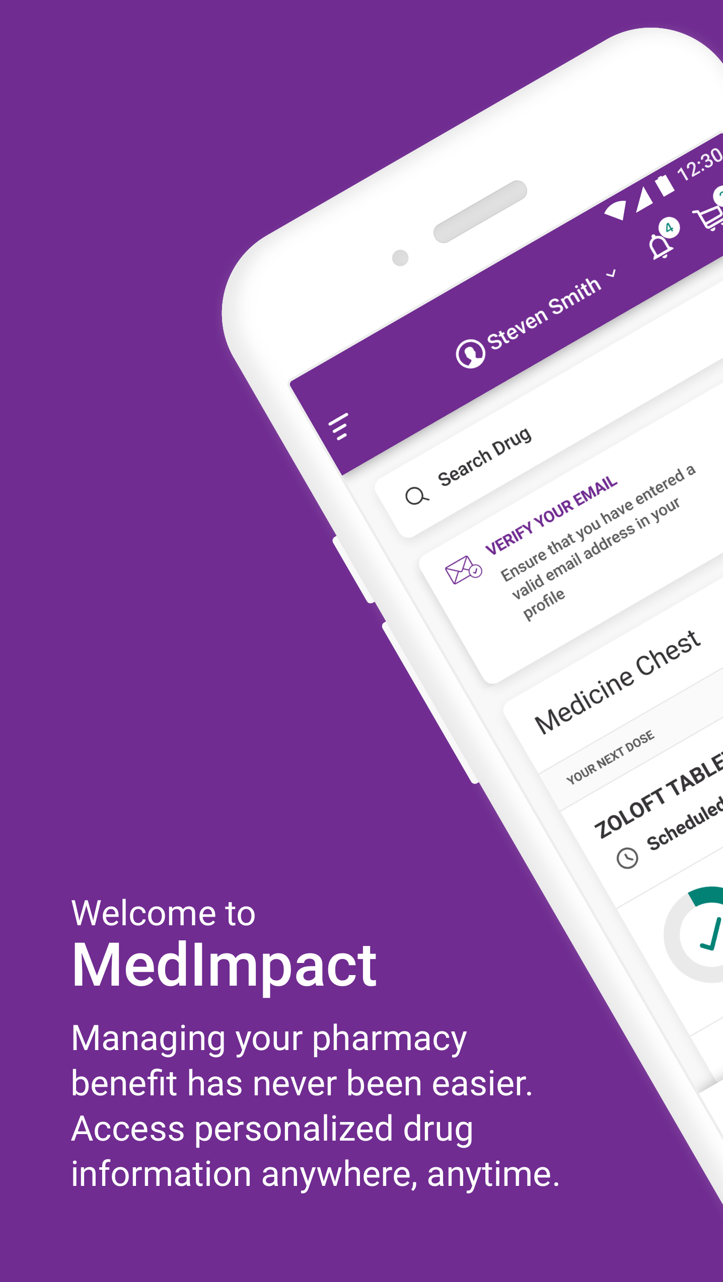
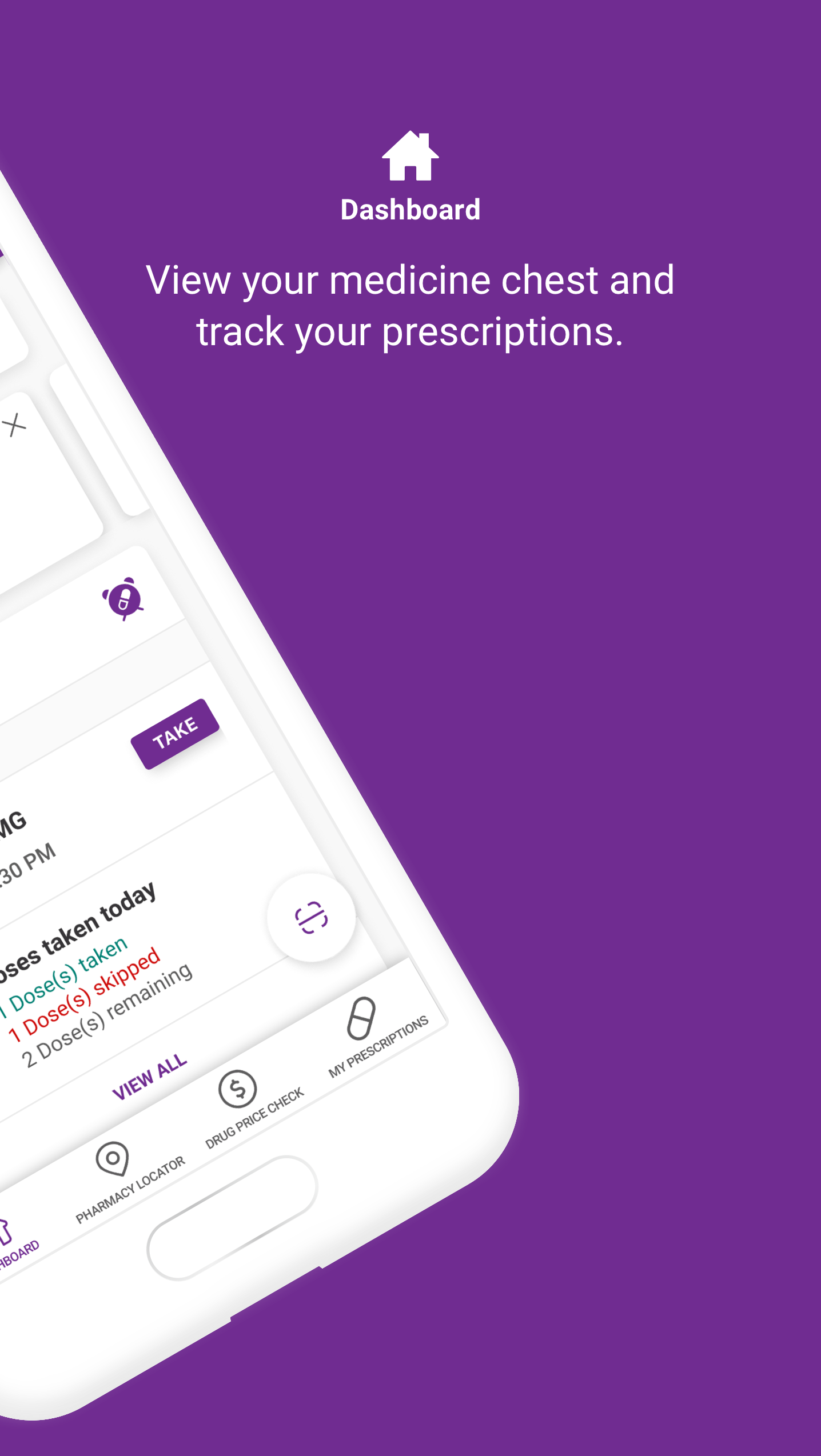
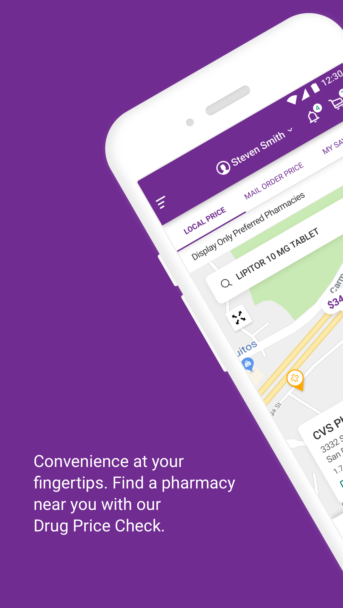
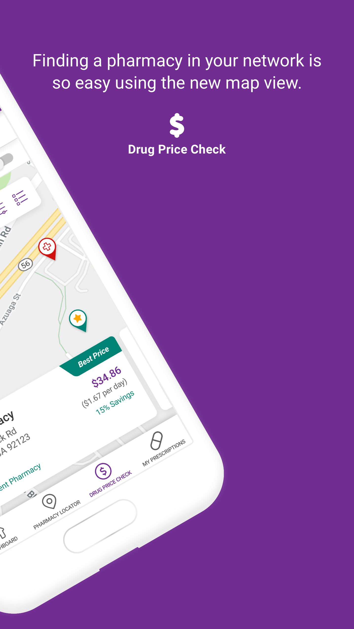
MedImpact was built for mobile as well as desktop. The app puts the same core tasks, checking a drug price, refilling a prescription, tracking doses, and managing benefits, in a layout made for a phone.

App Sitemap

The information architecture of the mobile app, from the primary sections down to their screens.

MedImpact Mobile App
Dashboard
  • Next Steps
  • Benefit Overview
  • My Prescriptions
  • My Dependants
  • Savings
  • Medicine Chest
Drug Price Check
  • Local Price
  • Mail Order Price
  • My Savings
  • Pharmacy Map
My Prescriptions
  • Prescriptions
  • Orders
  • Claims History
  • Request a Prescription
Vaccines
  • Recommended
  • Vaccine Info
  • Schedule / Directions
Benefits & Enrollment
  • Benefit Highlights
  • Plan Comparison
Profile / Account
  • Profile
  • Medical Info
  • Payment
  • Dependants
  • Change Password
  • Notifications
Medicine Chest
  • Next Dose
  • Doses Taken
  • Reminders

App Store Images

MedImpact mobile app screen 1MedImpact mobile app screen 2MedImpact mobile app screen 3MedImpact mobile app screen 4MedImpact mobile app screen 5MedImpact mobile app screen 6

Inside the App

MedImpact mobile app screen

Hi Fi Designs

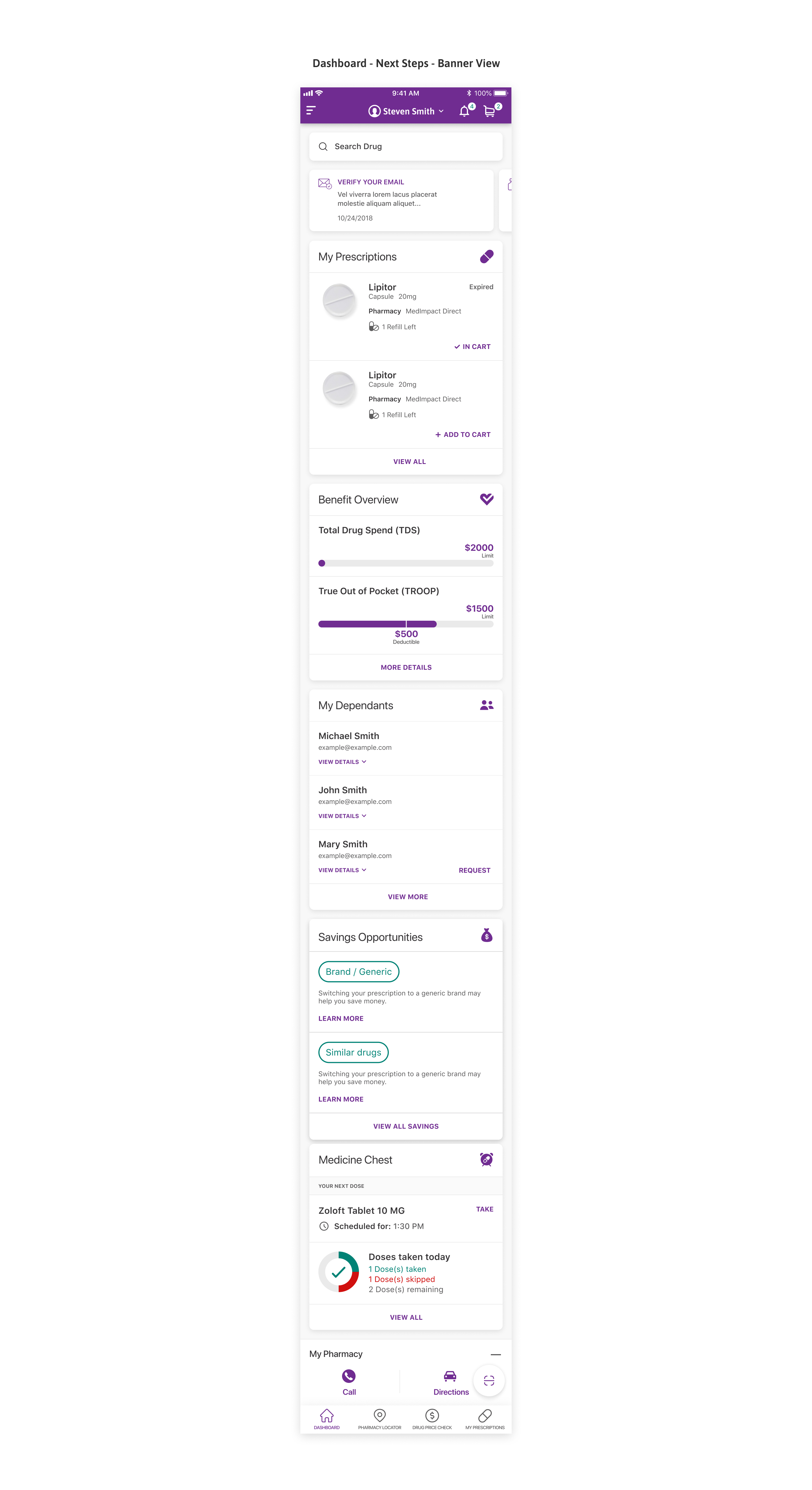
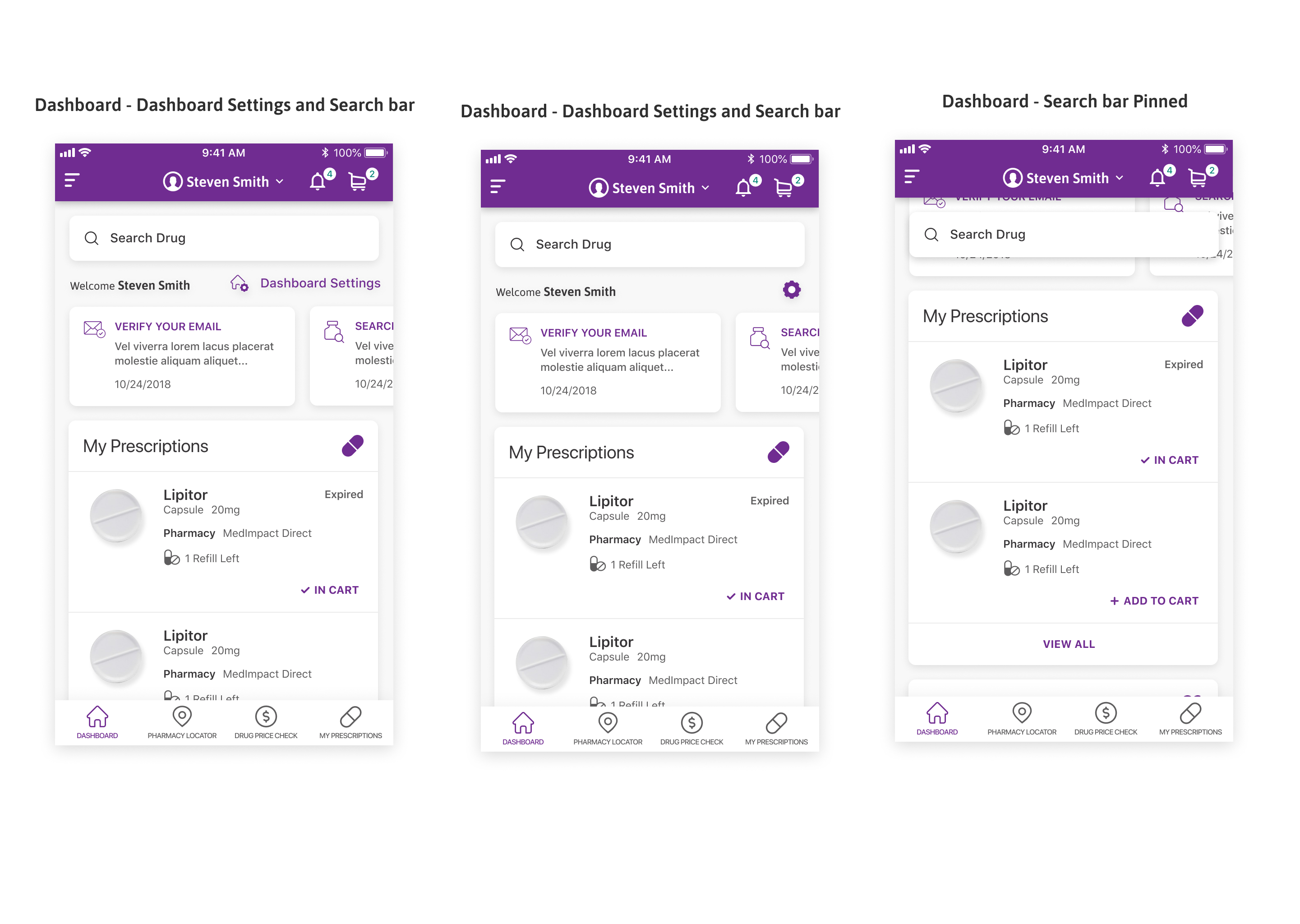
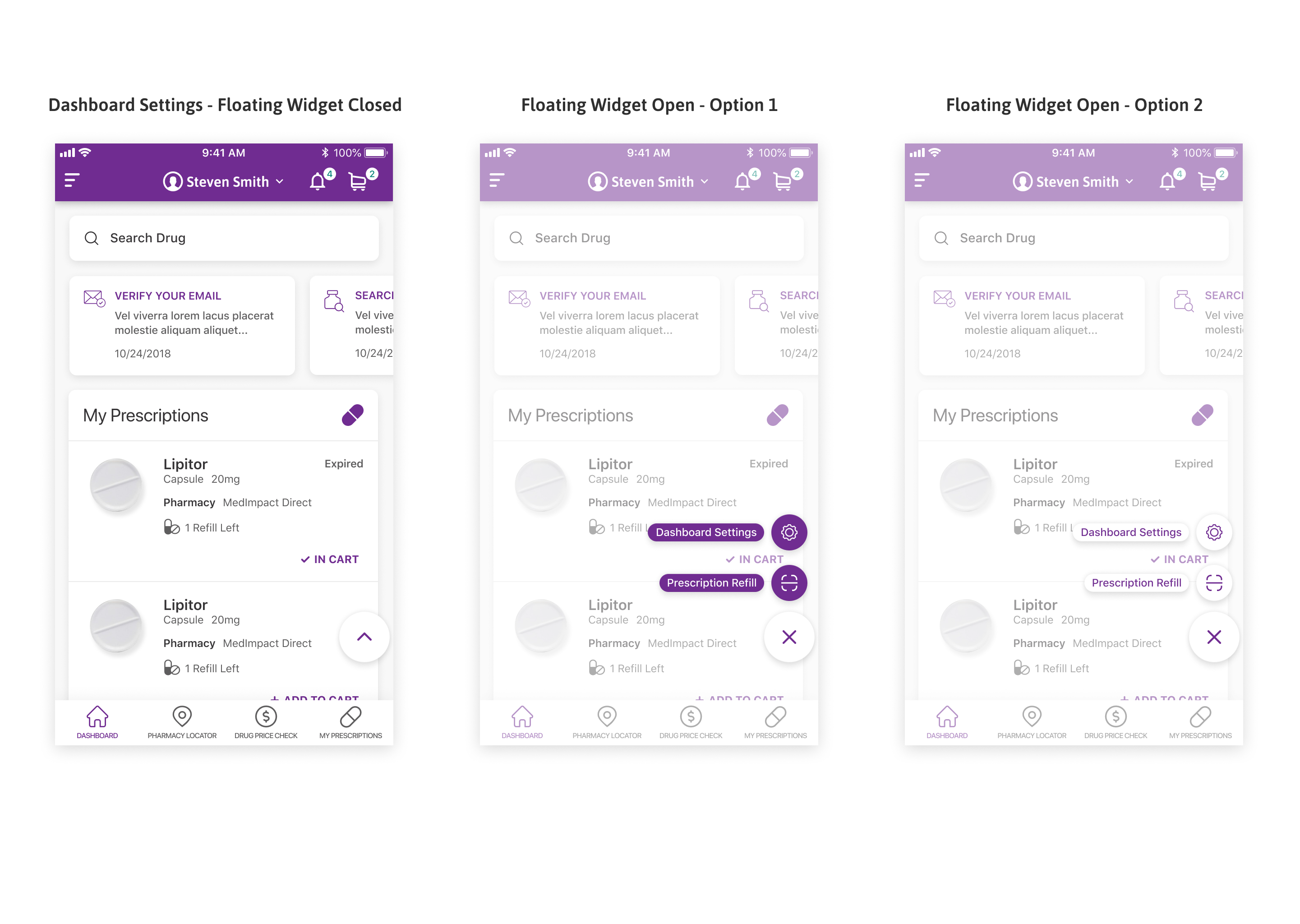
Dashboard

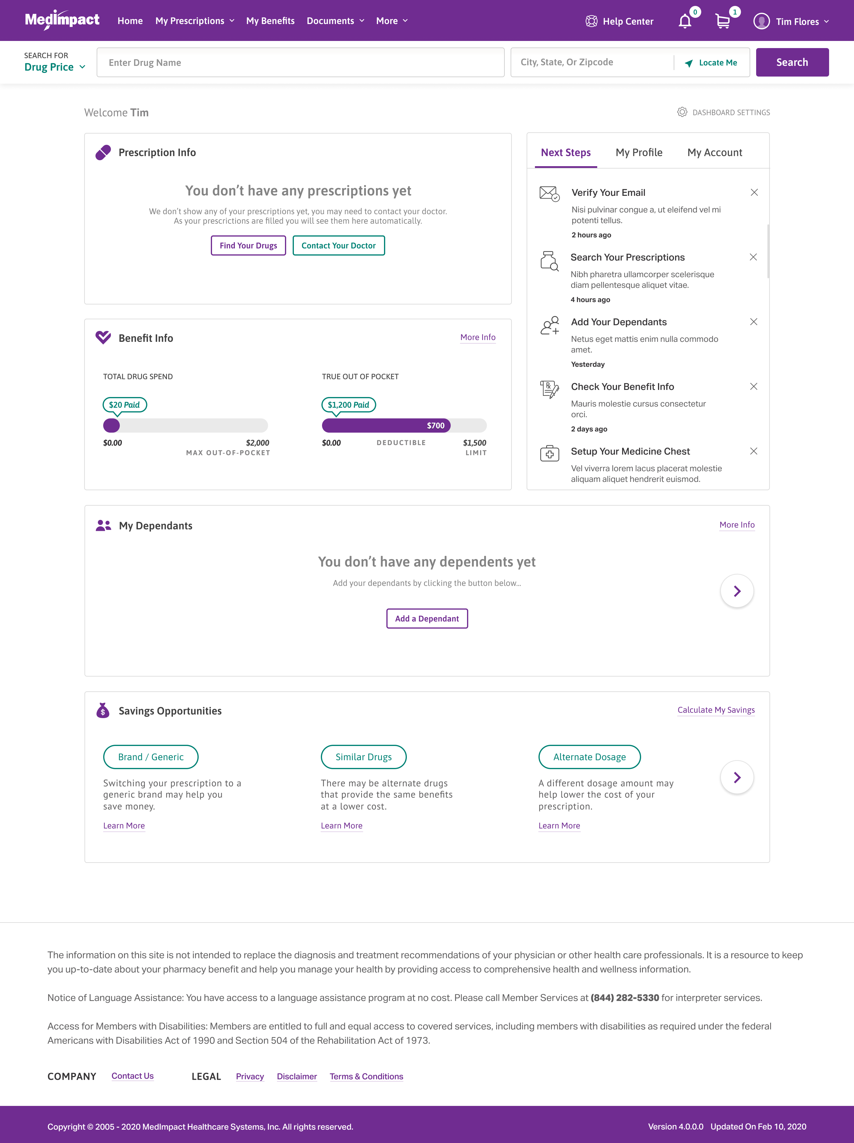
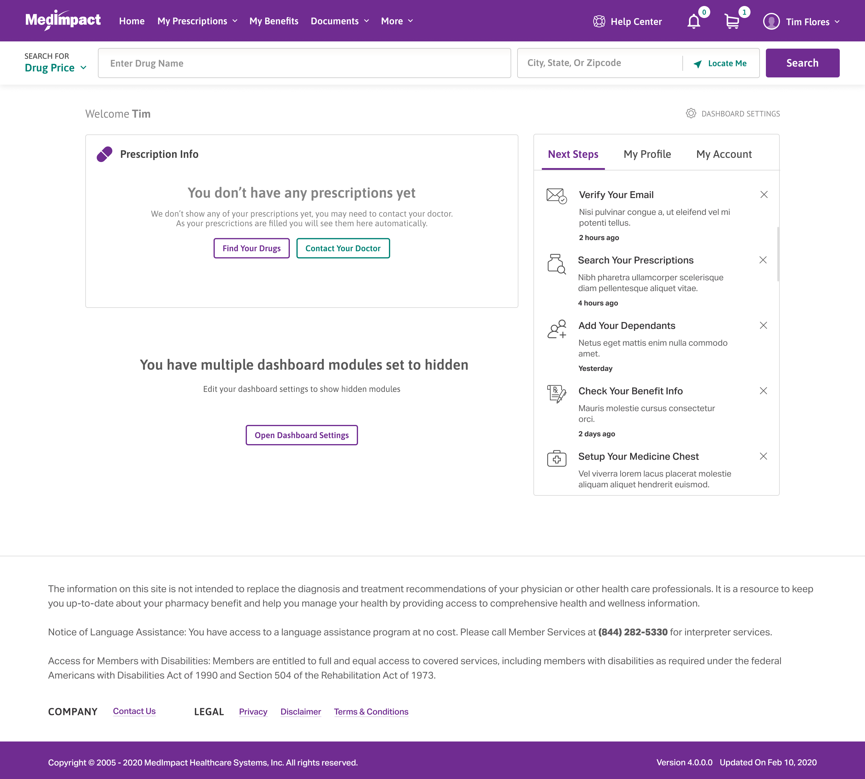
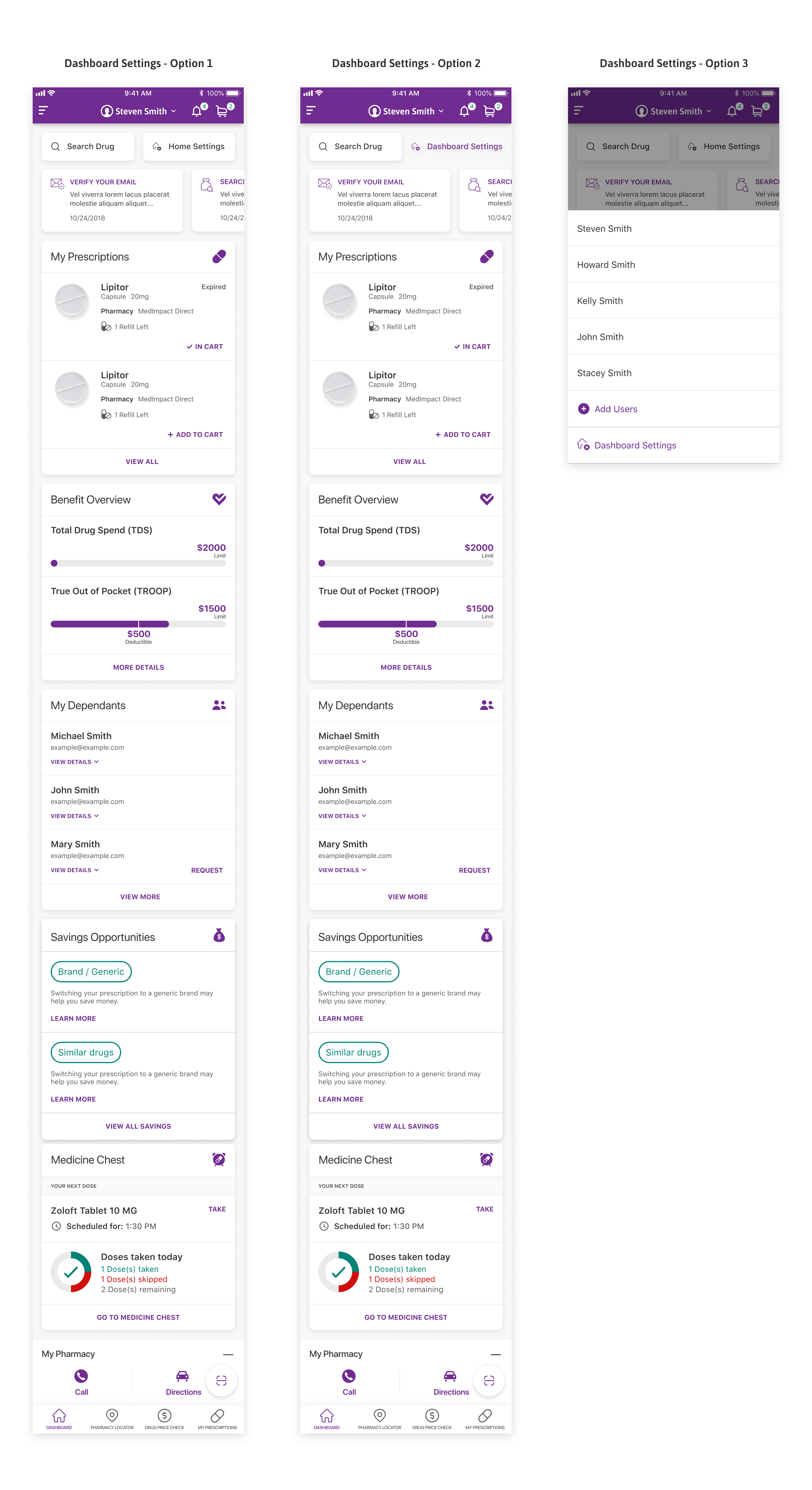
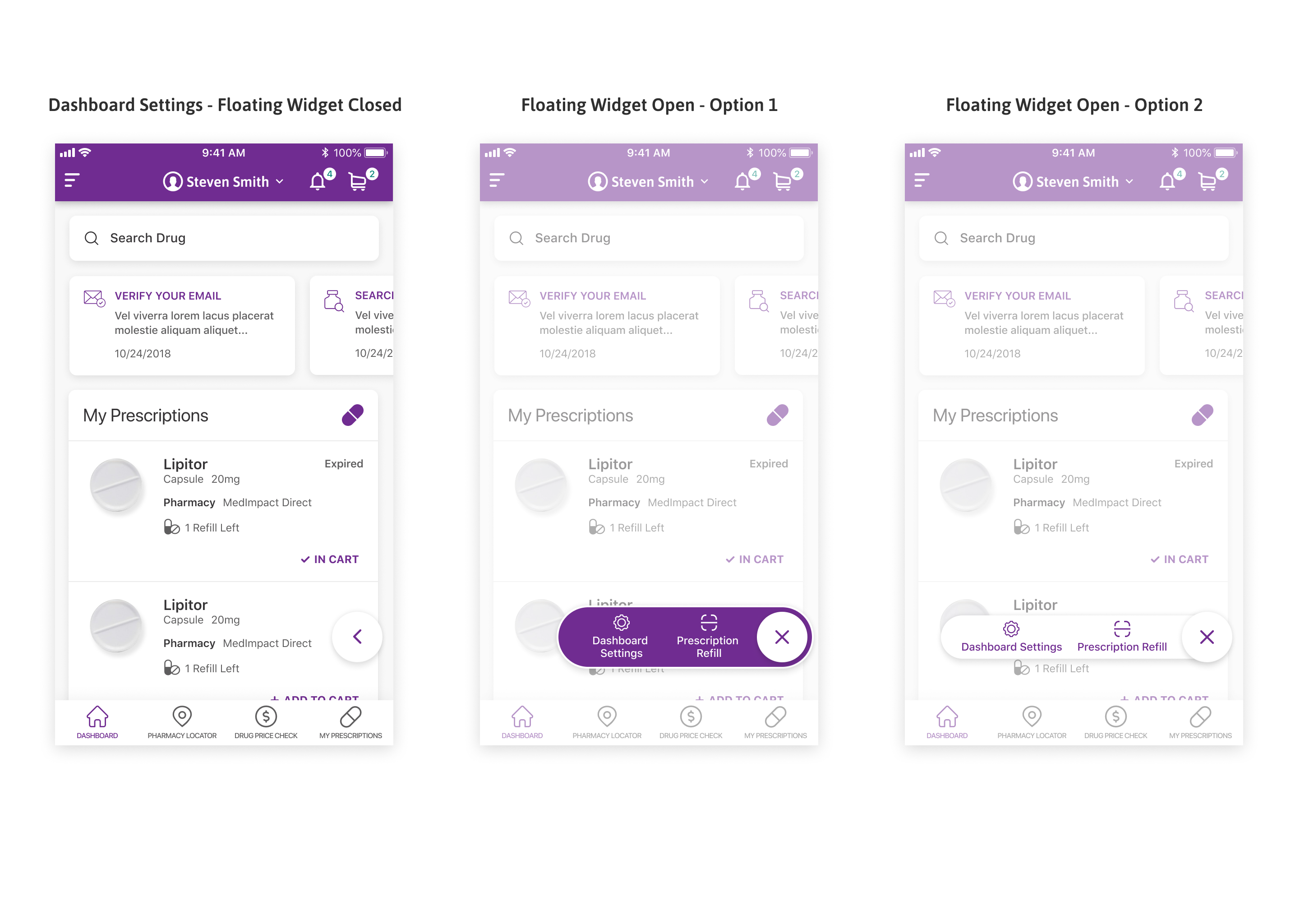
The dashboard shows to-do items, savings, and prescription status when a member logs in.

The most common next actions are placed on the first screen rather than behind navigation.

Prescriptions first

Prescriptions lead, status and refills, or a prompt to find your drugs if none are on file.

Savings up front

Savings Opportunities suggests a generic, a similar drug, or an alternate dosage to lower cost.

Dashboard

Notifications and cart

Alerts and the medication cart stay one tap away in the top bar.

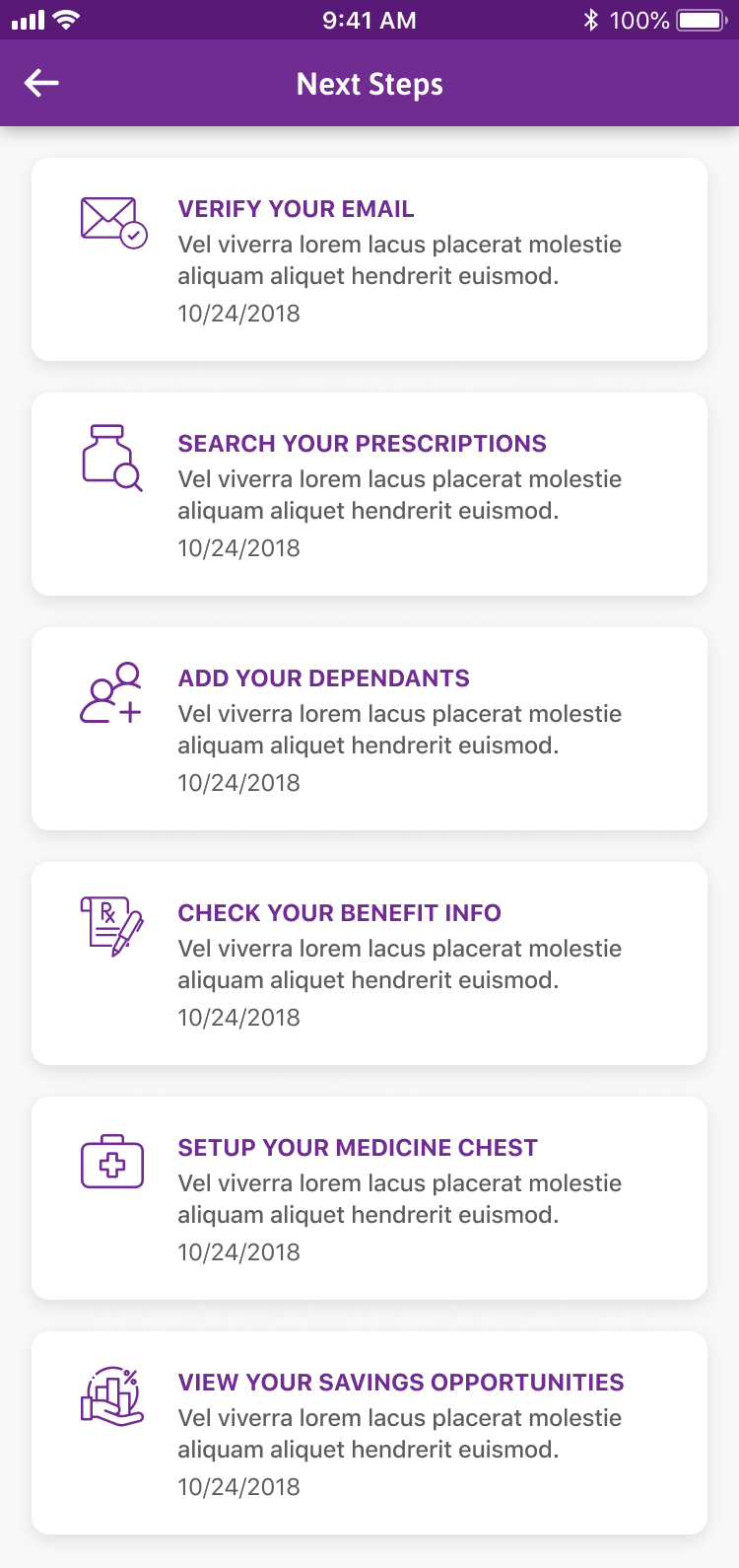
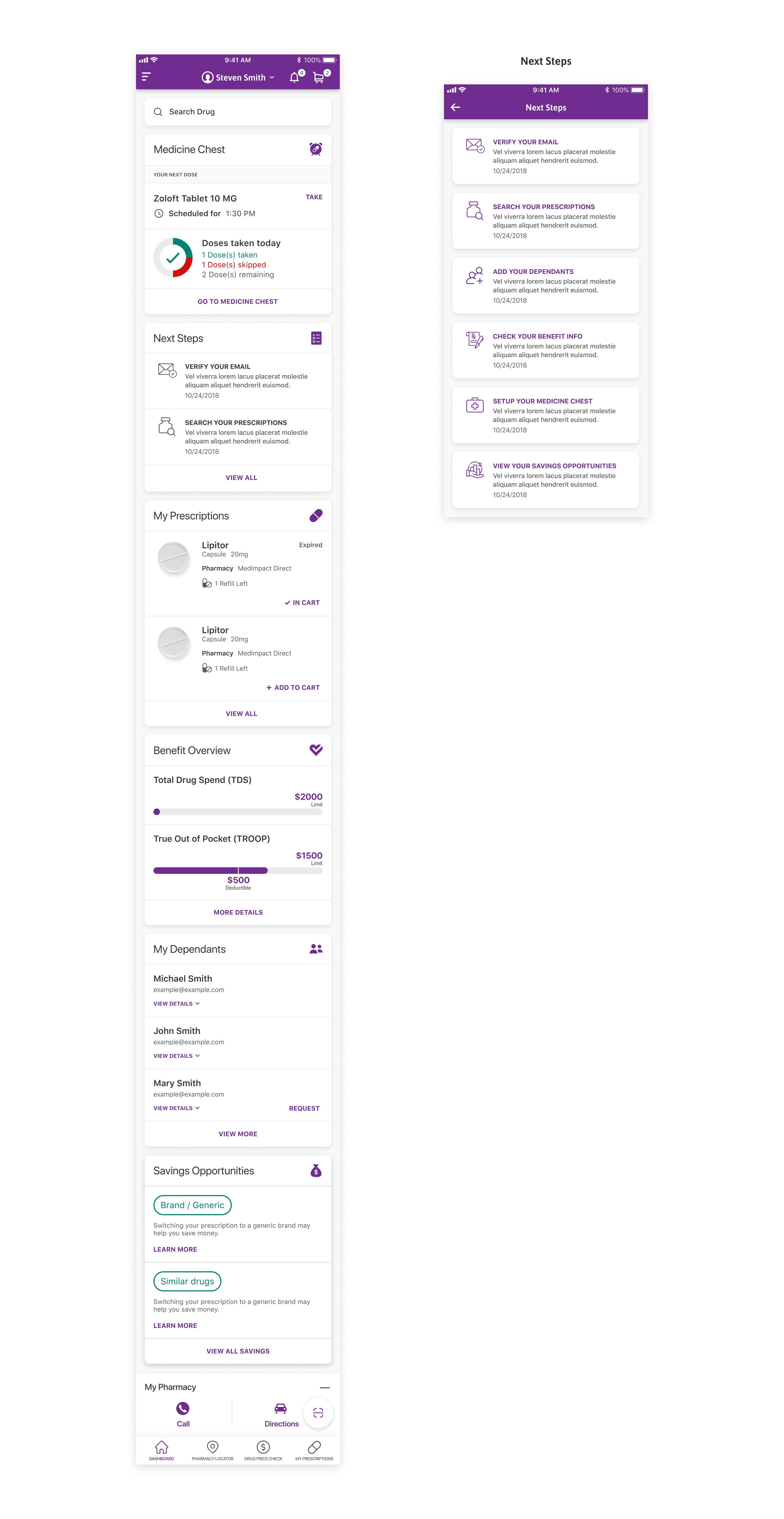
Next Steps

A to-do panel: verify email, add dependants, check benefits, set up the medicine chest.

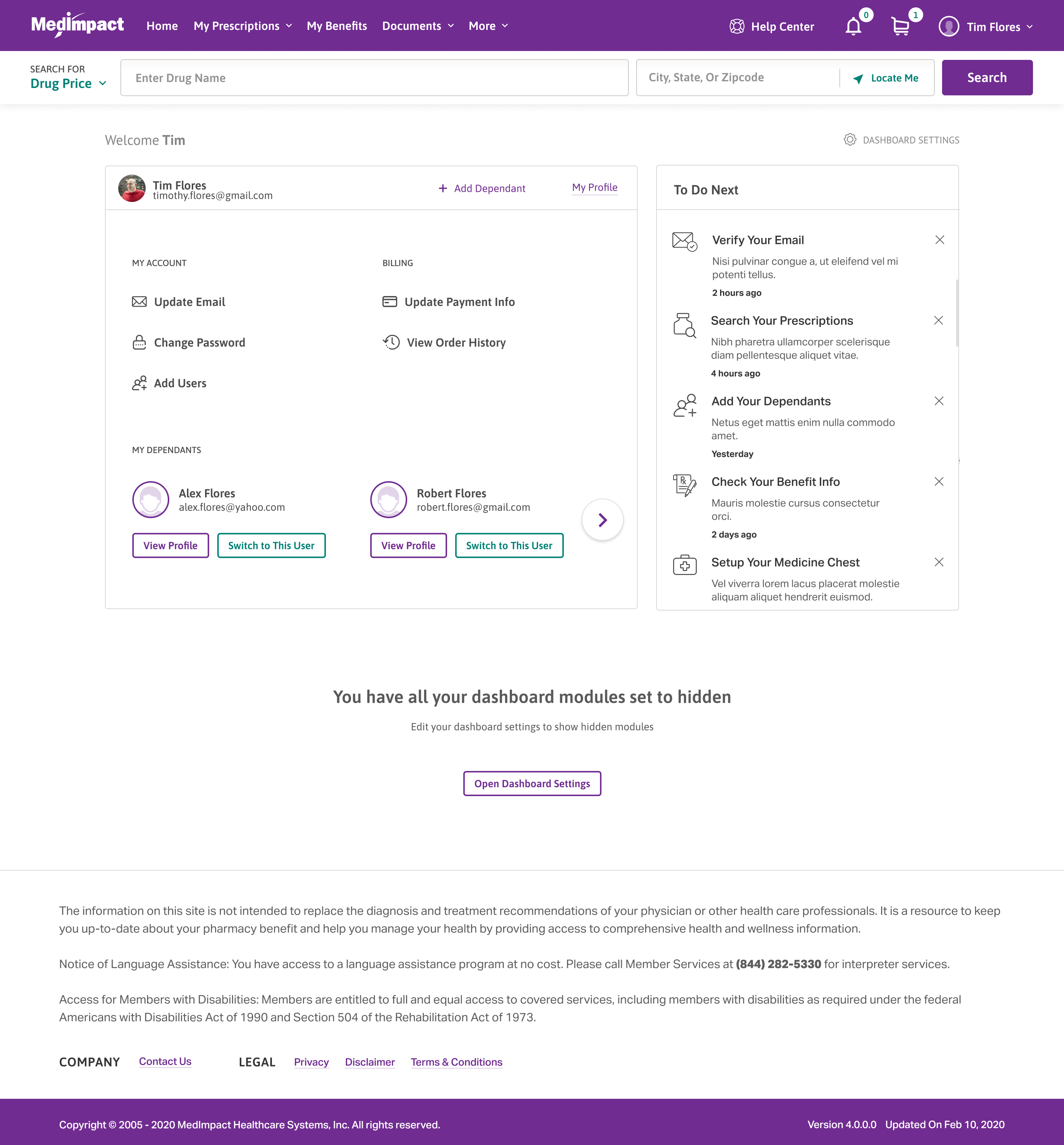
To Do Next

The To Do Next area lists tasks a member should handle, such as verifying an email, checking benefits, or setting up a refill.

Outstanding tasks are grouped in one place instead of scattered across the portal.

Refill from the dashboard

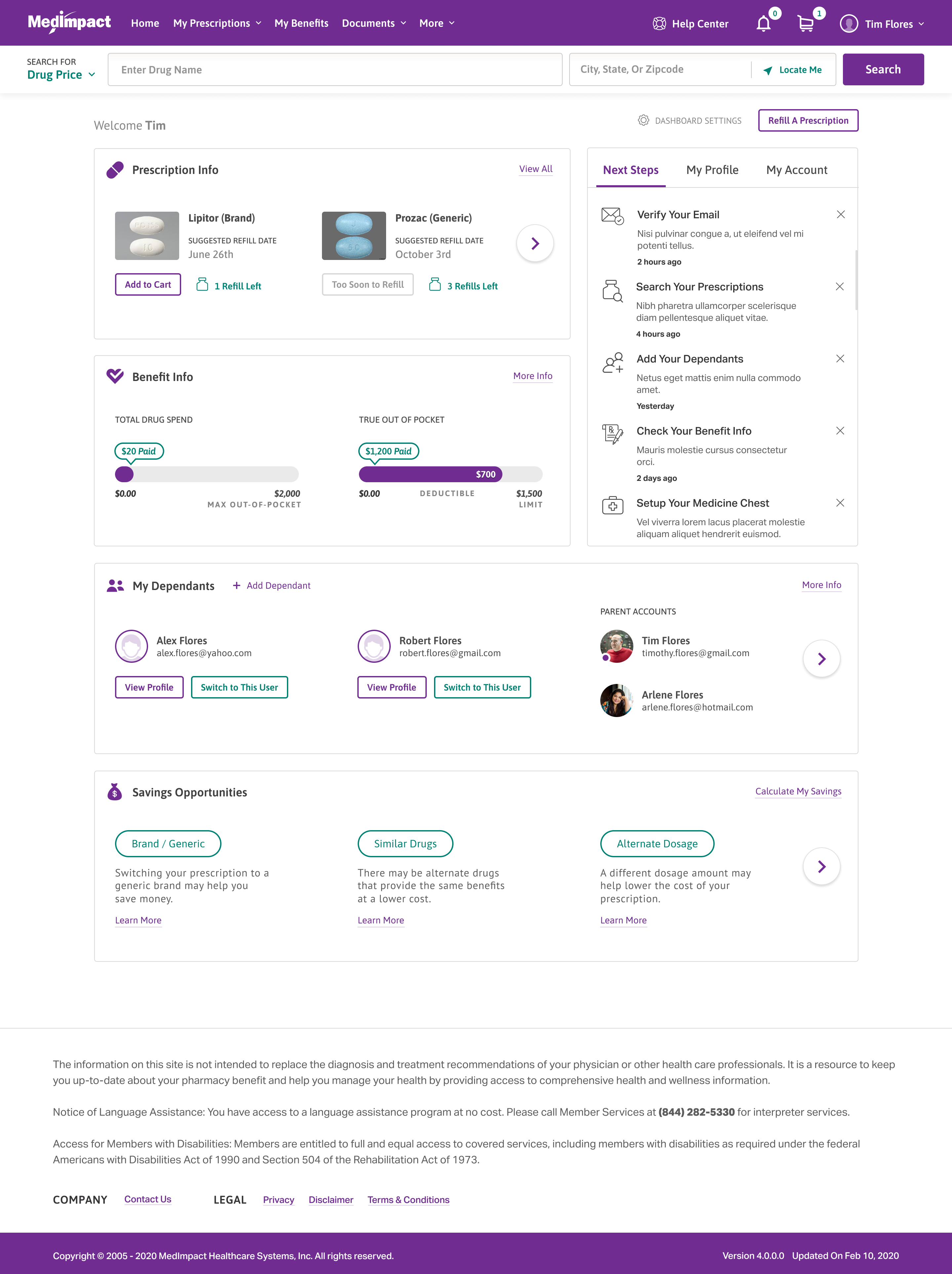
Prescription Info shows suggested refill dates and an Add to Cart button.

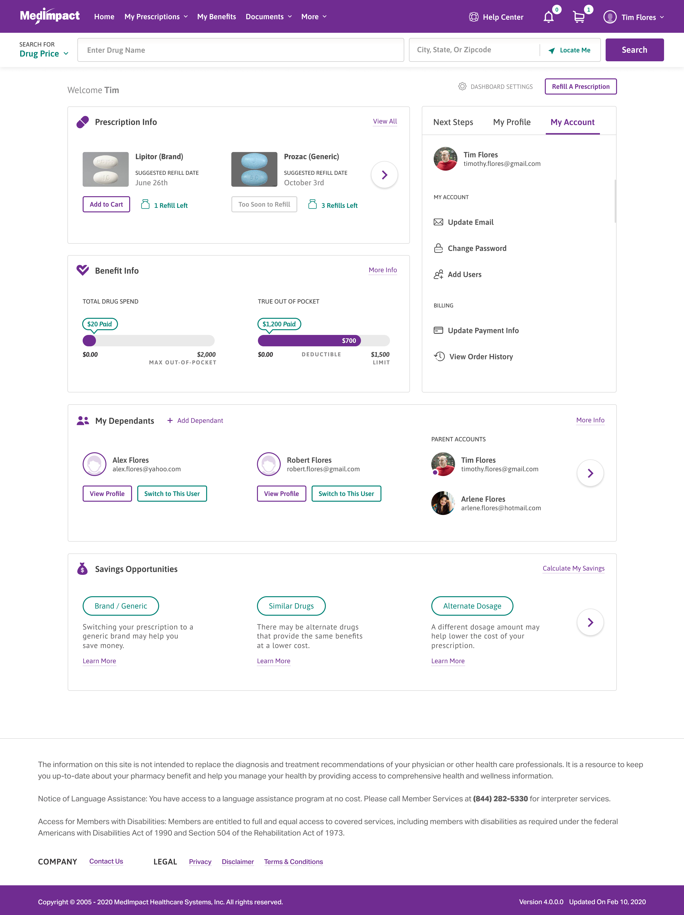
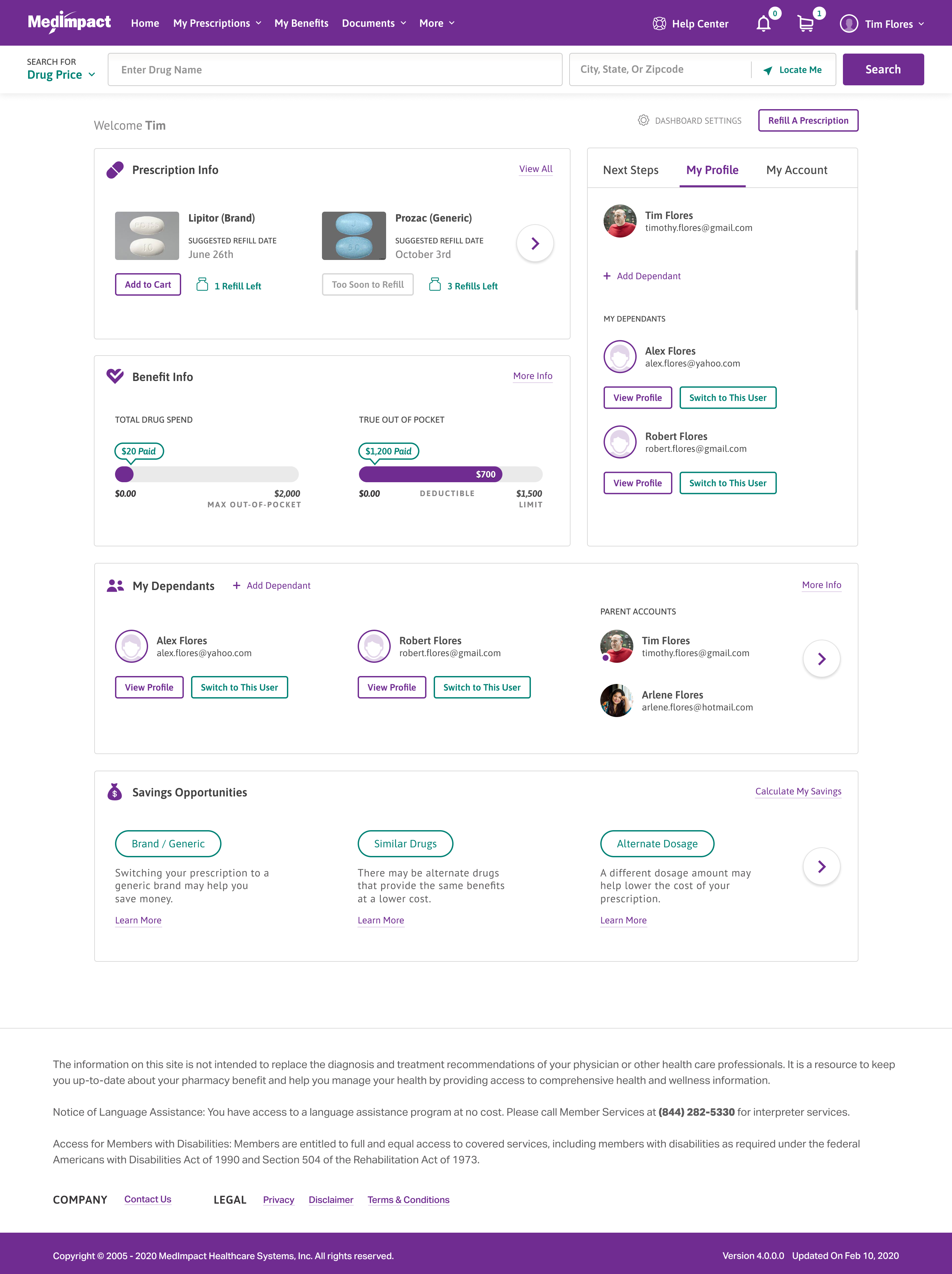
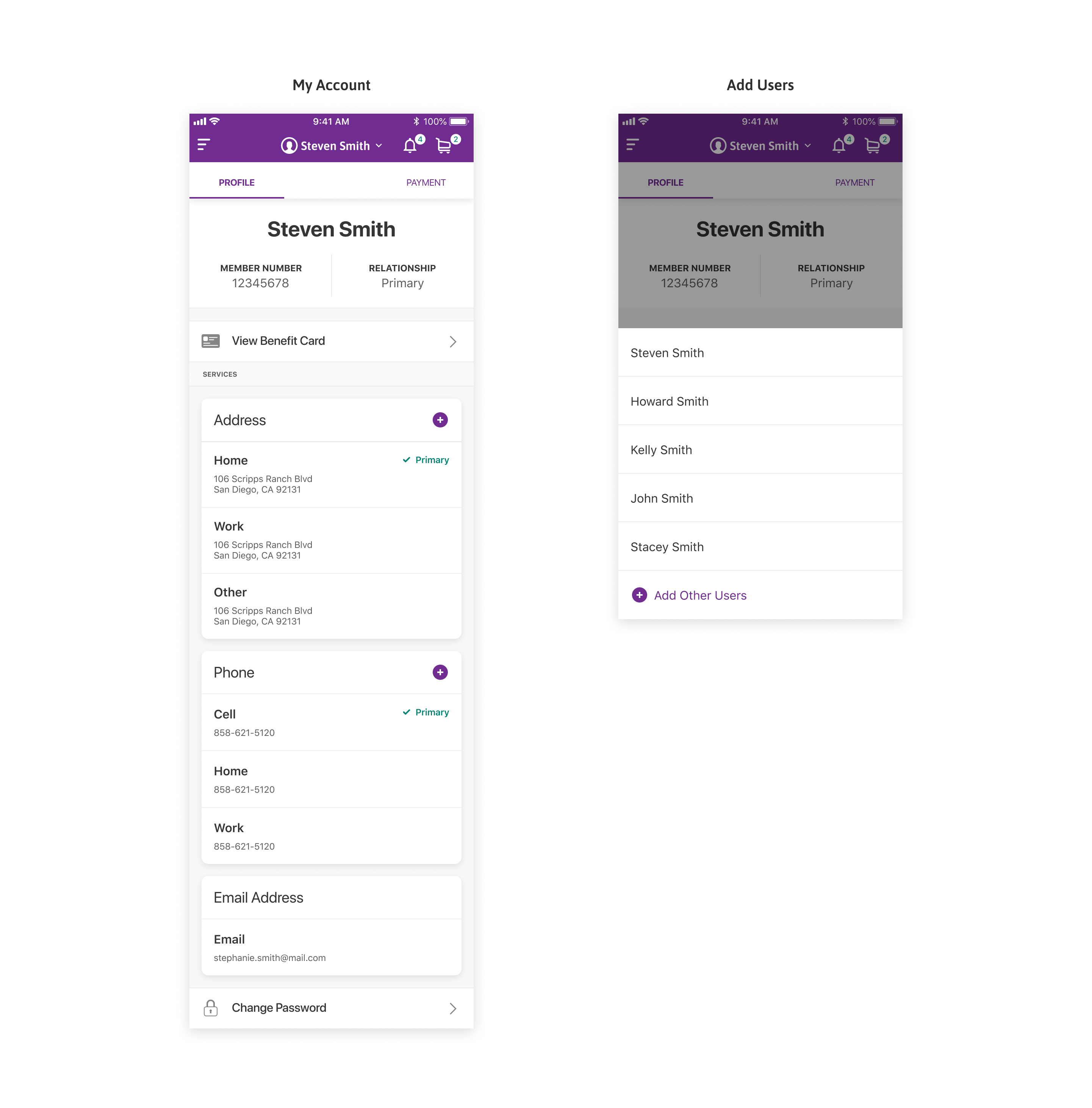
Manage dependants

View a dependant's profile or switch into their account from the dashboard.

To Do Next

Next Steps

The to-do list leads with the tasks a member should handle next.

Switch users

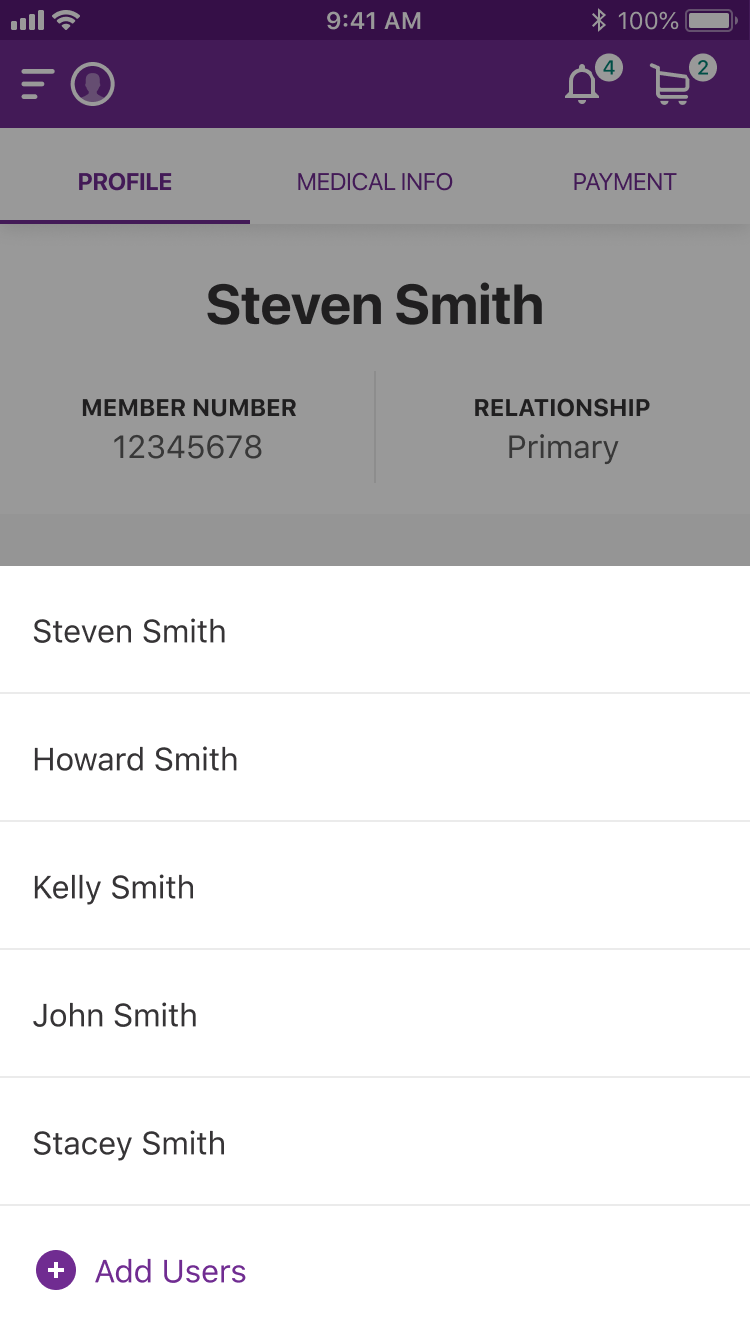
Parent accounts and dependants are listed so a member can switch who they manage.

My Prescriptions

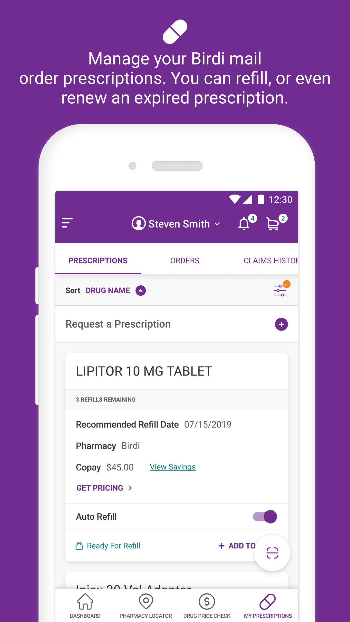
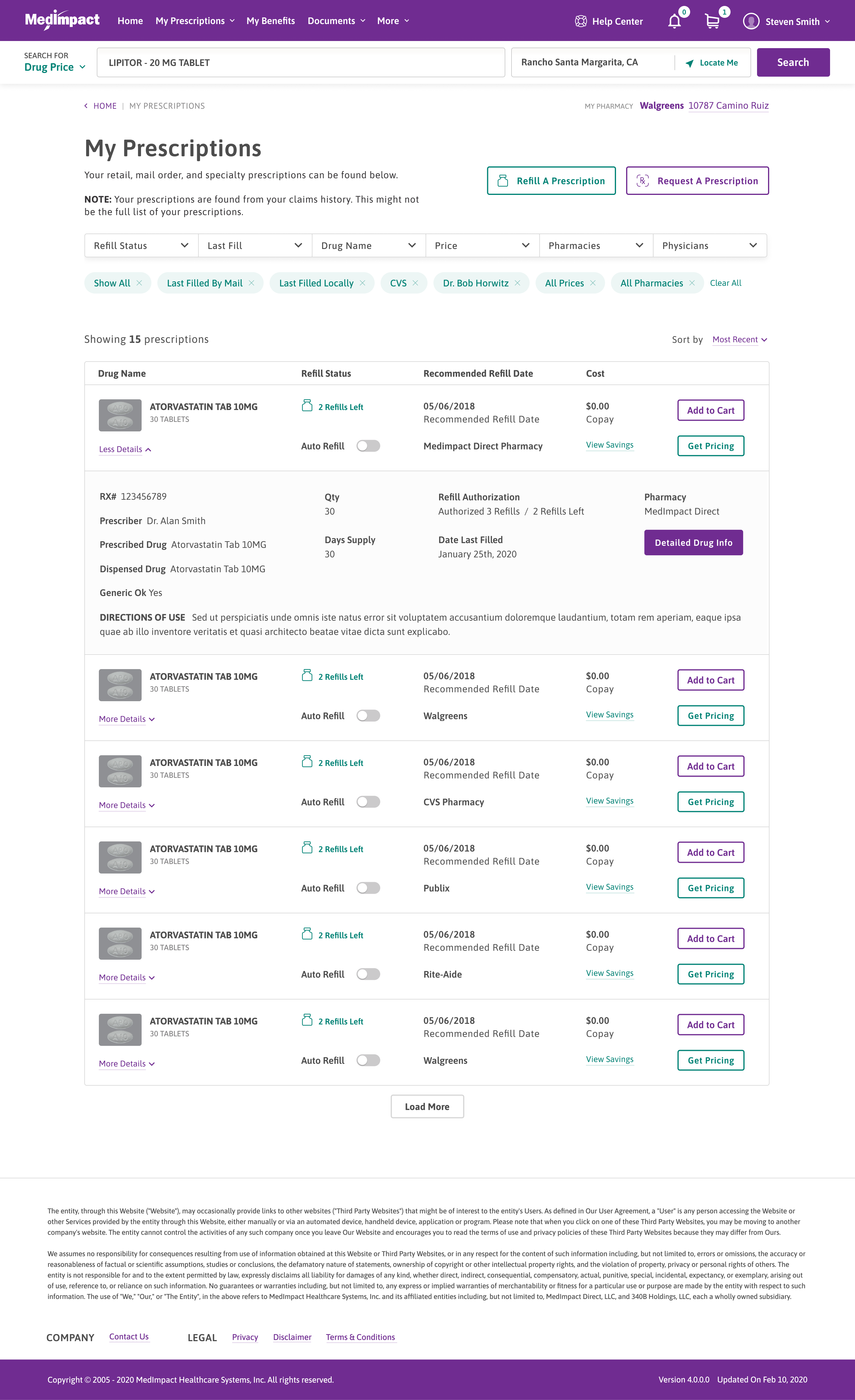
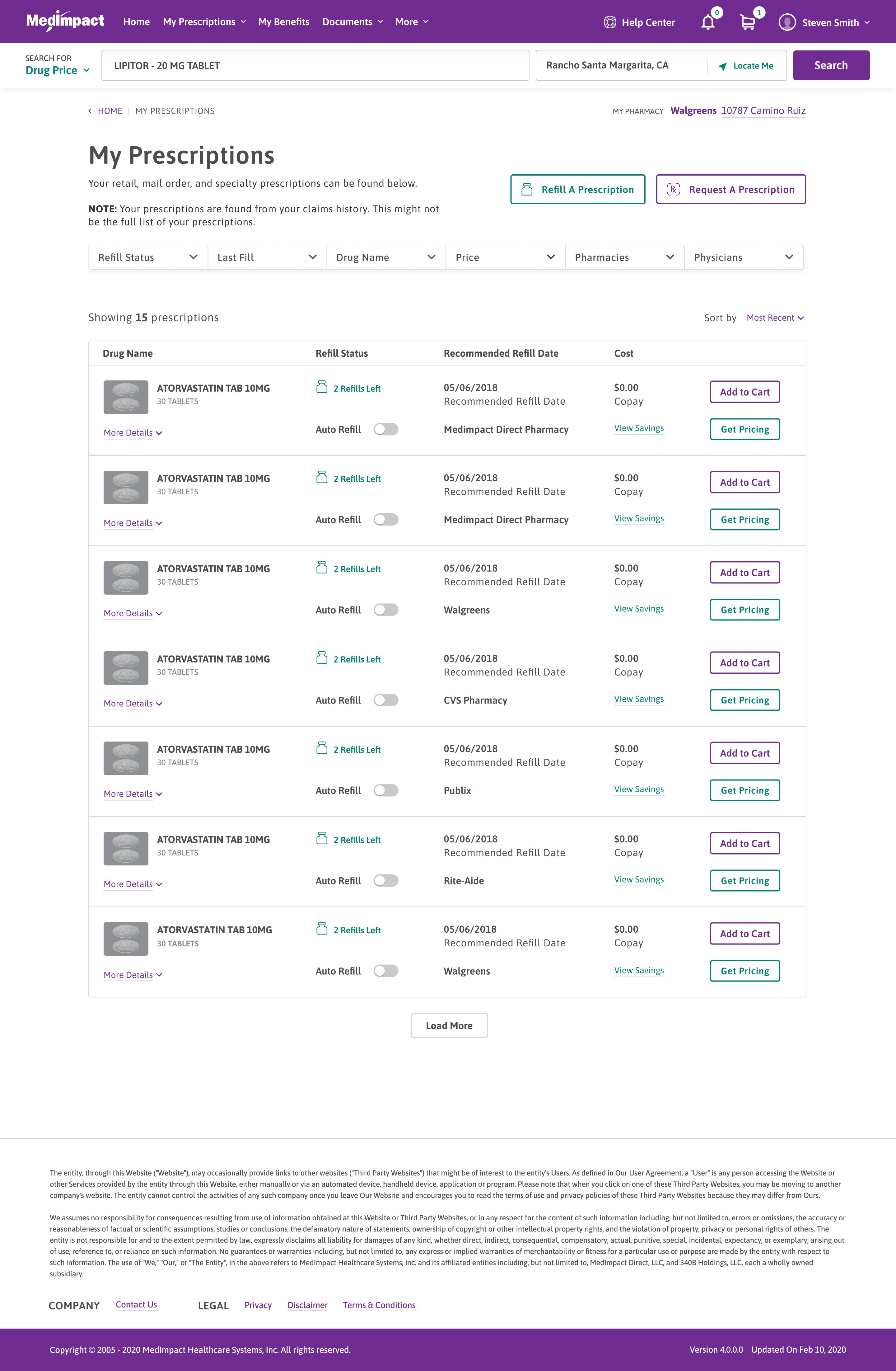
Active prescriptions are listed with drug name, last fill date, pharmacy, and prescriber, along with refill and auto-refill status.

Refill status is shown inline so members do not need to open each prescription.

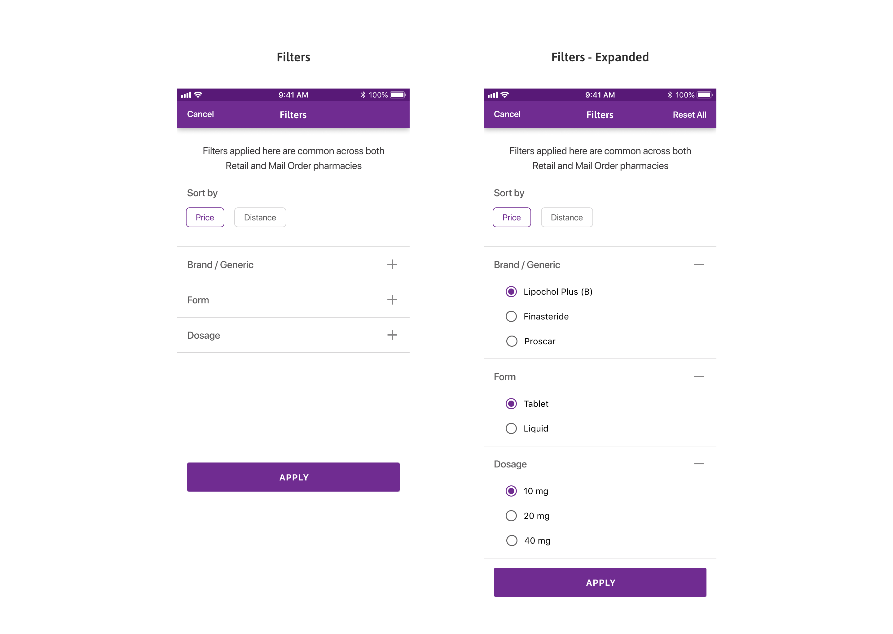
Filters as pills

Active filters show as removable pills under the filter row.

Refill status inline

Each row shows refills left, recommended refill date, pharmacy, and an auto-refill toggle.

My Prescriptions

Refill or request

Refill an existing prescription or request a new one from the top of the page.

Act from the list

Add to Cart and Get Pricing sit on every row, no drill-down needed.

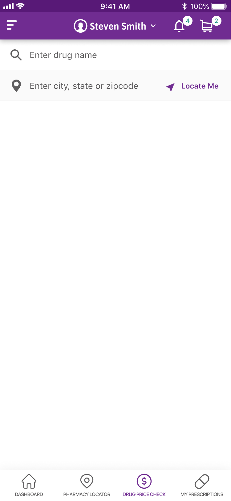
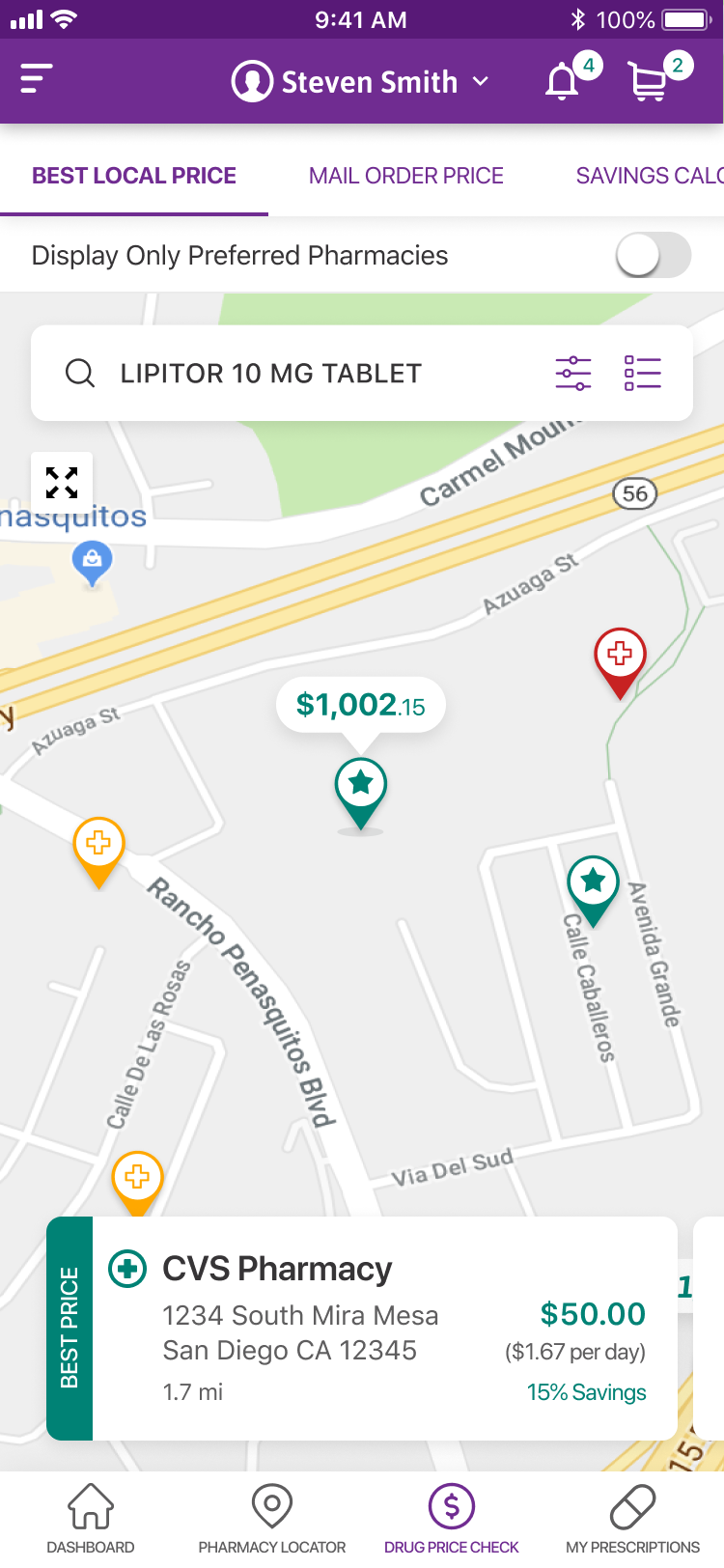
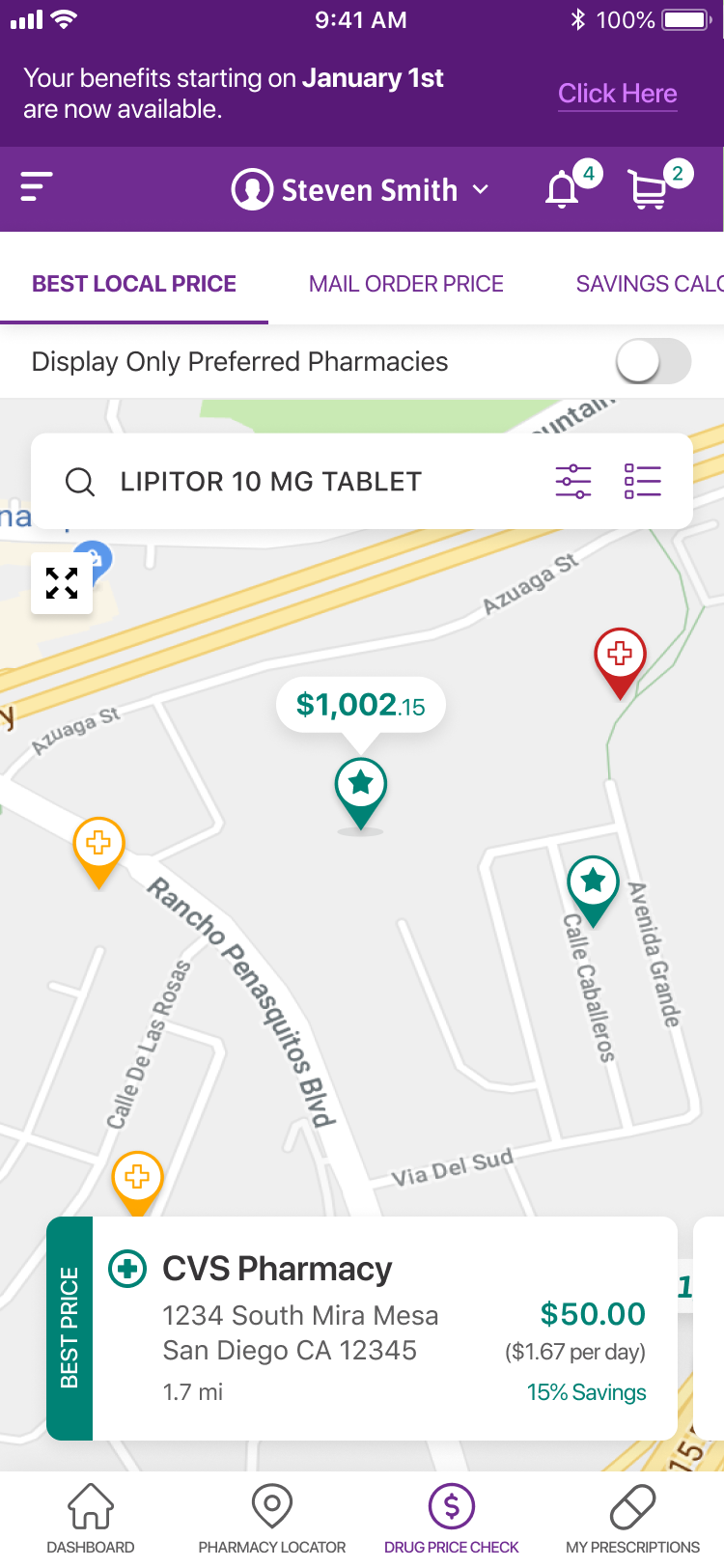
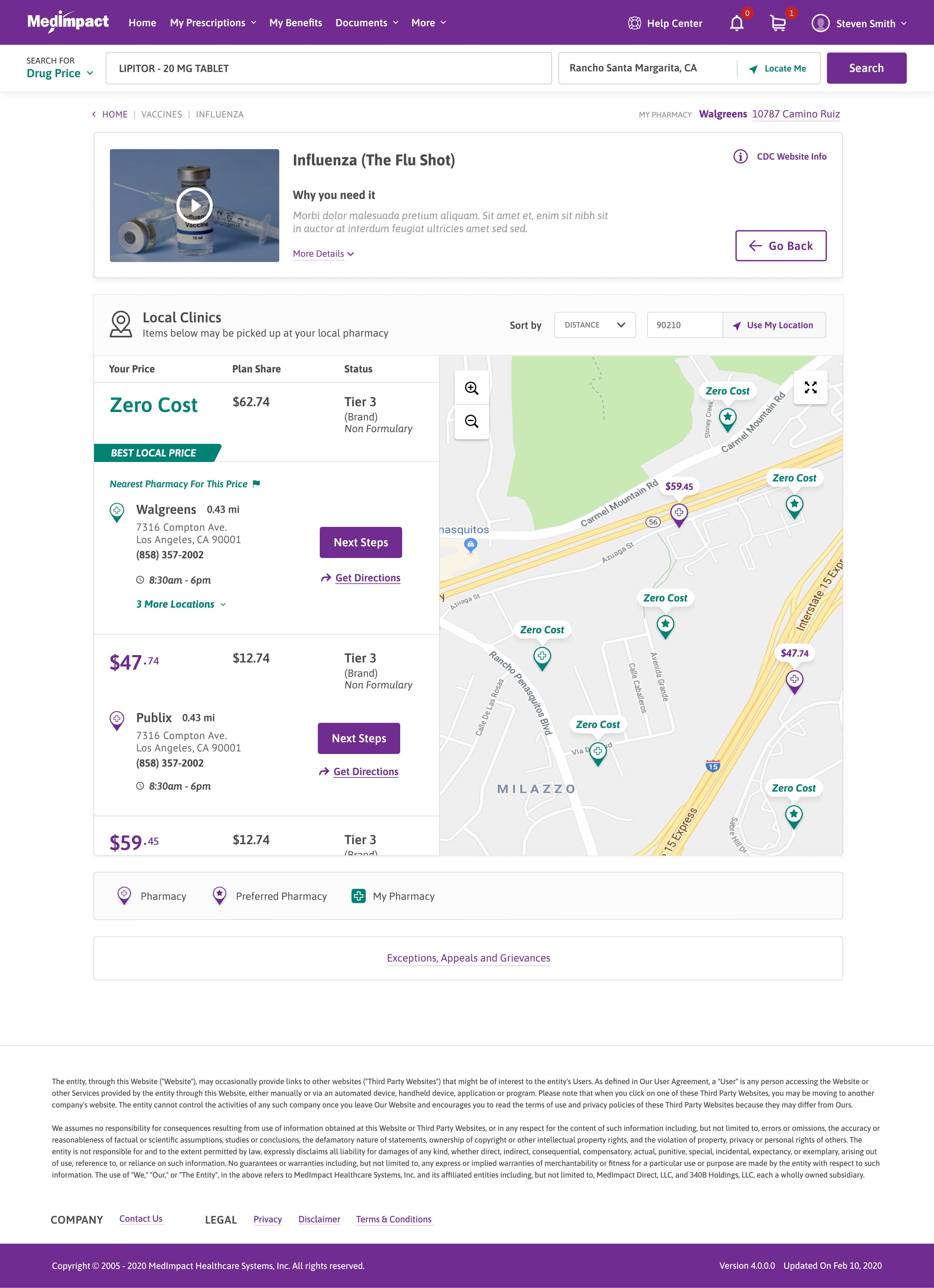
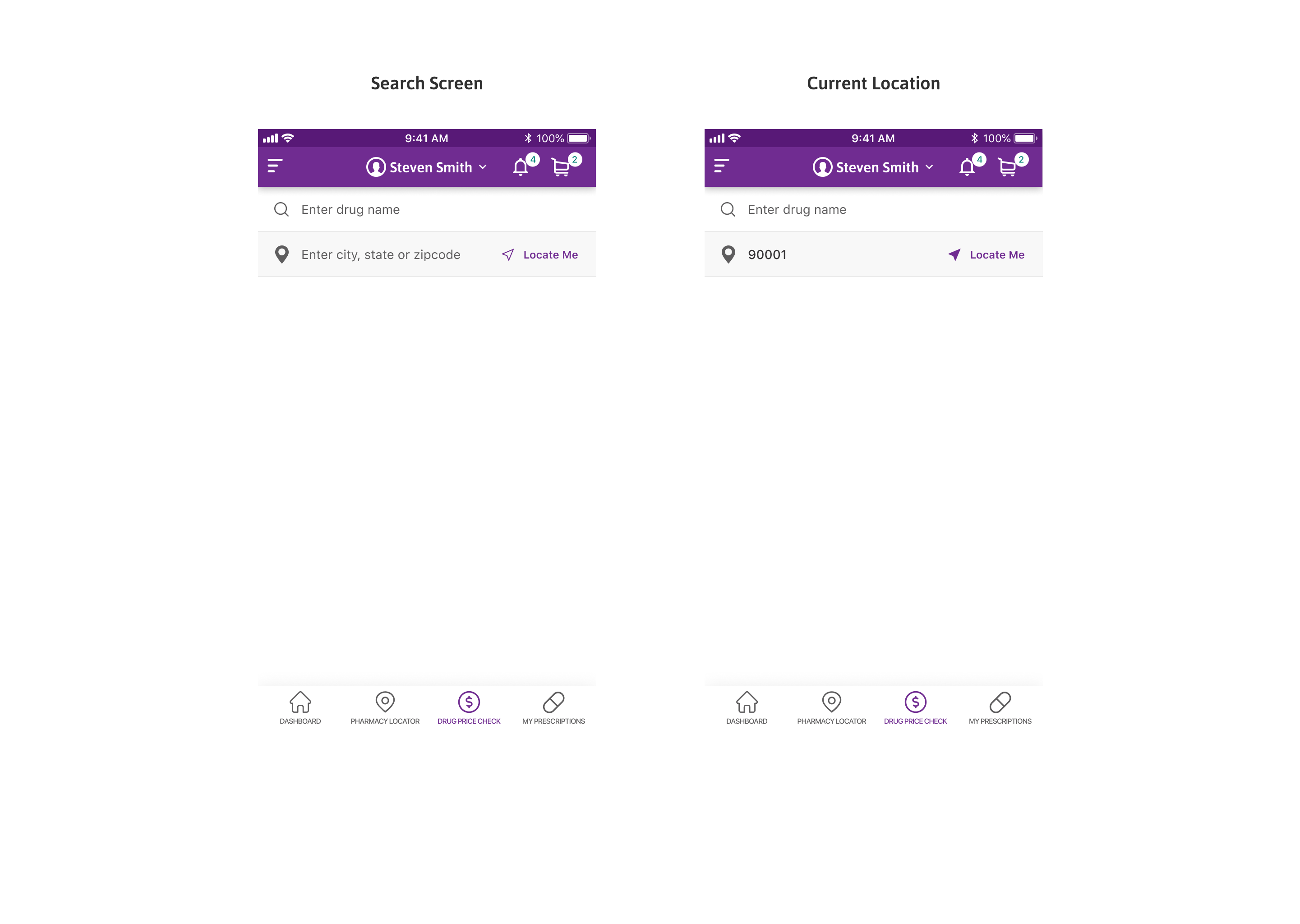
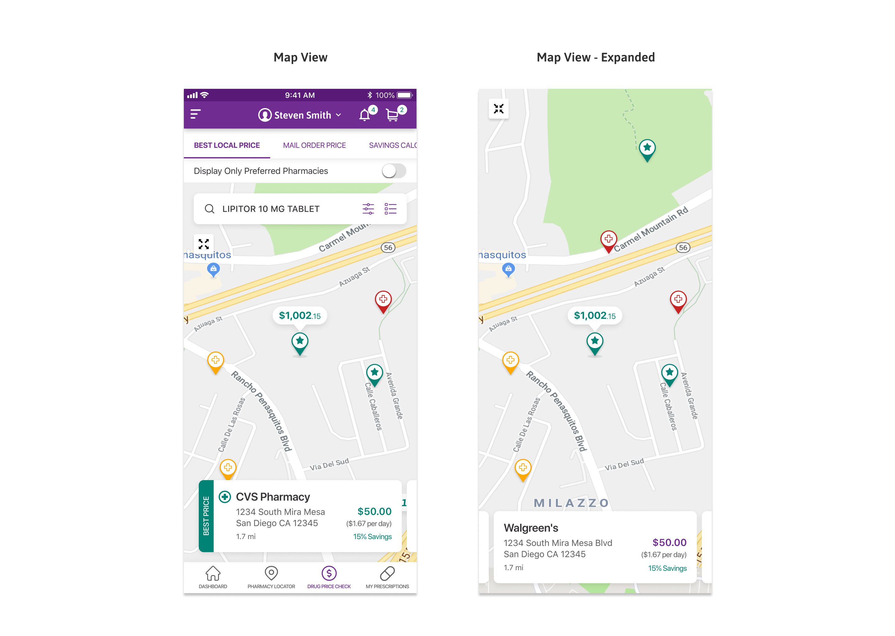
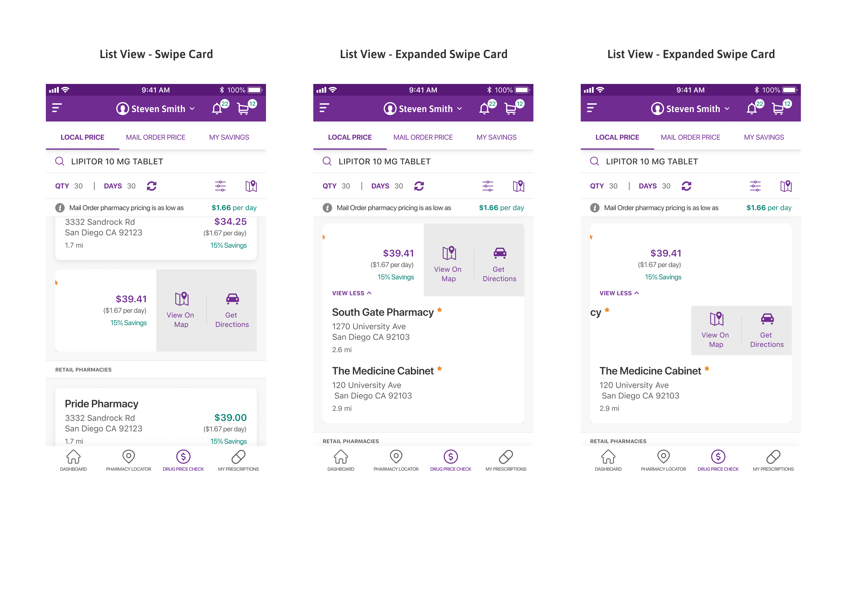
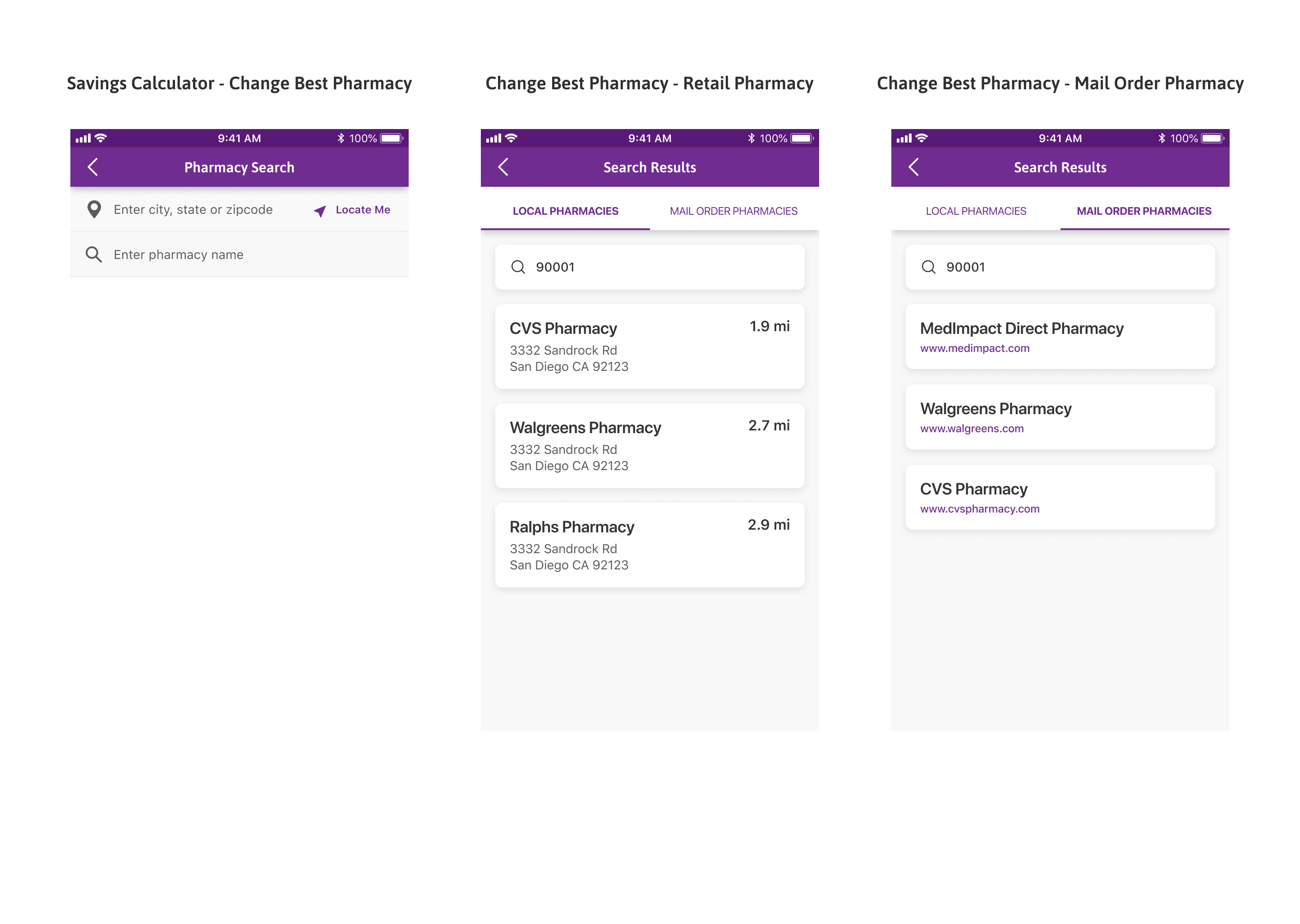
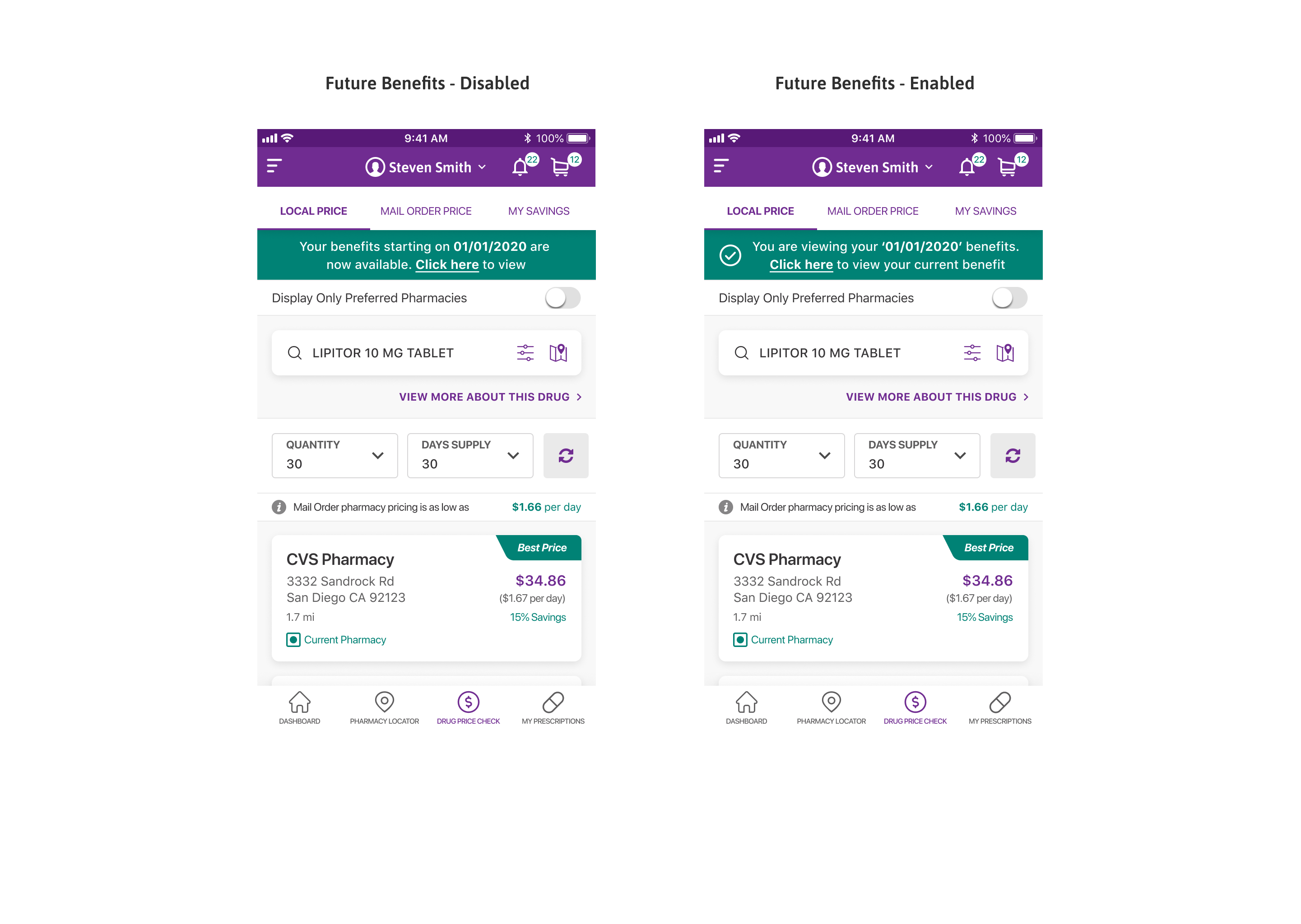
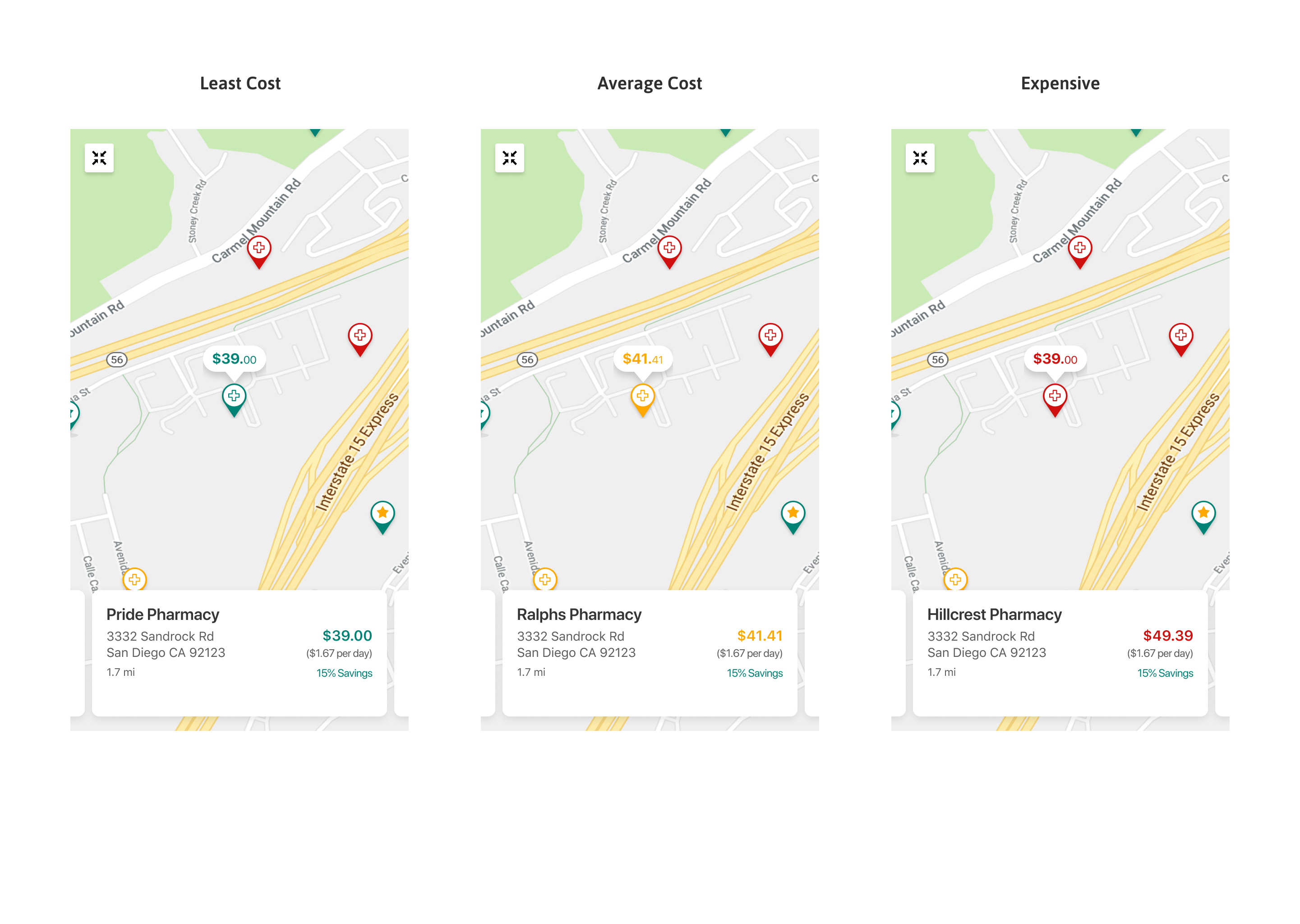
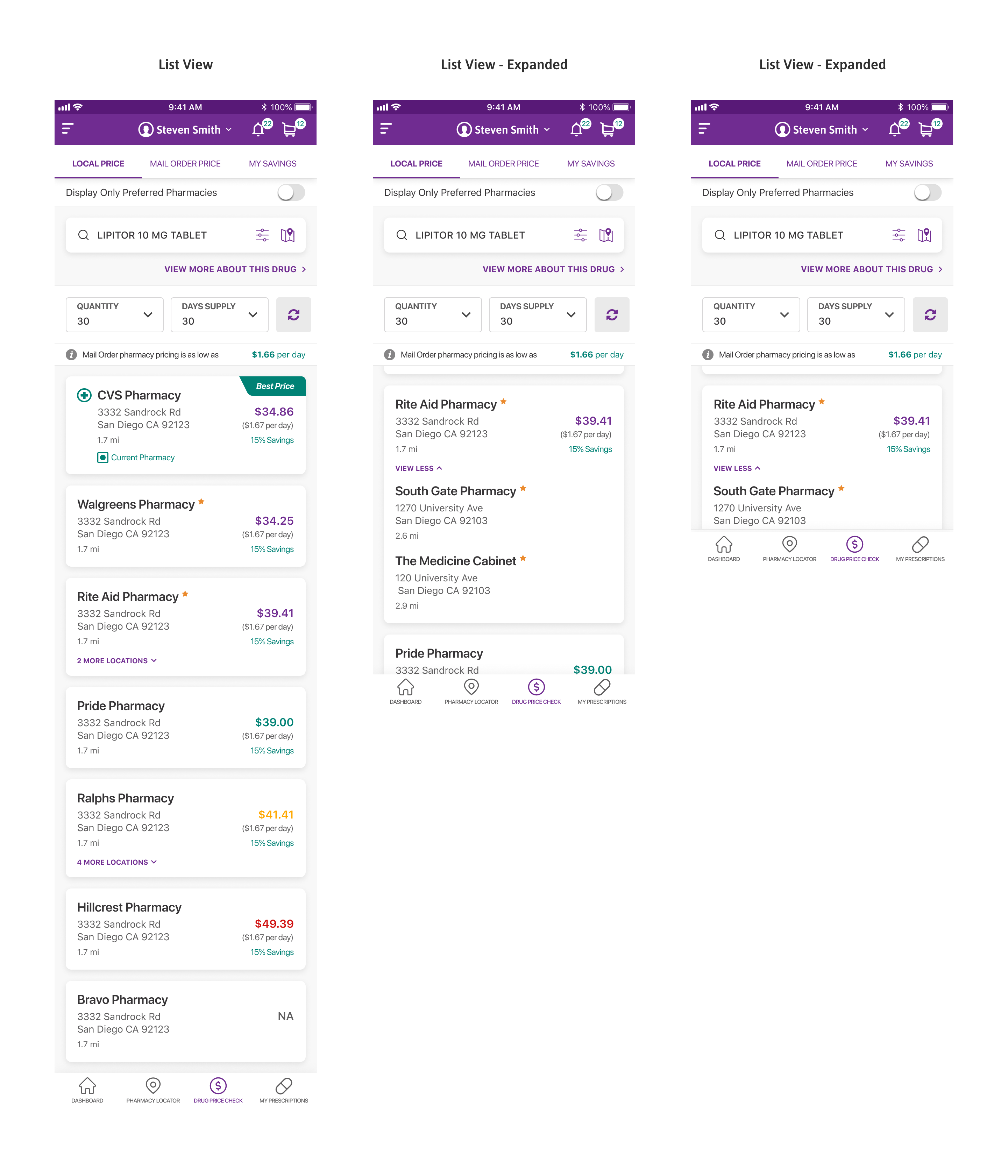
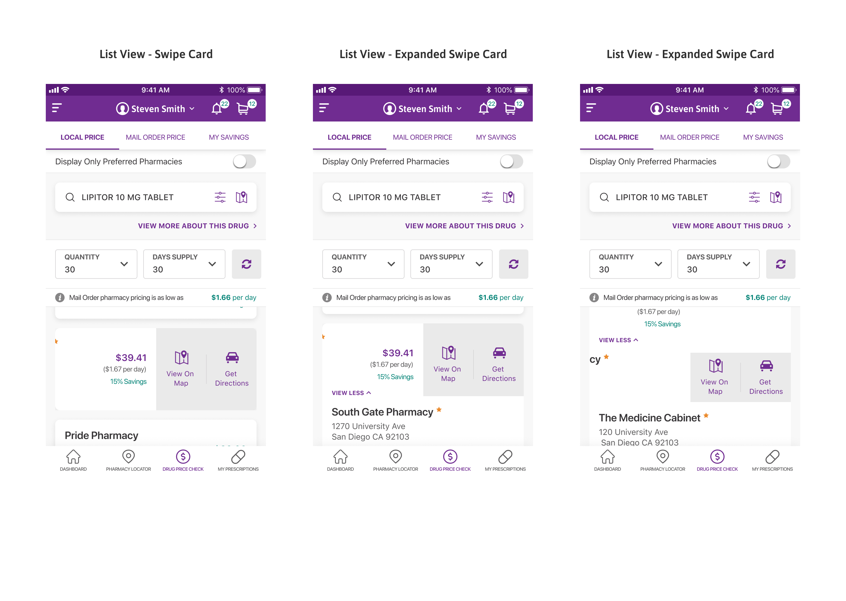
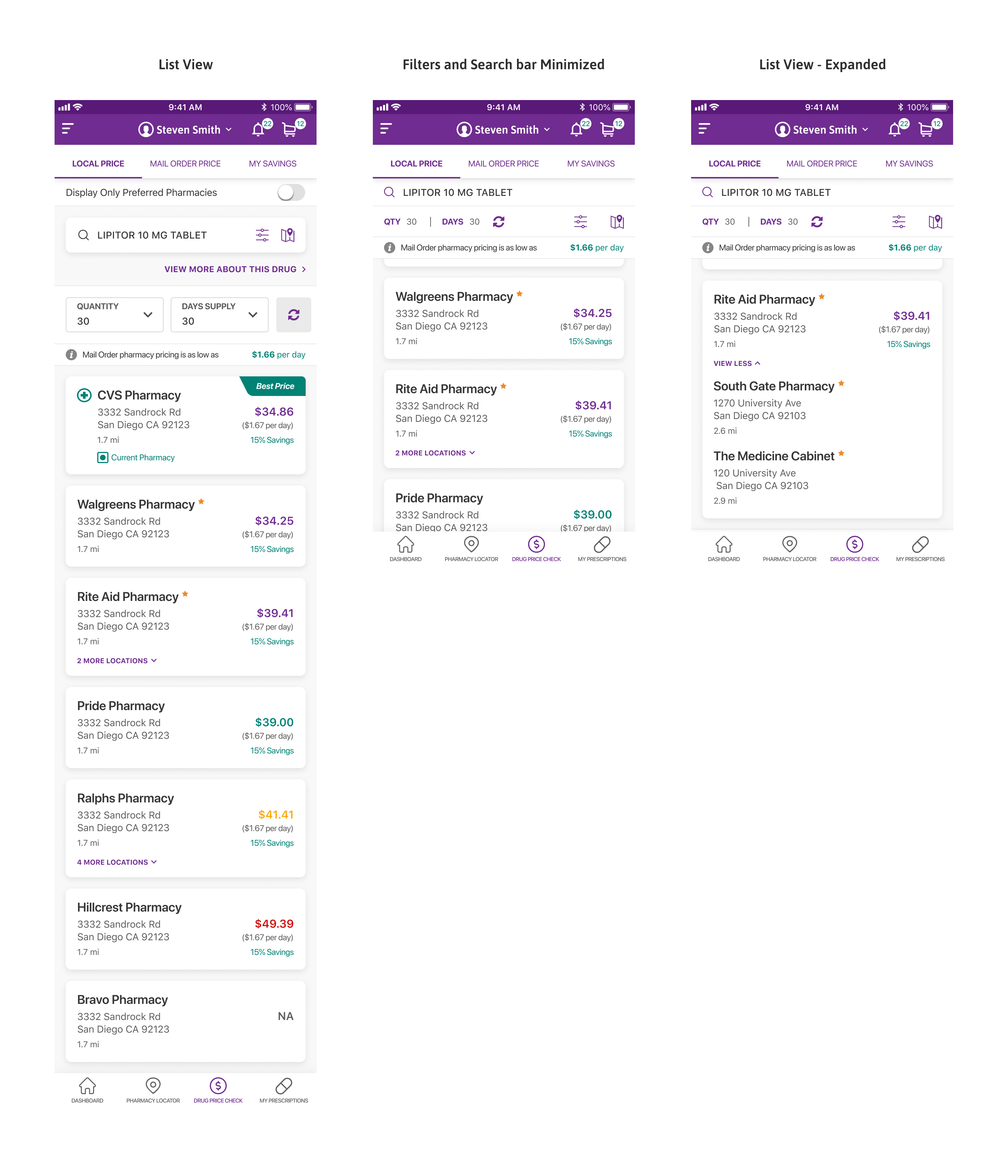
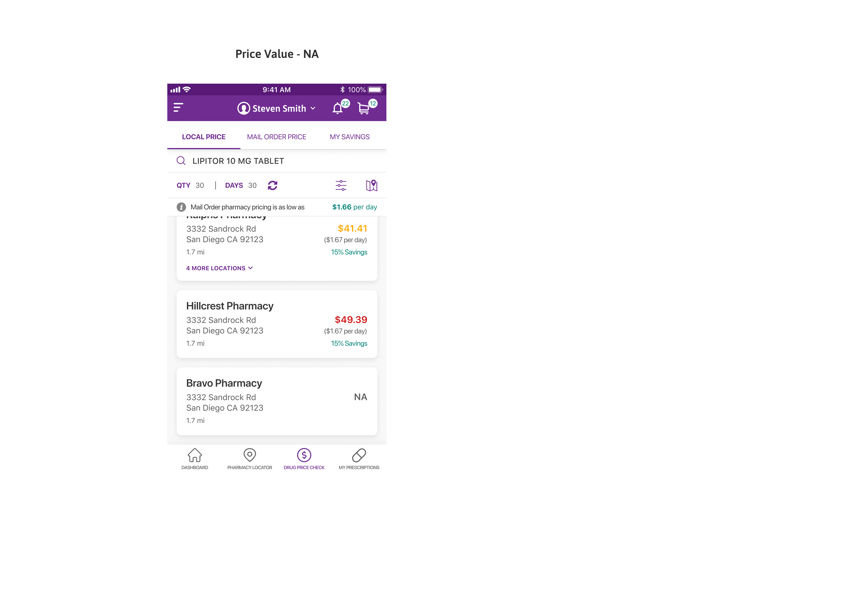
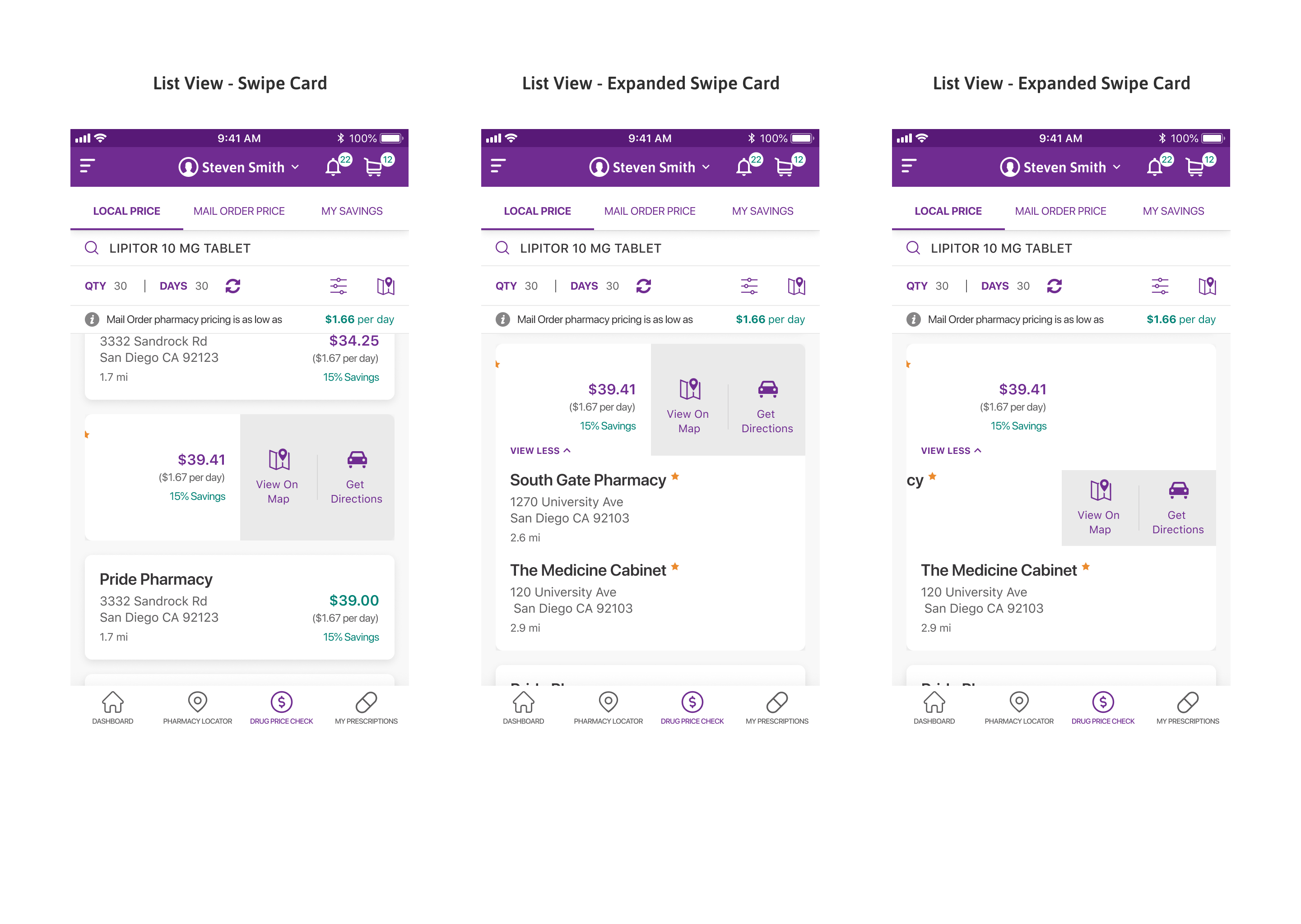
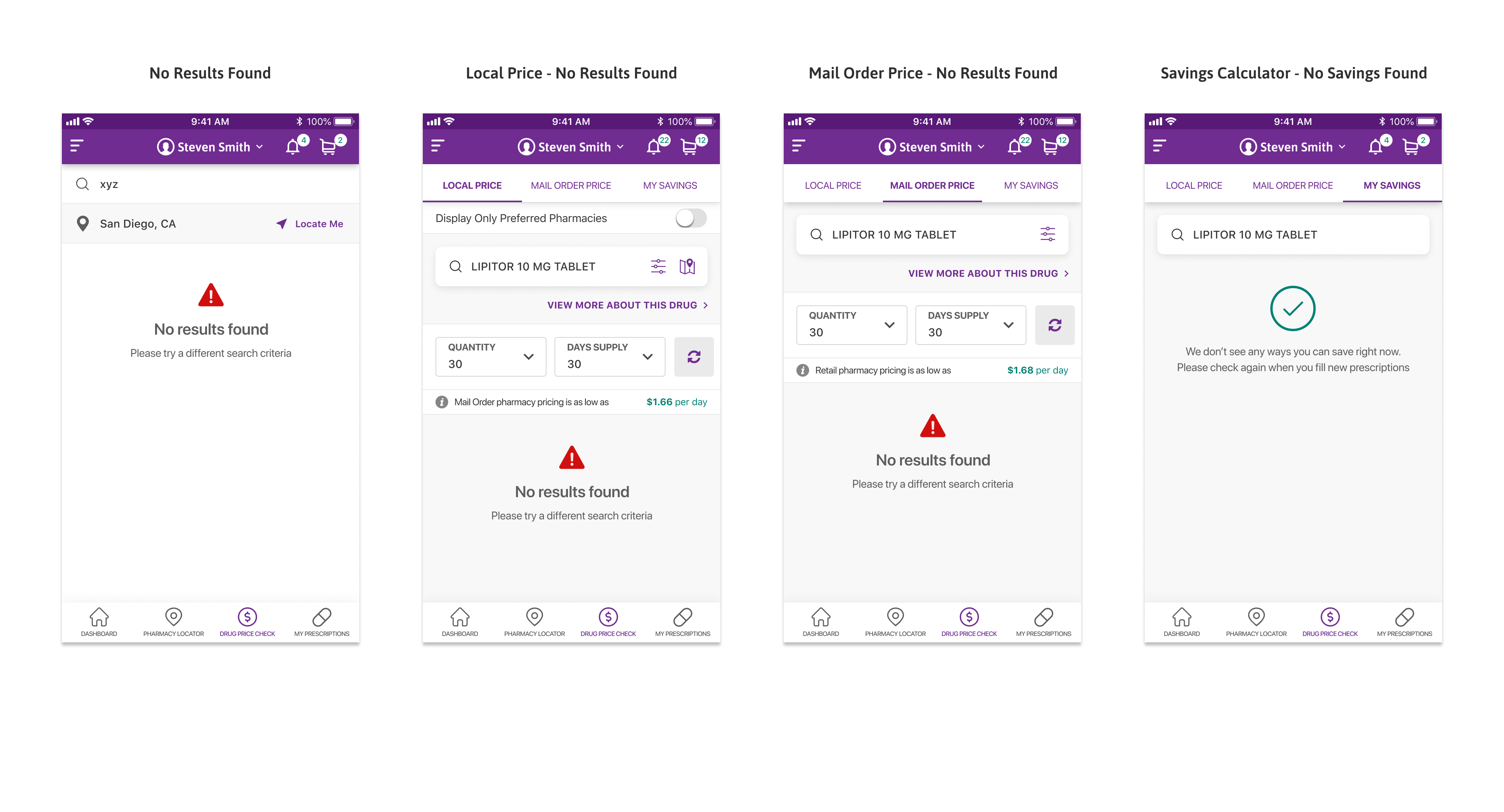
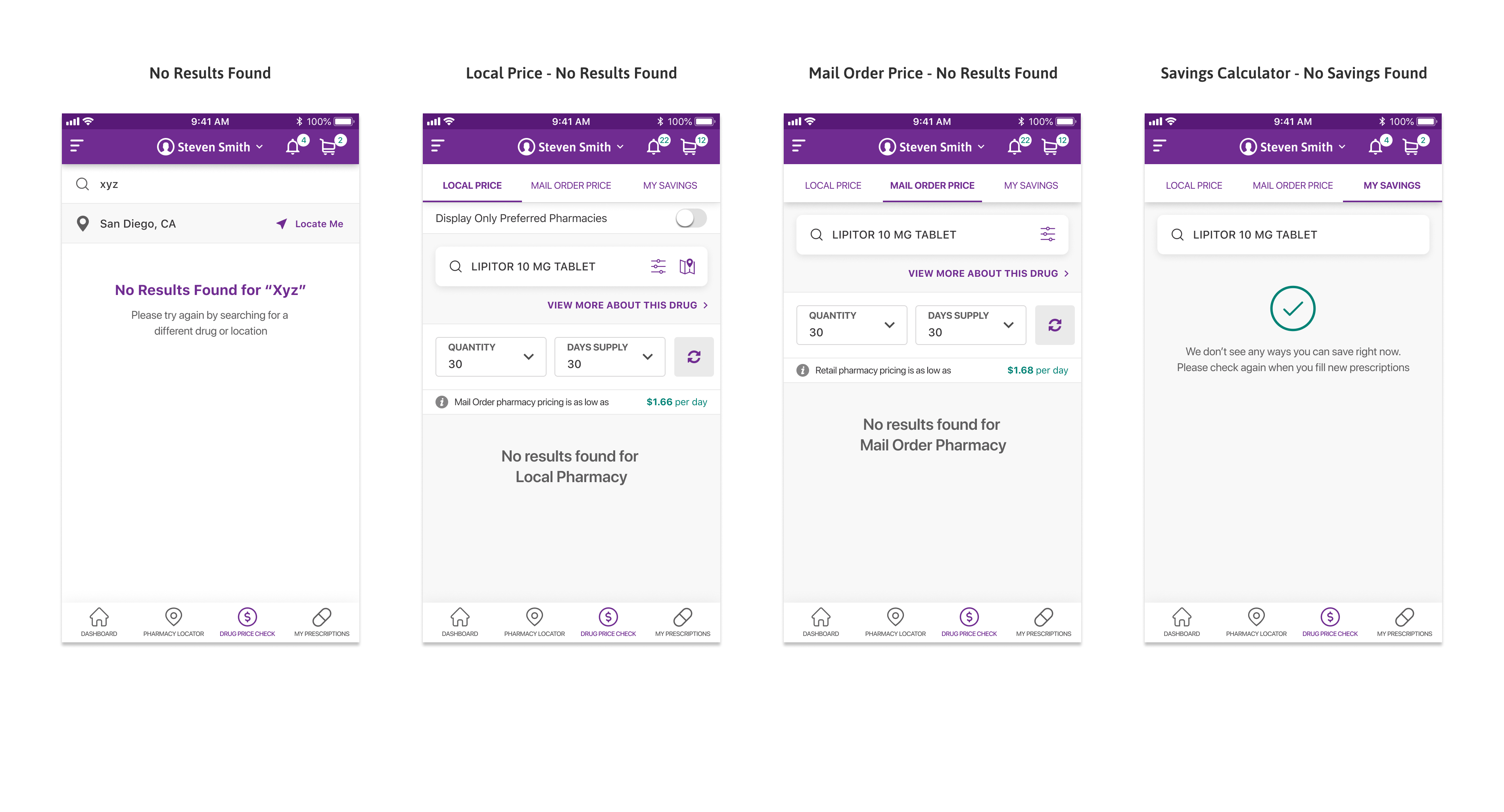
Drug Price Check: Best Local Price

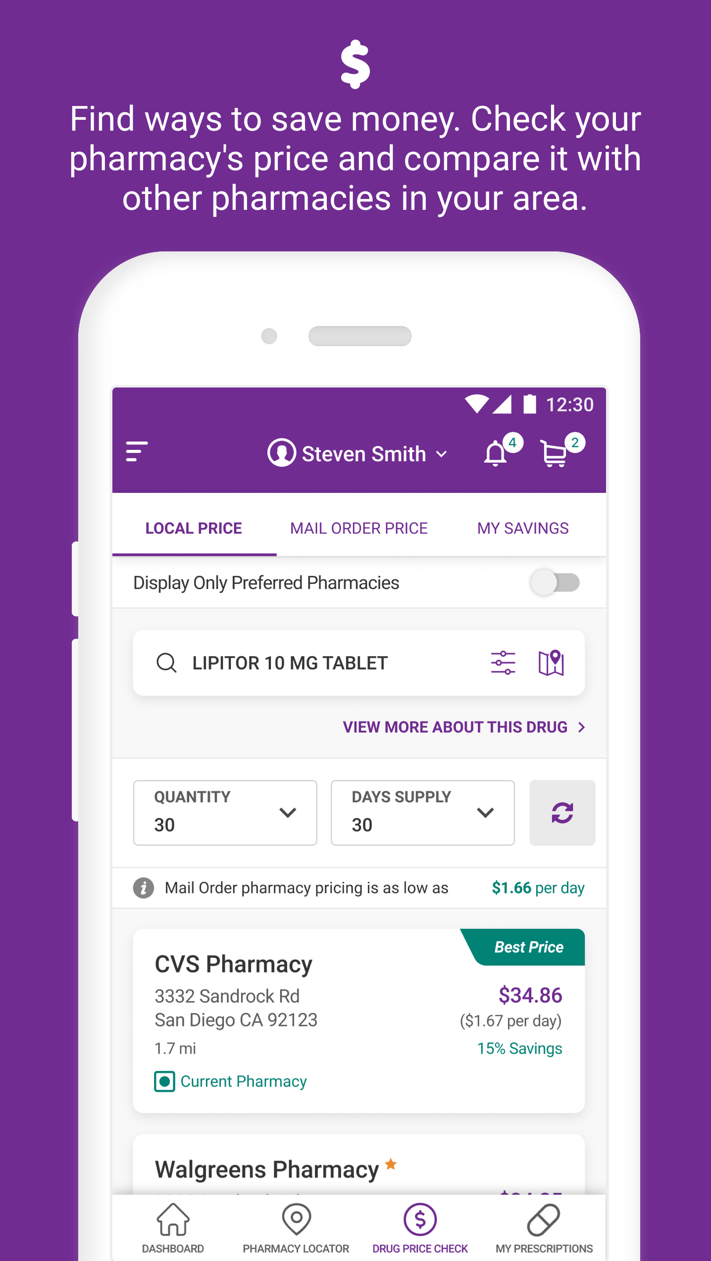
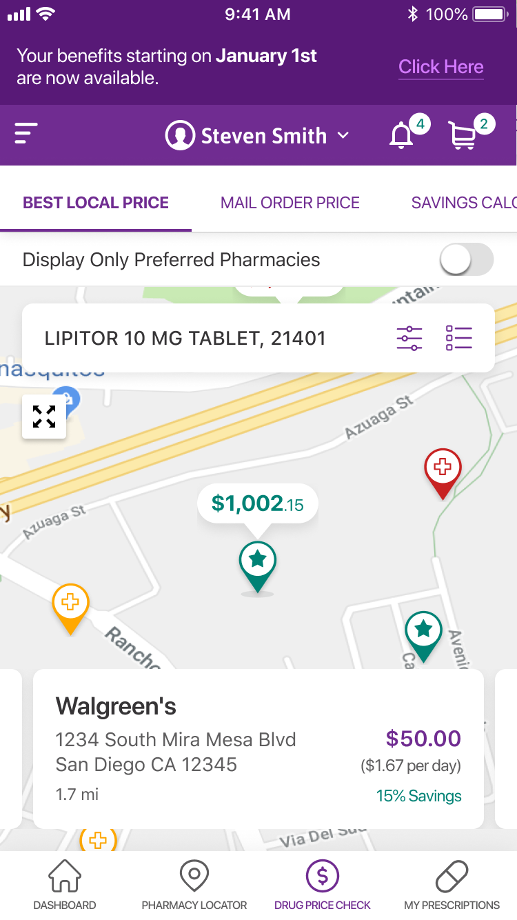
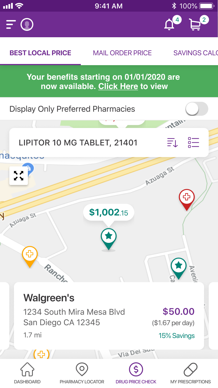
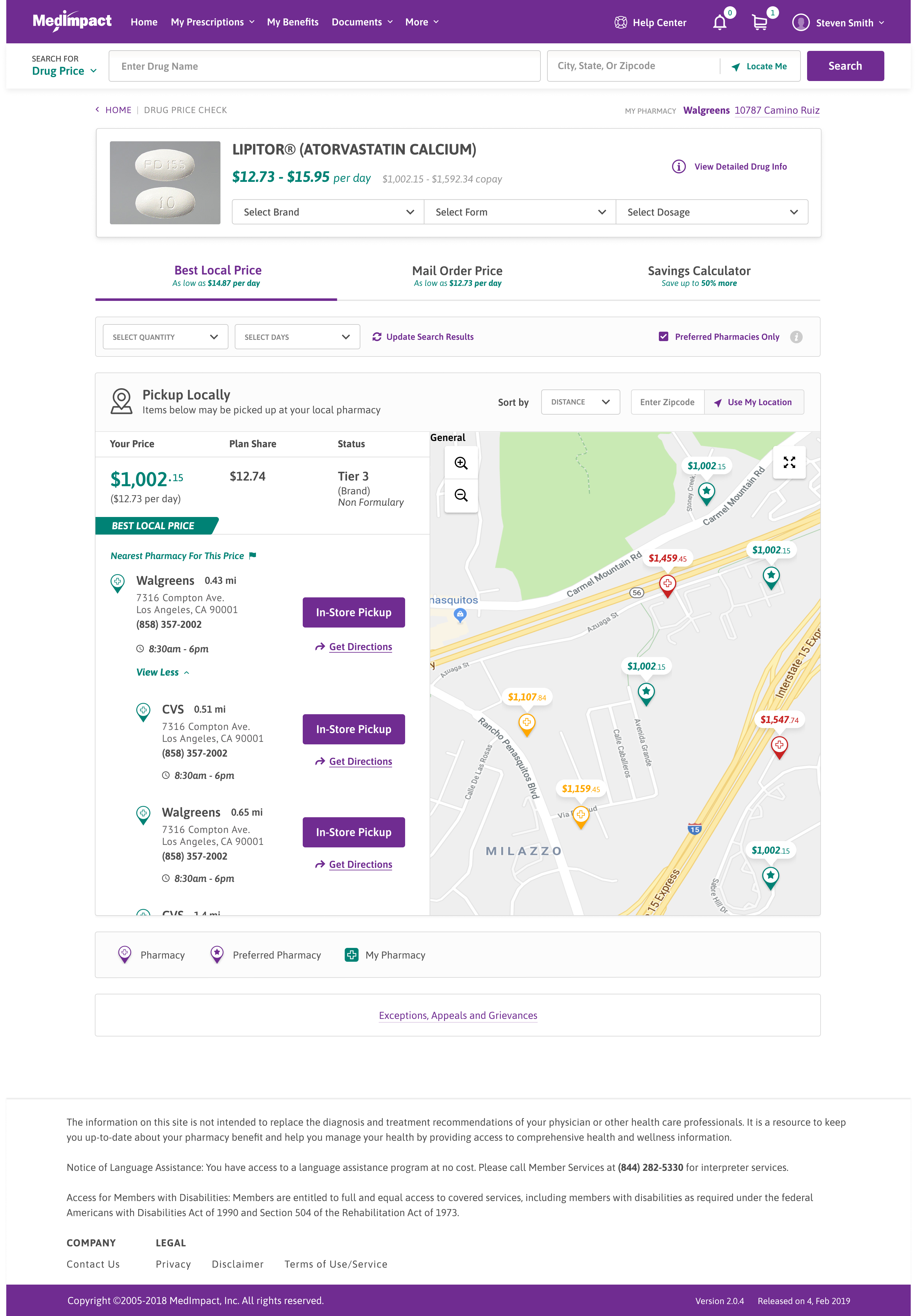
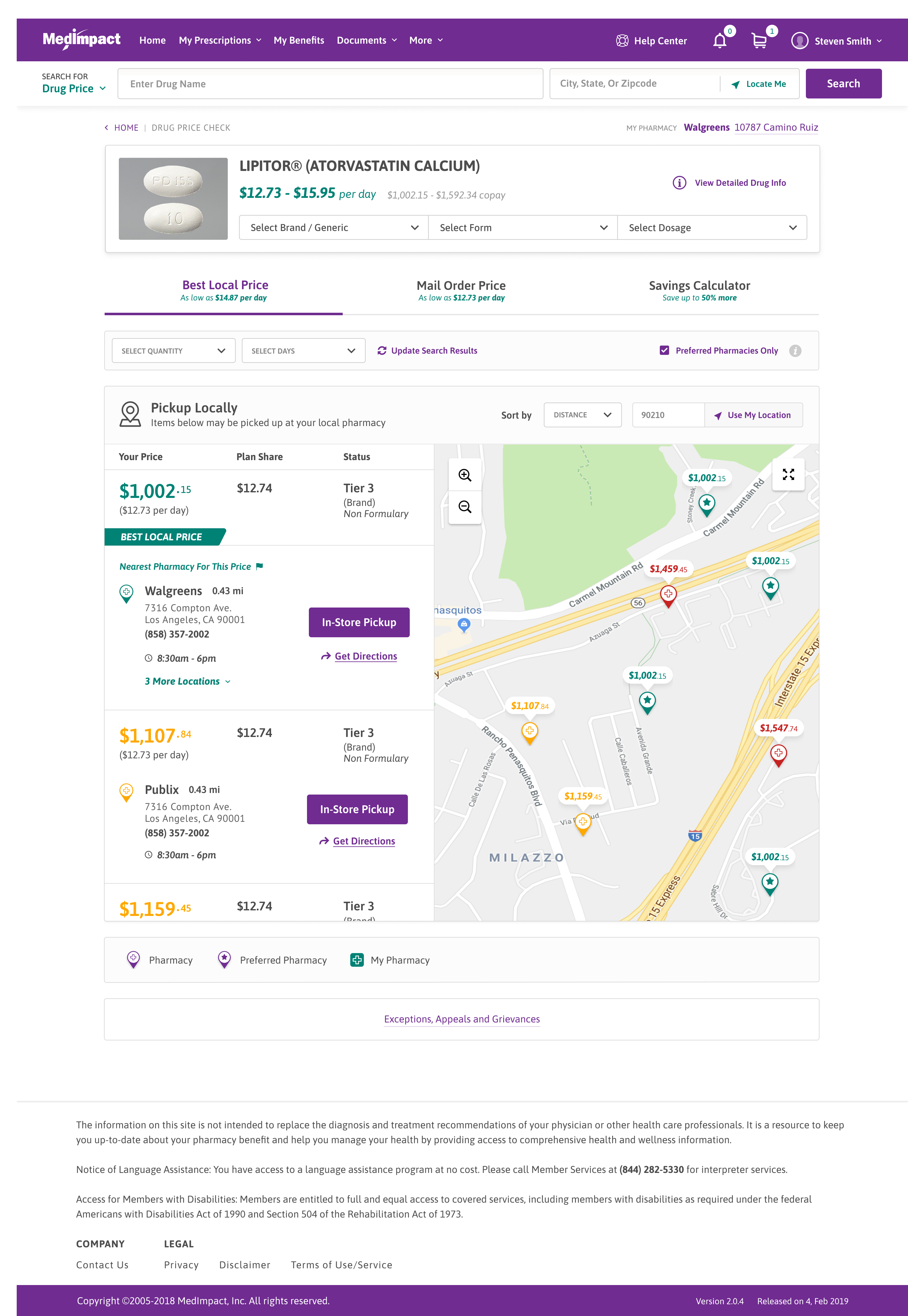
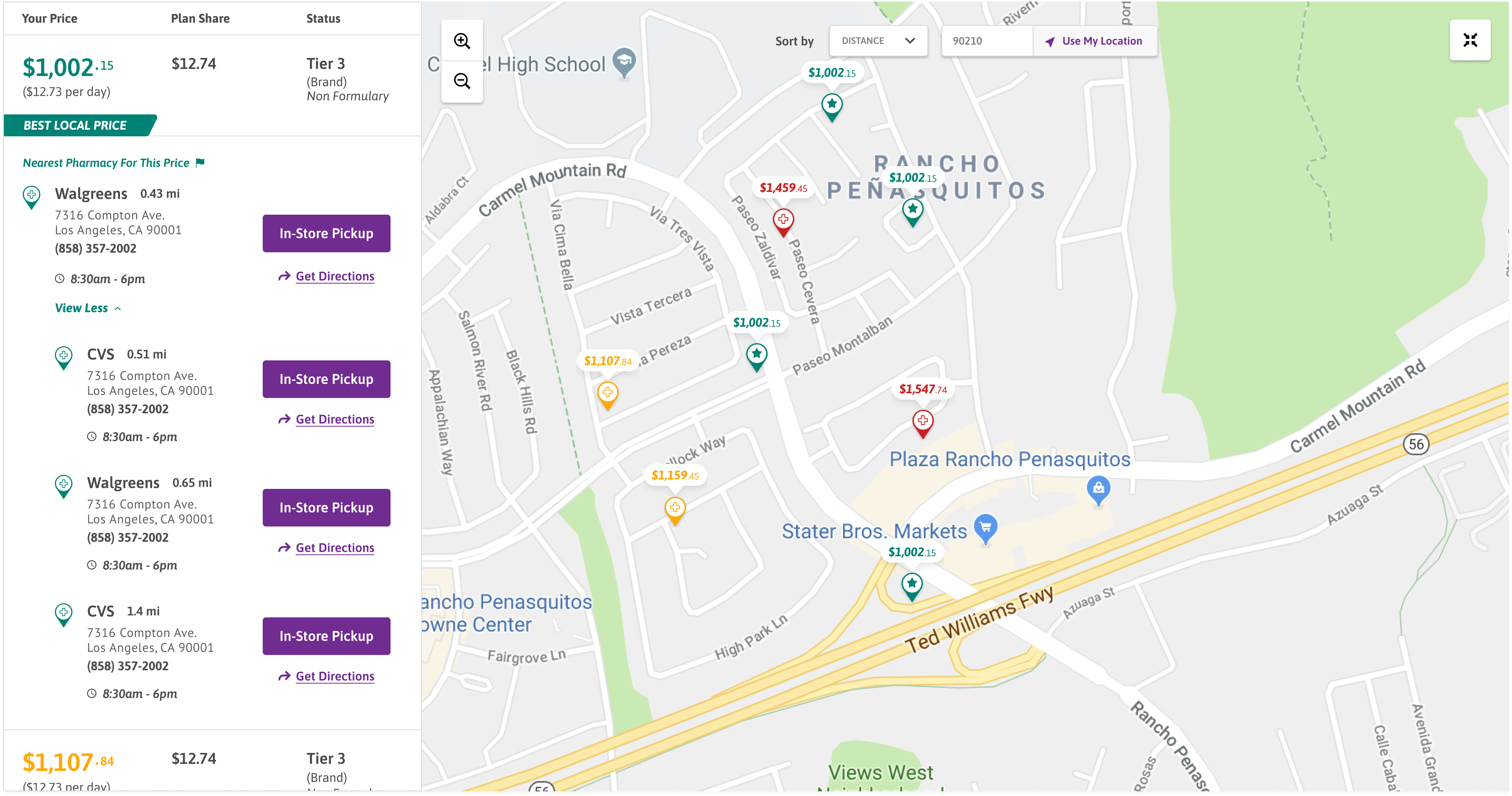
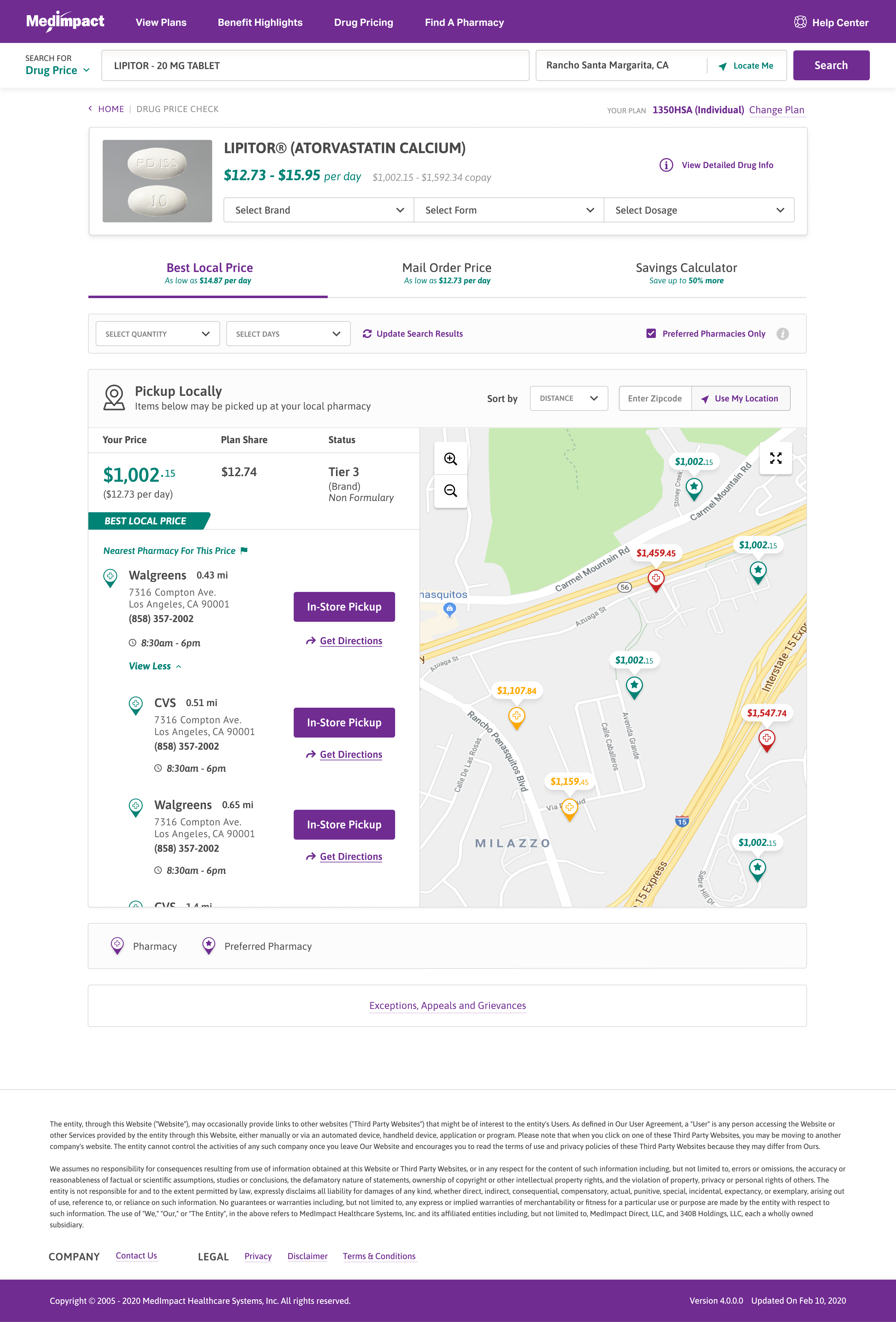
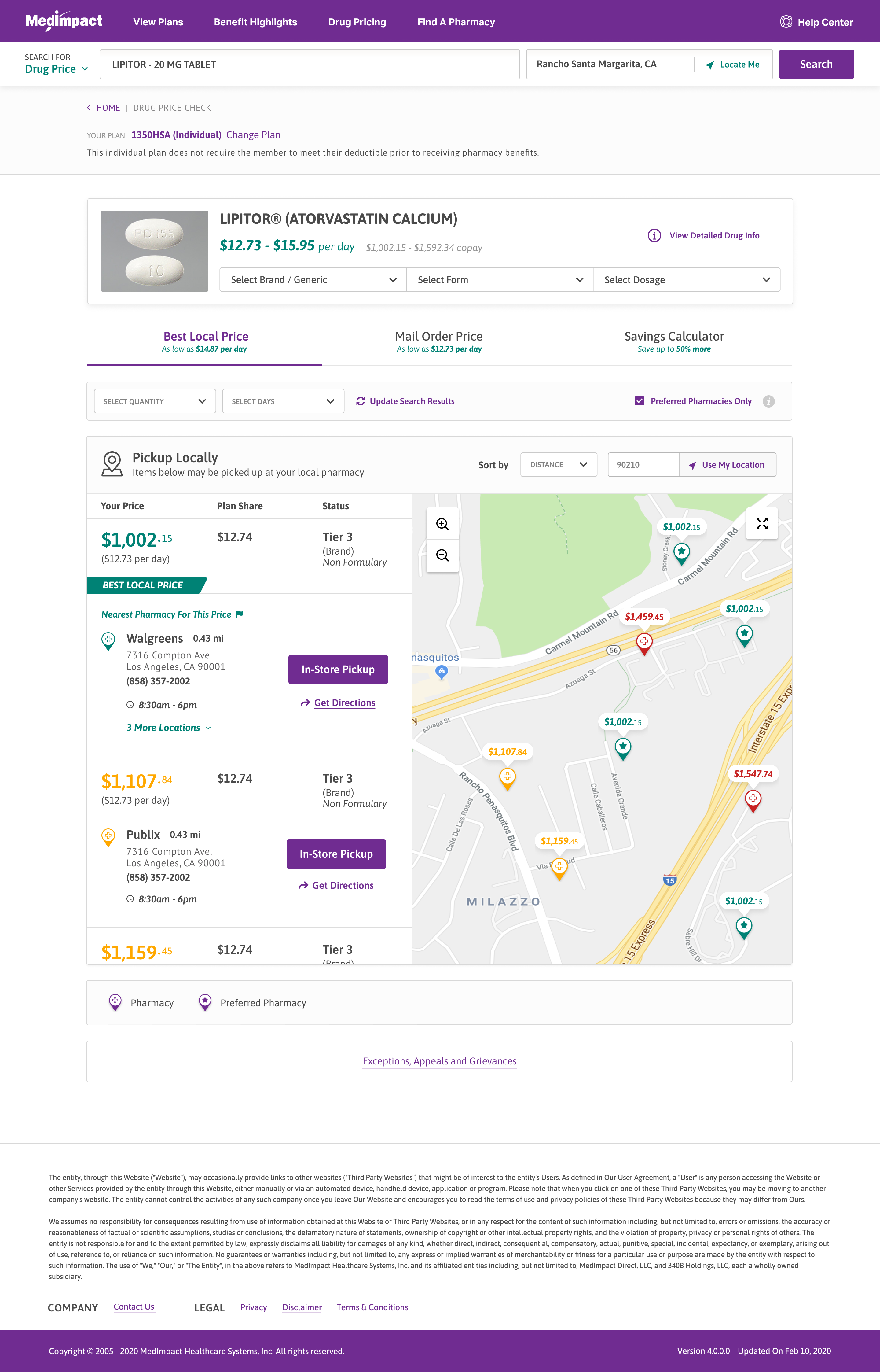
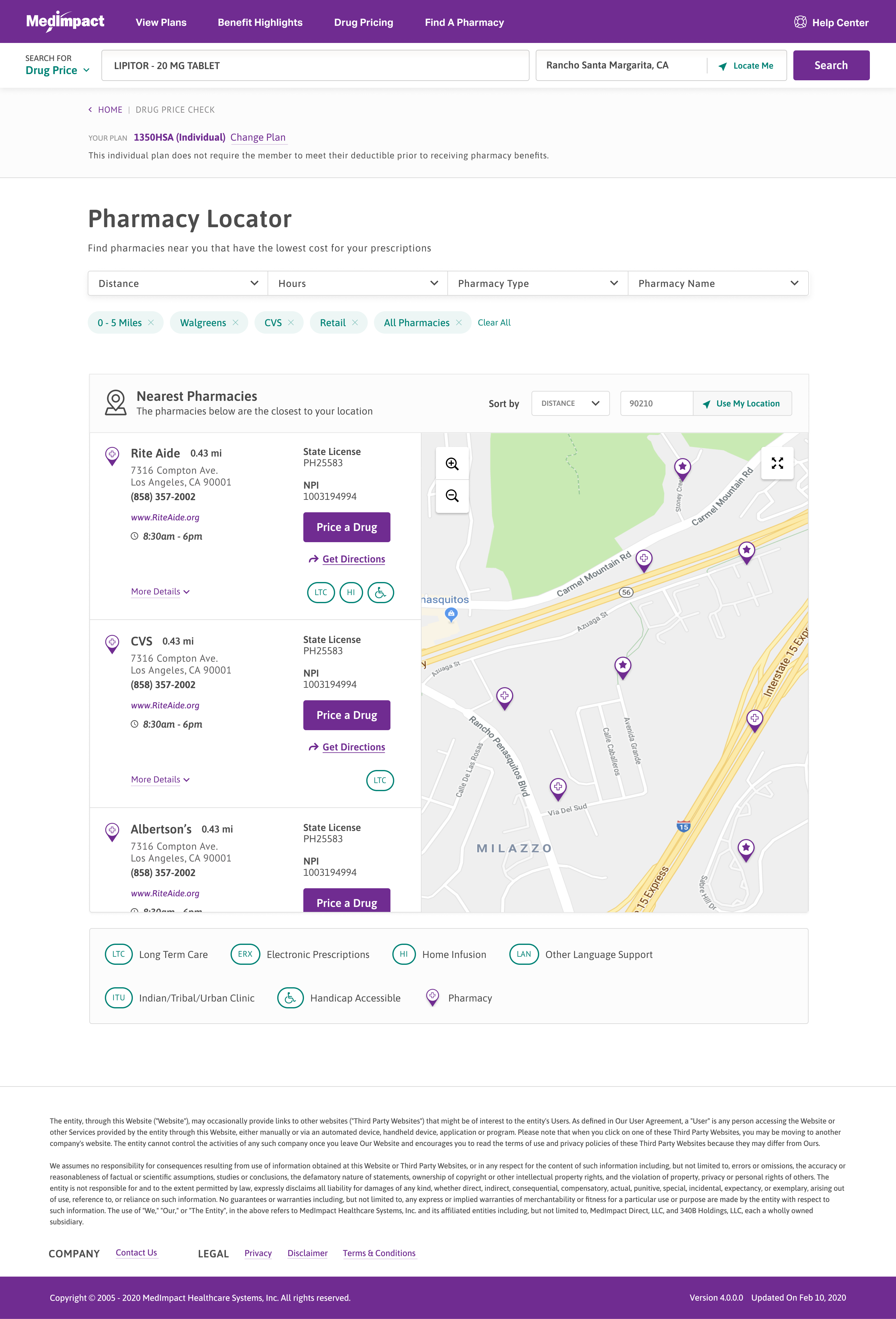
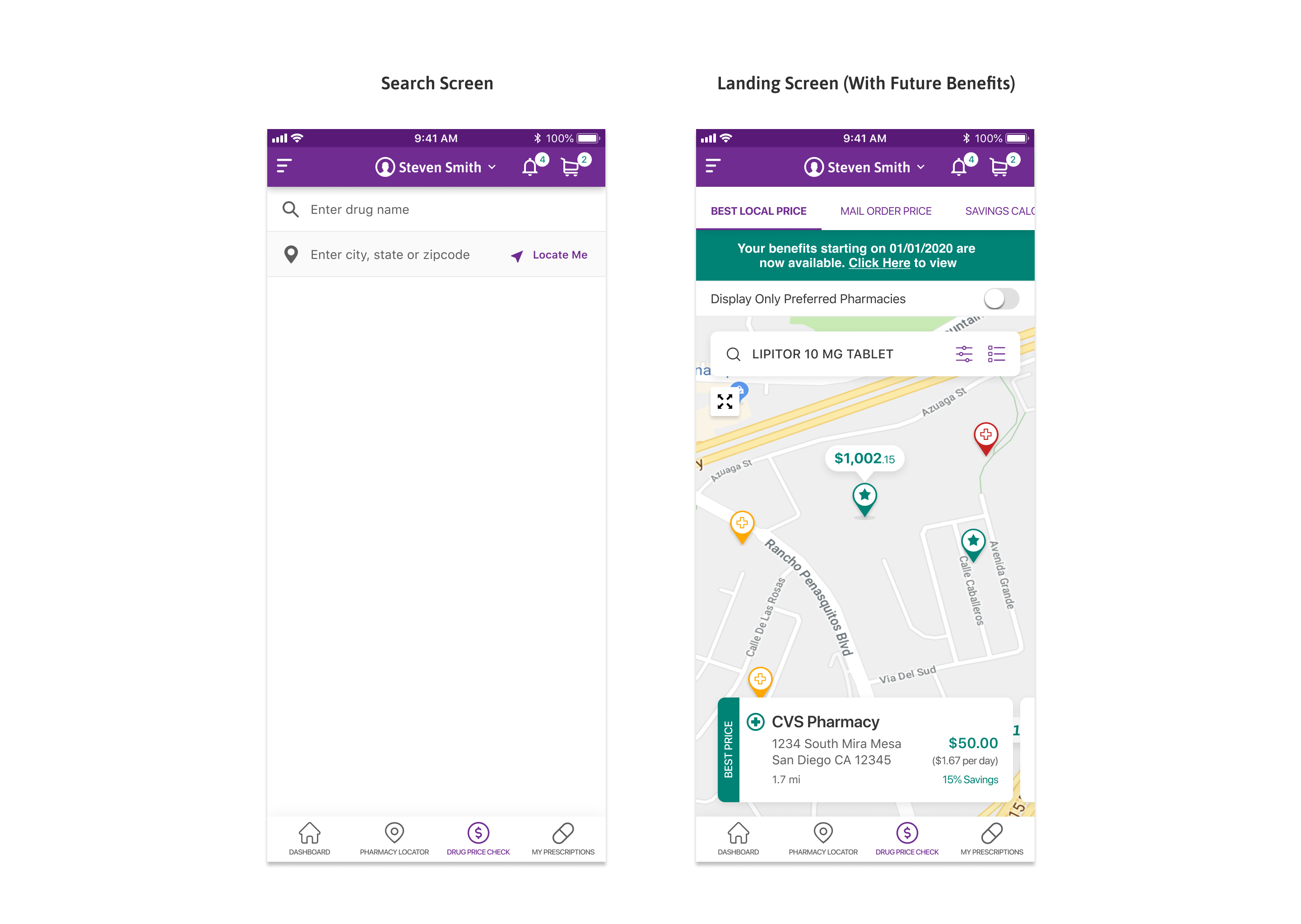
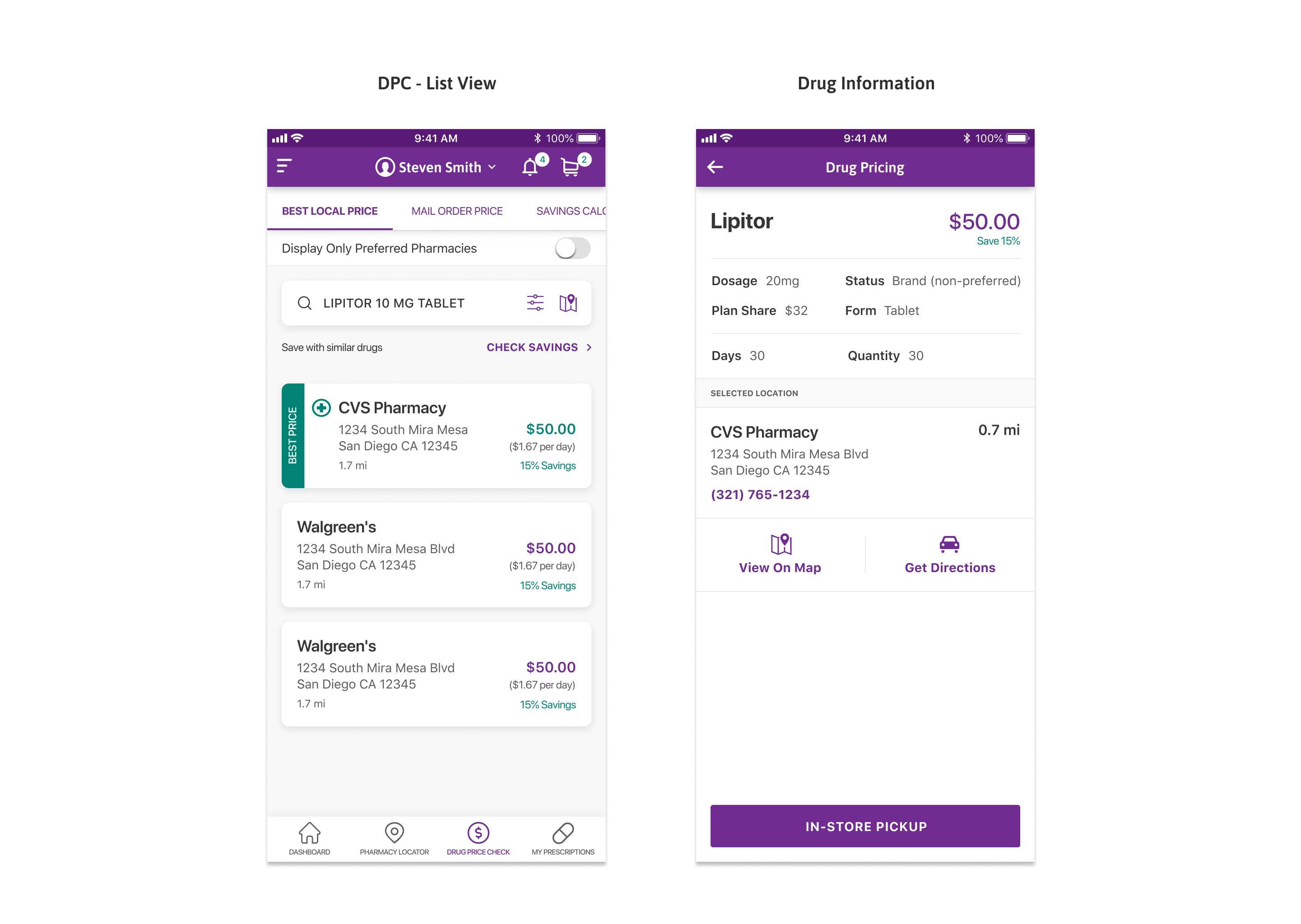
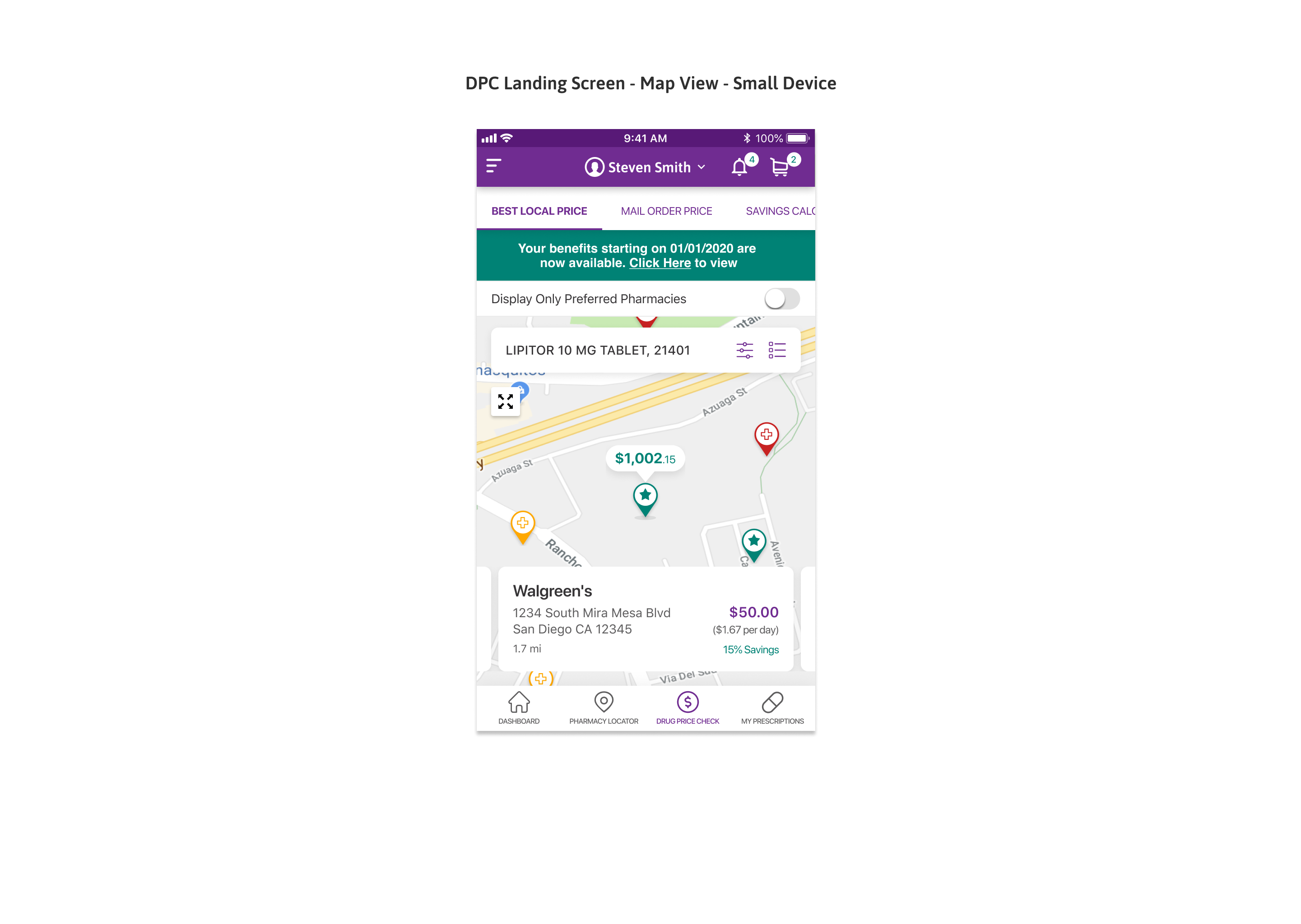
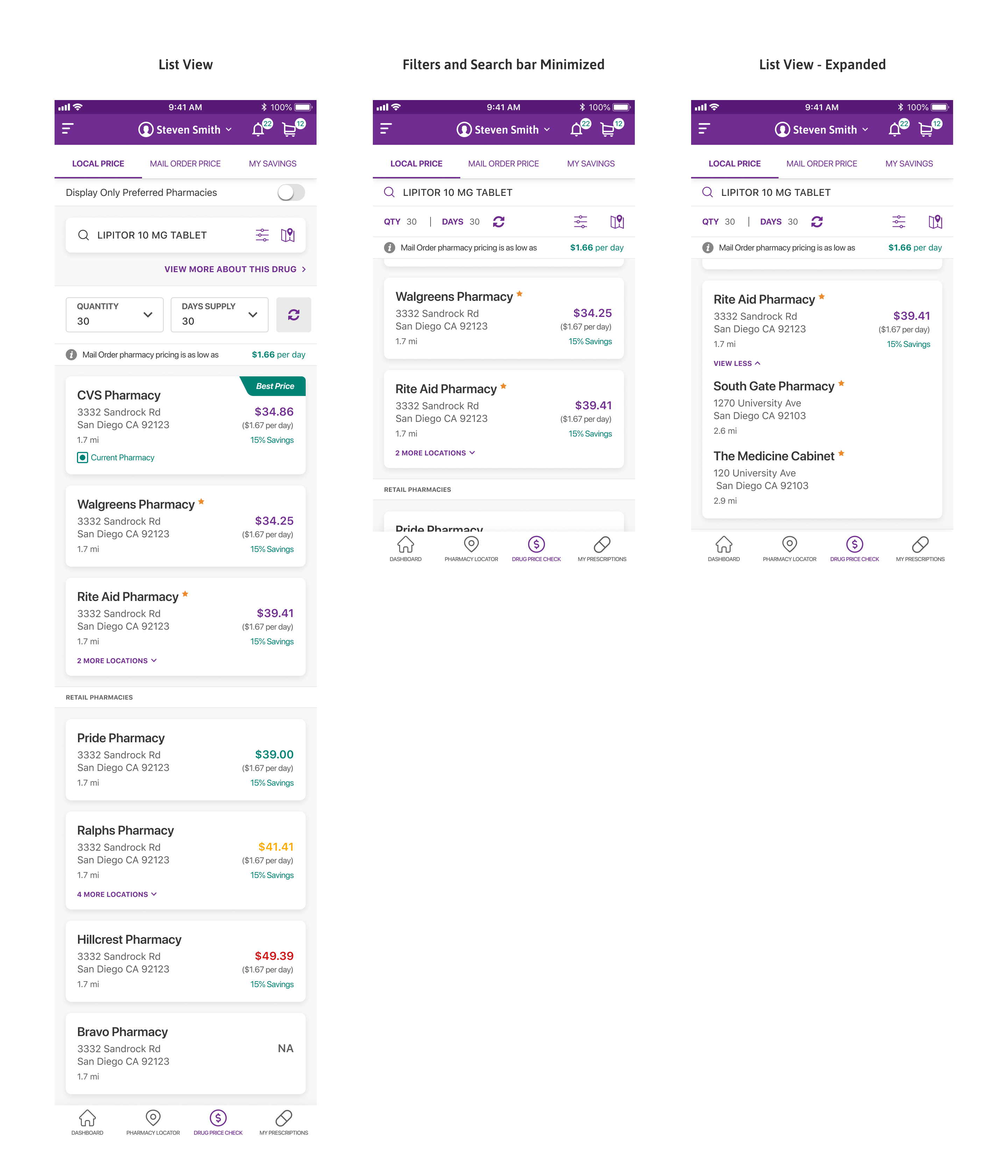
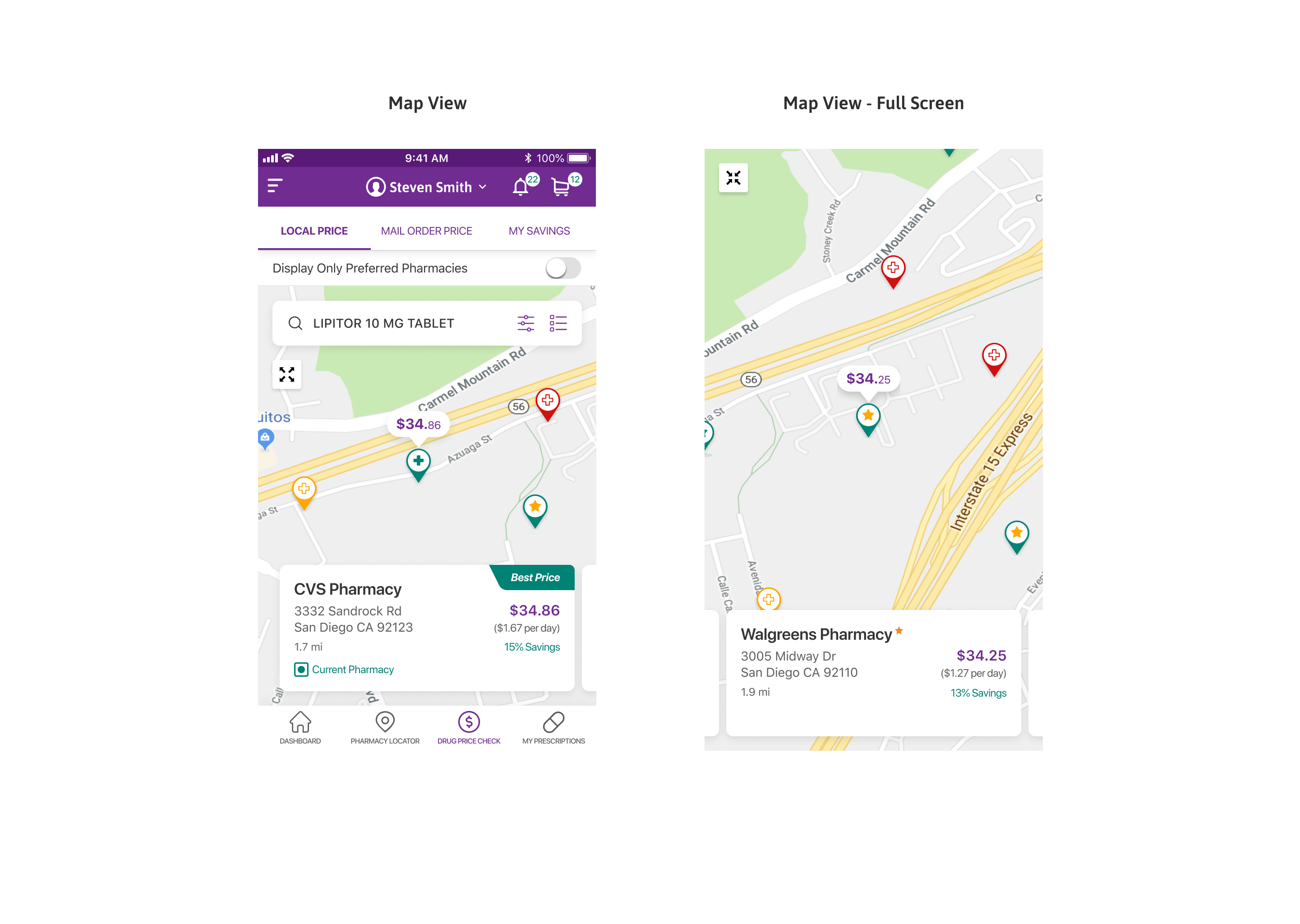
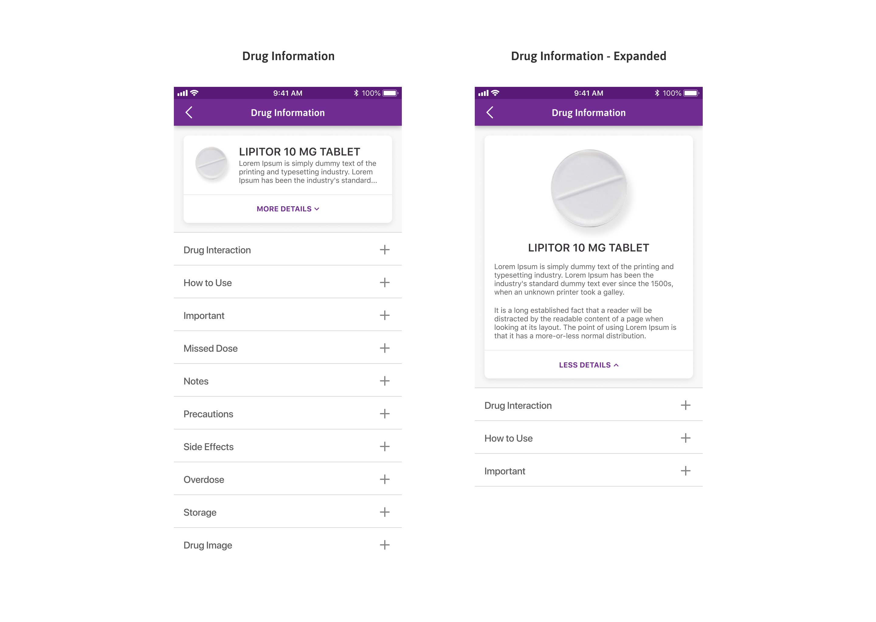
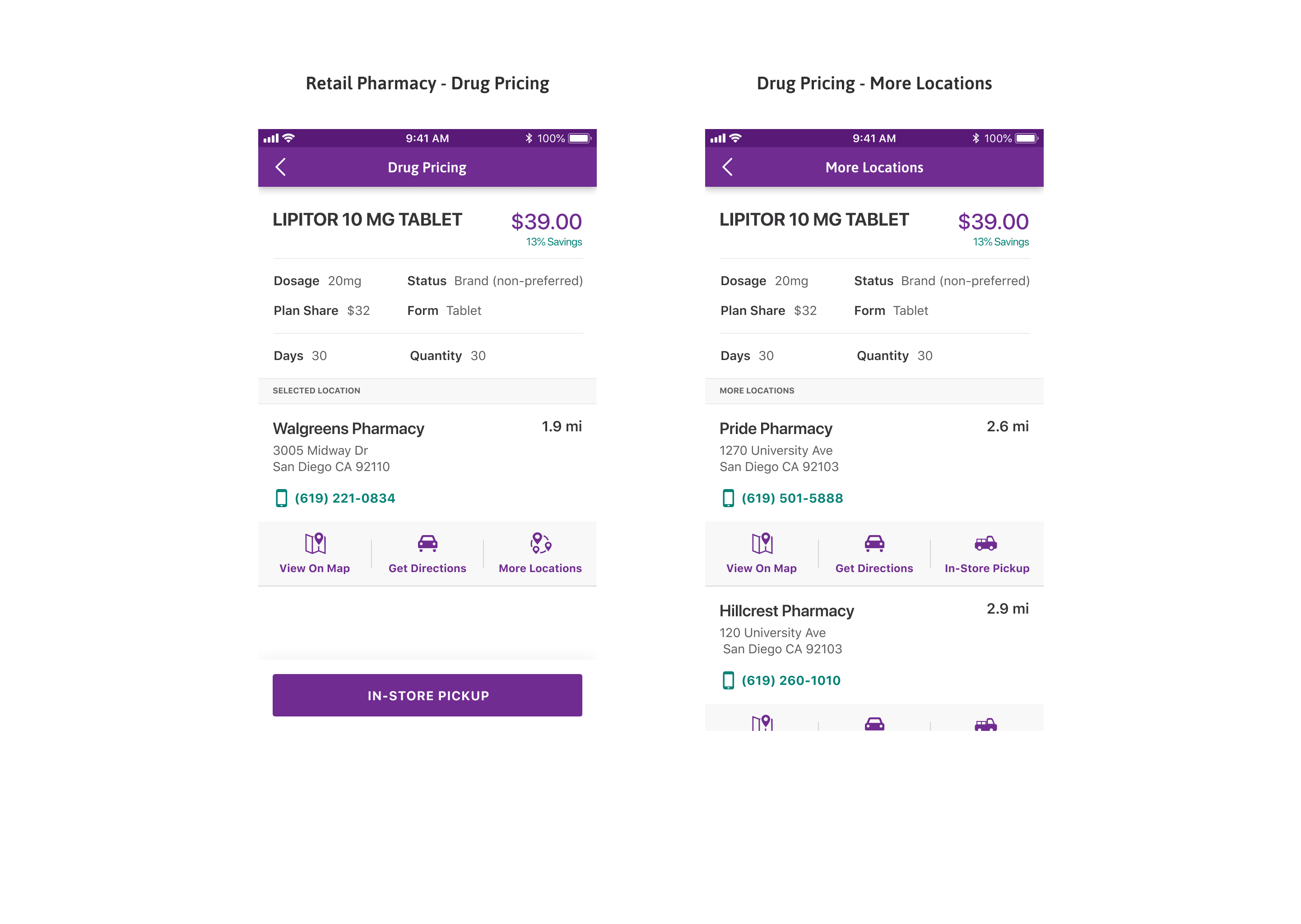
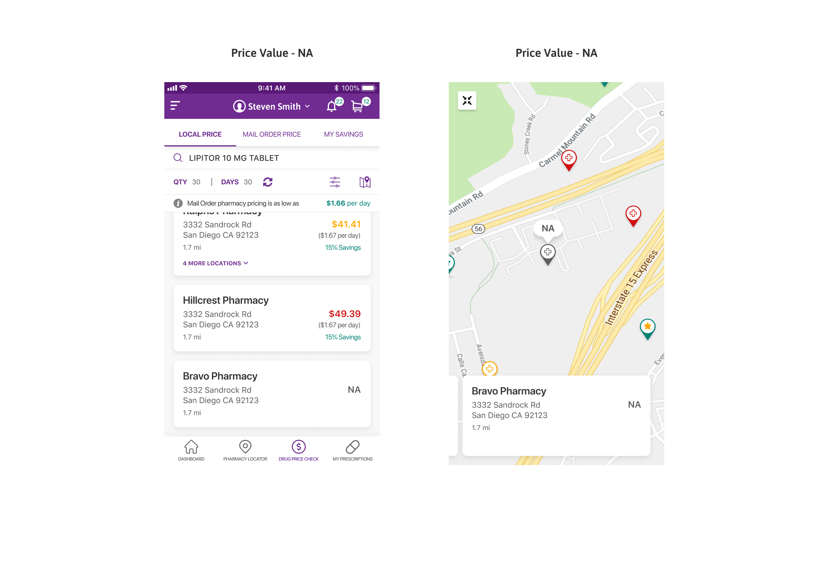
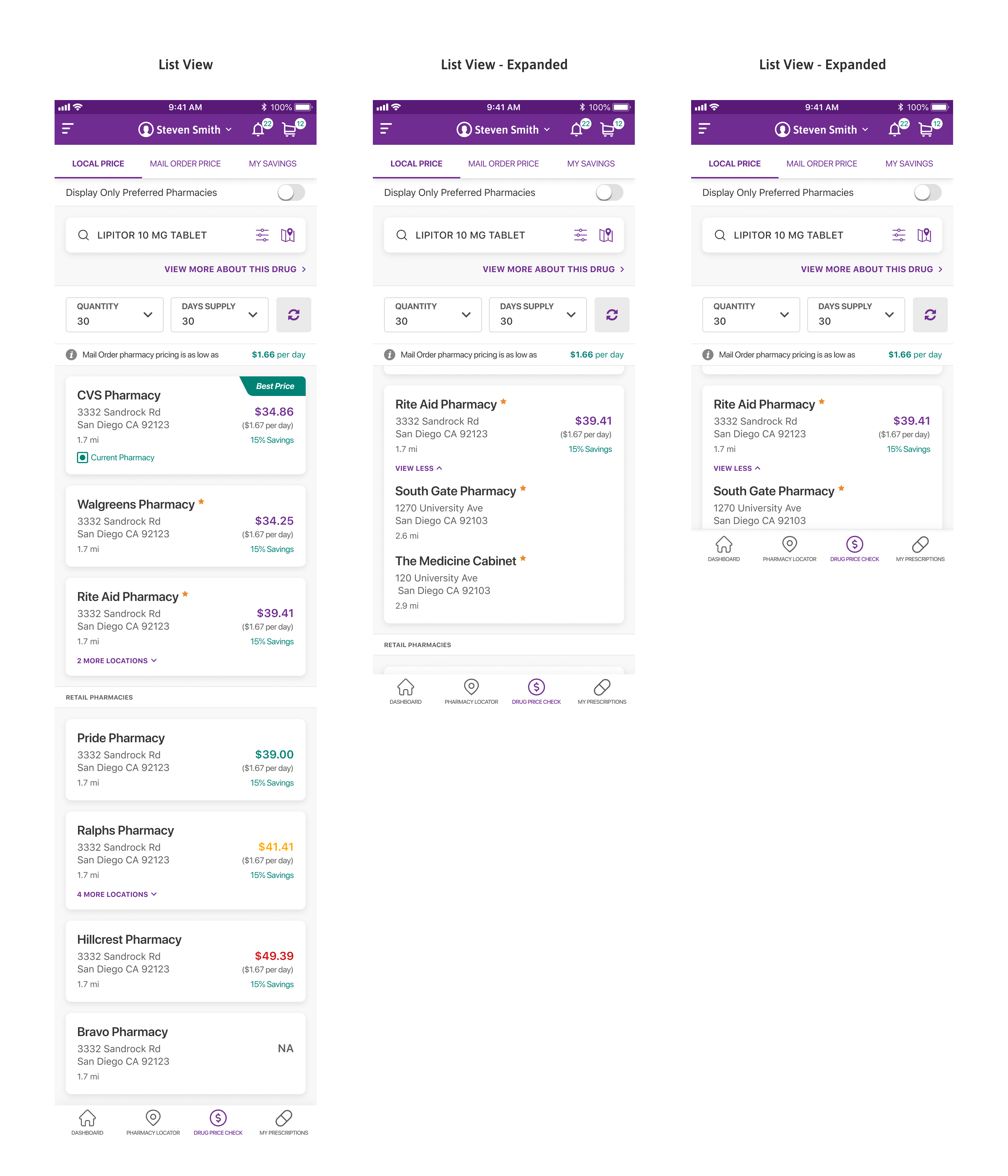
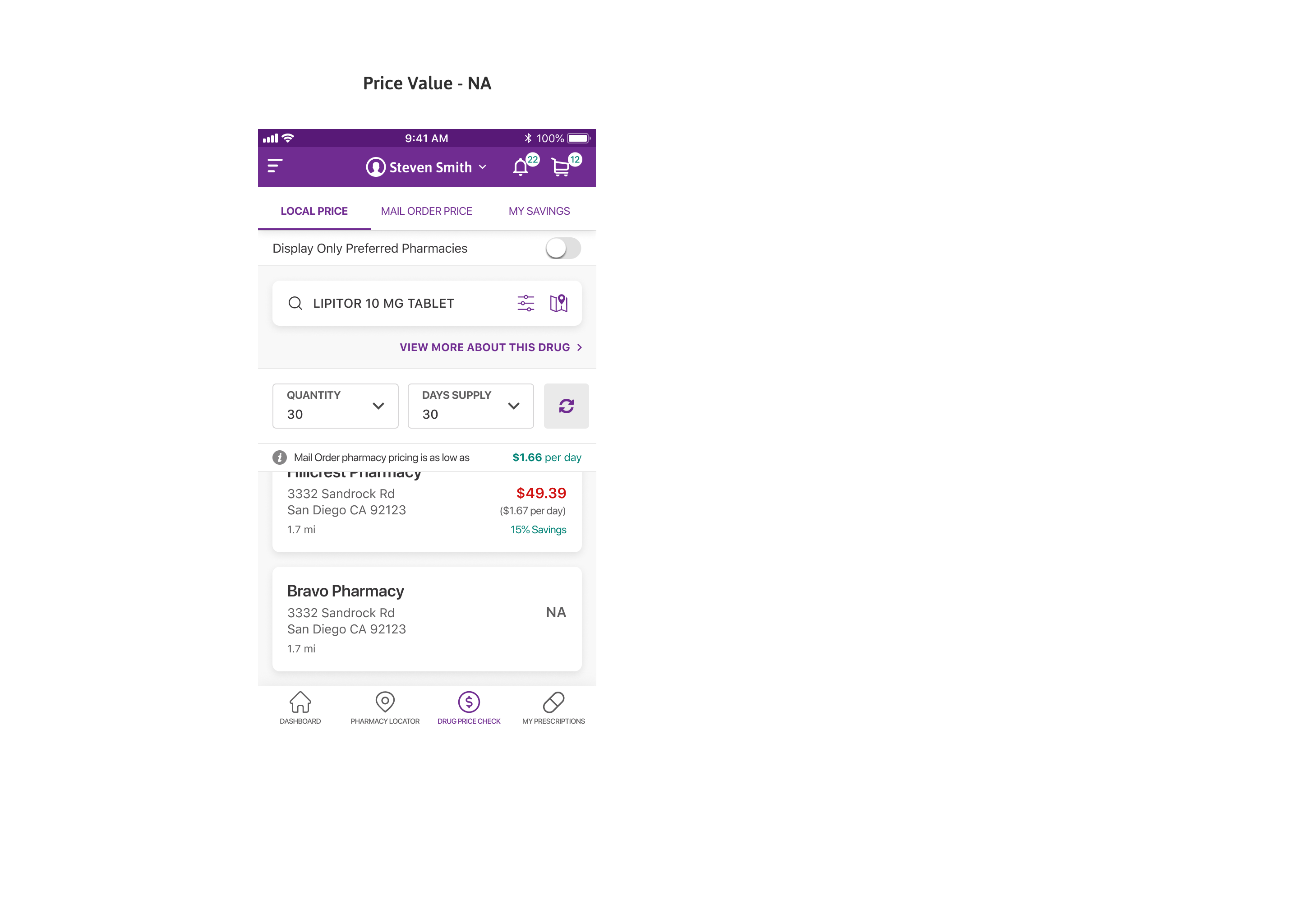
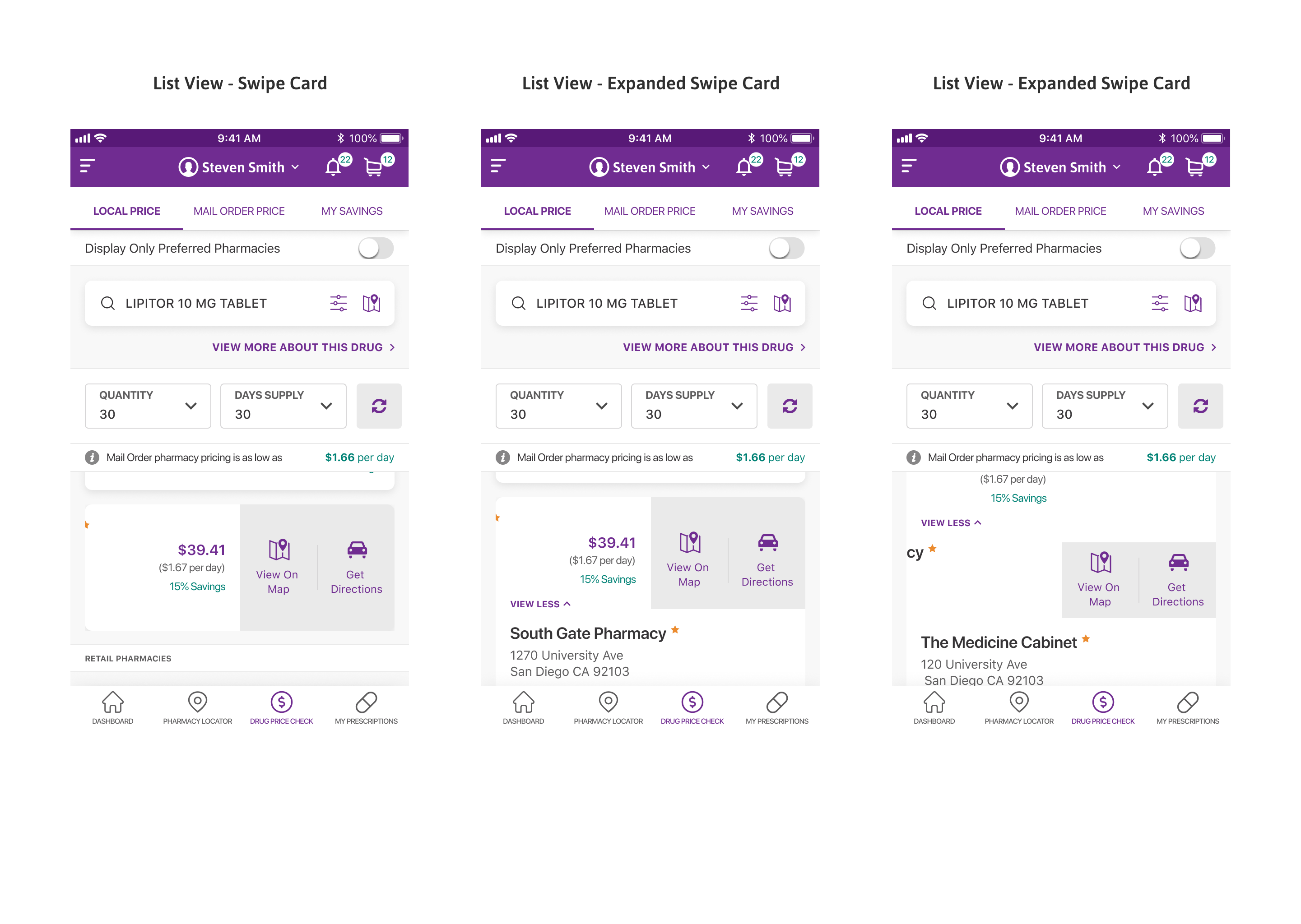
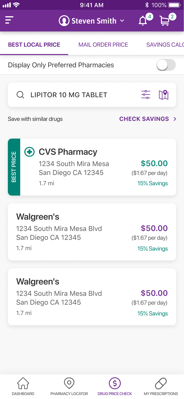
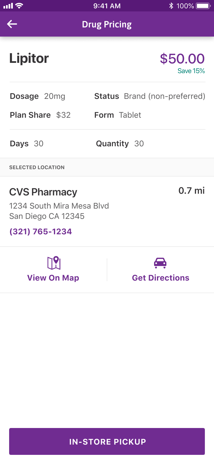
The Best Local Price tab lists nearby pharmacies and their price for the drug, with the lowest local price highlighted and shown on a map.

The three pricing views, Best Local Price, Mail Order Price, and Savings Calculator, sit under one set of tabs.

Three pricing tabs

Best Local Price, Mail Order Price, and Savings Calculator sit under one set of tabs.

Lowest local price

Nearby pharmacies are listed with their price, the best local price flagged.

Drug Price Check: Best Local Price

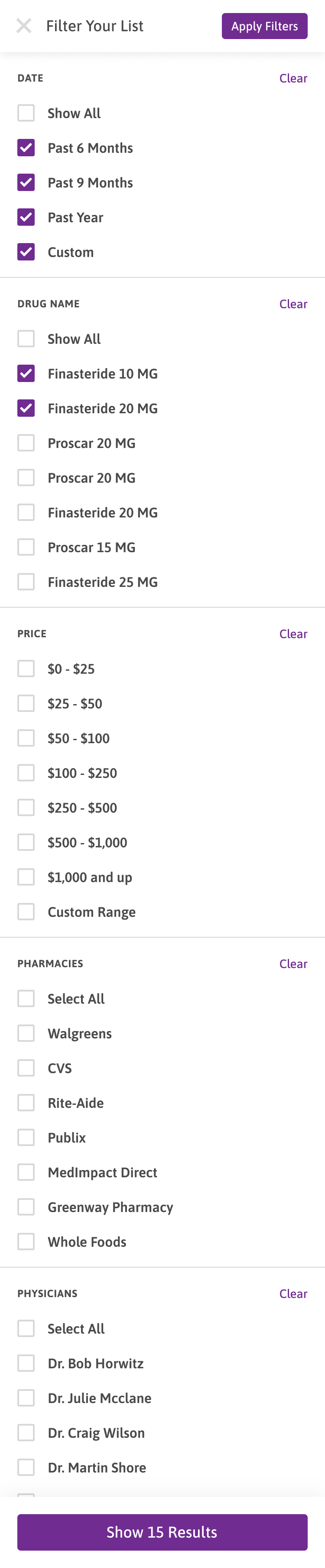
Filter the results

Sort by distance and limit to preferred pharmacies only.

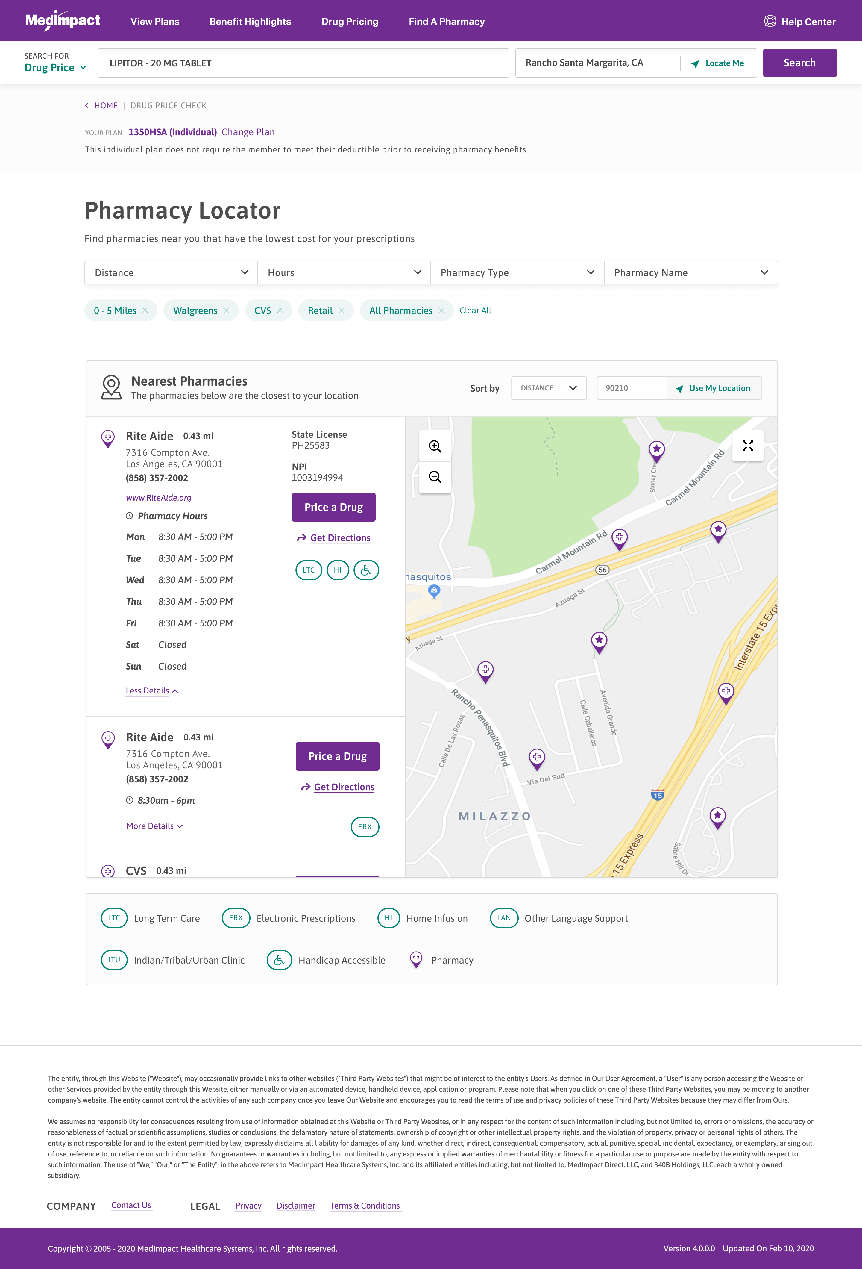
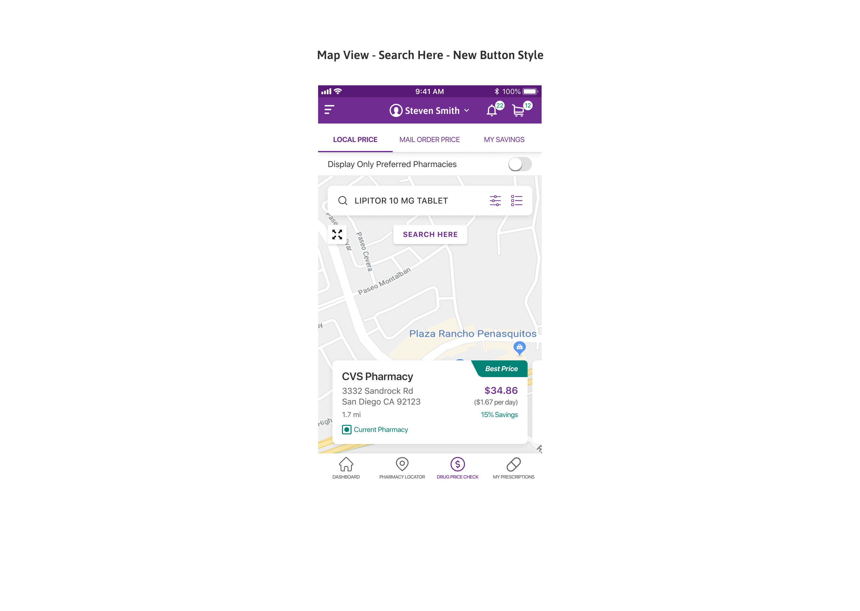
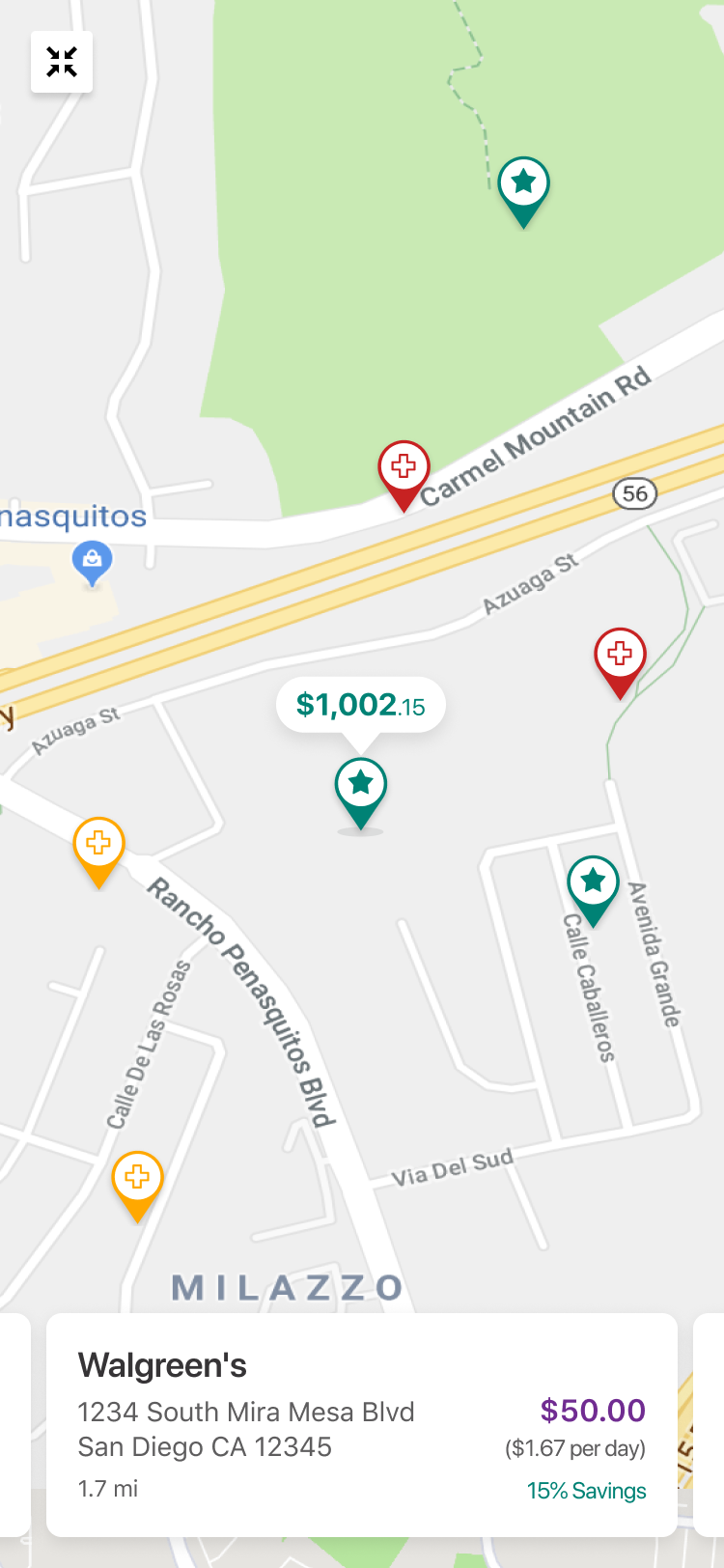
Prices on the map

The same pharmacies and prices are pinned on a map beside the list.

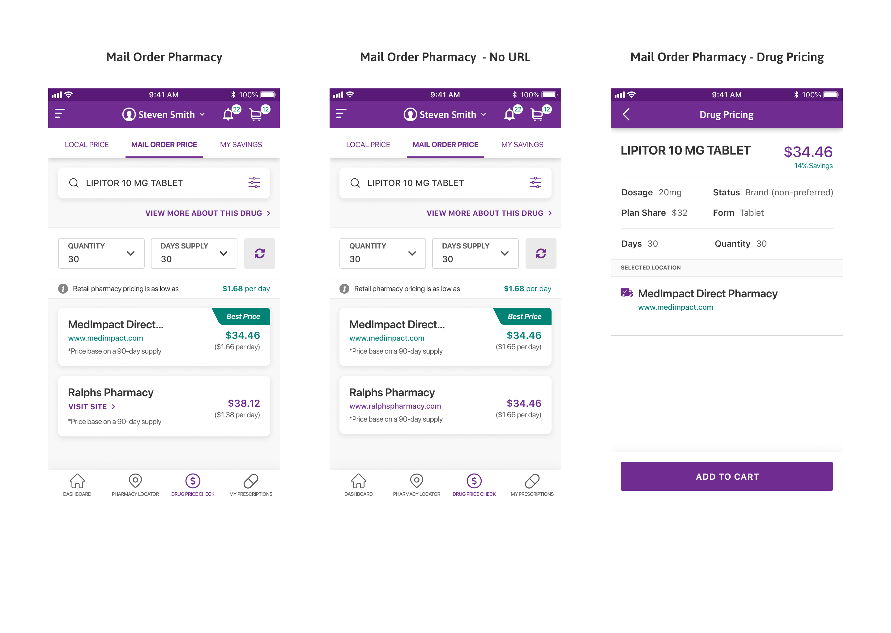
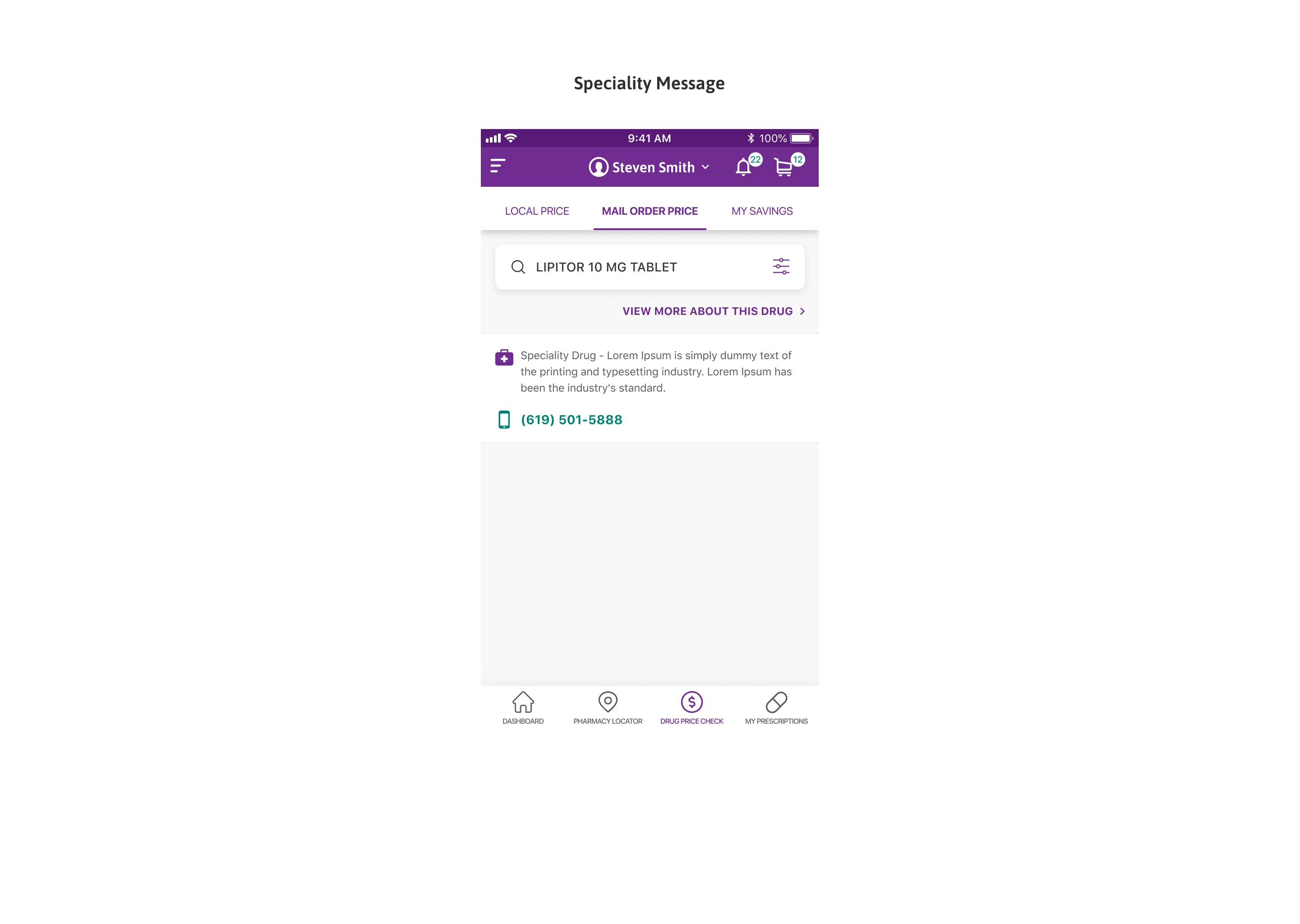
Drug Price Check: Mail Order Price

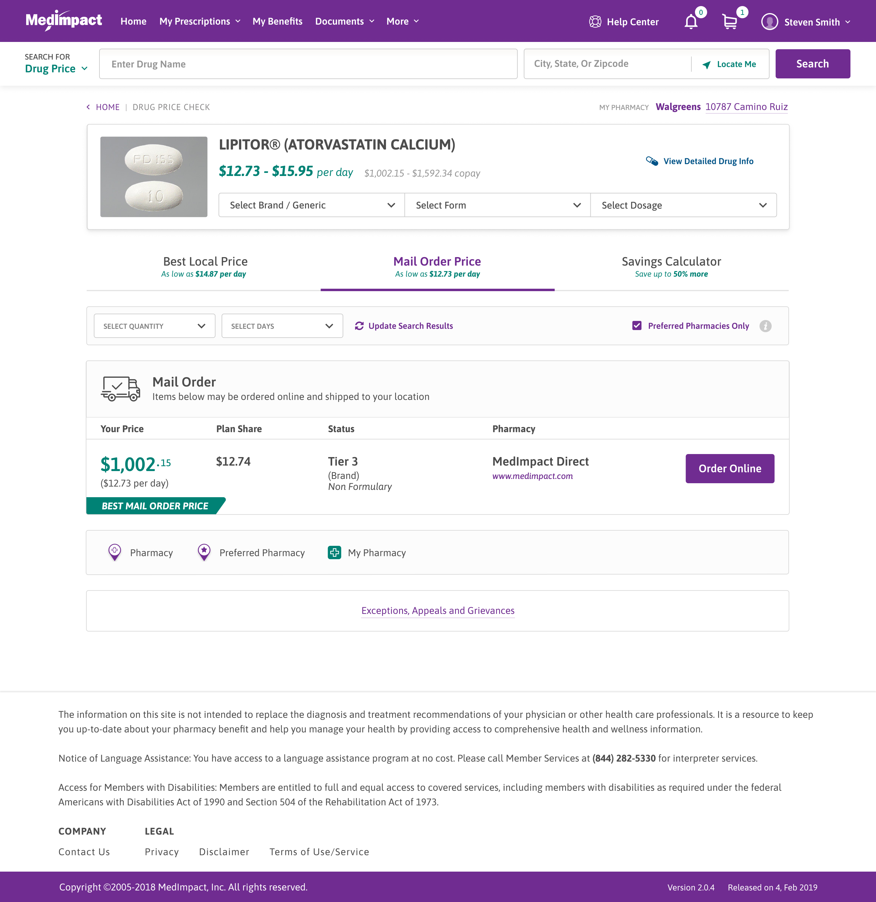
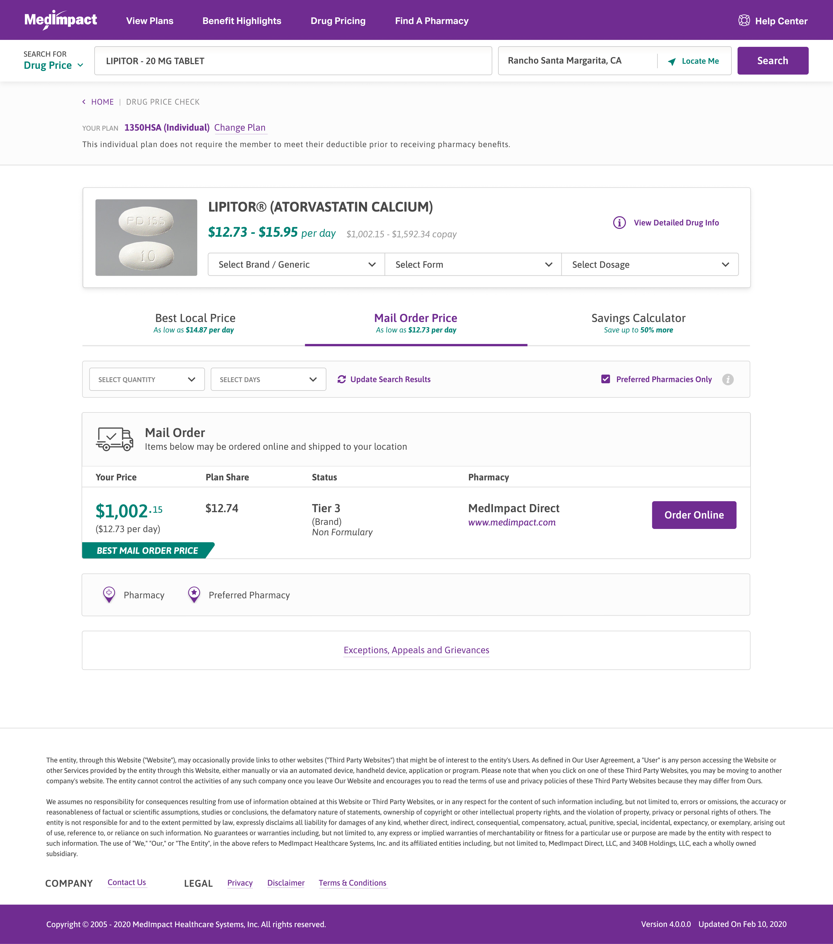
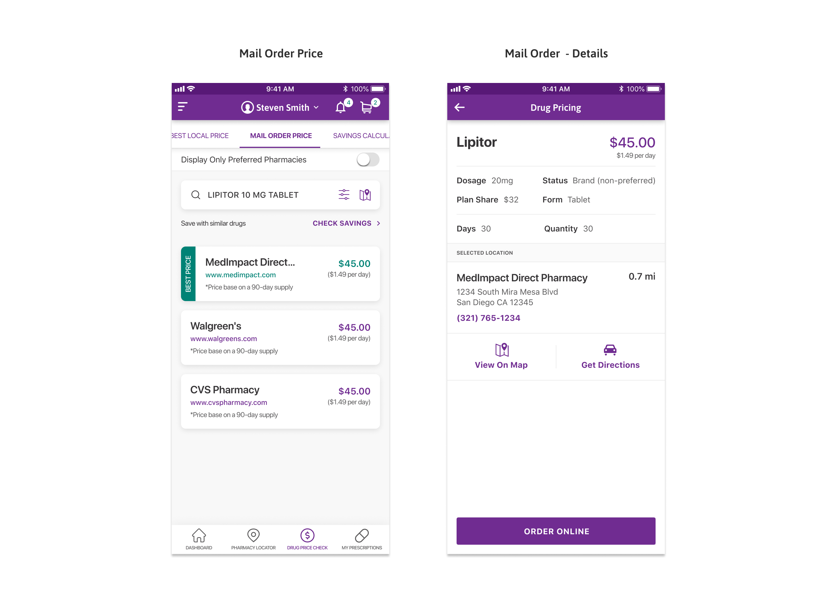
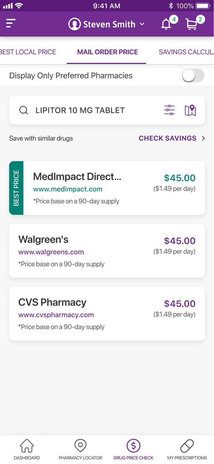
The Mail Order Price tab shows the cost of filling the same drug through mail order.

Mail order uses the same layout as local pricing, so the two are easy to compare.

Same tabs, mail order

The mail-order view uses the same tabs and layout as local pricing.

One mail-order price

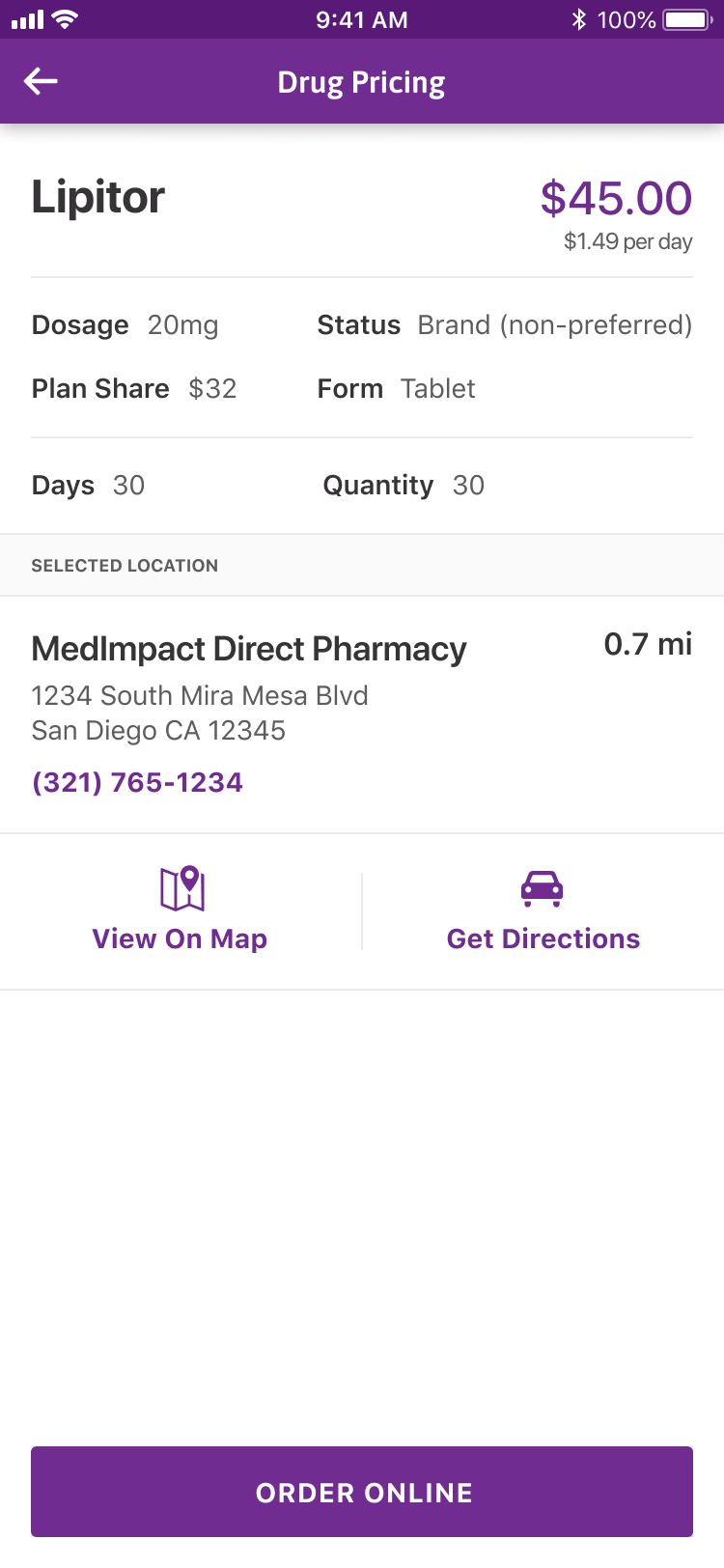
The best mail-order price and plan share are shown in the same format.

Drug Price Check: Mail Order Price

Preferred pharmacies

Limit results to preferred pharmacies only.

Order online

Order the mail-order fill directly from the result.

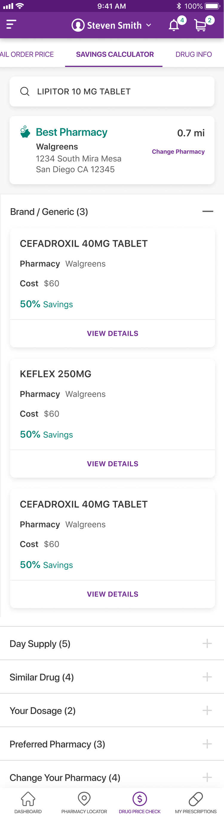
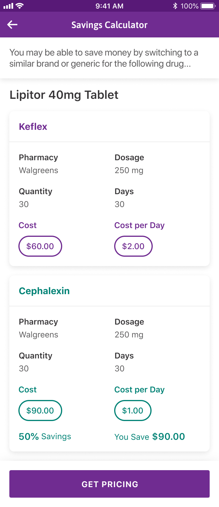
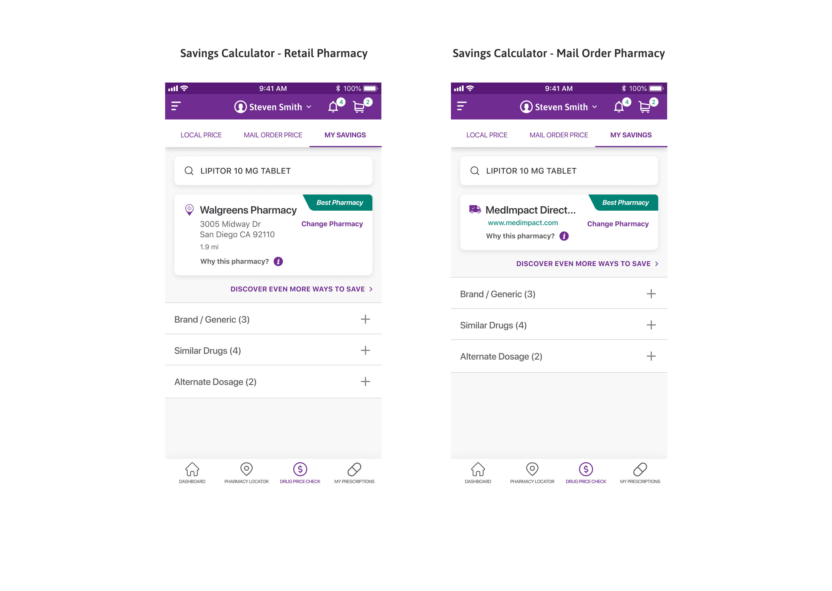
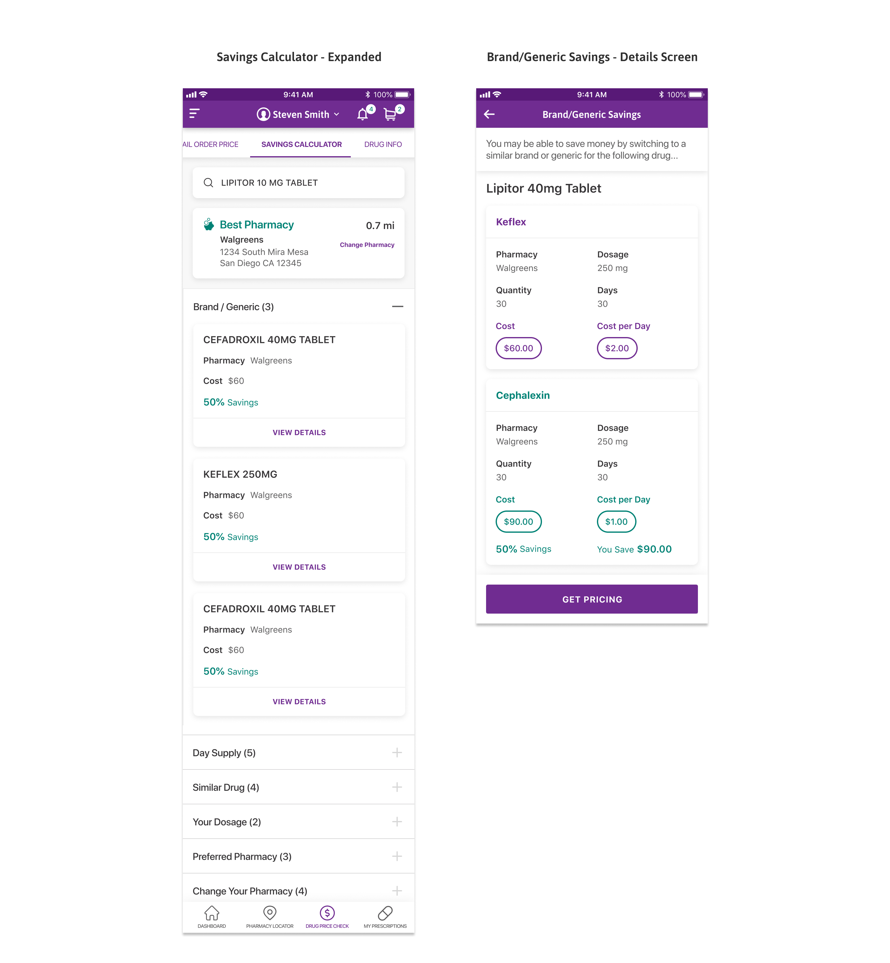
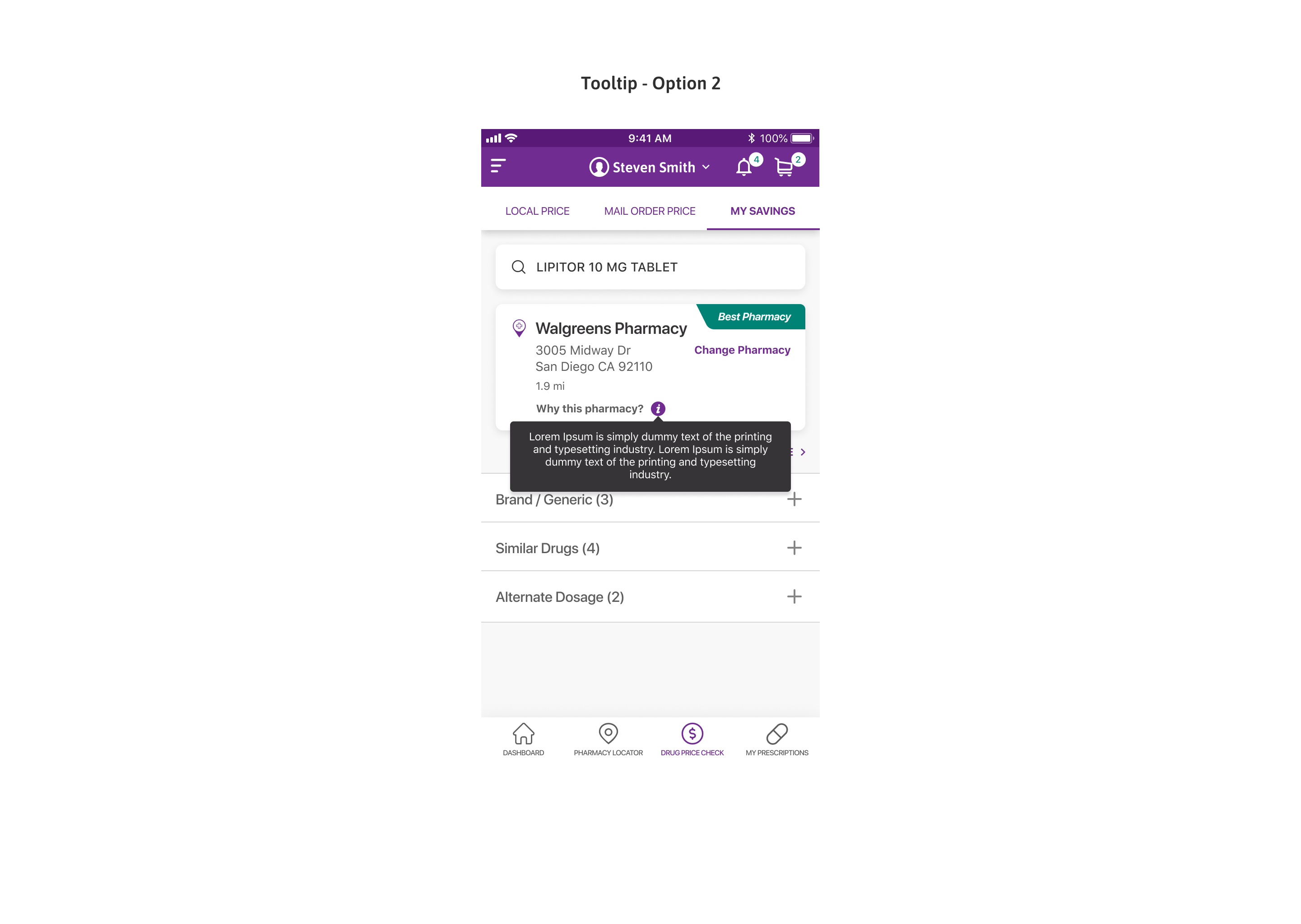
Drug Price Check: Savings Calculator

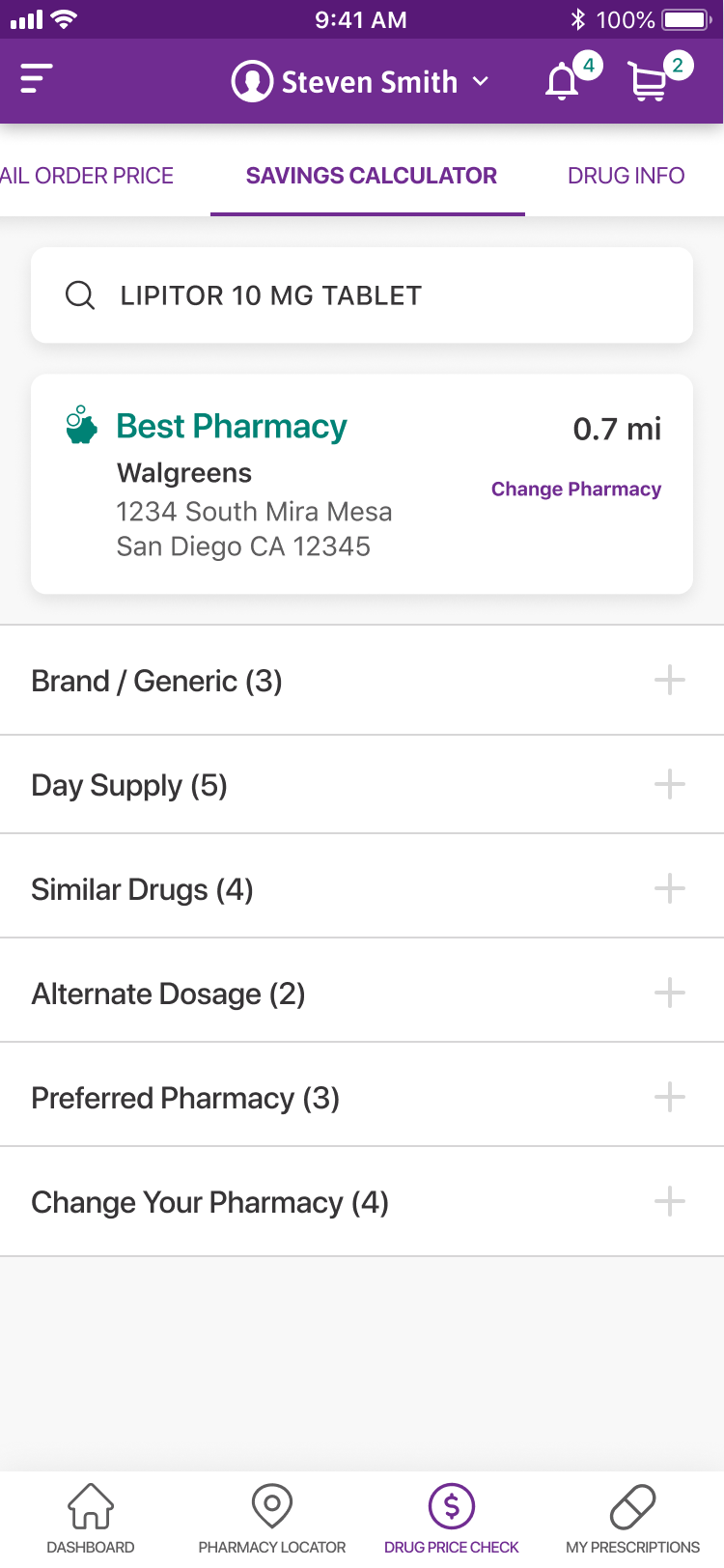
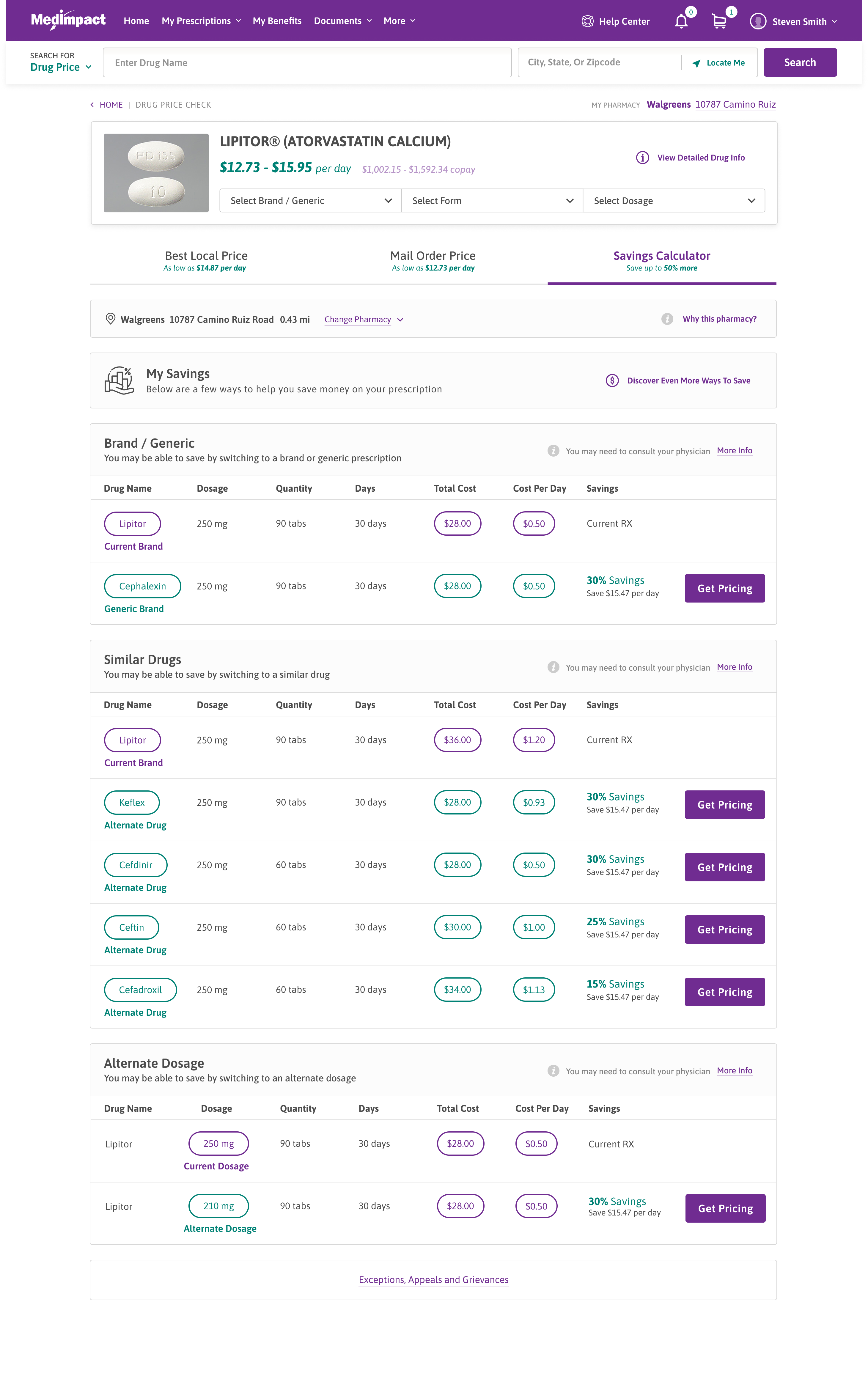
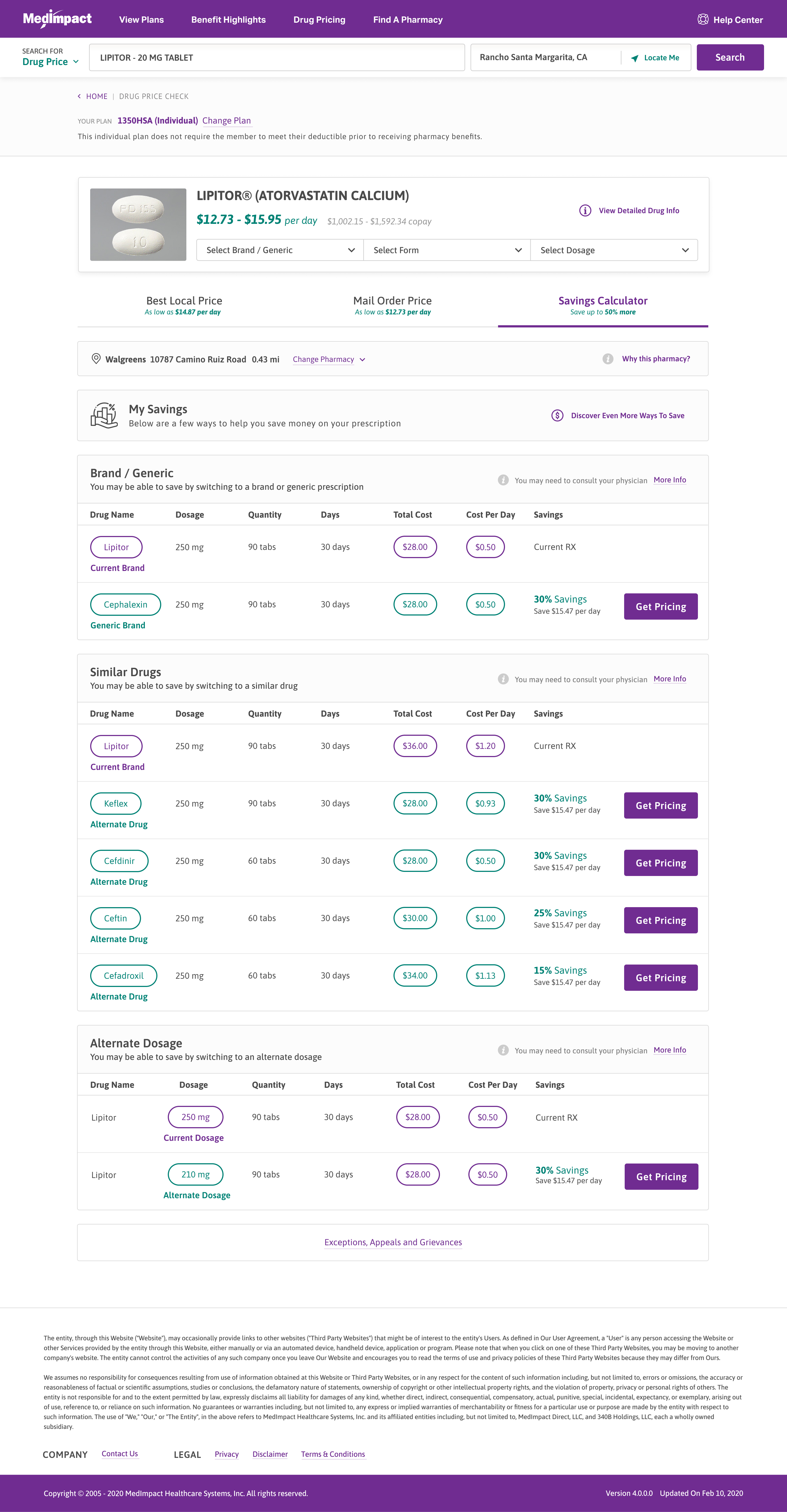
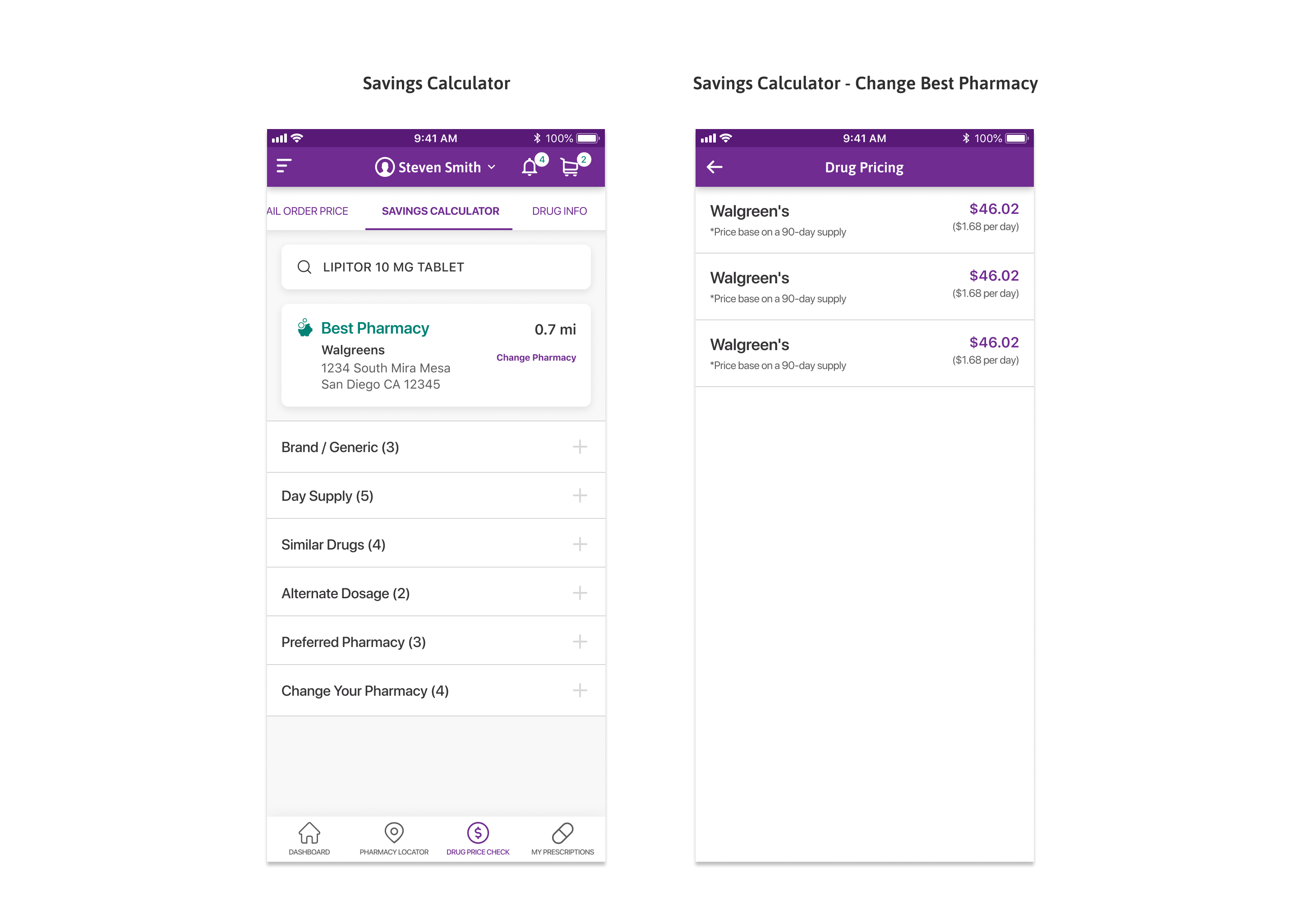
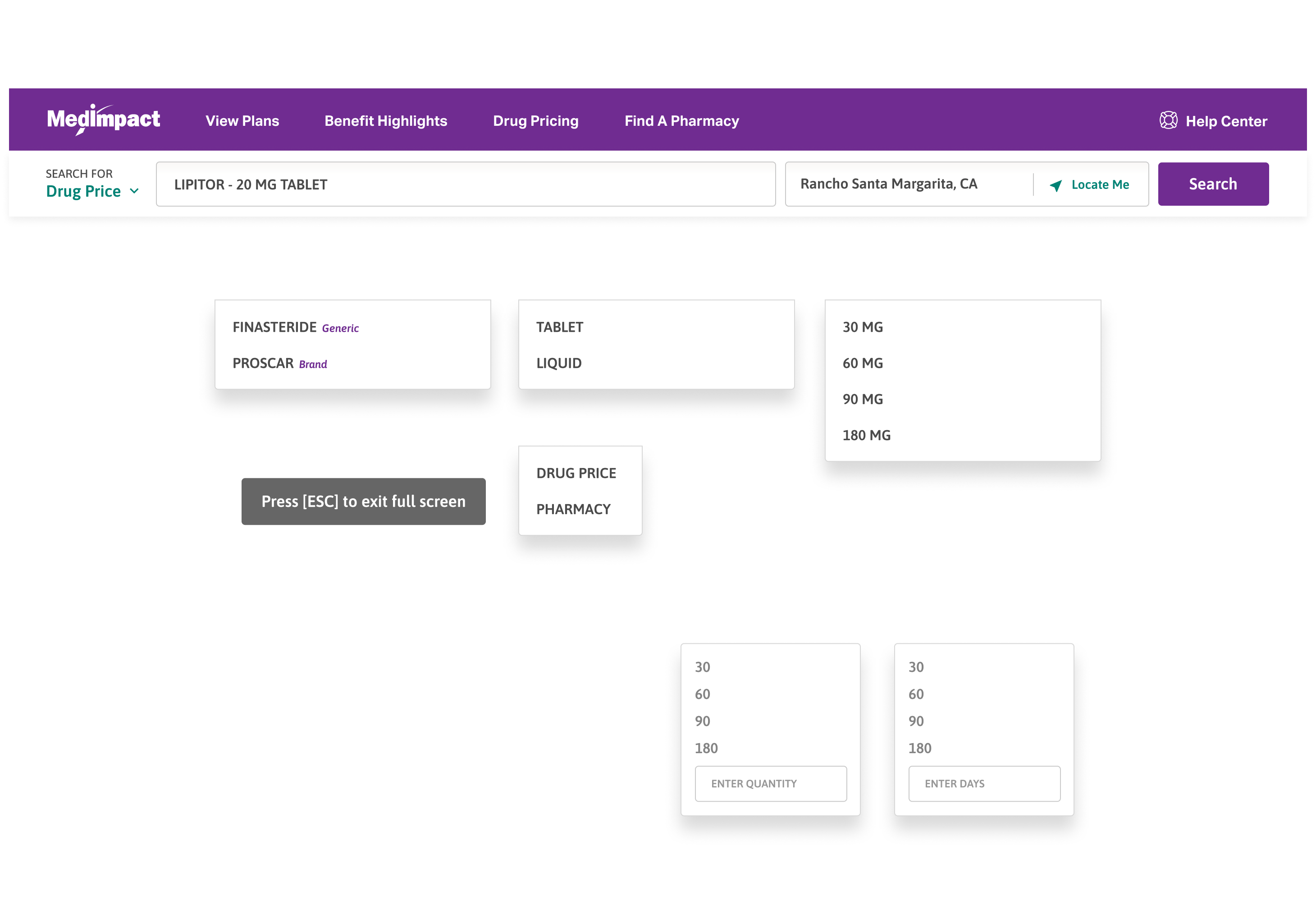
The Savings Calculator tab estimates how much a member can save by adjusting the drug details or pharmacy.

Members can move between the three pricing views without leaving the page.

Brand vs. generic

Switching between a brand and its generic is compared side by side.

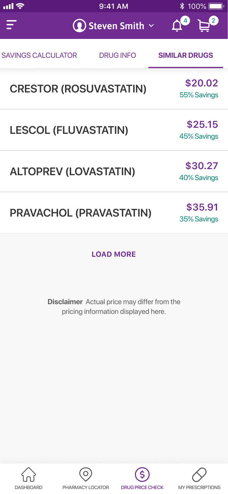
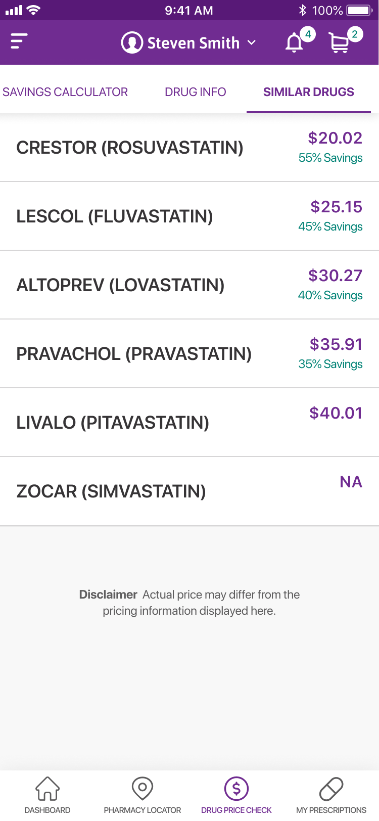
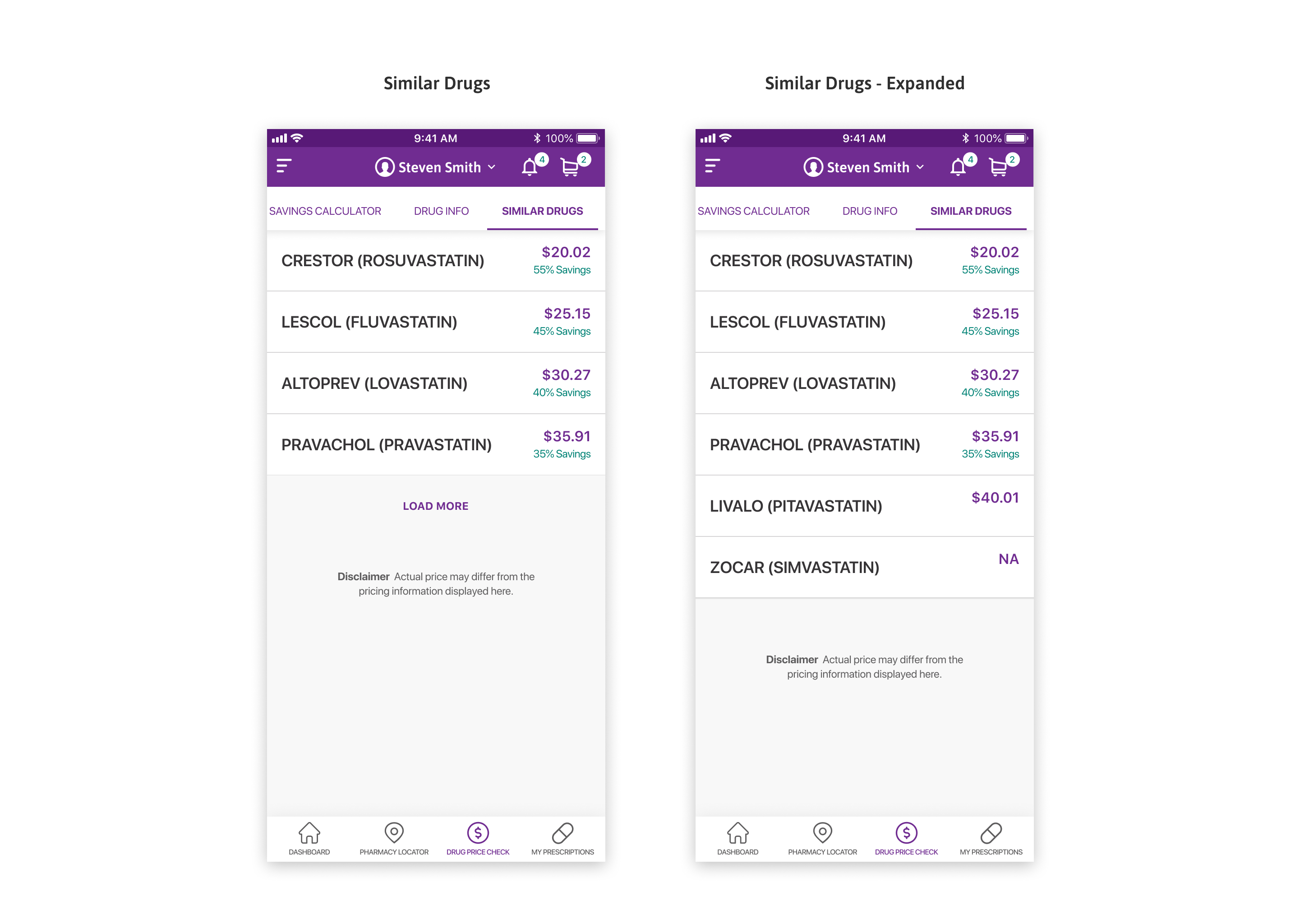
Similar and alternate drugs

Similar drugs and alternate dosages are listed with their cost.

Drug Price Check: Savings Calculator

Savings per option

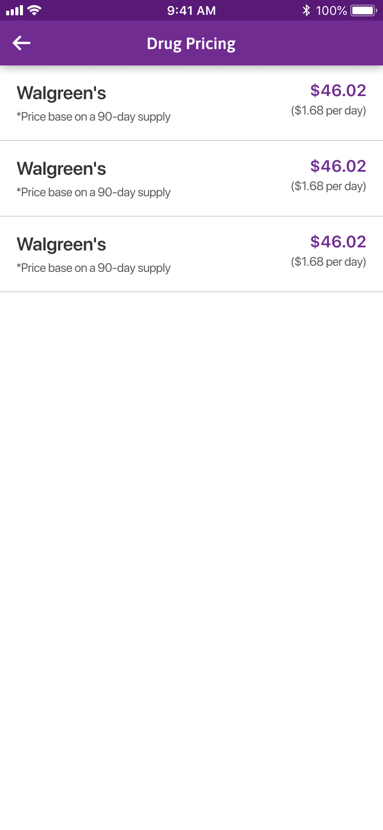
Each option shows the percentage and dollar savings versus the current drug.

Get pricing

Get Pricing on any option carries it into the price check.

Claims History

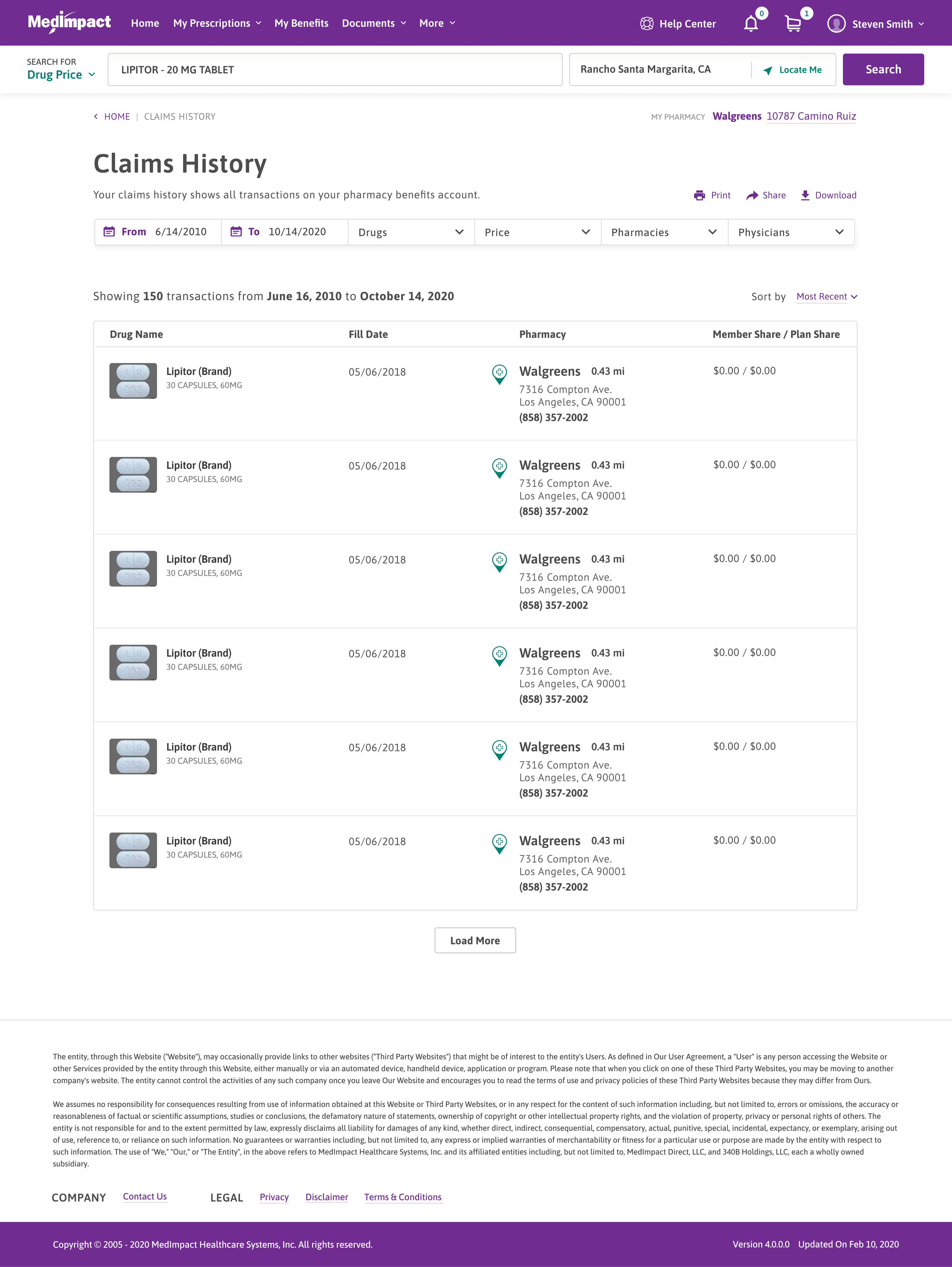
Claims are listed and can be narrowed with filters, shown as removable keyword pills above the results.

Members can see and adjust exactly which filters are active.

Filters as pills

Active filters show as removable keyword pills above the results.

Every transaction

Each claim lists the drug, fill date, and pharmacy.

Claims History

Print, share, download

Claims can be printed, shared, or downloaded from the top of the page.

Member vs. plan share

The right column shows what the member paid versus the plan.

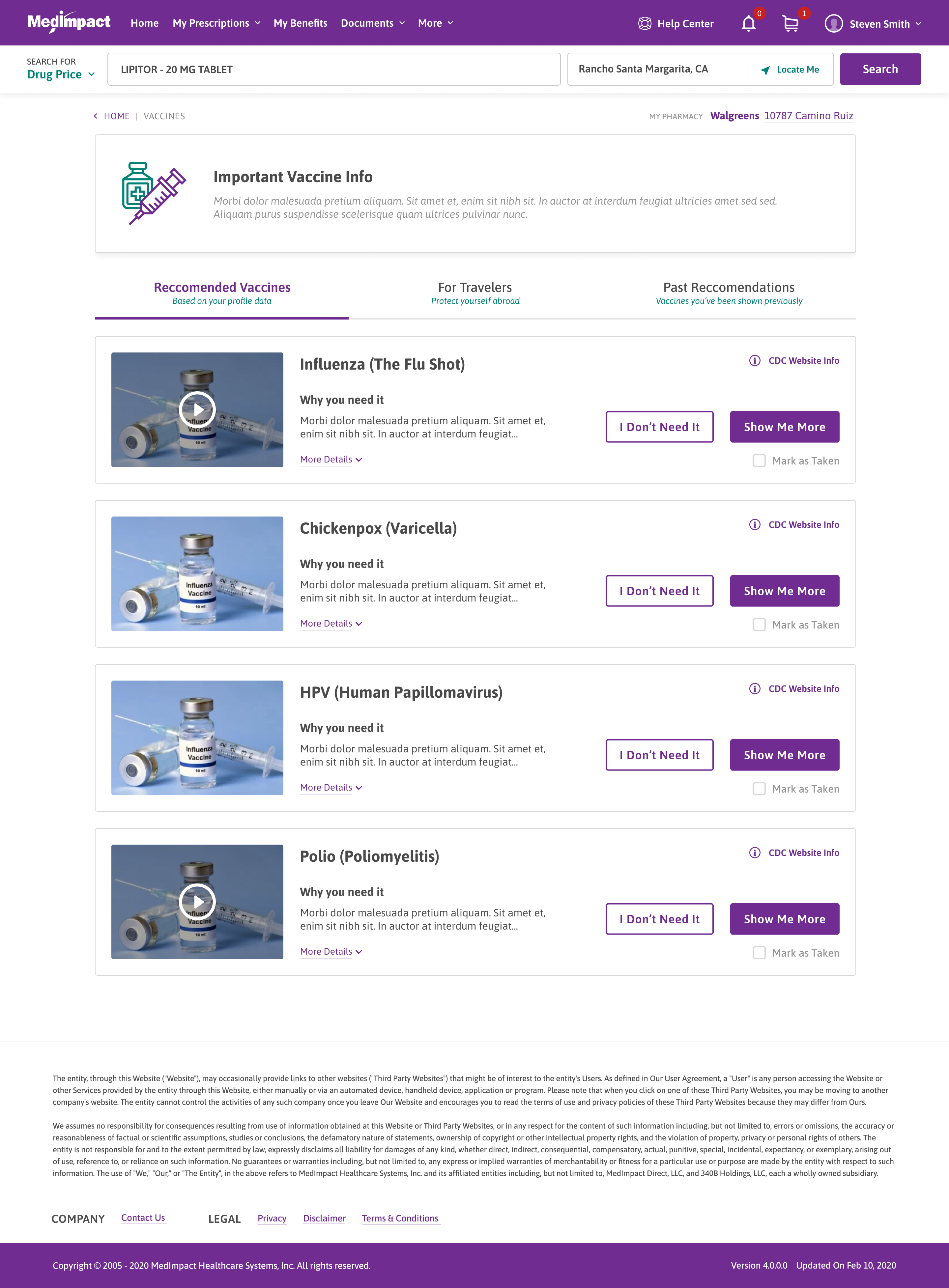
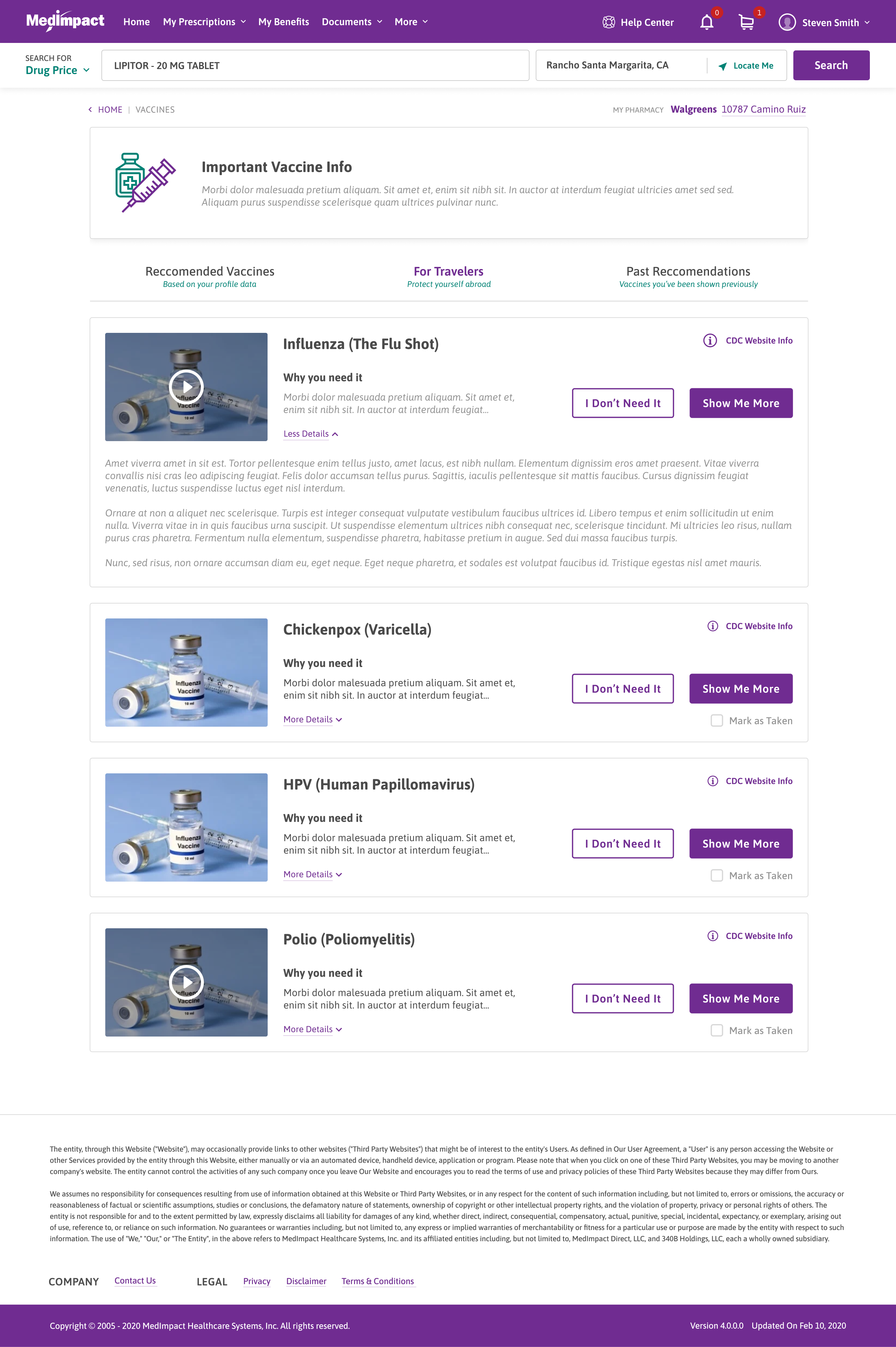
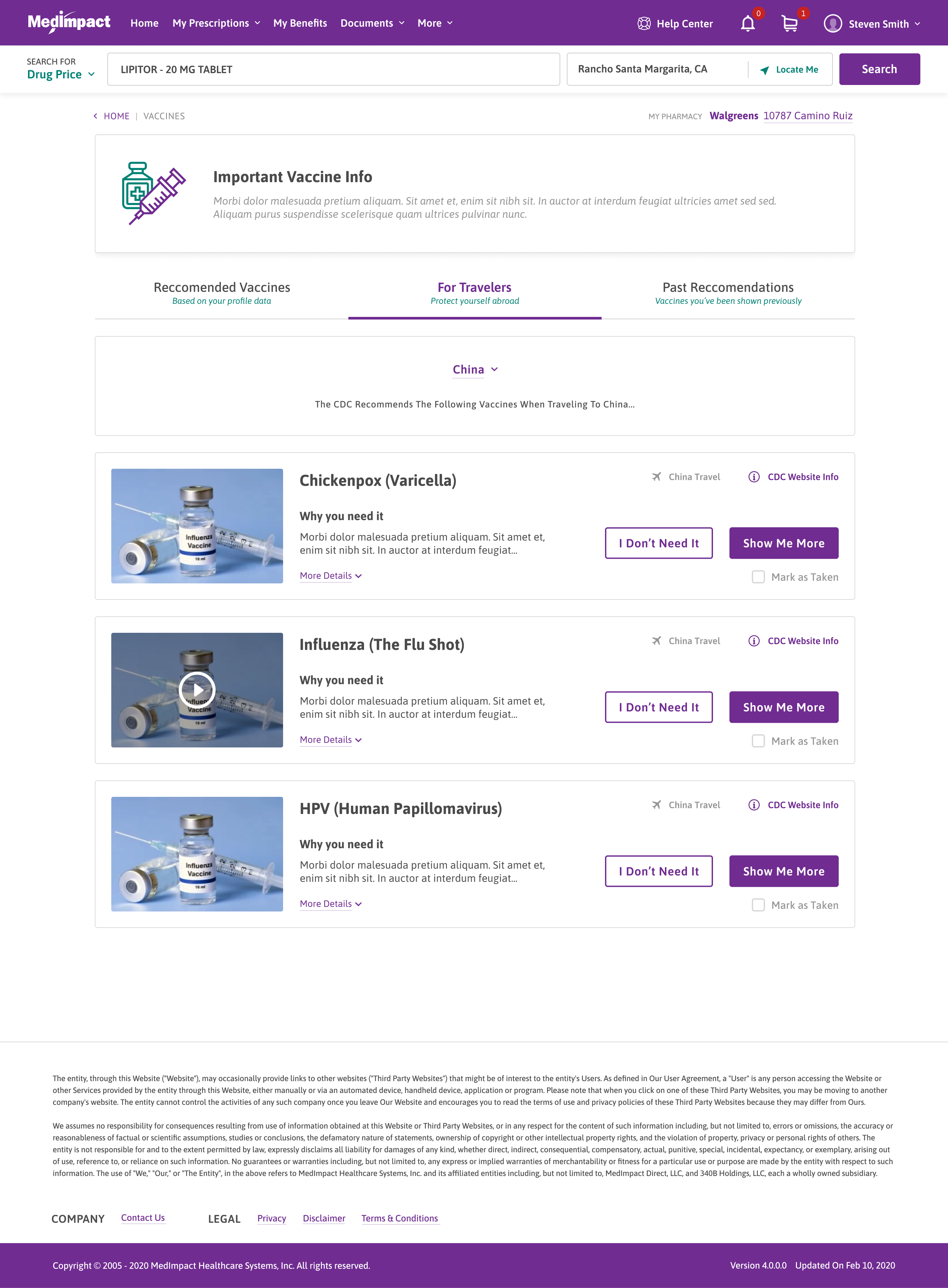
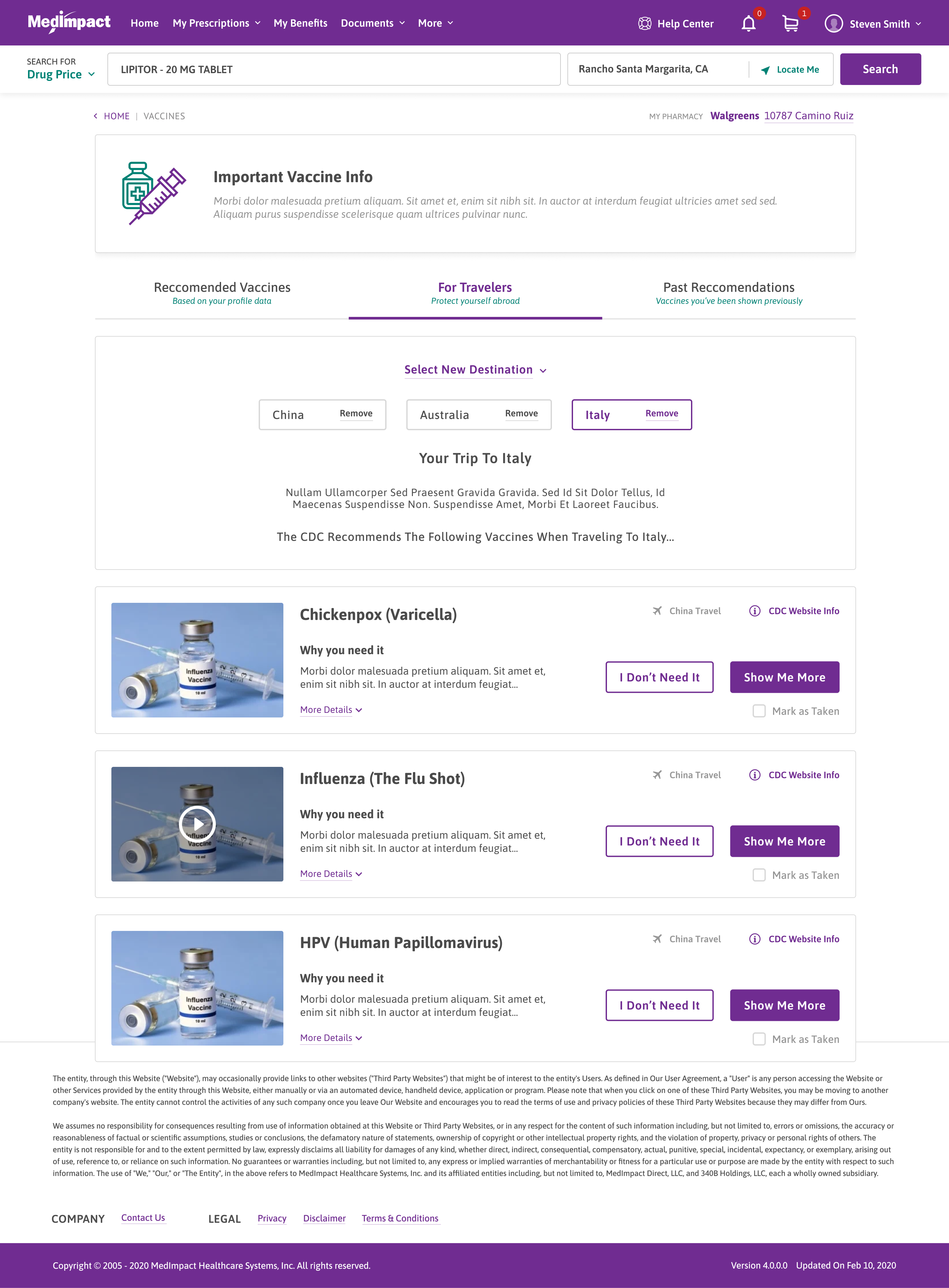
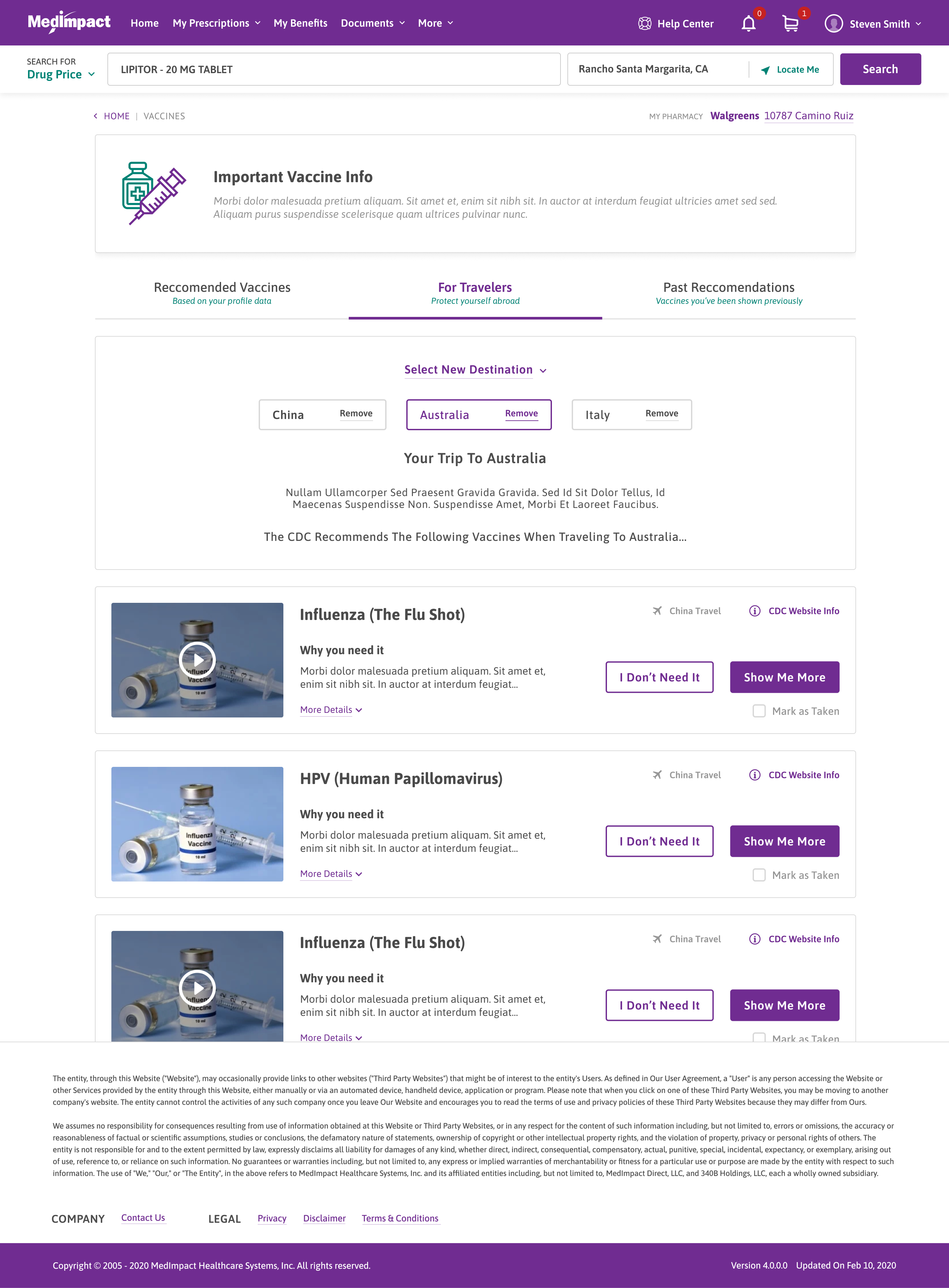
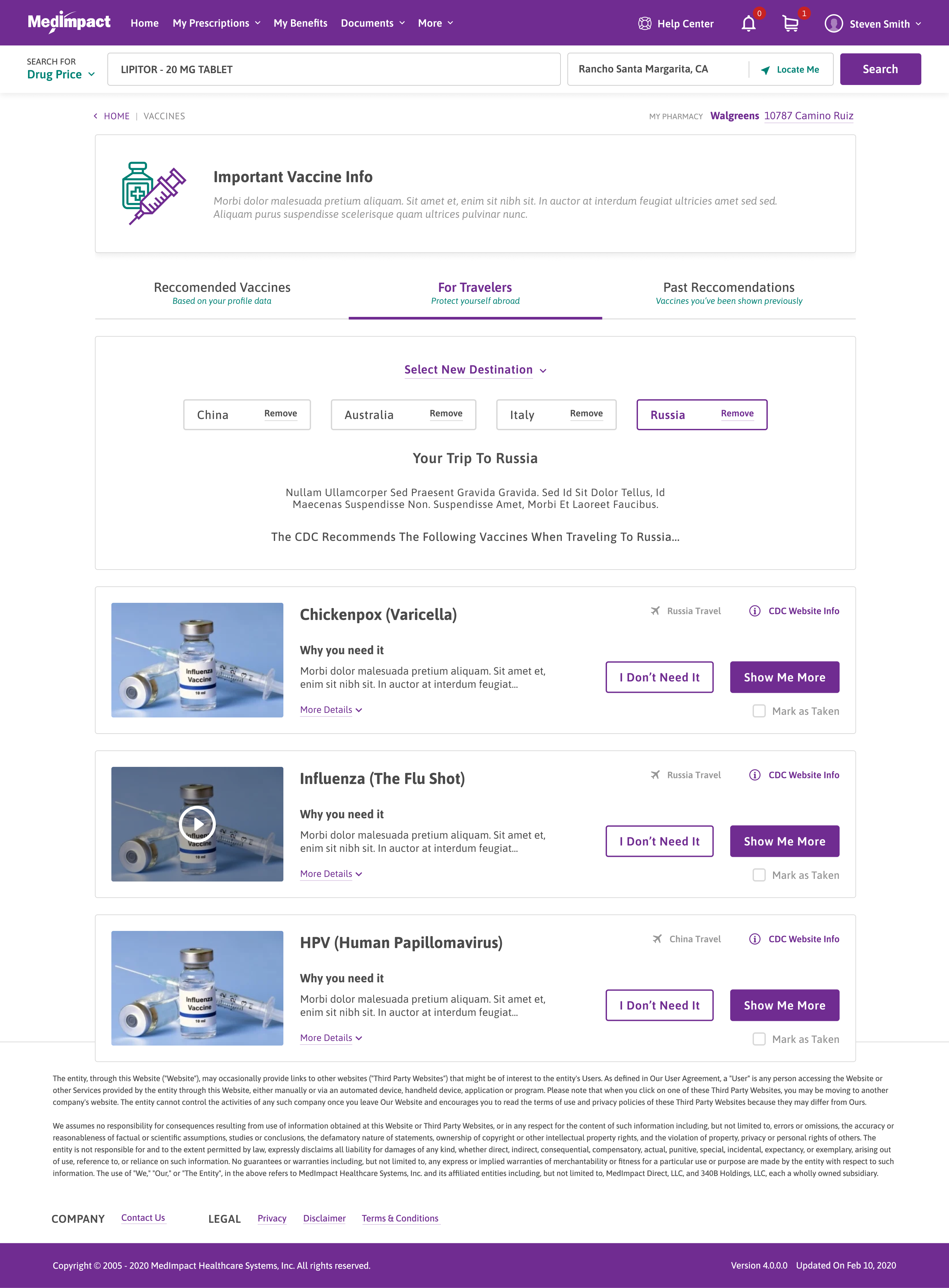
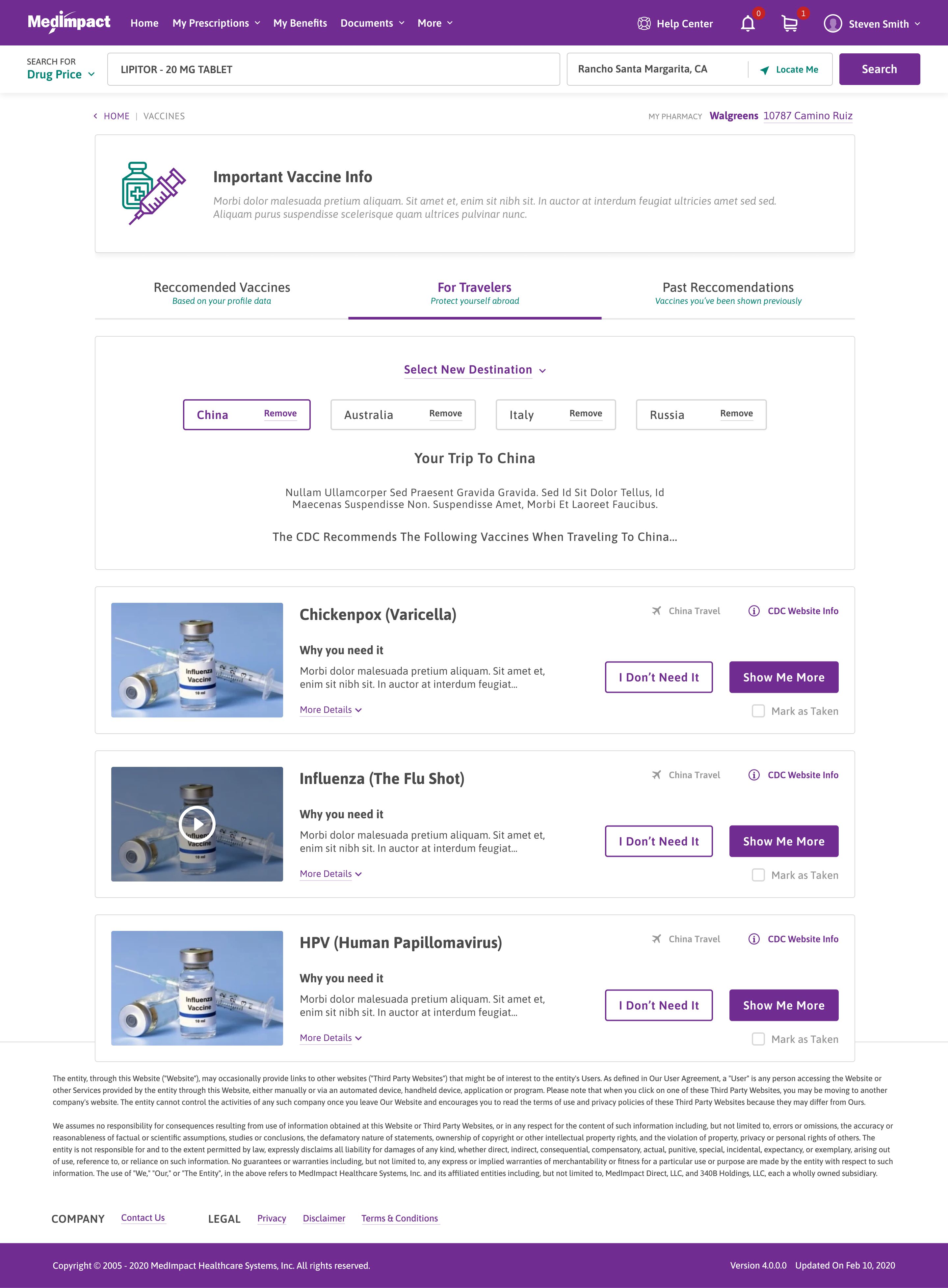
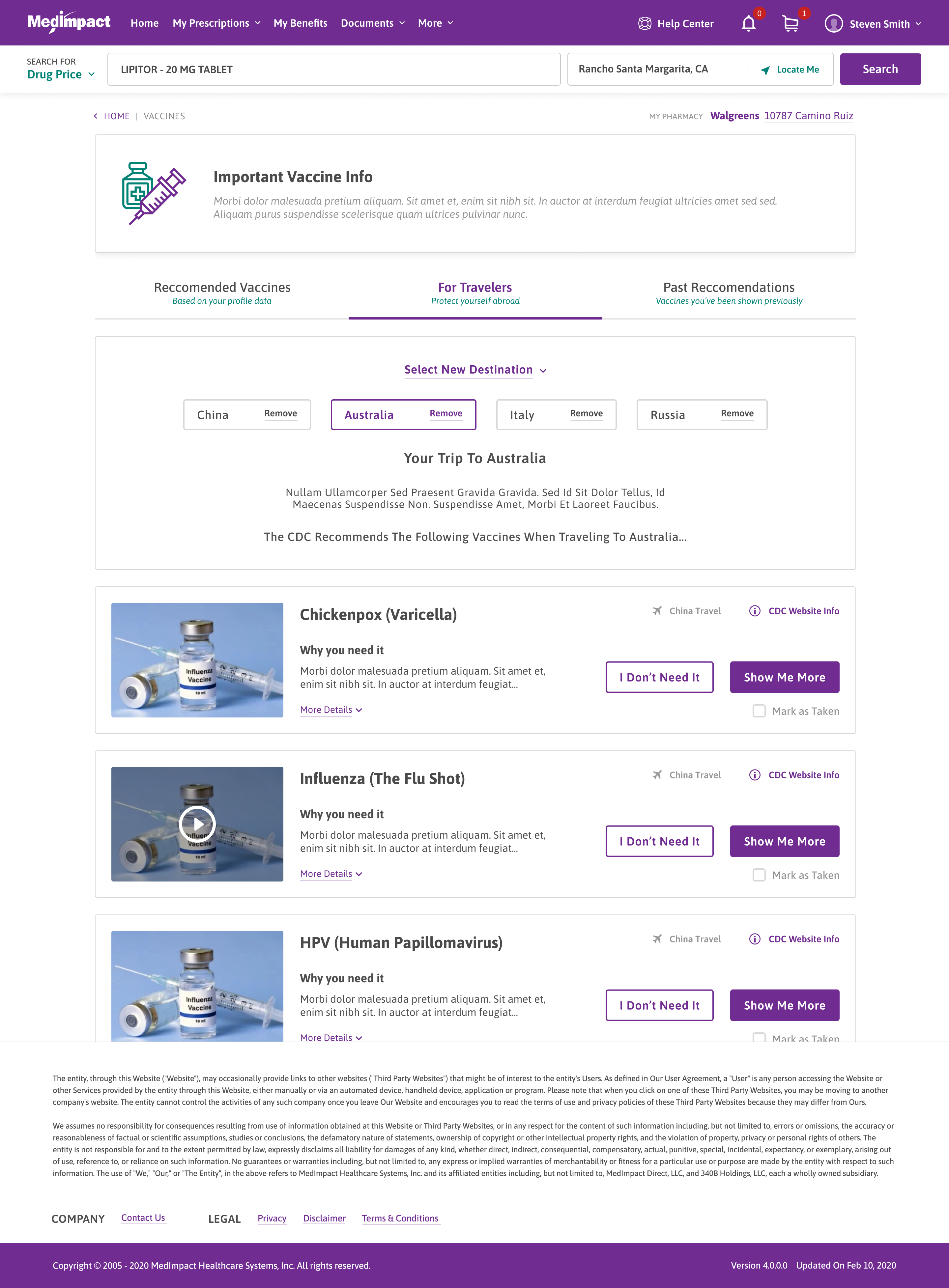
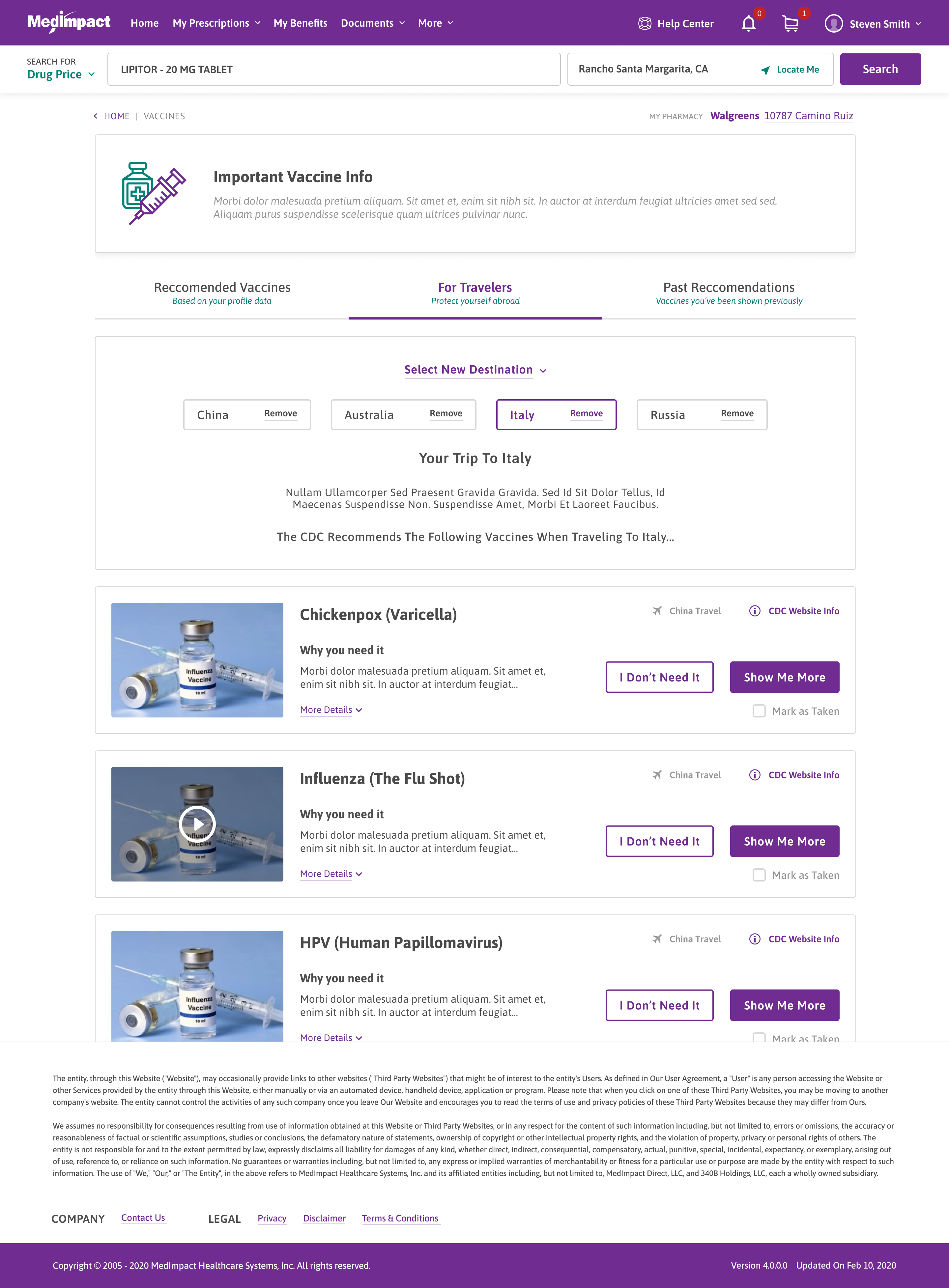
Vaccine Module

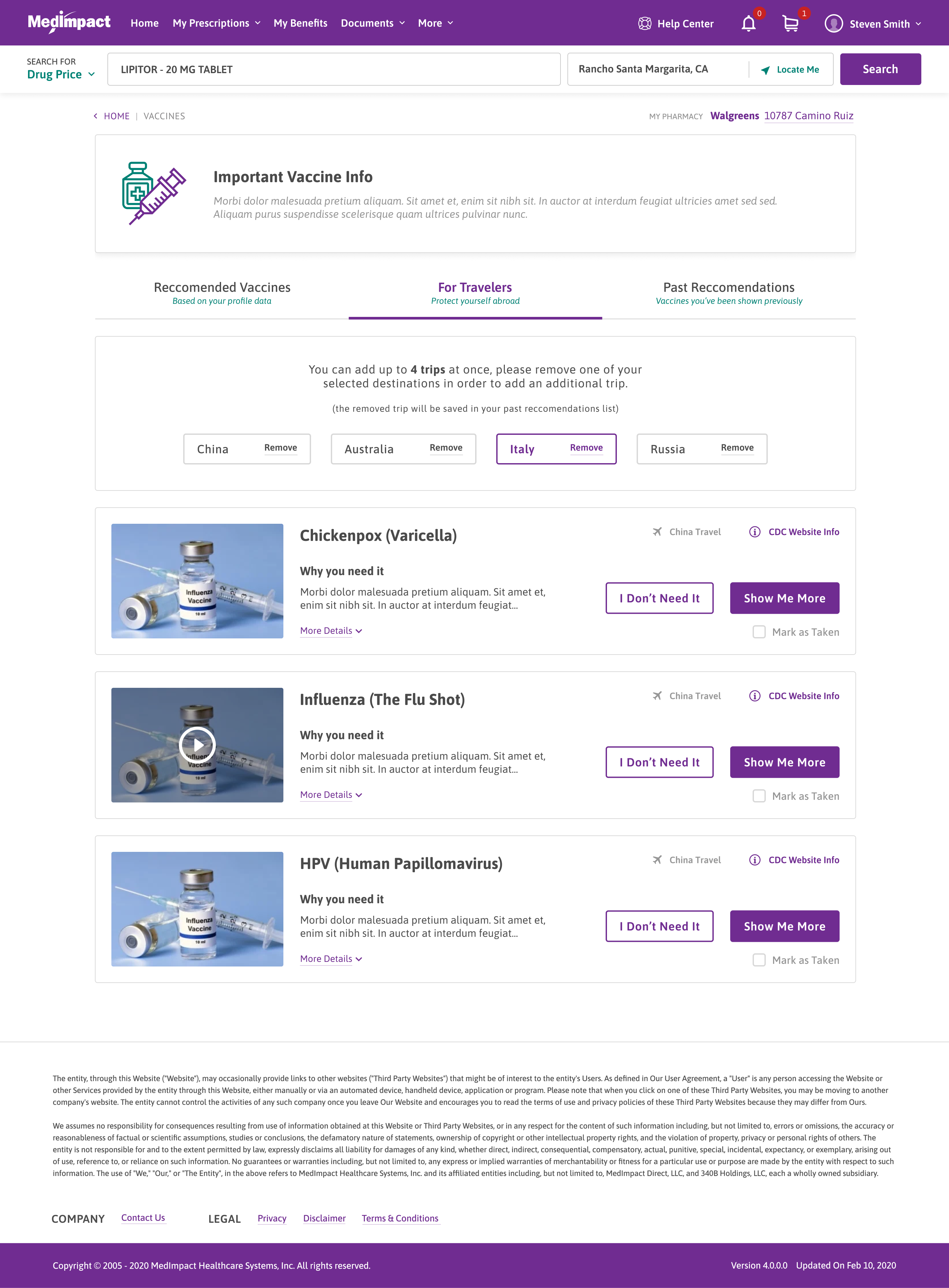
The vaccine module lists recommended vaccines with eligibility and details, and lets members schedule one.

Clinical detail is written in plain language, with the option to read more.

Recommended for you

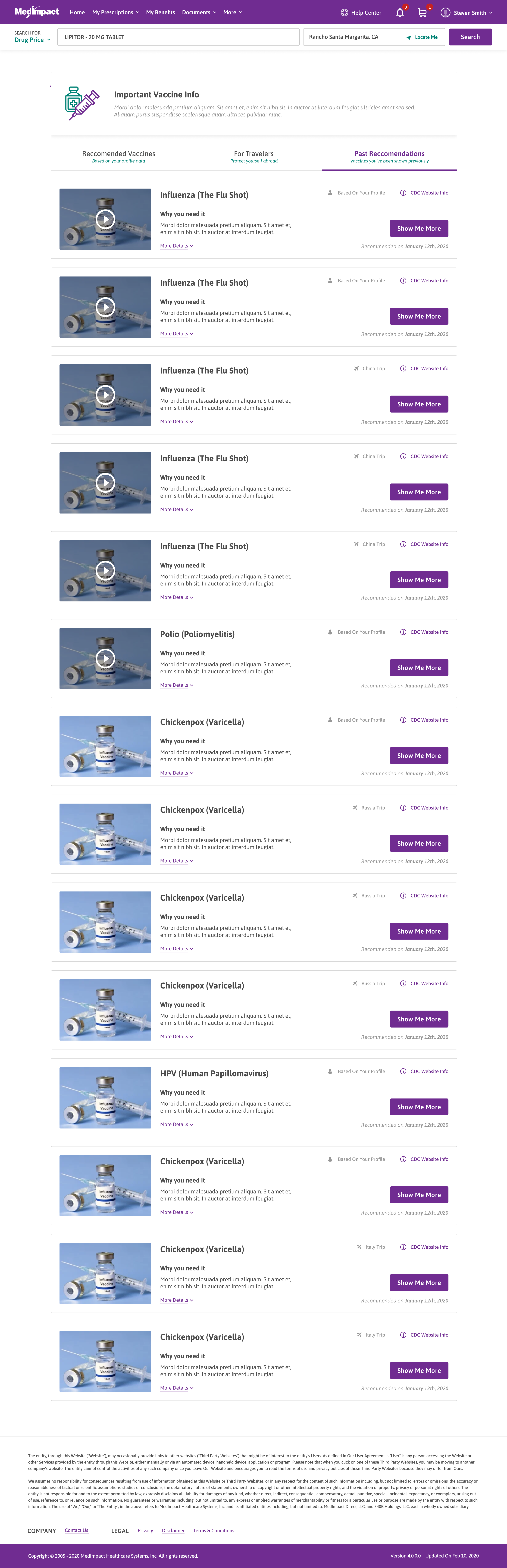
Vaccines are grouped into Recommended, For Travelers, and Past Recommendations.

Why you need it

Each vaccine explains why it is recommended, with a short video and read-more.

Vaccine Module

CDC info

A link to the CDC's page sits on every vaccine.

Act on it

Show Me More, I Don't Need It, or Mark as Taken on each card.

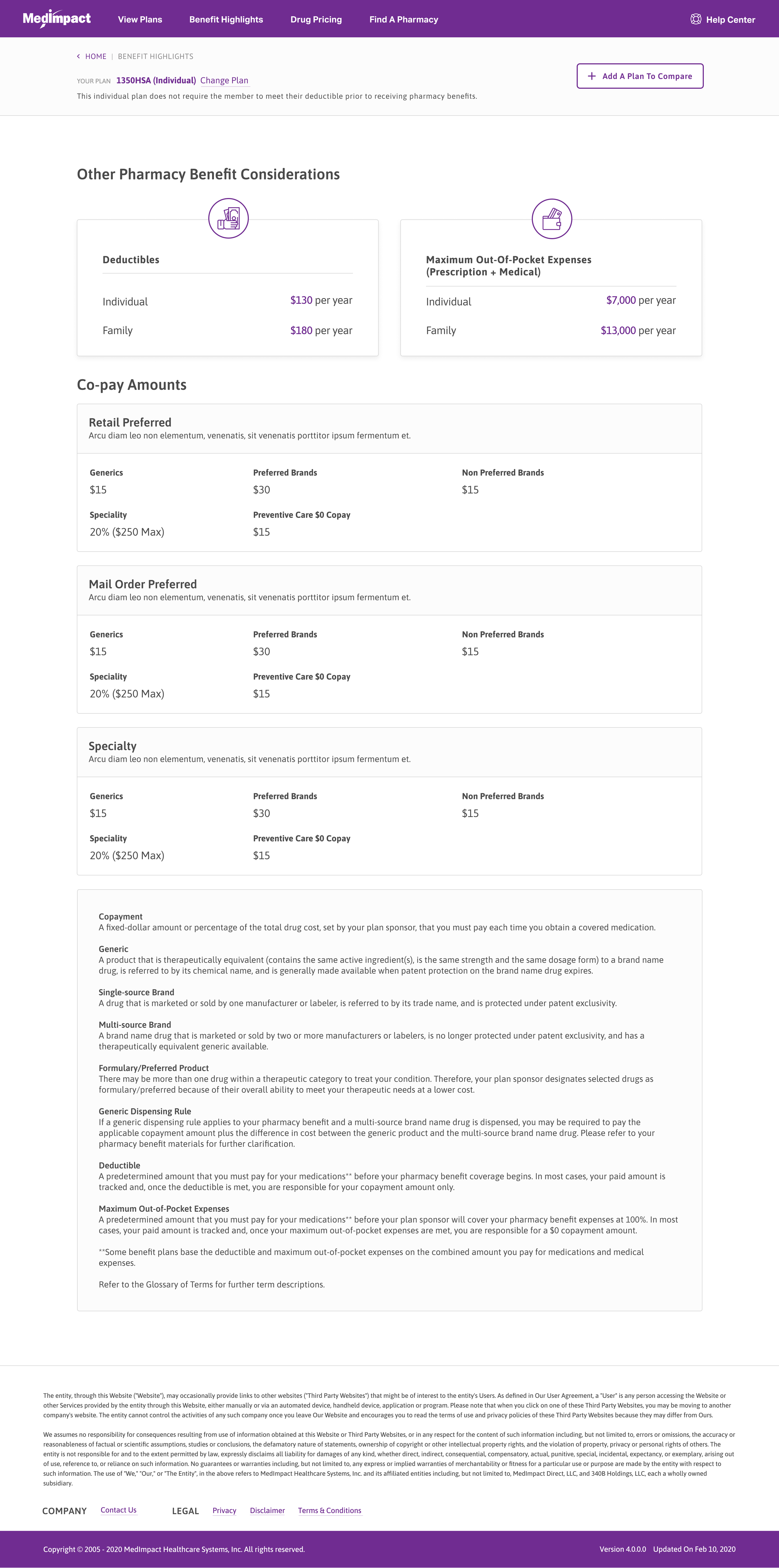
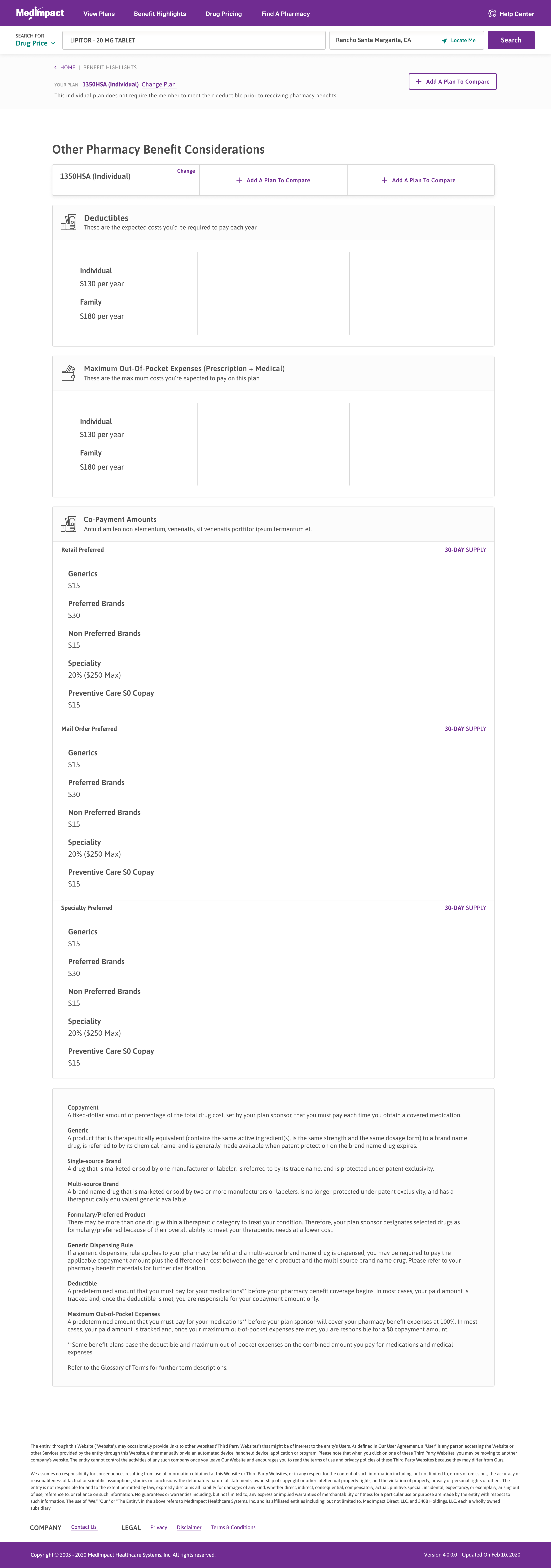
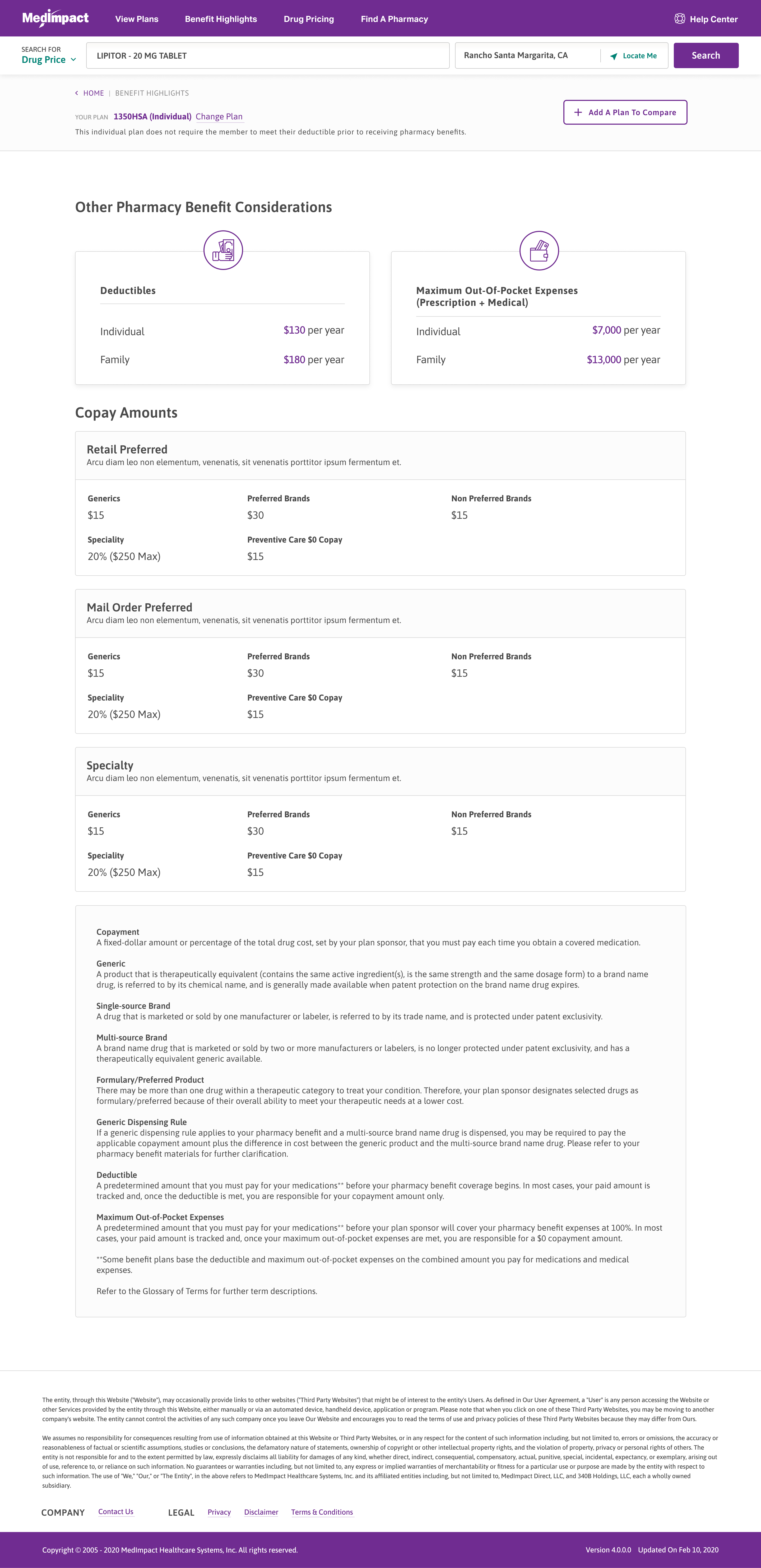
Open Enrollment

Benefit highlights summarize what a plan covers during open enrollment.

The summary leads, with full detail available below it.
Deductibles

Individual and family deductibles are shown in plain dollars.

Copay by tier

Retail, mail-order, and specialty copays are broken out by drug tier.

Open Enrollment

Add a plan to compare

Start a side-by-side comparison from the top of the page.

Out-of-pocket max

The prescription-plus-medical out-of-pocket maximum sits beside the deductible.

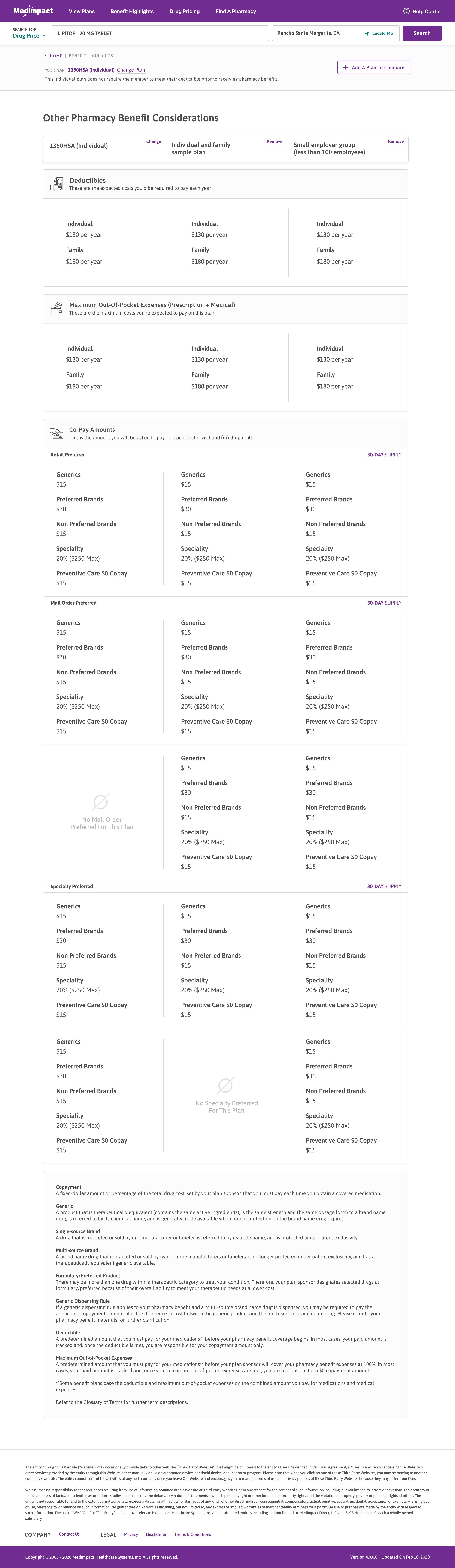
Plan Comparison

Plans are compared side by side across benefits and cost so members can see the differences in one view.

Plans are shown next to each other rather than one at a time.

Up to three plans

A member can line up as many as three plans at once.

Deductibles compared

Deductibles and out-of-pocket maximums are compared across plans.

Plan Comparison

Remove a plan

Any plan can be removed from the comparison in one tap.

Copays side by side

Retail, mail-order, and specialty copays line up column by column.

Dashboard

Desktop

MedImpact Dashboard populated state
MedImpact Dashboard — dashboard-tab-my-account
MedImpact Dashboard — dashboard-tab-my-profile
MedImpact Dashboard — disabled-my-benefits

Mobile

MedImpact Dashboard — 1-1-1-dashboard-tab-320
MedImpact Dashboard — 1-2-1-dashboard-tab-to-do-next-320
MedImpact Dashboard — 1-3-1-dashboard-tab-my-profile-320
MedImpact Dashboard — 1-4-1-dashboard-tab-my-account-320
MedImpact Dashboard — 1-5-1-dashboard-tab-no-prescription-datas-320

My Prescriptions

Desktop

MedImpact My Prescriptions — 1-1-1-my-prescriptions-1

Mobile

MedImpact My Prescriptions — filters-1
MedImpact My Prescriptions — my-prescriptions-1

Drug Price Check

Desktop

MedImpact Drug Price Check
MedImpact Drug Price Check — pharmacy price map (expanded)

Mobile

MedImpact Drug Price Check — 1-1-1-dpc-best-local-price-320
MedImpact Drug Price Check — 1-2-1-dpc-best-local-price-list-expanded-320
MedImpact Drug Price Check — 1-3-1-dpc-best-local-price-map-view-320
MedImpact Drug Price Check — 1-5-1-dpc-mail-order-320
MedImpact Drug Price Check — 1-6-1-dpc-savings-calculator-320

Claims History

Desktop

MedImpact Claims History — c

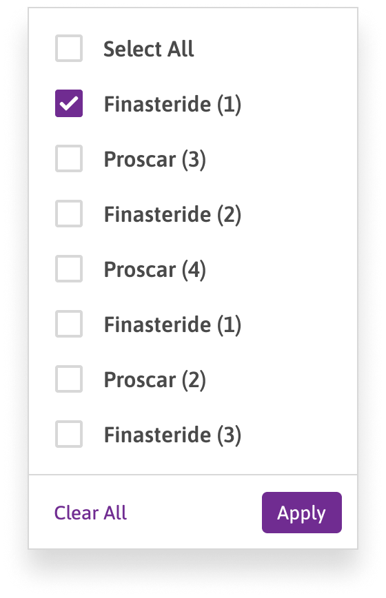
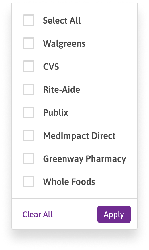
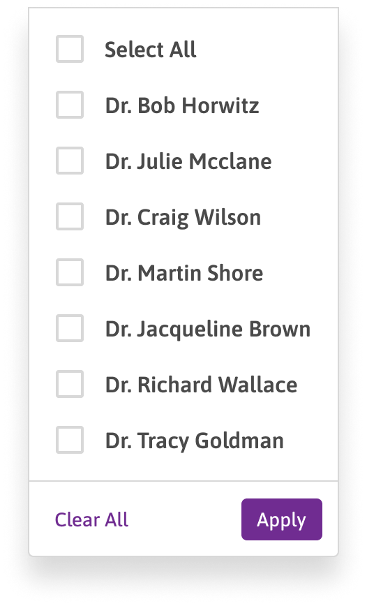
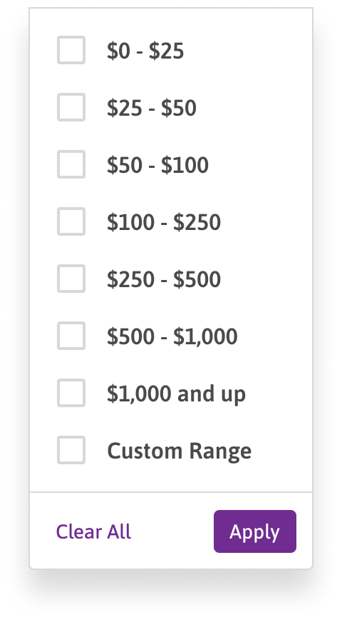
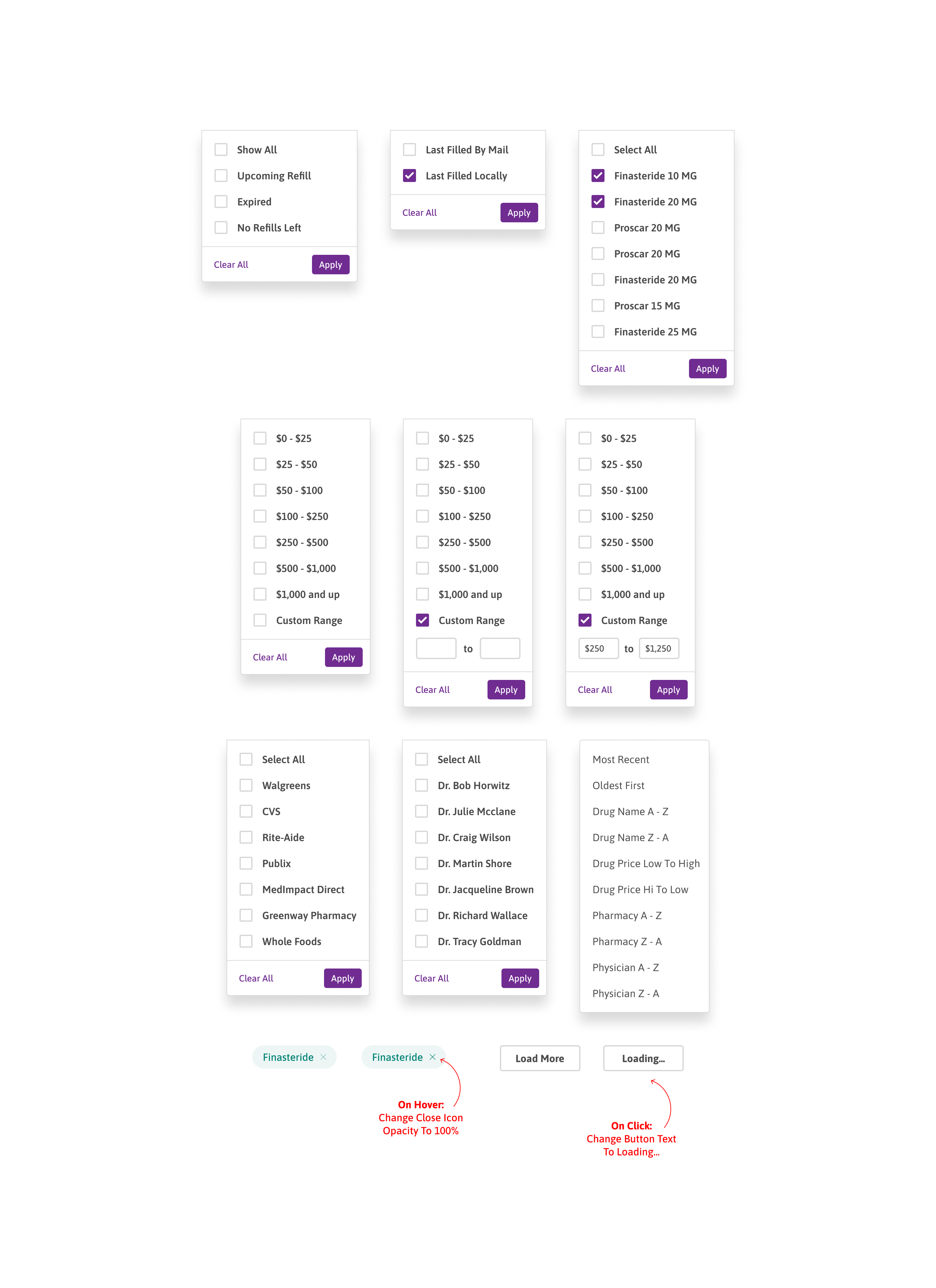
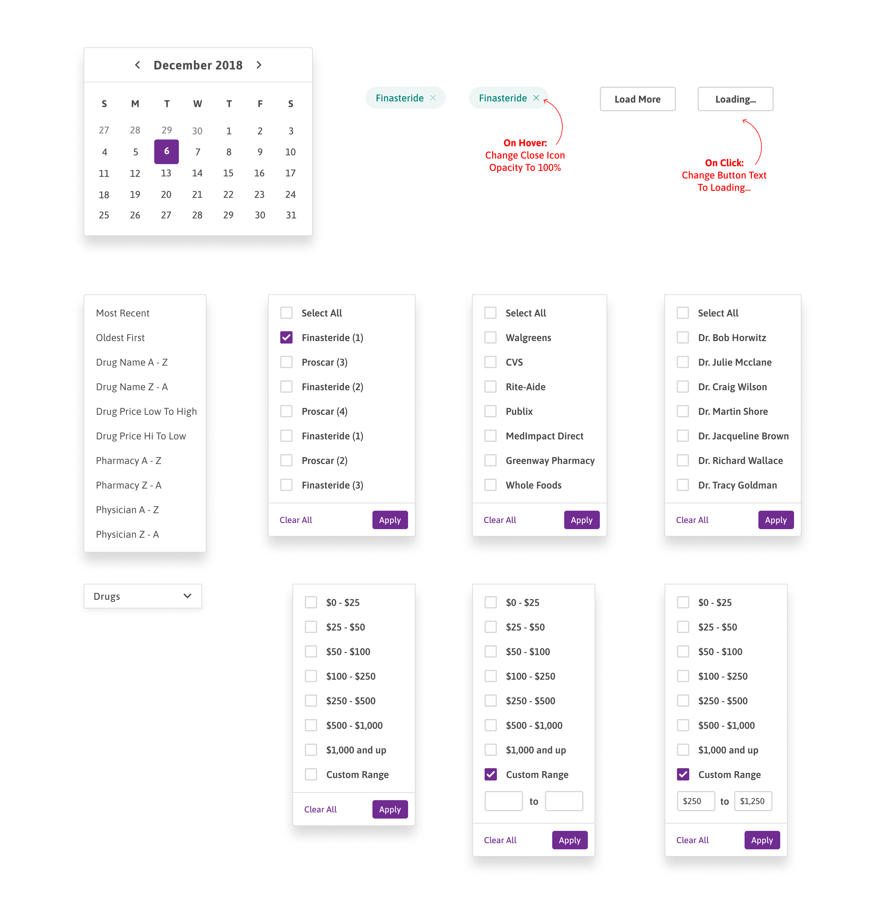
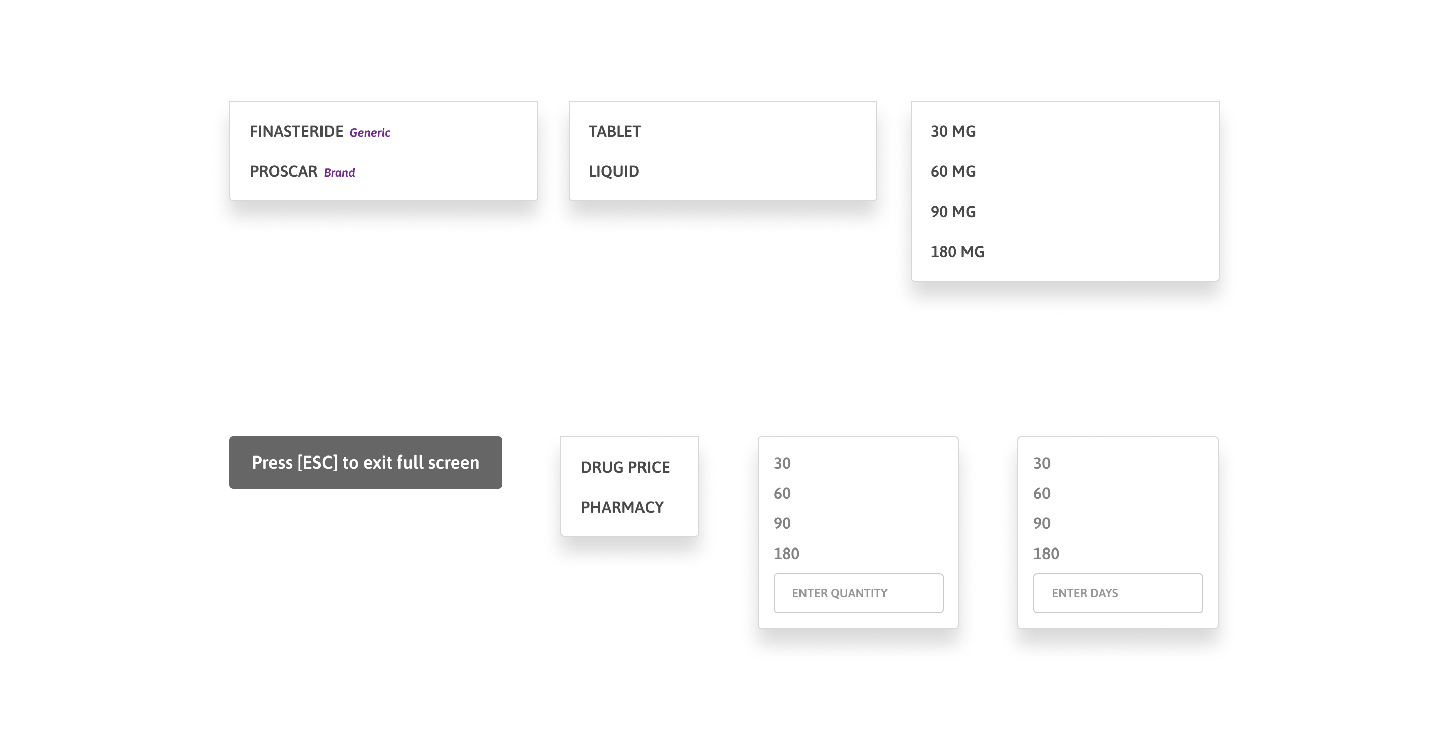
Filters & dropdowns

Claims filter, drug name
Claims filter, pharmacies
Claims filter, physician
Claims filter, price
Claims sort dropdown
Claims date range picker
Claims share popup
Claims share popup expanded
Claims share access options

Mobile

MedImpact Claims History — claims-history-filters-enabled
MedImpact Claims History — claims-history
MedImpact Claims History — filters-1

Vaccine Module

Desktop

MedImpact Vaccine Module — 15
MedImpact Vaccine Module — 16
MedImpact Vaccine Module — 22
MedImpact Vaccine Module — 24
MedImpact Vaccine Module — 26
MedImpact Vaccine Module — 29
MedImpact Vaccine Module — 30
MedImpact Vaccine Module — 31
MedImpact Vaccine Module — 32
MedImpact Vaccine Module — 33
MedImpact Vaccine Module — 34

Mobile

MedImpact Vaccine Module — for-travelers-1
MedImpact Vaccine Module — past-recommendations
MedImpact Vaccine Module — recommended-vaccines-1
MedImpact Vaccine Module — recommended-vaccines-extended

Open Enrollment

Desktop

MedImpact Open Enrollment landing page
MedImpact Open Enrollment — 1-4-1-benefit-highlights-oe
MedImpact Open Enrollment — benefit-highlights-1
MedImpact Open Enrollment — best-local-price-expanded
MedImpact Open Enrollment — best-local-price
MedImpact Open Enrollment — drug-price-check
MedImpact Open Enrollment — home-1
MedImpact Open Enrollment — mail-order-price
MedImpact Open Enrollment — pharmacy-locator-1
MedImpact Open Enrollment — savings-calculator
MedImpact Open Enrollment

Mobile

MedImpact Open Enrollment — benefit-highlights-comparison
MedImpact Open Enrollment — benefit-highlights
MedImpact Open Enrollment — drug-price-check-1
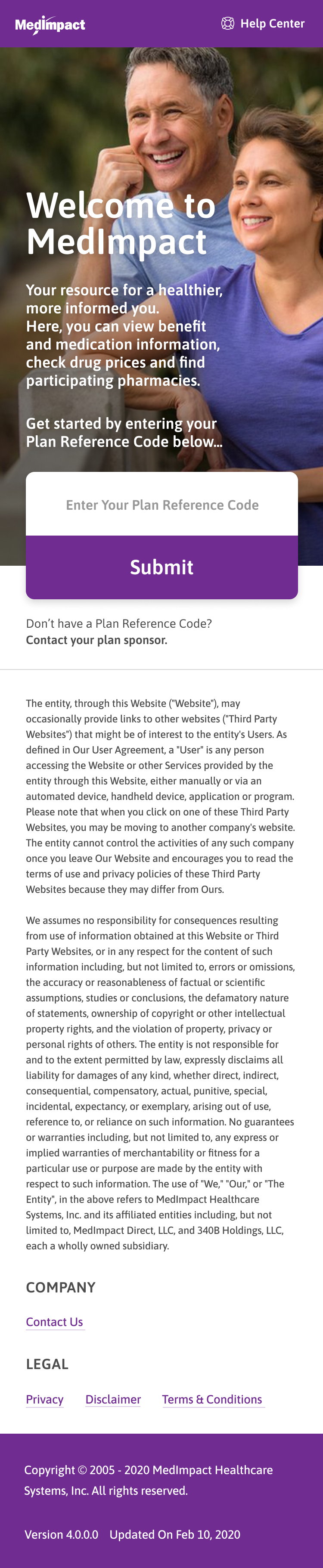
MedImpact Open Enrollment — landing-page
MedImpact Open Enrollment — pharmacy-locator-expanded
MedImpact Open Enrollment — pharmacy-locator-map-view-2
MedImpact Open Enrollment — pharmacy-locator
MedImpact Open Enrollment — savings-calculator
MedImpact Open Enrollment — select-plan

User Testing

I ran moderated usability tests with 7 participants to validate the core member tasks. Each session lasted about 25 minutes and followed a structured test guide. I tracked completion rate, error rate, time to success, and satisfaction, then assigned severity ratings (1 = cosmetic, 4 = must fix) to prioritize what needed attention.

7Participants
11Tasks Tested
88%Completion Rate
25 minAvg. Session

Task Results

TaskU1U2U3U4U5U6U7Rate
Look up a drug's price and compare it across nearby pharmacies.7/7
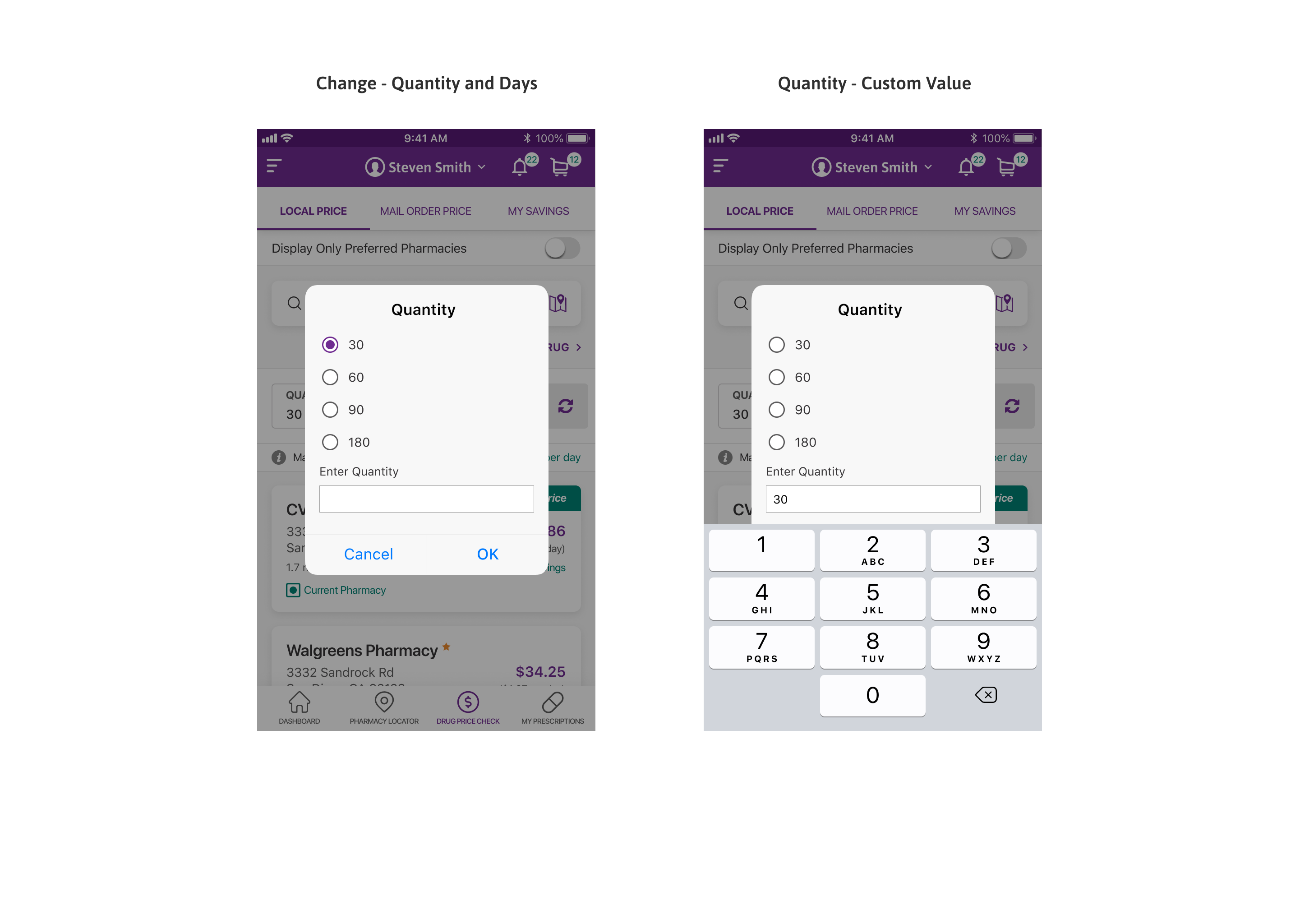
Switch the pharmacy used for pricing and confirm the price updates.6/7
Refill a prescription from the My Prescriptions list.7/7
Filter claims history by date range and drug to find a specific claim.6/7
Find a recommended vaccine and locate a nearby pharmacy to get it.7/7
Compare two plans during open enrollment.4/7
Share a claims record with a caregiver by email.6/7
Turn on auto-refill for a prescription.7/7
Check how much of the annual deductible has been met.6/7
Add a dependant and switch to their account view.4/7
Set a dose reminder in the Medicine Chest.7/7
Pass
Delayed
Failed

Key Findings

Severity 3Must Fix

Starting a Plan Comparison

2 of 7 participants weren't sure how to begin comparing plans during open enrollment. We added a clearer entry point and a short prompt noting that up to three plans can be compared at once.
Severity 2Improve

Pharmacy Switch Feedback

1 participant didn't notice that prices had updated after switching pharmacy. We added a brief highlight on the updated prices so the change is easy to catch.

Severity 1Cosmetic

Removable Filter Pills

1 participant didn't realize the keyword filter pills on Claims History could be removed. We added a clear remove affordance and a short tooltip.


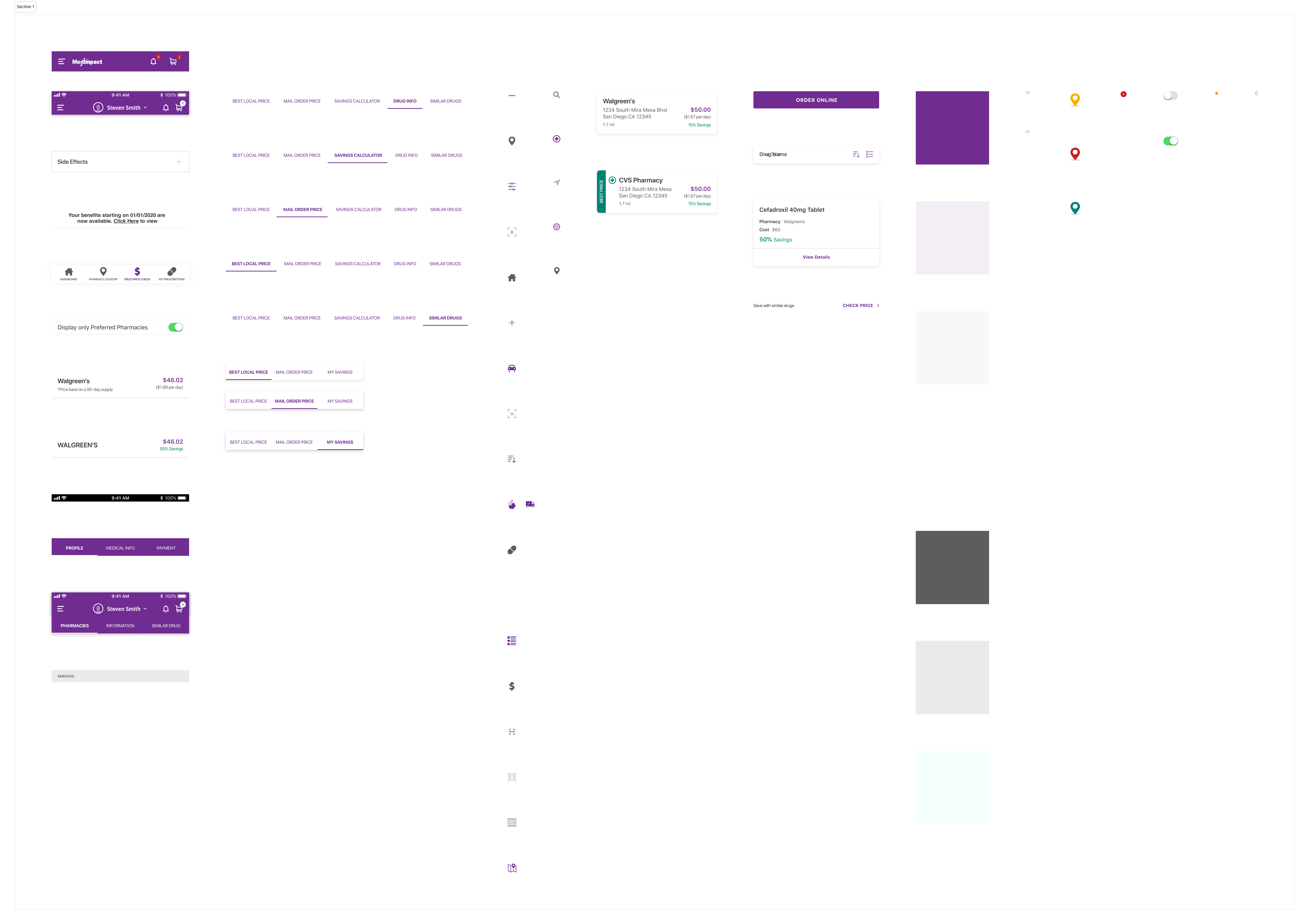
Developer Handoff

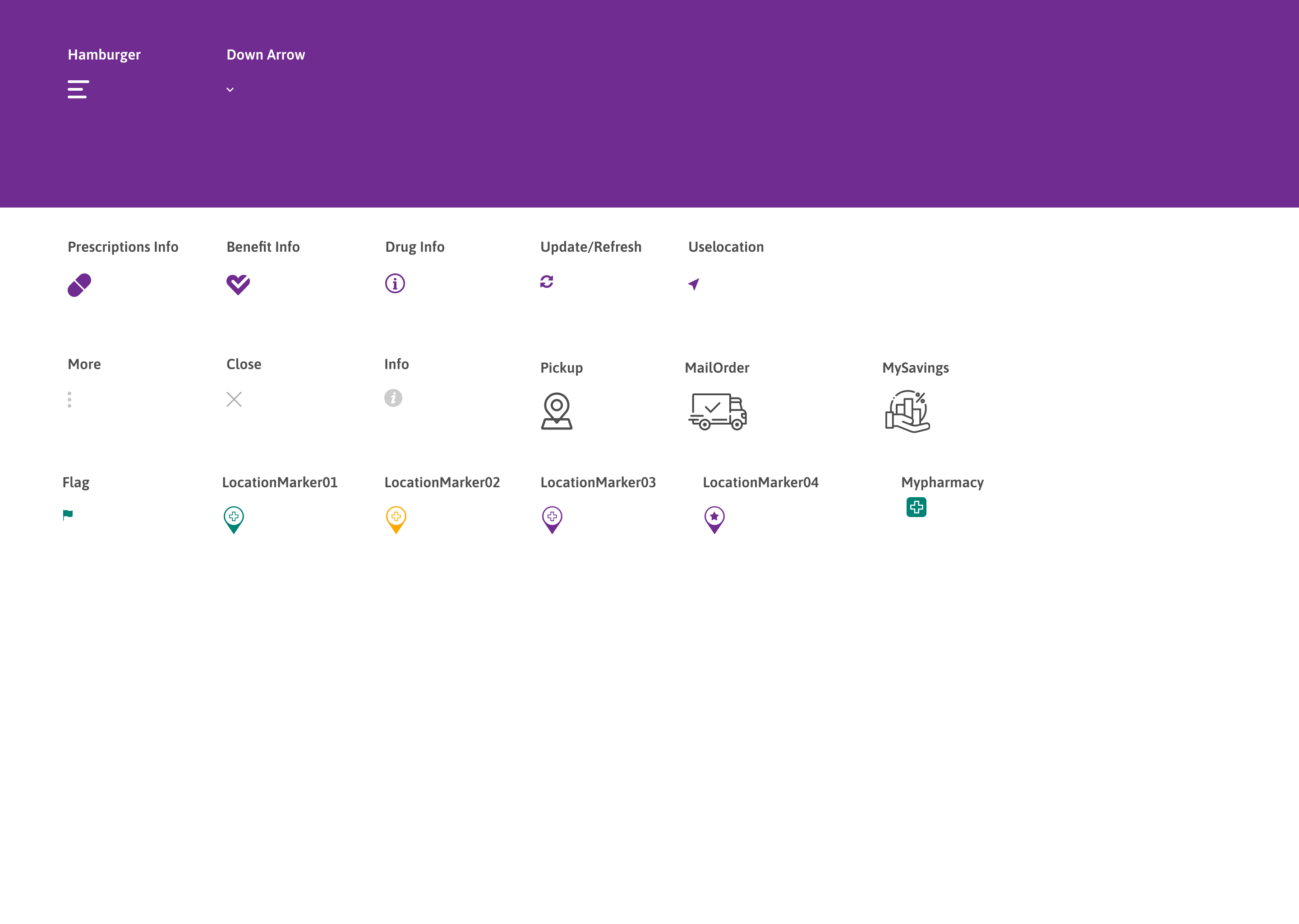
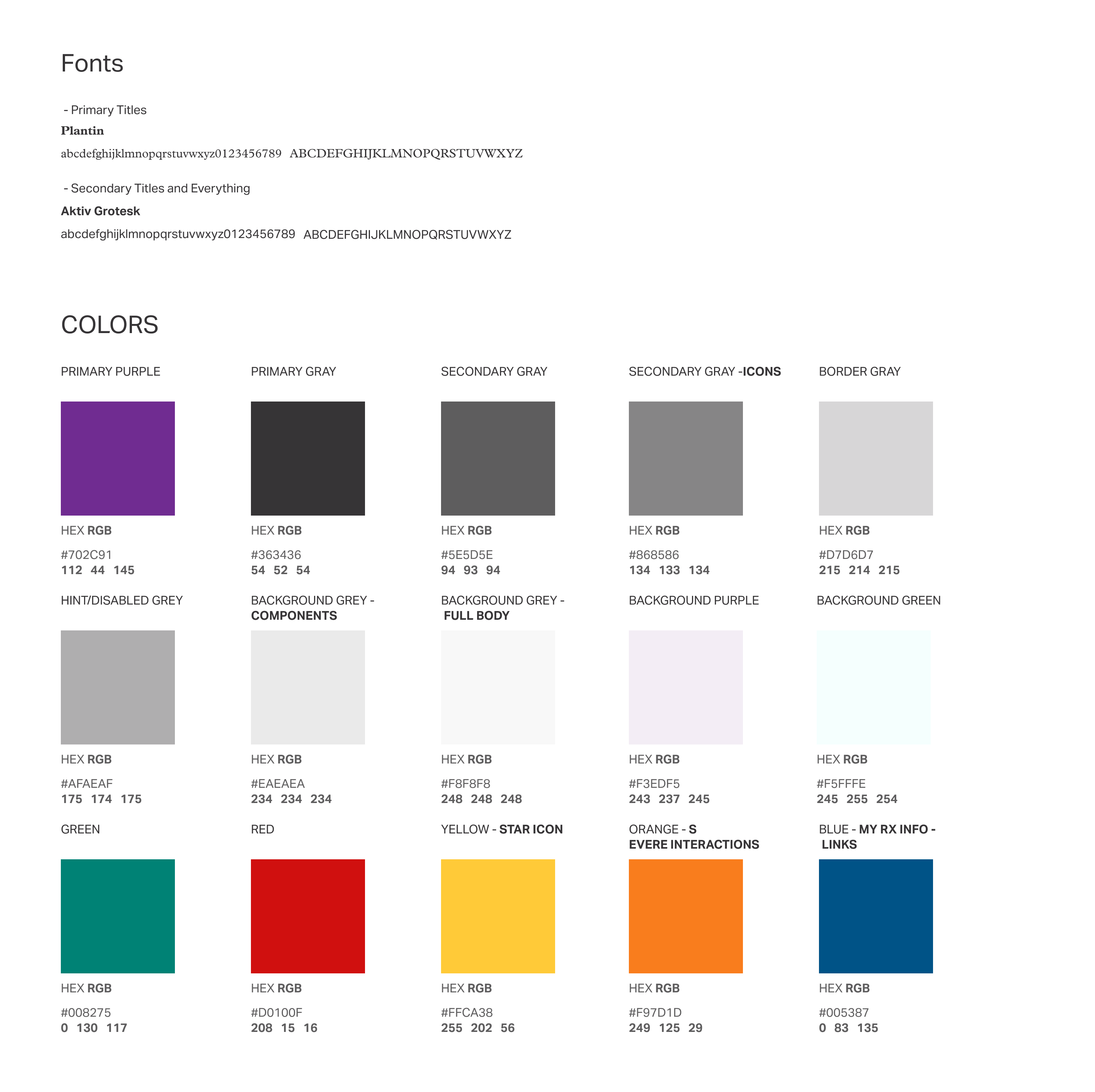
The handoff files cover the full icon set, color and type styles, and redlined specs for every screen and state, organized so developers can reference components and their variants at a glance.

MedImpact developer handoff spec

Client Feedback

After the project, the product manager I worked with completed a UX/UI client feedback survey and left a recommendation on my LinkedIn. Here is the full response.

UX / UI Client Feedback Survey

1 response · Product Manager, Photon

Overall rating: Excellent

Overall

Overall, how do you feel about your experience working with Christopher Torres as your UX/UI design service provider?

Excellent

UX / UI design services

Innovation / Creativity

Excellent

Reliability

Excellent

Speed of project completion

Excellent

Support provided

Excellent

Working with Christopher

Would you rate Christopher Torres as easy, or difficult to work with?

Excellent - Very easy to work with

How do you feel about the way Christopher performed in your team environment?

Excellent - An amazing team player

Friendliness

Very friendly

Professionalism

Extremely Professional

Solving the problem

Do you feel that Christopher was interested in solving your UX/UI challenges?

Very interested

When solving UX/UI problems, how would you rate the solutions that Christopher provided?

Extremely well presented and understandable

How would you rate Christopher's understanding of your UX/UI challenges?

Very satisfied that my UX/UI challenges were understood

Outcome

Were all of your UX/UI challenges solved during this engagement? (that were included in your original project scope)

Yes

How would you rate Christopher's UX/UI skills as compared to that of other designers you have worked with?

Better than other designers I have worked with

If you were given the opportunity, would you hire another UX/UI designer to redesign the work Christopher provided to you?

No

If given the opportunity, would you work with Christopher again?

Absolutely Yes

In their words, would you hire another designer to redesign the work?

“The work done was thorough and meets our needs. I don't see a reason to have another designer to perform a redesign.”


Final Takeaways

What I Learned

Clear presentation of cost and plan information was the most important factor for members in this product.
Showing costs before a decision had a larger effect on the experience than any individual feature.
Meeting with the product team every day kept design and development aligned and reduced rework.

Because many members used the portal only on mobile, mobile was treated as a primary target rather than a secondary one.