BLEND METRICS

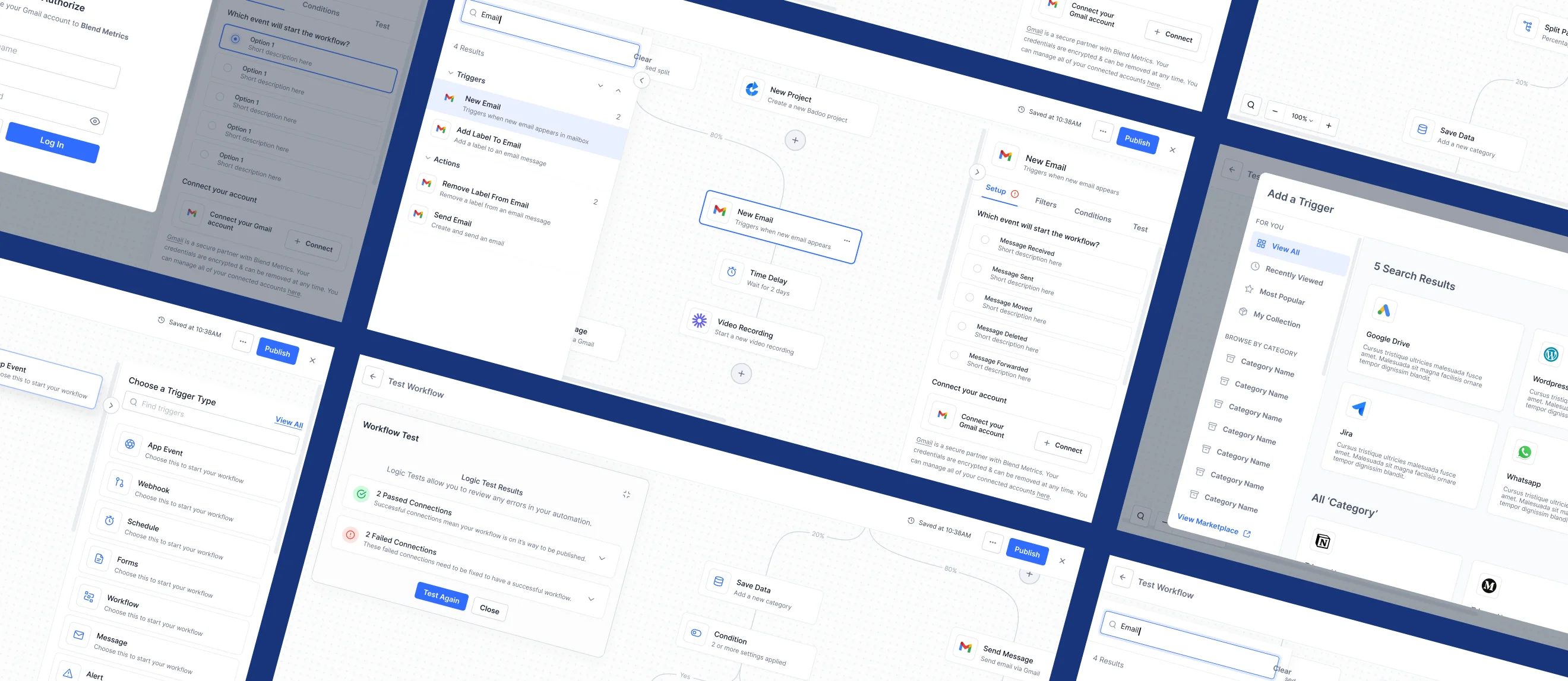
New API Integration workflow builder to be more intuitive and flexible

Blend Metrics platform overview

ABOUT THE PROJECT

Designing for Control

Blend Metrics is an API integration platform that helps businesses connect their tools through visual workflow automations. The existing builder worked, but it wasn't intuitive. Users struggled to set up conditional logic, couldn't easily test their workflows before publishing, and had no clear way to handle branching paths or error states.

So I was brought in to redesign the entire workflow builder experience from the ground up.

I led the UX strategy and visual design for a new drag-and-drop canvas, a smarter sidebar configuration system, conditional and percentage-based split paths, inline validation, and a full testing flow, all built on top of a custom design system I created specifically for this product.

The goal? Give users the confidence to build complex automations without second-guessing every step.
ROLE

Senior UX Architect

UX Strategy & Direction

UI Design System

Hi-Fidelity Visual Design

CLIENT

Blend Metrics


The Problem

The idea behind the workflow builder was straightforward: Pick a trigger → Add your steps → Publish.

But the actual experience was far from straightforward. The original builder tried to support everything, triggers, actions, conditional logic, split paths, testing, but without enough visual structure or feedback. During internal reviews and early user sessions, the same question kept coming up: "Wait... did this actually work?"

Users were building workflows but couldn't tell if they were configured correctly until something broke in production.

Problem 01: Canvas Confusion

Users didn't know where to start. The canvas had no empty states, no onboarding hints, and no visual hierarchy. Dropping a trigger onto a blank screen felt like guessing, not building.

Problem 02: Invisible Logic

Conditional branching was powerful but opaque. Users had no way to tell at a glance:

  • Which path a condition would trigger
  • Whether their logic was complete
  • What happened to contacts who didn't match any rule

Split paths were especially confusing. There was no visual distinction between conditional and percentage-based splits, and no inline validation to flag missing rules.

Problem 03: Publish and Pray

There was no way to test a workflow before it went live. Users would publish, wait for real data to flow through, and then discover broken connections or misconfigured steps after the fact. No test mode. No error preview. No safety net.

I built the whole thing and hit publish,
but I have no idea if it actually works.

👀 What We Noticed Early

Even power users were avoiding the advanced features. They'd build simple linear workflows and skip conditional logic entirely because the interface made it feel too risky. That's when we knew the problem wasn't the feature set. It was the experience around it.


Design Requirements

🧊 Show, Don't Tell

The canvas should communicate workflow state visually. Connection lines, color-coded nodes, inline status badges, and error highlights should make the builder self-explanatory without documentation.

"I shouldn't have to click into every node to know if my workflow is set up right." - Early tester

🛡 Prevent Errors Before They Happen

Inline validation, required-field indicators, and error states on the canvas should catch configuration issues before users ever hit "Publish." The system should protect users from shipping broken automations.

👁 Make Complex Logic Approachable

Conditional splits, percentage routing, and AND/OR logic are powerful features. But they shouldn't feel like writing code. The interface should make branching logic feel like a visual decision tree, not a spreadsheet formula.

💬 Keep the Canvas Clean

No matter how complex the workflow gets, the canvas should stay readable. Auto-layout, consistent node sizing, and curved connection lines should keep multi-step automations visually organized.

Test Before You Ship

Users need a way to validate their entire workflow before publishing. A built-in test runner that shows passed and failed connections, with inline error highlights, gives users the confidence to go live.

Design for the Builder's Workflow

Auto-save, version history, undo support, and contextual sidebars should let users build iteratively without fear of losing progress. The builder should feel like a creative tool, not a form.


The Solution

We didn't just polish the existing builder. We rethought the entire workflow creation experience.

We rebuilt the canvas with drag-and-drop interactions, added a contextual sidebar that adapts to whatever node you're configuring, and introduced split paths with both conditional and percentage-based routing. Then we layered in a full test-before-publish flow so users could validate their automations before going live.

Every decision was guided by one question: "Can the user tell what's happening and feel confident it's correct?"

Here's what changed:

Visual Drag & Drop Canvas

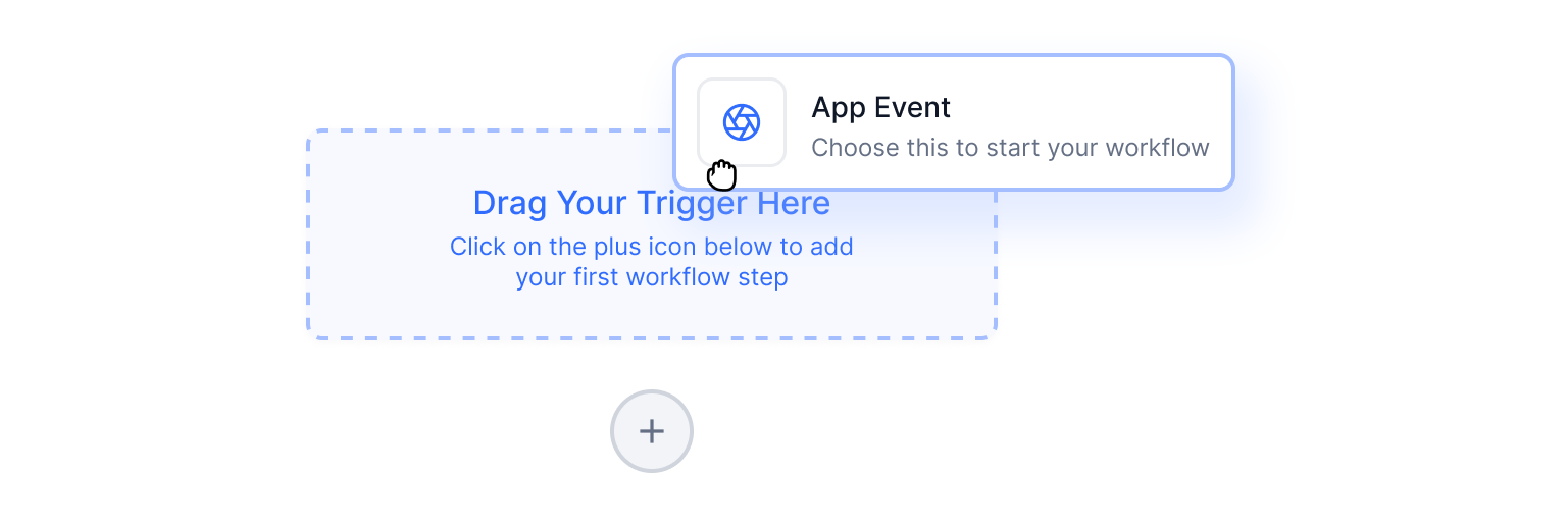
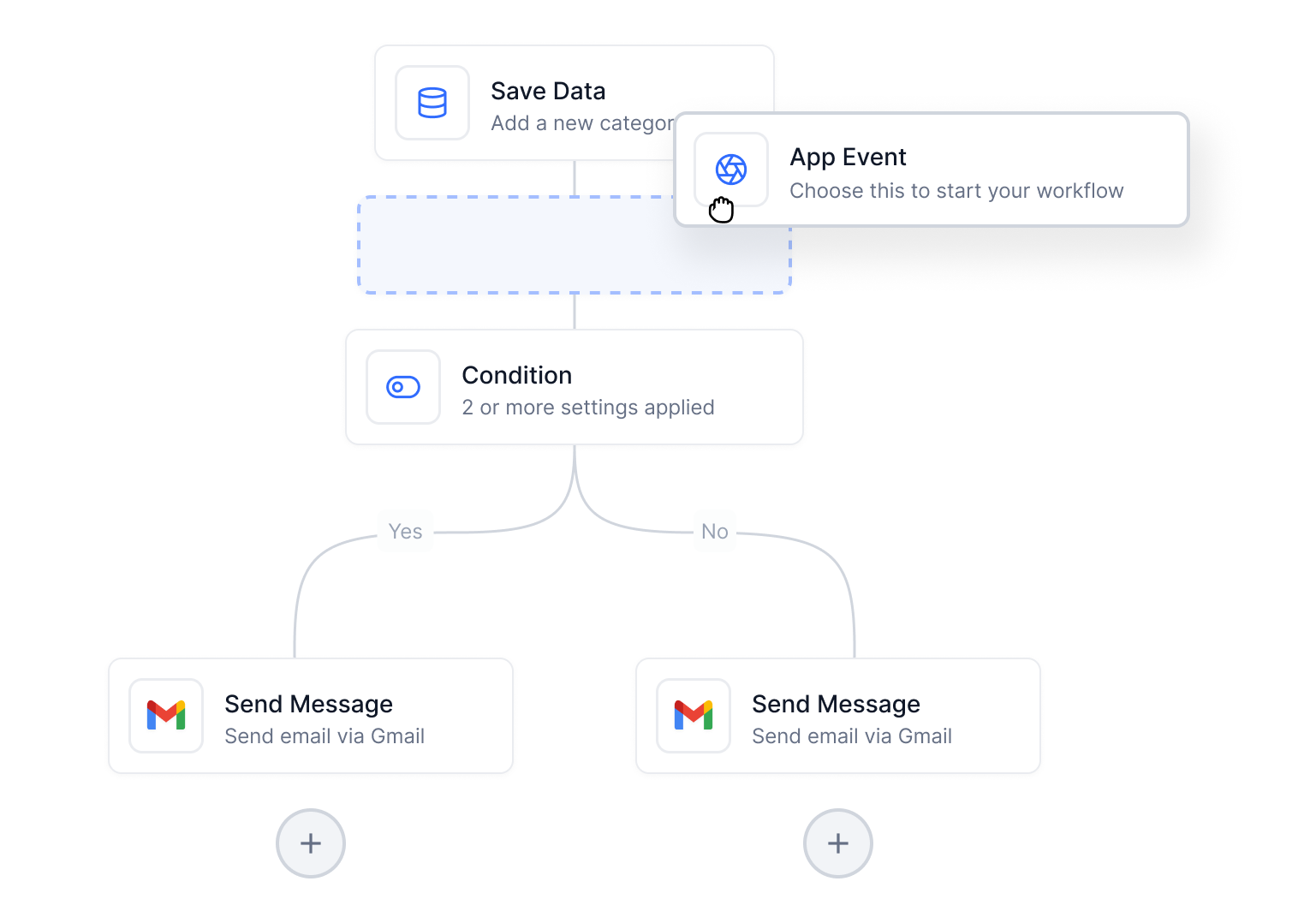
A three-step interaction: empty drop zone appears, highlights on hover, snaps on release. Users always know where a node will land.

Contextual Sidebar

The sidebar adapts to the selected node, showing trigger setup, action configuration, or split path conditions with tabbed navigation.

Conditional & Percentage Splits

Two split types give users full control over branching logic: route by data conditions or distribute traffic by percentage for A/B testing.

Inline Validation

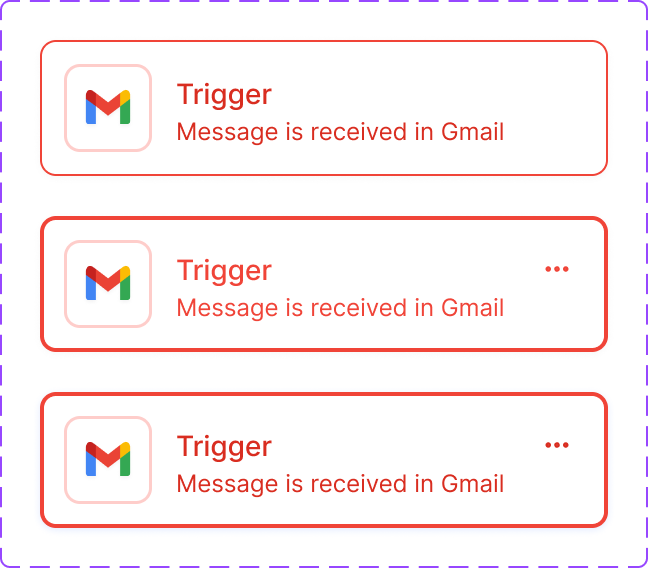
Unconfigured nodes get red error borders and warning icons on the canvas. Users see problems before they publish, not after.

Built-in Test Runner

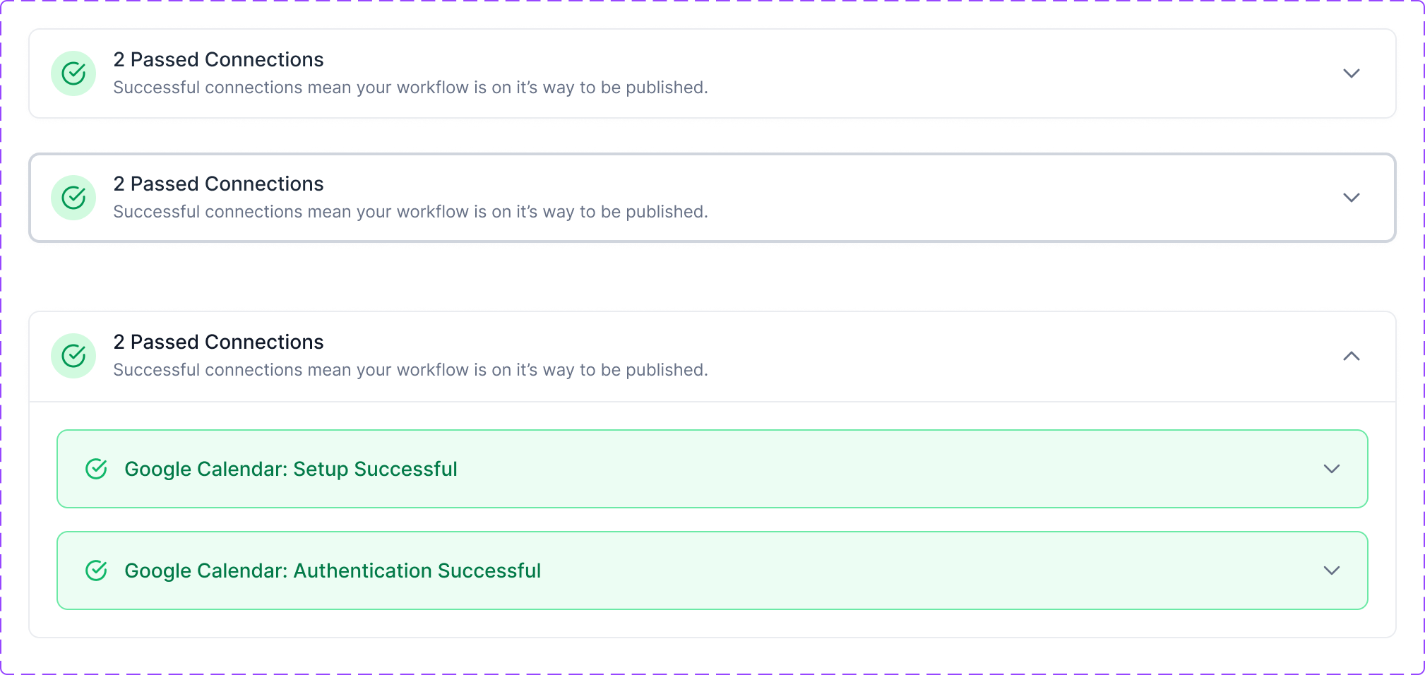
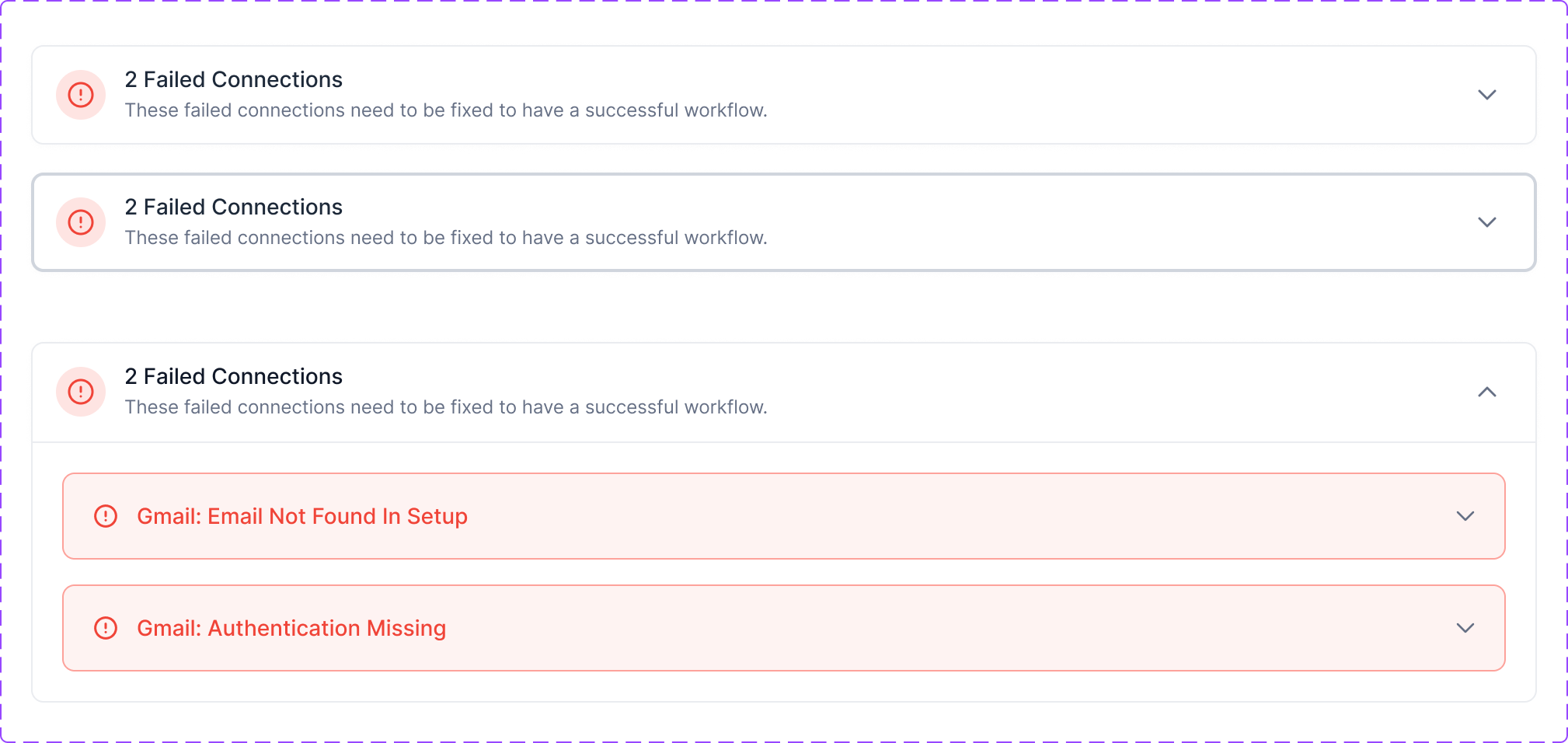
A pre-publish test panel shows passed and failed connections with expandable details. Error nodes are highlighted directly on the canvas.

Auto-save & Version History

A persistent save indicator in the header shows real-time status. Version history lets users roll back changes without losing their work.

The result was a builder where users could see their logic, validate their setup, and publish with confidence.


My Design Process

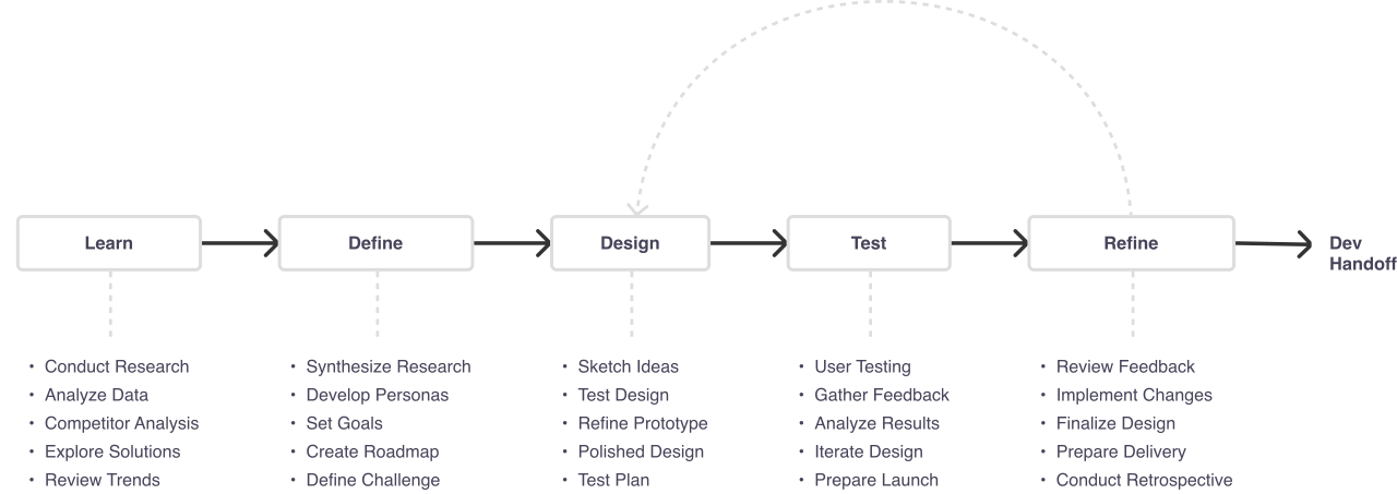
The same process runs through every project I take on. Learn, define, design, test, refine, then hand off. The loop from refine back to design is the part that matters most: nothing here is a straight line, and the workflow builder took several passes before the canvas told users what they needed to know.

Design process: Learn, Define, Design, Test, Refine, then Dev Handoff, with an iteration loop from Refine back to Design. Each step lists its tasks below it.

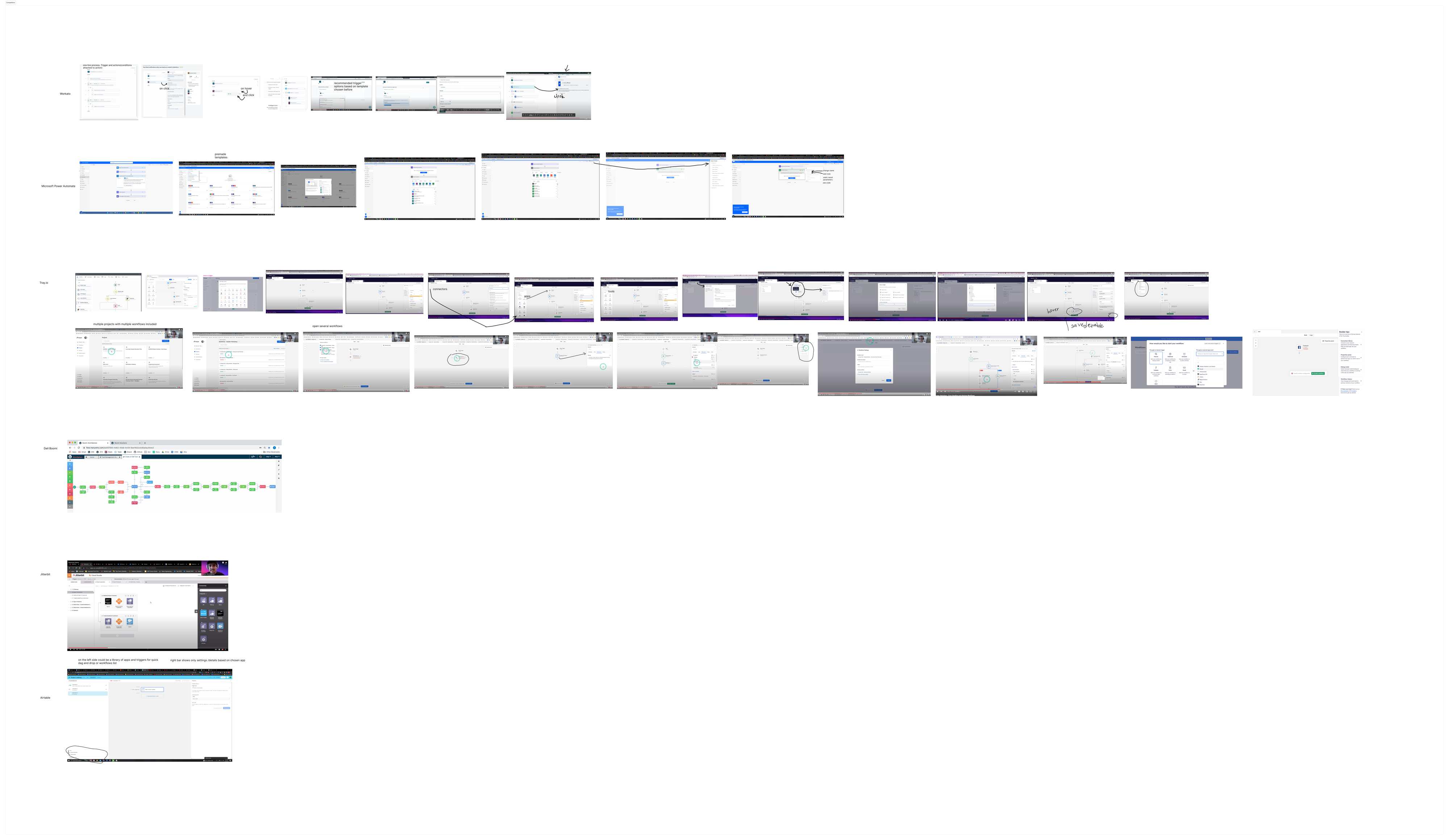
Market Research

Comparing the Competition

Before committing to any design direction, we studied other workflow and automation platforms to see how they handle the same challenges we were solving.

We analyzed a mix of direct and indirect competitors:

  • Zapier (the market leader, simple but limited visual feedback)
  • Make (formerly Integromat, powerful but visually dense)
  • n8n (open-source, developer-friendly, steep learning curve)
  • HubSpot Workflows (polished but rigid branching)
  • Workato, Tray.io (enterprise-grade, complex onboarding)

🔎 What We Were Looking For

Canvas Clarity

How readable is the workflow at a glance?

Error Visibility

Can users spot broken connections before publishing?

Branching UX

How intuitive is it to set up conditional or split-path logic?

Testing Support

Can users validate workflows before they go live?

✖ Where They Fell Short

🧱 Zapier & HubSpot

  • Linear step lists that don't scale visually for complex automations
  • Branching logic feels bolted on rather than native to the builder
  • No inline validation or canvas-level error highlighting

🧩 Make & n8n

  • Powerful visual canvases, but overwhelming for non-technical users
  • Dense node configurations that require deep product knowledge to navigate

💬 Workato & Tray.io

  • Enterprise-grade features behind complex onboarding flows
  • Strong testing tools, but the setup process itself needs a tutorial

These gave us a clear benchmark: powerful logic needs an approachable interface, not just more features.

Competitive Analysis

Competitive analysis board: Zapier, Make, n8n, HubSpot, Workato, Tray.io

Best In Class

Best in class board: workflow builder patterns and UI benchmarks

User Research

Competitor teardowns told me what the category had settled on. They could not tell me why Blend Metrics’ own users were abandoning workflows halfway through. For that I ran a survey to size the problem, then interviews to understand it.

34 survey responses from people who had built at least one workflow in the previous month, and 8 follow-up interviews of roughly 30 minutes each with the operations and marketing people who live in this tool daily.

What the Survey Told Us

The survey was deliberately short. Five questions, all about the moment before and after publishing, because that is where the support tickets clustered.

Before publishing, how confident are you that the workflow is set up correctly?

n = 34

Where do you lose the most time in the builder?

n = 34, single choice

When a workflow fails, how do you find the problem?

n = 34, single choice

Two numbers reframed the project. 68% would not publish without manually checking the workflow first, and 62% debug by opening every step in turn. People were not asking for more power. They were doing the builder’s job for it, holding the whole workflow’s state in their head because the canvas would not show it to them.

What We Asked in Interviews

The survey said where time went. The interviews said why. I kept the questions behavioral, asking what people actually did last time rather than what they think of the product.

  1. Walk me through the last workflow you built. Where did you get stuck?
  2. How do you know a workflow is working before you turn it on?
  3. Tell me about a time one broke. How did you find out, and what did you do next?
  4. When a workflow needs to do different things for different people, how do you set that up today?
  5. What goes through your head right before you hit publish?

What They Told Us

Different words, same three frustrations, and each one maps to a theme that came out of the affinity map.

I click into every single step before I publish, just to be sure. That takes longer than building the thing did.
Operations lead, 40-person SaaSConfiguration clarity
I avoid branching. If I need two paths I build two separate workflows, because at least then I know which one broke.
Marketing operations managerBranching anxiety
You publish it and wait to see if someone complains. That is the test.
Automation specialist, agencyTesting & validation

Affinity Mapping

We gathered notes from user interviews, internal feedback sessions, and early usability tests, then grouped them to find the patterns.

Users were articulating frustrations differently, but the underlying themes were consistent. Whether they were talking about triggers, conditions, or testing, the same anxieties kept surfacing.

Once we clustered everything, it became clear: we weren't just solving for layout or interaction. We were solving for confidence.

Common Themes We Found

💬 Configuration Clarity

  • "I set up the trigger but I'm not sure it's actually connected."
  • "Which fields are required vs. optional?"

🧩 Branching Anxiety

  • "I added a split path but I don't know what happens to contacts who don't match."
  • "Can I see all conditions at once without clicking into each path?"
  • "What if I accidentally delete a path with steps in it?"

👥 Testing & Validation

  • "How do I know this works before I publish it?"
  • "Can I run a test with sample data?"
  • "Where do I see what failed and why?"

💸 Workflow Management

  • "Does it auto-save or do I have to manually save?"
  • "Can I go back to a previous version?"
  • "What happens if I accidentally close the tab?"

💡 What This Told Us

Users didn't want fewer features. They wanted more visibility. So every design decision from here on, inline validation, test runners, auto-save indicators, confirmation dialogs, was built to answer one question: "Can I trust what I just built?"

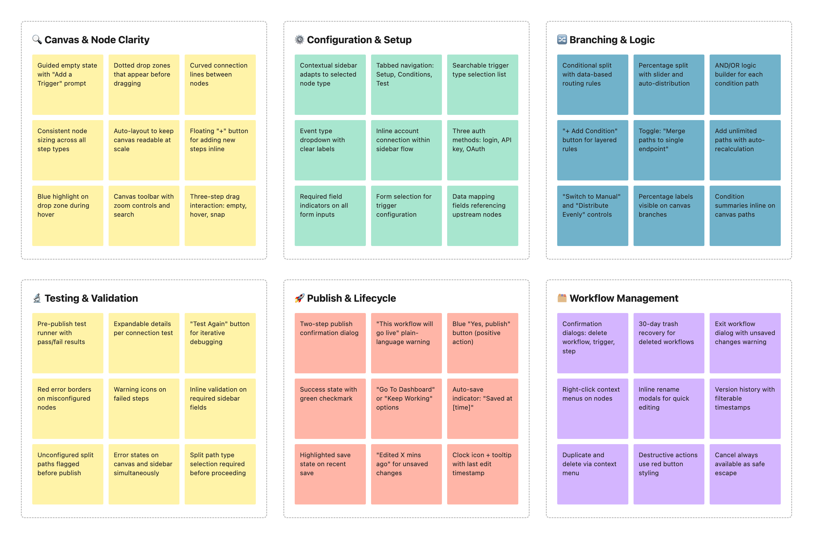
Affinity map: Canvas & Node Clarity, Configuration & Setup, Branching & Logic, Testing & Validation, Publish & Lifecycle, and Workflow Management themes

Feature Prioritization

Once we had a clearer picture of what users needed, we mapped out every possible feature and sorted them by impact, effort, and user confidence. The question at the center of every decision: "Will this help users build and publish workflows with less doubt?"

If the answer wasn't a clear yes, it didn't make the cut.

✅ Must-Have

  • Drag-and-drop canvas with visual drop zones
  • Contextual sidebar with Setup, Conditions, and Test tabs
  • Conditional split paths with AND/OR logic builder
  • Percentage-based split paths with auto-distribution
  • Inline validation with error borders and warning icons
  • Pre-publish test runner with pass/fail results
  • Auto-save indicator and confirmation dialogs

🤔 Nice-to-Have (Later)

  • Version history with rollback support
  • Workflow templates and cloning
  • Real-time collaboration on the canvas
  • Advanced analytics per workflow node

❌ Will Not Have

  • Code-based workflow editor
  • Custom node creation from scratch
  • Cross-workflow dependency chains
  • AI-generated workflow suggestions

This helped us stay focused. We didn't chase power-user features. We prioritized clarity and validation at exactly the points where users tend to lose confidence.

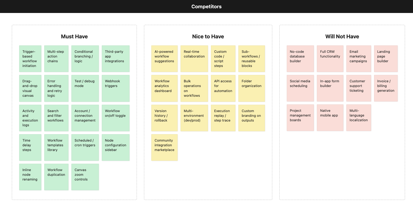
Card sorting: Competitors - Must Have and Nice to Have features from Zapier, Make, n8n, HubSpot
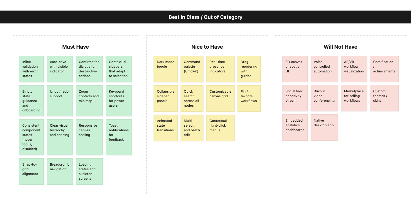
Card sorting: Best in Class / Out of Category - UX patterns from top builder tools

User Journey

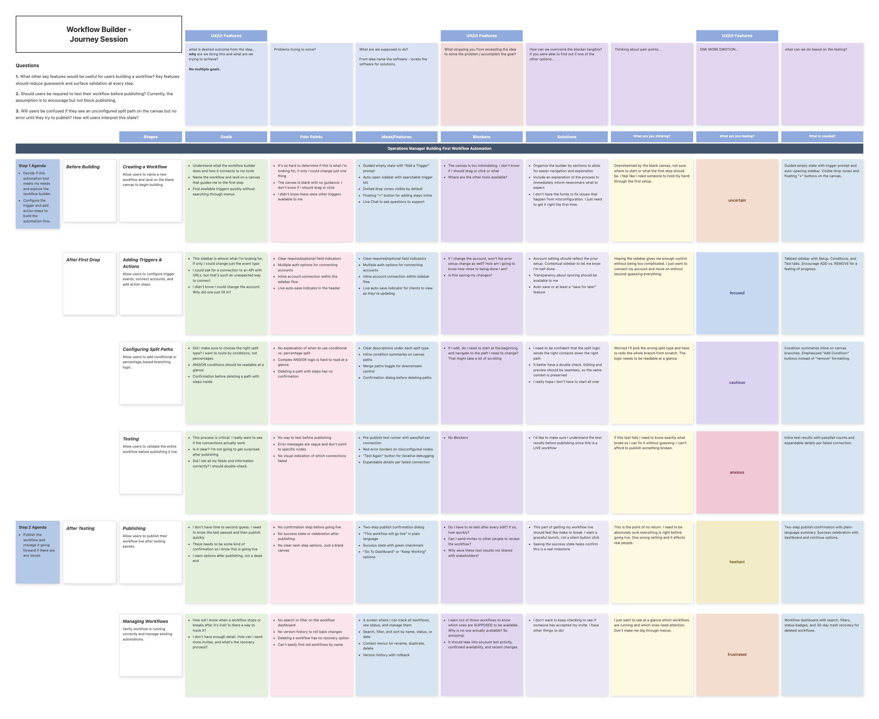
We mapped out what it actually felt like to build a workflow in Blend Metrics, from opening a blank canvas to publishing a live automation. The journey revealed hidden friction points at every stage. Users weren't just clicking nodes. They were guessing, backtracking, and abandoning workflows they weren't sure would work.

💡 Where Things Got Messy

  • No guided empty state on the blank canvas
  • No visual feedback when nodes were misconfigured
  • No way to test a workflow before publishing
  • No confirmation or success state after going live

😰 What We Had to Fix

To create a smoother, more confident builder flow, we focused on the moments that triggered doubt and redesigned them with clarity in mind:

  • Added guided empty states and drop zone hints on the canvas
  • Introduced inline validation with red error borders and warning icons
  • Built a pre-publish test runner with pass/fail results per connection
  • Created confirmation dialogs and success states for every destructive or milestone action

We weren't just mapping clicks. We were mapping confidence levels. Because automation builders don't lose users at the start. They lose them in the middle, when things get complex and there's no feedback telling them they're on the right track.

Workflow Builder Journey Session board
Phase
1. Creating
a Workflow
2. Adding
Triggers & Actions
3. Configuring
Split Paths
4. Testing
5. Publishing
6. Managing
Workflows
Emotions
Uncertain where
to start building
Focused but unsure
about node setup
Cautious building
branching logic
Anxious about
broken connections
Hesitant to push
workflow live
Frustrated tracking
multiple workflows
Actions

1A. Name the workflow and land on a blank canvas.

1B. Look for guidance on where to start. Try to find available triggers.

1C. Drag a trigger onto the canvas and see it snap into place.

2A. Open the sidebar to configure the trigger's event type and account.

2B. Add action steps via the "+" button or by dragging from the panel.

2C. Connect a third-party account using one of the authorization methods.

3A. Add a Split Path node and choose conditional or percentage split.

3B. Define conditions using the AND/OR logic builder for each path.

3C. Add action steps to each branch. Toggle merge paths on or off.

4A. Click "Test" to run the pre-publish validation.

4B. Review passed and failed connections in the results panel.

4C. Click error-highlighted nodes on the canvas to fix issues inline.

5A. Click "Publish" and review the confirmation dialog.

5B. Confirm the workflow will go live. See the success state.

5C. Choose "Go to Dashboard" or "Keep Working" as next step.
6A. Browse the workflow dashboard to find existing automations.

6B. Use context menus to rename, duplicate, or delete workflows.

Thoughts

1A. "This blank canvas is intimidating. Where do I even start?"

1B. "I hope I don't break something by dragging the wrong thing."

2A. "Which fields are required? I don't want to miss something."

2B. "I hope this auto-saves. I don't want to lose my setup."

3A. "I need conditional logic but I'm not sure which split type to use."

3B. "What happens to contacts who don't match any condition?"

4A. "I really hope this works. I've spent too long setting this up to start over."

5A. "Is this actually going to go live right now? What if something's wrong?"

5B. "I wish I could see a summary of everything before confirming."

6A. "I need to find the workflow I built last week but I can't remember what I named it."

Pain Points

1A. Blank canvas gives no guidance on first steps.

1B. No empty state explaining the trigger-first workflow.

1C. Drop zones aren't visible until you start dragging.

2A. Required fields aren't clearly marked in the sidebar.

2B. Account connection flow interrupts the configuration flow.

2C. No indication of save status after making changes.

3A. No explanation of when to use conditional vs. percentage split.

3B. Complex AND/OR logic is hard to read at a glance.

3C. Deleting a path with steps has no confirmation dialog.

4A. No way to test before publishing.

4B. Error messages are vague and don't point to specific nodes.

4C. No visual indication of which connections failed.

5A. No confirmation step before going live.

5B. No success state or celebration after publishing.

5C. No clear next-step options after publish.

6A. No search or filter on the workflow dashboard.

6B. No version history to roll back changes.

6C. Deleting a workflow has no recovery option.

Insights /
Opportunities

1A. Add a guided empty state with "Add a Trigger" prompt.

1B. Auto-open sidebar with available trigger types.

1C. Show drop zones proactively on the canvas.

2A. Mark required fields with clear visual indicators.

2B. Keep account connection inline within the sidebar flow.

2C. Add persistent auto-save indicator in the header.

3A. Add descriptions under each split type explaining the use case.

3B. Show condition summaries inline on the canvas paths.

3C. Add confirmation dialog before deleting paths with content.

4A. Build a pre-publish test runner with pass/fail per connection.

4B. Highlight error nodes on the canvas with red borders.

4C. Add "Test Again" for iterative debugging.

5A. Add two-step confirmation dialog before publishing.

5B. Celebrate with a success state and green checkmark.

5C. Offer "Go to Dashboard" and "Keep Working" options.

6A. Add search and filter to the workflow dashboard.

6B. Add version history with rollback support.

6C. 30-day trash recovery for deleted workflows.


User Flows

We mapped five core flows that represent the full lifecycle of building and managing a workflow automation. Each one was designed to reduce cognitive load at the exact moments where users tend to hesitate, second-guess, or abandon the process entirely.

Flow 1: Creating a Workflow

Open Workflow Builder → Click "New Workflow" from the dashboard → Name the workflow in a modal dialogLand on Canvas → Guided empty state appears with "Add a Trigger" prompt → Dotted drop zone shows where to startSelect First Trigger → Sidebar auto-opens with searchable trigger list (App Event, Webhook, Schedule, Forms) → Drag trigger onto the canvas drop zoneTrigger Activates → Drop zone changes color to confirm placement → Sidebar switches to trigger setup with Setup/Conditions/Test tabs → Floating "+" button appears for adding next steps

The biggest risk here was the blank canvas. Early versions dropped users onto an empty screen with no guidance. We solved this with a guided empty state that tells users exactly what to do first, eliminating the "where do I even start?" moment.

Flow 1, Creating a Workflow: dashboard to first trigger on canvasWorkflowDashboardClick CreateWorkflowName WorkflowModalEnter workflownameBlank CanvasEmpty StateClick “Add aTrigger”Sidebar DrawerTrigger ListTriggerfound?Drag trigger todrop zoneTrigger ActiveSetup TabTrigger oncanvasSearch fortrigger

Flow 2: Configuring Triggers & Actions

Configure Trigger → Select event type from dropdown → Connect account via inline OAuth flow → Required fields marked with clear indicatorsAdd Action Steps → Click "+" button or drag from sidebar panel → Choose action type (Send Email, Save Data, API Call) → Each step auto-opens its setup sidebarMap Fields → Map data from trigger to action fields → Dynamic field suggestions based on connected apps → Live preview of mapped valuesBuild the Sequence → Add multiple actions in sequence → Reorder via drag and drop → Live auto-save indicator confirms progress is preserved

Users needed to feel like they were making progress, not just filling out forms. The sidebar stays contextual to whatever node is selected, and the auto-save indicator removes the anxiety of losing work mid-setup.

Flow 2, Configuring Triggers and Actions: connect accounts, configure events, map fieldsTrigger oncanvasTrigger SetupSidebarAccountconnected?Select triggerevent typeTriggerscomplete?Click + toadd stepSidebar DrawerAction ListDrag actiononto canvasAction SetupTabMap fields viadata flyoutStepscomplete?SequencebuiltAuthorizationWindowClick Connectto authorize

Flow 3: Configuring Split Paths (Branching Logic)

Add Split Path Node → Choose between Conditional Split or Percentage Split → Clear descriptions explain when to use each typeDefine Conditions → Build rules with AND/OR logic builder → Inline condition summaries appear on canvas paths → Readable at a glance without opening the sidebarAdd Steps to Branches → Each branch gets its own "+" button for adding actions → Merge paths toggle controls whether branches rejoin downstreamValidate Paths → Confirmation dialog before deleting paths with existing steps → Visual preview shows which contacts route down which path → Edit any branch without restarting from the beginning

Branching logic is where most workflow tools lose people. We made the split type decision easy with plain-language descriptions, kept conditions readable on the canvas itself, and added safeguards against accidental deletion of configured paths.

Flow 3, Configuring Split Paths: conditional and percentage branching logicConditionalPercentageSequencebuiltAdd Split PathnodeSplit Path SetupSidebarSplittype?Conditions TabAND/OR builderBuild conditionrulesData Flyoutfield pickerPercentage SplittabSet distributionacross pathsTotals100%?Name eachpathPath Previewcontact routingAdd steps toeach branchMergepaths?Set mergepointBranchingconfigured

Flow 4: Testing a Workflow

Initiate Test → Click "Run Test" from the toolbar or right-click context menu → Choose test scope: single step, single trigger, or entire workflowReview Results → Pass/fail indicator per connection → Green checkmarks for successful steps, red error borders for failed nodes → Expandable details show exactly what went wrongDebug & Fix → Click failed node to jump directly to its configuration → Fix the issue in the sidebar without leaving the test view → Error context preserved so users know what to changeRe-test → "Test Again" button for iterative debugging → Results update in real-time → All steps must pass before the publish button becomes available

Testing was the biggest trust-builder in the entire flow. Users told us they would never publish something they couldn't verify first. The inline debugging loop (test, see error, fix, re-test) kept them in flow state instead of bouncing between screens.

Flow 4, Testing a Workflow: run test, review pass/fail, debug failed nodesWorkflowbuiltOpen workflowoptions menuSelect “RunWorkflow Test”Test RunningstateTest Resultspass / fail perconnectionAll stepspass?Ready toPublishTestspassingExpand failednode detailsInline errordetail on nodeFix nodeconfiguration

Flow 5: Publishing & Managing Workflows

Publish → Two-step confirmation dialog: "This workflow will go live" in plain language → Blue "Yes, publish" button with cancel option → No ambiguity about what happens nextSuccess State → "Congratulations, your workflow is now live!" celebration screen → "Go To Dashboard" or "Keep Working" options → Clear next steps instead of a dead endManage from Dashboard → Track all workflows with status badges (Live, Draft, Paused) → Search, filter, and sort by name, status, or date → Context menus for rename, duplicate, pause, unpublish, and deleteLifecycle Actions → Pause or unpublish live workflows with confirmation → Version history with rollback to previous states → 30-day trash recovery for deleted workflows → Exit confirmation prevents accidental abandonment

Publishing should feel like a milestone, not a gamble. The two-step confirmation removes doubt, the success state provides emotional closure, and the dashboard gives users long-term control over everything they've built.

Flow 5, Publishing and Managing Workflows: two-step confirmation and dashboard managementTestspassingClick PublishPublish ConfirmStep 1Confirmpublish?Final ConfirmStep 2Success StateGo todashboard?WorkflowDashboardSearch, filter& sortWorkflow liststatus & versionhistoryPause, renameor deleteWorkflowmanagedBack tocanvasKeep workingon canvas

Legend

User flow legend: Start/End, Action, Screen/Page, DecisionStart/EndActionScreen/PageDecision
The hardest part wasn't building the features.
It was making complex logic feel effortless.

Wireframe Iterations

Workflow Canvas

V1 roughed out the empty state at low fidelity: a drop zone waiting for a trigger and a list docked to the right, with nothing named yet. V2 firmed it up: the drop zone got a prompt, a floating "+" hinted at the next step, and the trigger types got names. By V3 the blank page had become a guided starting point, with a clear "Add a Trigger" prompt, a searchable sidebar that opens on its own, and triggers you drag straight onto the canvas.

Version 1

Version 2

Version 3

Sidebar Configuration

V1 had a flat settings panel that showed all options at once. V2 introduced tabbed navigation (Setup, Conditions, Test) to organize complexity. By V3, the sidebar was fully contextual, adapting its content based on whether a trigger, action, or split path was selected, with inline validation for required fields.

Version 1

Version 2

Version 3

Split Path Builder

V1 only supported linear workflows with no branching. V2 introduced a basic conditional split with two paths. By V3, users could choose between conditional and percentage splits, add unlimited paths, define AND/OR conditions, and toggle whether paths merge or stay independent downstream.

Version 1

Version 2

Version 3

Test & Publish Flow

V1 had no testing at all, just a publish button. V2 added a basic "run test" that showed pass/fail as text. By V3, the test panel showed expandable results per connection, the canvas highlighted error nodes in red, and a confirmation dialog with success state celebrated the publish milestone.

Version 1

Version 2

Version 3

Multiple Triggers

V1 allowed exactly one trigger per workflow, so anything with more than one entry point had to be rebuilt as a separate automation. V2 supported a second trigger, but the connectors met at right angles and it was hard to tell which trigger fed which step. By V3, a workflow could hold up to five triggers, with curved fan-in connectors converging cleanly on the first action, and the "Add Trigger" affordance disappearing once the fifth was placed.
Version 1

Version 2

Version 3

Account Connection

V1 pushed users out to a third-party consent screen and dropped them back on a blank canvas with no memory of what they were configuring. V2 pulled the account row inline next to a Connect button. By V3, authorization happened entirely in the sidebar: a checkmark on the Setup tab confirmed completion, and plain-language copy explained that credentials are encrypted and can be revoked at any time.

Version 1

Version 2

Version 3

Path Naming & Merge Points

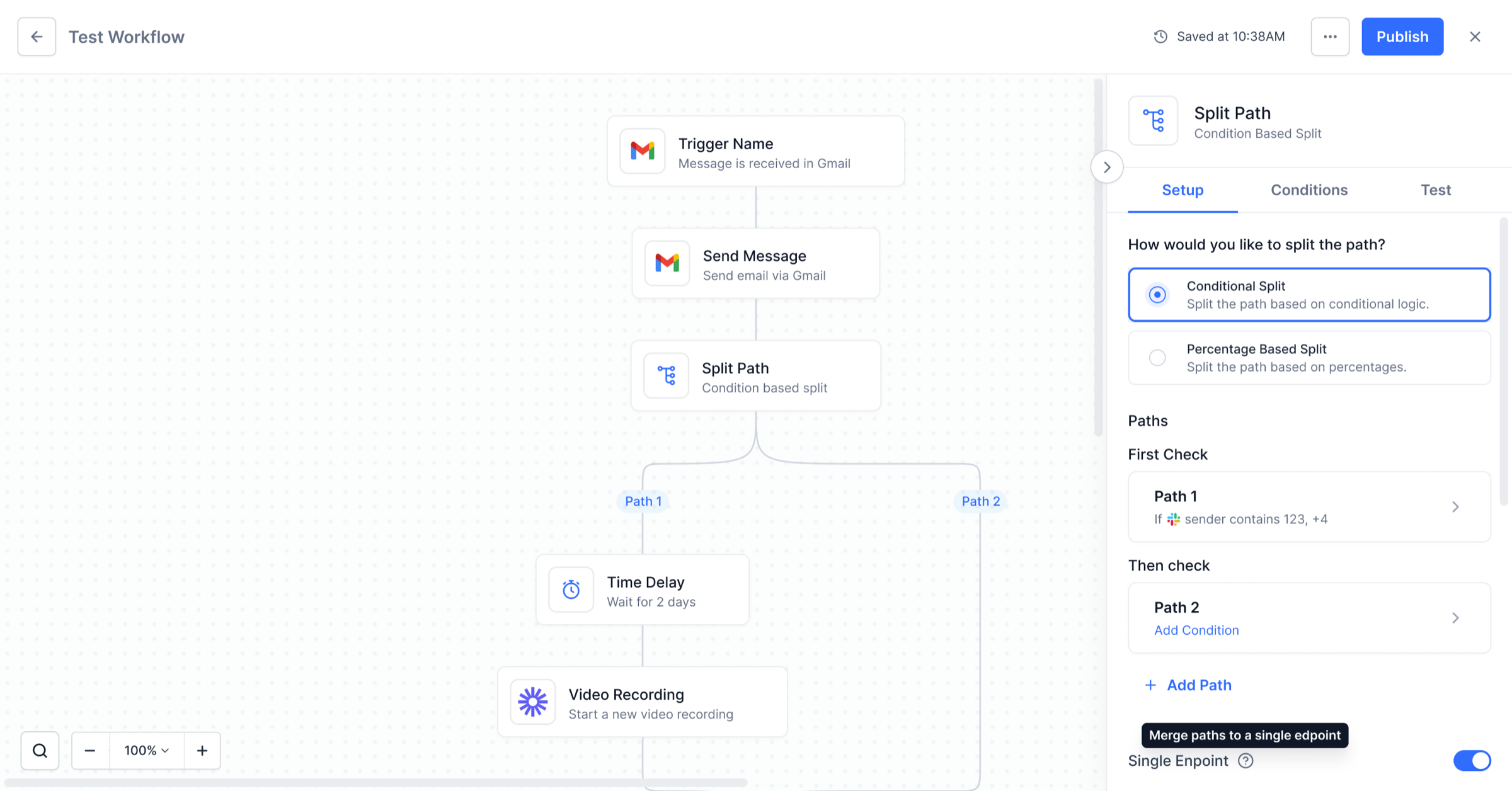
V1 left branches unlabeled, so a workflow with two paths gave no clue which condition sent a contact down which route. V2 added Path 1 and Path 2 chips on the canvas. By V3, paths could be renamed, a catch-all "Other" path caught anything matching no condition, and a Single Endpoint toggle merged the branches back to one node, shown on the canvas as a dashed outline converging on a single "+".

Version 1

Version 2

Version 3

Key Components

Not every decision needed a full screen. These three panels carried the most weight in testing: the trigger type picker that answers "how does this workflow start?", the trigger event list that narrows an app down to a specific event, and the condition builder where AND/OR logic is actually assembled. Getting the density and hierarchy right at this level is what made the wider canvas readable.

Trigger Type Picker

Trigger Event Setup

Condition Builder

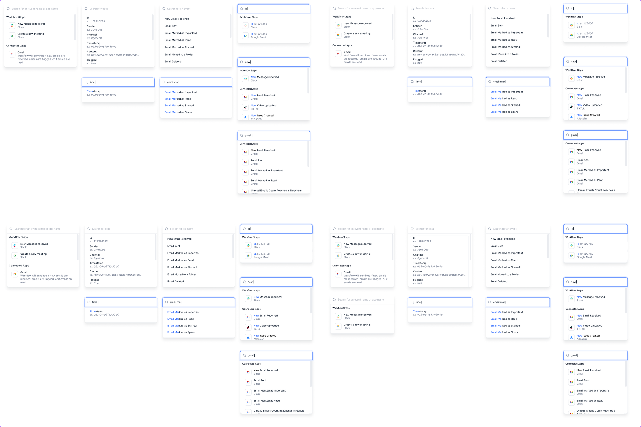
Step Library Popup

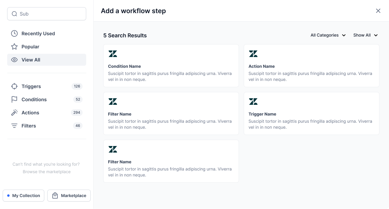
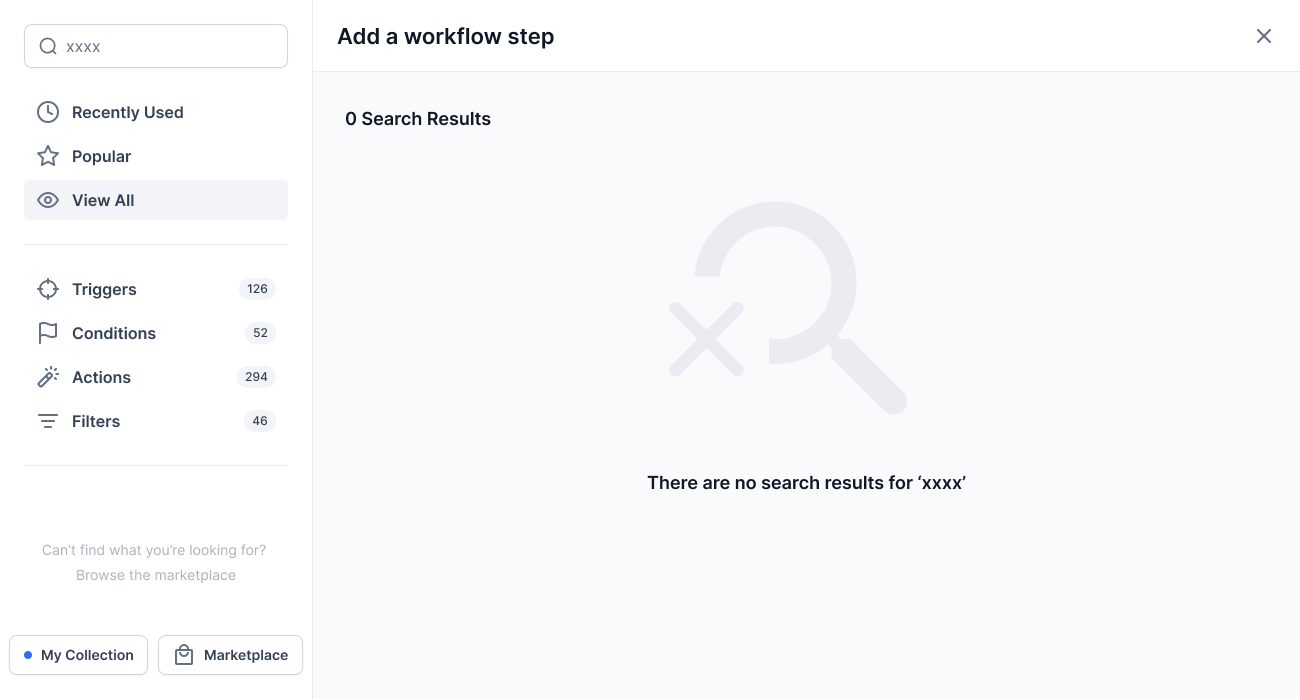
With 126 triggers, 52 conditions, 294 actions and 46 filters, the step library was the densest surface in the product. It had to stay browsable by category, scannable as a list, searchable across every type at once, and honest when a search returned nothing. These four states set the pattern for every picker in the builder.

Browse by category

List view

Search results

No results

Conditional Logic: States & Selectors

Conditional logic is where the builder either earns trust or loses it, and almost all of that happens inside small selectors. Users needed to nest AND/OR groups without losing the thread, pick an operator and a value in one motion, see what data a field actually holds before choosing it, and name a condition so it could be reused. These are the states that carried that weight.

Nested AND/OR groups

Operator dropdown

Field picker flyout

Date picker menu

Step search

Save condition modal


Final Features

Workflow Canvas

This is the core builder experience. Users land on a clean canvas with a guided empty state, add triggers and actions via drag-and-drop, and see their automation take shape in real time.

Canvas Header & Auto-save

The top bar shows the workflow name, back navigation, and a persistent auto-save indicator so users always know their work is safe.

Node Connection Lines

Curved connection lines and consistent node sizing keep the workflow readable as complexity grows. The dotted drop zone guides placement.

Contextual Sidebar

The sidebar adapts to whatever node is selected, showing trigger setup, action configuration, or split path conditions with tabbed navigation.

Canvas Toolbar

Zoom controls and search live in a compact toolbar at the bottom-left, keeping the canvas uncluttered while remaining instantly accessible.

Trigger & Action Setup

The sidebar walks users through every configuration step: selecting a trigger type, connecting an account, choosing an event, and mapping fields. Nothing is left ambiguous.

Trigger Type Selection

A searchable list of available triggers with icons and descriptions, so users can find the right starting point without guessing.

Event & Account Configuration

Once a trigger is selected, the sidebar shows event type options, form selection, and account connection status with clear required-field indicators.

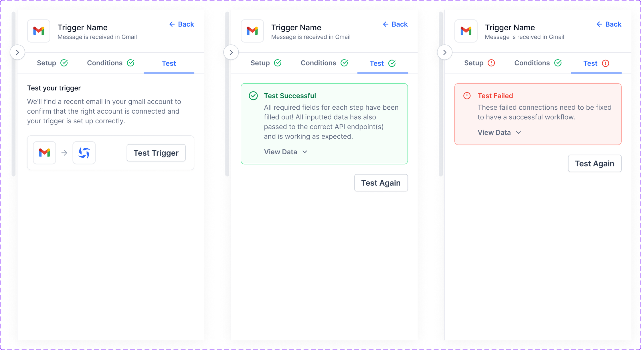
Setup, Conditions & Test Tabs

Tabbed navigation organizes the configuration into logical steps: define the setup, add optional conditions, and test the connection, all within the same sidebar panel.

Split Path Configuration

When workflows need to branch, the split path interface makes it visual and approachable. Users choose between conditional routing or percentage-based distribution, and the canvas reflects the decision in real time.

Conditional vs. Percentage Split

Users select their split type upfront. Conditional paths use data-based rules, while percentage paths distribute traffic with sliders and auto-calculation.

AND/OR Logic Builder

Each conditional path gets its own rule set with inline AND/OR toggles and an "+ Add Condition" button for layered logic. Conditions can reference data from any upstream node.

Testing & Validation

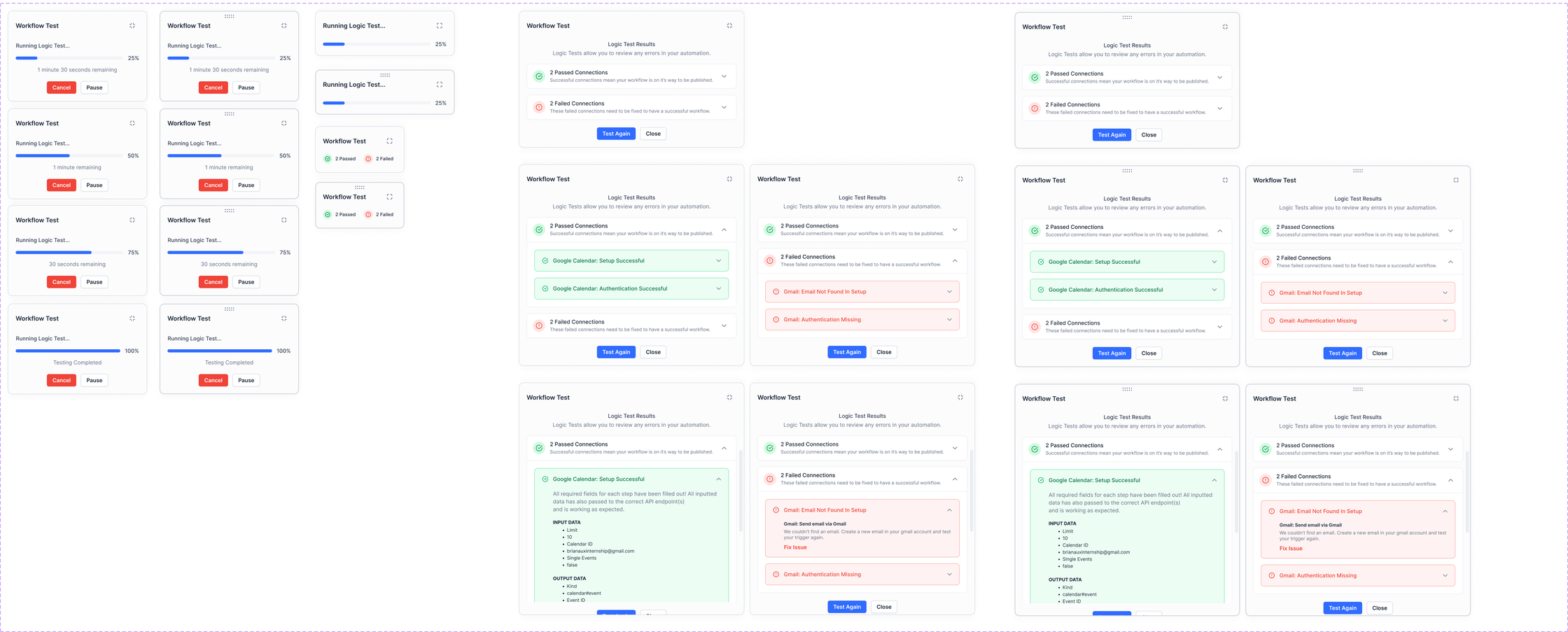
The test runner gives users a clear picture of their workflow's health before publishing. Passed and failed connections are displayed with expandable details, and the canvas highlights error nodes so fixes happen in context.

Test Results Panel

A sidebar panel showing passed and failed connections with counts, expandable details, and a "Test Again" button for iterative debugging.

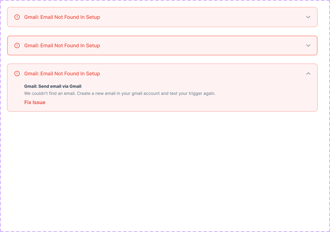
Errors Flagged Where You Fix Them

A failing step is outlined on the canvas and flagged again in its own sidebar, down to the exact field and a plain-language message. Finding an error and fixing it happen in the same place.

Publish & Confirmation

Publishing is the highest-stakes moment in the builder. The two-step publish flow confirms intent with plain language, then celebrates the milestone with a clear success state and next-step options.

Pre-publish Confirmation

A modal dialog explicitly states the workflow will become "live and available to your users," with a primary "Yes, publish" button to reinforce this as a positive action.

Success State

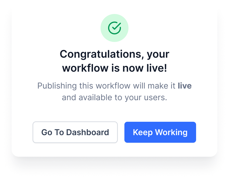
A success checkmark, a congratulatory message, and two options, "Go To Dashboard" or "Keep Working," let users choose their own next step without a forced redirect.

Authorization & Account Connection

Connecting third-party accounts is a required step for most triggers and actions. The authorization flow supports multiple methods so users can connect in whatever way their service requires.

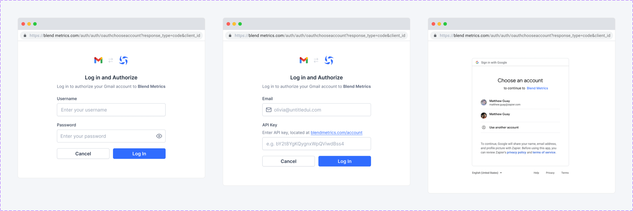
Multiple Auth Methods

Three authorization types are supported: username/password login, email/API key authentication, and Google OAuth account picker. Each method adapts the form fields accordingly.

Workflow Management

Beyond the canvas, users need tools to manage their workflows at scale. Context menus, version history, and rename modals give users control over their workflow library without cluttering the builder itself.

Context Menus & Modals

Right-click context menus on nodes and workflows expose quick actions like rename, duplicate, and delete. Rename modals use inline editing for speed.

Version History

A filterable version history panel lets users browse, compare, and restore previous versions of their workflow with timestamps and change summaries.

Workflow Searching

Once a workflow grows past a handful of steps, finding a specific node by scrolling stops working. Search reads the whole canvas and returns matches grouped by type, so users can jump straight to the step they meant.

Grouped, Counted Results

Matches are split into Triggers and Actions with a count on each group and a total at the top, so users can tell at a glance whether the thing they want is a trigger or a step.
Jump Straight to the Node

Selecting a result highlights that node on the canvas and scrolls it into view. The canvas never resets, so users keep their place in the workflow.

Sidebar Tabs: Setup, Conditions & Test

Every node on the canvas is configured through the same three tabs. Splitting the work this way meant a node could be set up, gated, and verified without ever leaving the sidebar or losing canvas context.

Setup Tab

Defines what the node does: the event that fires it, the account it runs against, and its required fields. Anything missing is flagged inline and marks the tab itself, so an incomplete step is visible from the canvas.

Conditions Tab

Gates the node behind rules. Conditions are grouped, joined with AND/OR, and saved independently, so a step can be reused with different gating without rebuilding it.

Test Tab

Runs the step on its own and shows the sample payload it received. Testing one node at a time is what let users debug without publishing.

Workflow Version Control

Publishing is not the end of a workflow’s life. Every publish is snapshotted so users can see what changed, who changed it, and roll back a bad edit without rebuilding from memory.

Every Publish Snapshotted

Each version records the author, timestamp and step count. The current draft sits at the top of the same timeline, so the relationship between what is live and what is being edited is never ambiguous.

Restore Without Losing Work

Preview shows a read-only version before committing to it. Restoring brings a version back as a new draft rather than overwriting the live workflow, and 30 days of history is kept.

Step Library

With 126 triggers, 52 conditions, 294 actions and 46 filters, the library is the densest surface in the product. It had to stay browsable for people exploring and instant for people who already know the step they want.

Browse by Category

Steps are grouped by source and purpose with a live count on every category, so the scale of the library reads as useful rather than overwhelming.

Search Across Every Type

Search cuts across triggers, conditions, actions and filters at once, and returns an honest empty state rather than a blank panel when nothing matches.

Options Menu & Confirmations

Cloning, testing, pausing and deleting all live behind one options menu. Every action that is destructive or hard to undo is confirmed in the same shape, so the pattern is learned once and applies everywhere.

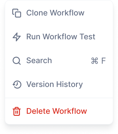
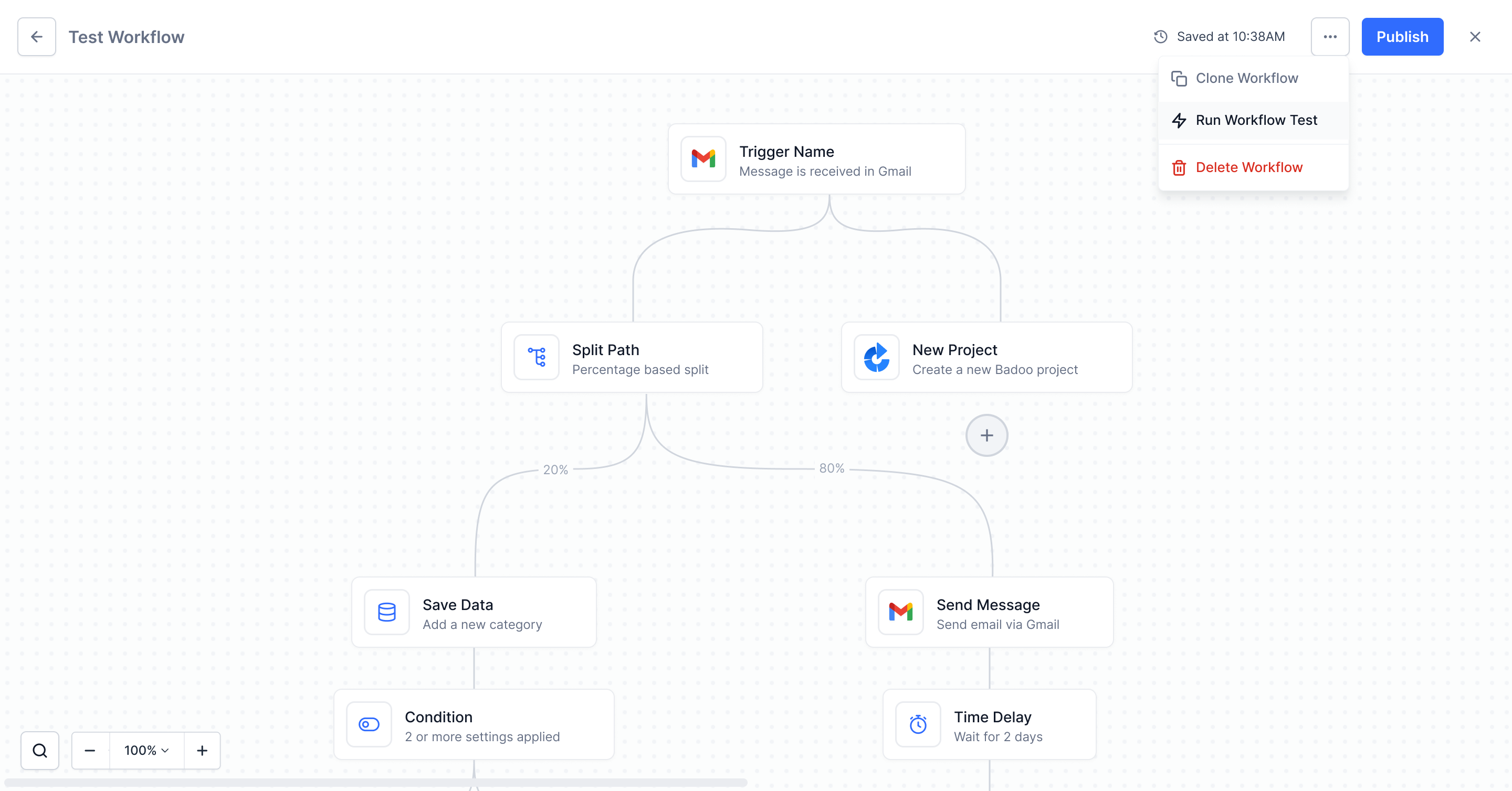
One Menu, Every Action

Clone, run a test, pause and search sit together, with the destructive action separated below a divider so it is never a mis-click away from a routine one.

Consistent Confirmations

Deleting a workflow, a trigger or a step, exiting with unsaved changes, and publishing all use the same dialog: what will happen, what is recoverable, and a clearly-labelled action.


UI Design System

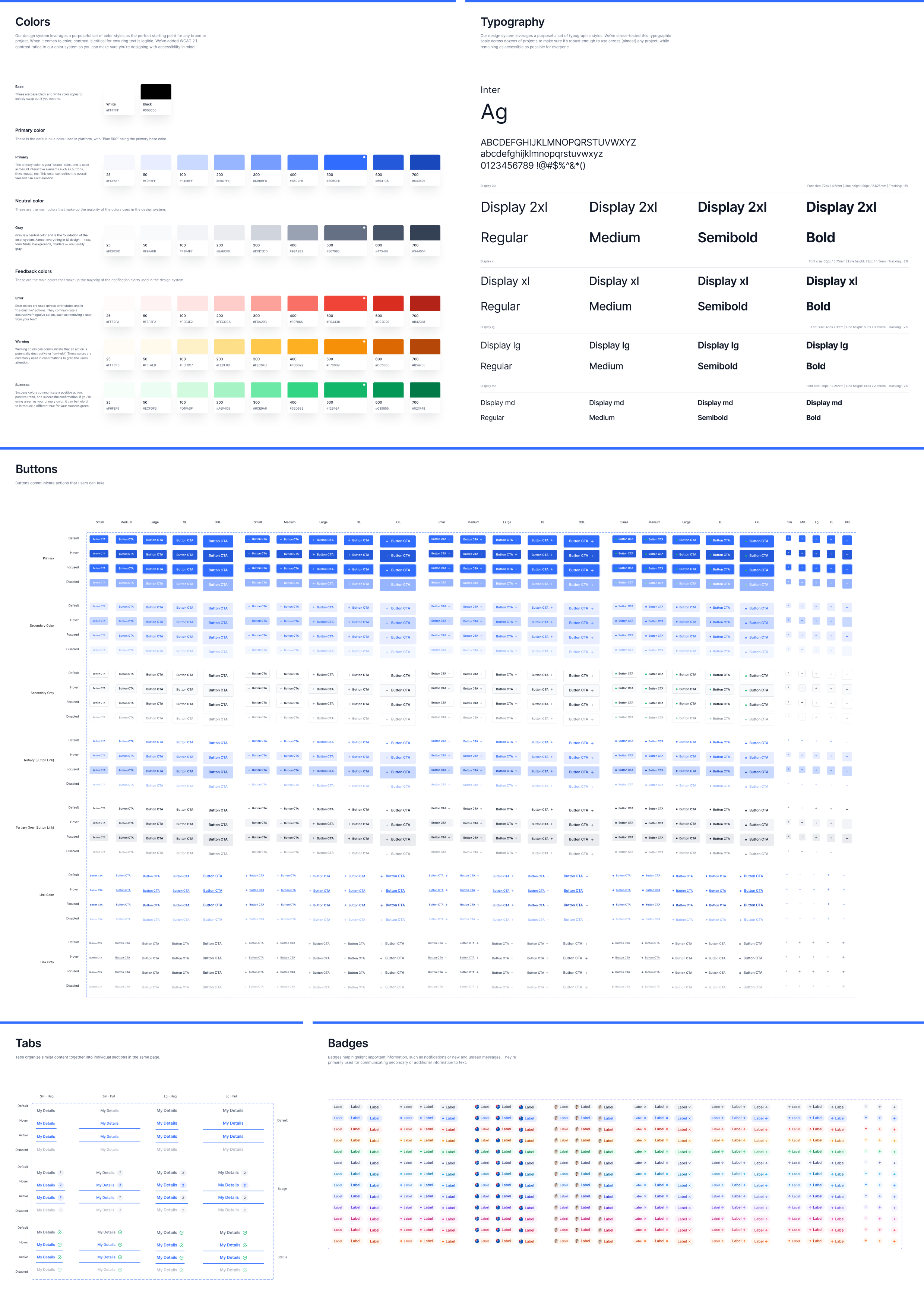
Every component in the workflow builder is built from a unified design system I created specifically for this product. Colors, typography, buttons, form elements, and status indicators are all standardized to ensure visual consistency across the canvas, sidebar, and modal layers.

UI Design System: colors, typography, buttons, tabs, and badges

Stylized UI Components

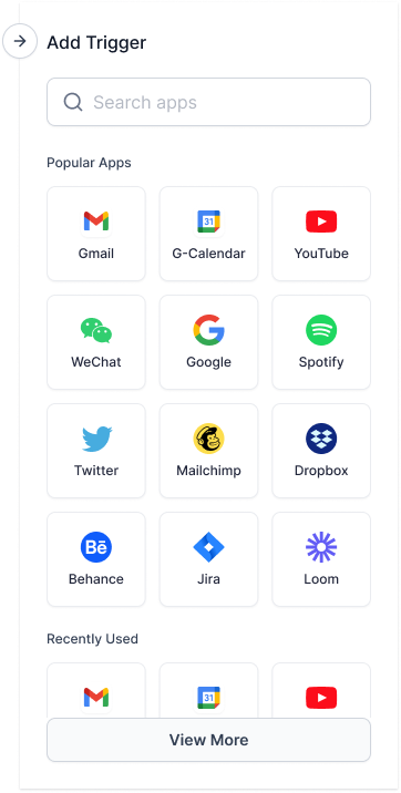
App Picker

The first choice in every workflow: which app does this start from? With hundreds of integrations behind it, the picker has to answer that in one screen without turning into a directory.

Key Details

  • Popular Apps leads, because most workflows start from a handful of the same tools, so the long tail sits behind search rather than in front of it
  • Search is the first control, so anyone who already knows their app never scrolls
  • Recently Used sits below, since building several workflows against the same app is the common case
  • View More defers the full catalogue instead of paginating it into the panel, keeping the picker one screen tall
App picker panel with search, a Popular Apps grid, Recently Used and View More

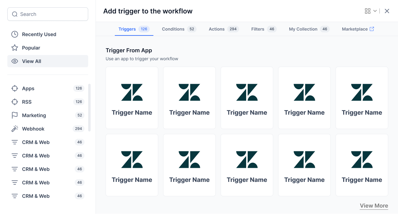
Step Library Popup

The picker behind every "add a step" action. With 126 triggers, 52 conditions, 294 actions and 46 filters, it had to stay browsable for people exploring and instant for people who already know what they want.

Key Details

  • Category rail with live counts, so the scale of the library reads as useful rather than overwhelming
  • Search cuts across triggers, conditions, actions and filters at once instead of forcing a category first
  • An honest empty state that names the query that returned nothing, rather than a blank panel
  • The same popup shell serves browse, search and empty, so it stays one component with three states
Step library popup browsing triggers by category with counts
Browse by Category
Step library popup showing search results across every category
Search Results
Step library popup empty state for a search with no results
Empty State

Condition Builder

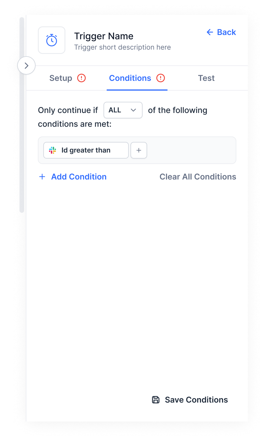
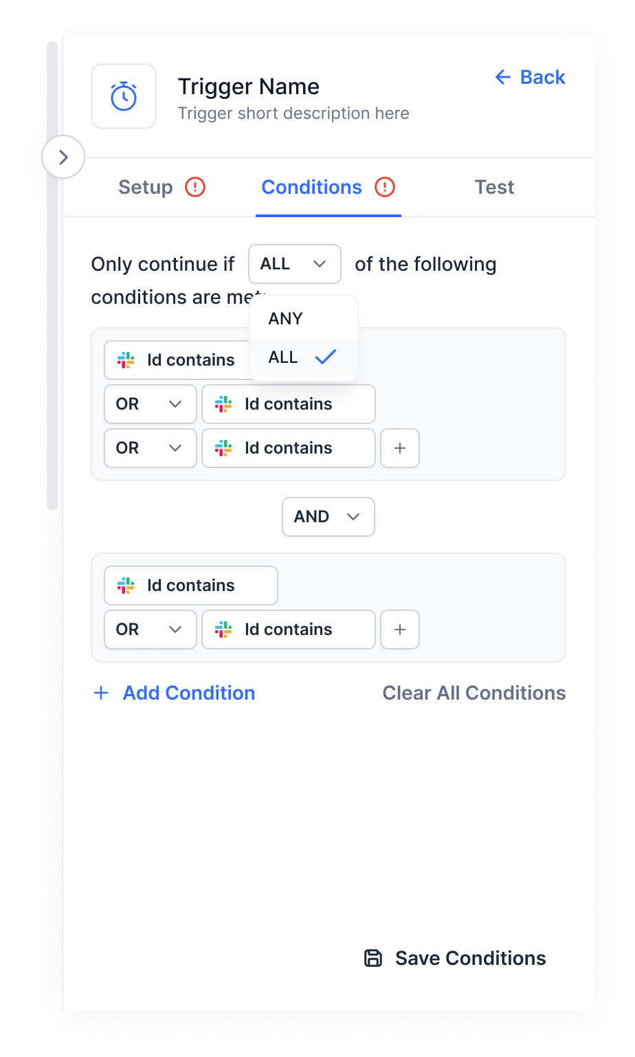
Where AND/OR logic is actually assembled. This is the densest surface in the product and the one most likely to lose people, so the whole design is about keeping a complex rule readable at a glance.

Key Details

  • Conditions group visually, so a nested rule reads as structure rather than a wall of text
  • ANY/ALL and AND/OR are inline selectors, editable in place without a separate modal
  • Each condition is a chip carrying its source app icon, so the data it references is identifiable at a glance
  • Add Condition and Clear All Conditions sit together, making it as easy to unwind a rule as to build one
Condition builder sidebar with a single condition and save actionCondition builder with nested AND/OR groups and the ANY/ALL selector open

Menus & Flyouts

The small surfaces that carry most of the configuration work. Each one had to open in place, stay scannable, and close without losing the user’s position in the sidebar.

Key Details

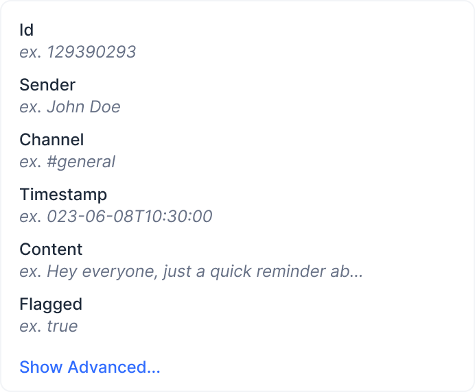
  • The data flyout lists every available field with a real example value, so users pick data on evidence rather than a field name
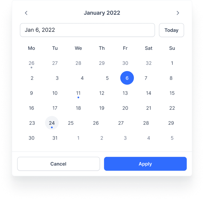
  • The date picker handles selected, hover and event-dot states, with Today as a one-tap shortcut
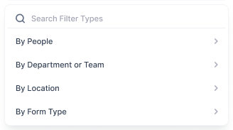
  • The filter dropdown is searchable, because a category list stops being useful once it outgrows the panel
  • All three open anchored to their trigger, never as a full-screen interruption
Data field flyout listing available fields with example valuesDate picker menu with month navigation, selected and hover statesSearchable filter categories dropdown menu

Drag & Drop

How anything gets built. Dragging a step from the sidebar onto the canvas is the single most repeated action in the product, so the drop zone has to say what will happen before the user commits, not after.

Key Details

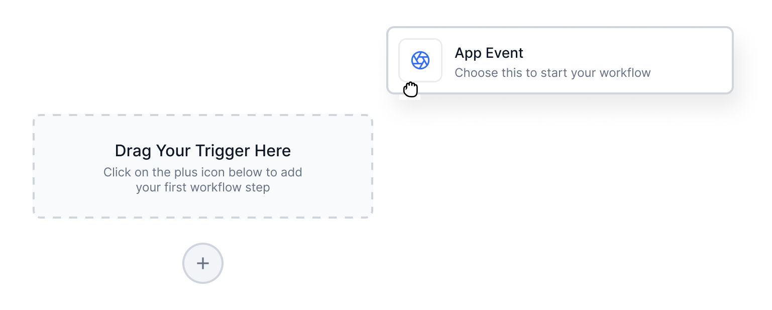
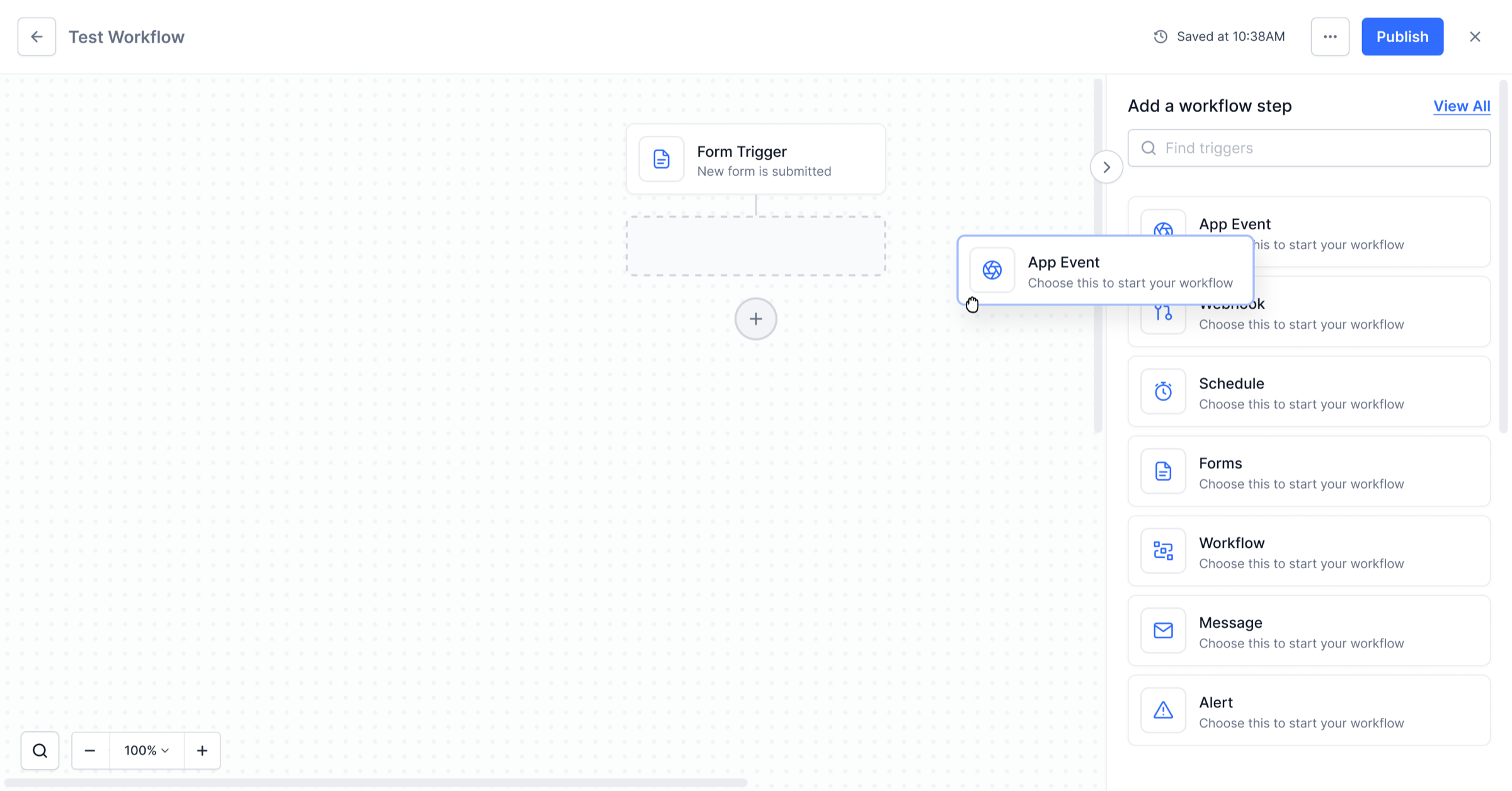
  • The drop zone is visible by default with a “Drag Your Trigger Here” prompt, so an empty canvas explains itself instead of waiting to be guessed at
  • Entering the zone changes its styling, confirming the drop will land before the user lets go, which is the difference between a confident drop and a hesitant one
  • Existing steps reflow to make room, so dropping into the middle of a built workflow never means rebuilding what came after
  • Empty, hover and snapped are one component, so the interaction stays consistent whether it is the first step or the tenth
Drag and drop, empty state: the drop zone reads Drag Your Trigger Here with an App Event card held above itDrag and drop, hover state: the drop zone turns blue as the App Event card enters itDrag and drop, snapped state: the node lands in the workflow and the existing steps reflow around it

Publish Success

The last screen in the build, and the only one whose job is emotional. Publishing is the highest-stakes moment in the builder, so the success state exists to confirm the milestone rather than dump the user back on a canvas.

Key Details

  • A success checkmark and plain-language confirmation, so there is no doubt the workflow is live
  • Two exits, Go To Dashboard or Keep Working, so the user picks the next step instead of being redirected
  • Reuses the same dialog shell as the rest of the builder, so the moment feels part of the product, not bolted on
Publish success state with congratulations message and Go To Dashboard or Keep Working options

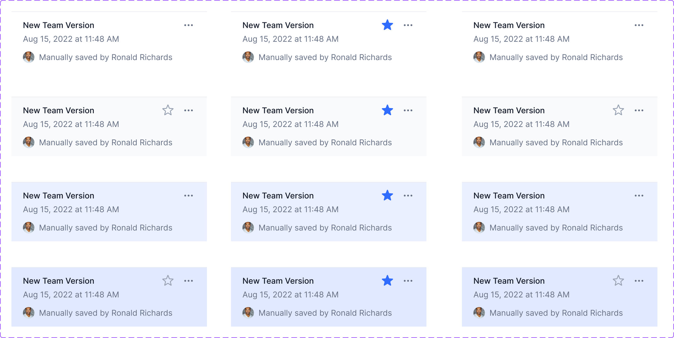
Version History

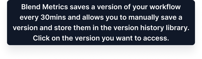
Publishing is not the end of a workflow’s life. Every save is snapshotted, so a bad edit is a recoverable mistake rather than a rebuild from memory.

Key Details

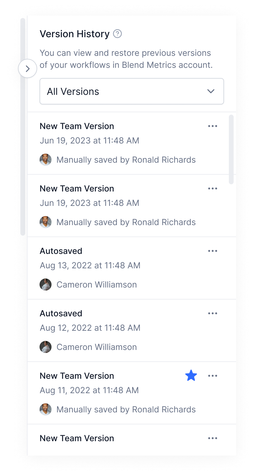
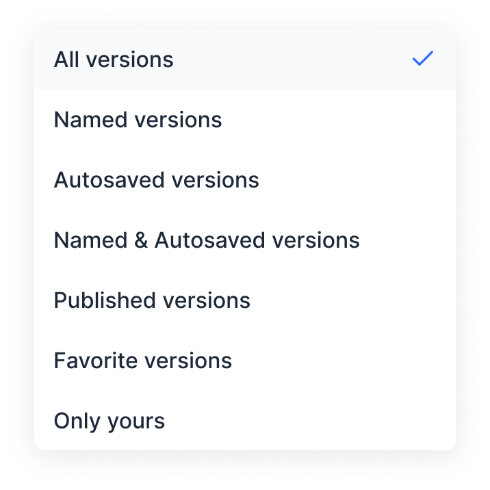
  • Autosaves and manual saves sit in one timeline, each carrying its author and timestamp, so “who changed this” is answered without asking
  • Versions can be starred, so the handful that matter stay findable in a list that only ever grows
  • A filter narrows the list by type, because a version history stops being useful the moment it outgrows the panel
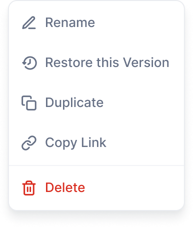
  • Every row carries the same overflow menu of rename, restore, duplicate, copy link and delete, so the actions are learned once
Version History panel: a filterable timeline of autosaved and manually saved versions, each with author, timestamp and an overflow menu

Hi Fi Designs

Workflow builder canvas showing a Form Trigger connected to an action node, with the sidebar drawer open to add workflow steps

Workflow Canvas

The core builder experience. Users start by adding a trigger, then drag action nodes onto the canvas. The sidebar stays contextually aware, showing available steps that can be added at any point in the workflow.

The dotted drop zone and floating "+" button guide users through the build process without requiring a tutorial.

Complex Workflows

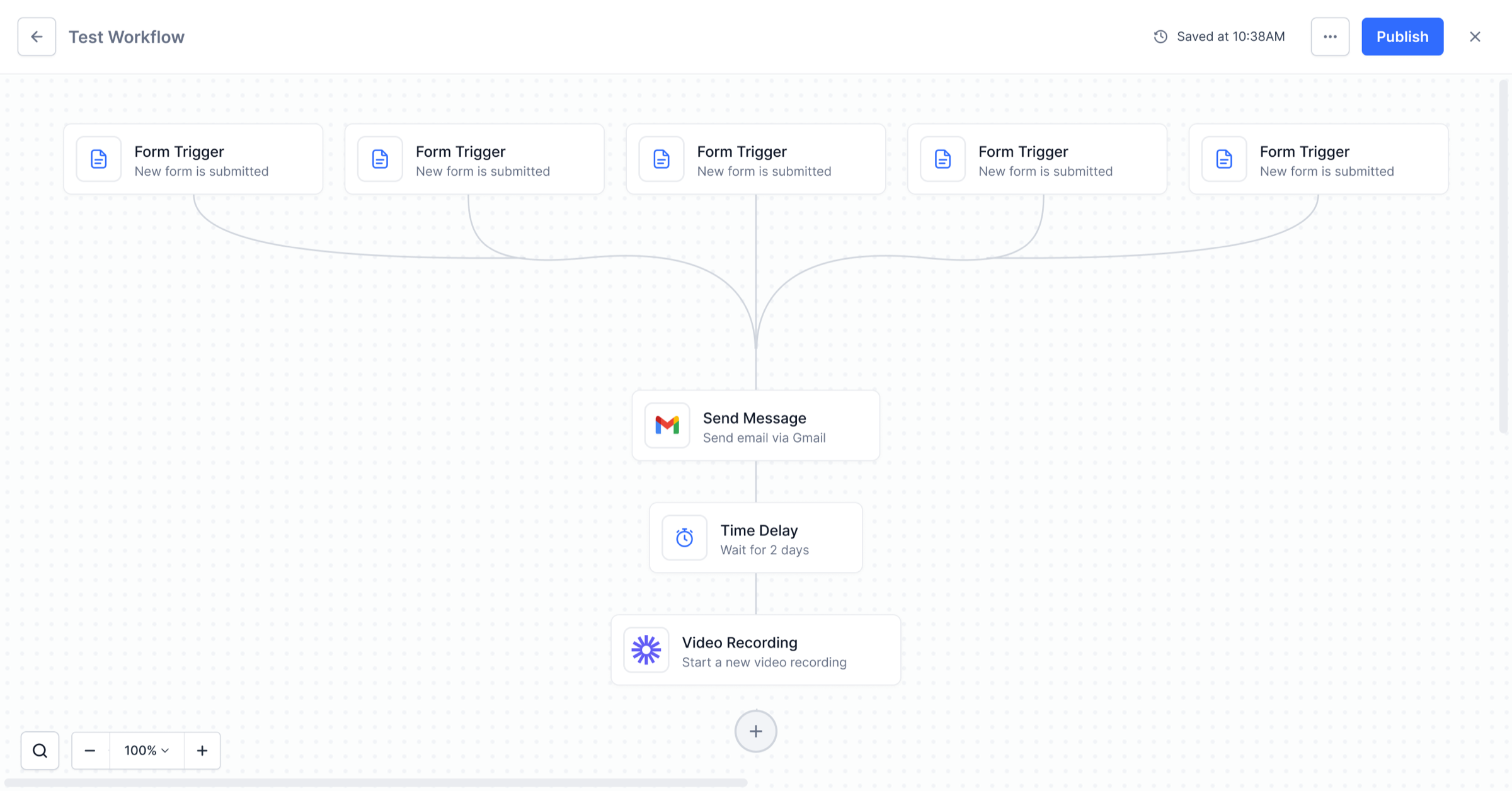
Workflows scale gracefully. Multiple triggers fan into action chains with time delays, conditional logic, and third-party integrations like Gmail. The canvas auto-layouts nodes so the flow stays readable even as complexity grows.

Curved connection lines and consistent node sizing keep multi-step automations visually clear instead of overwhelming.
Complex workflow with five Form Triggers connected to Send Message, Time Delay, and Video Recording action nodes
Workflow canvas showing a conditional split path with Send Message action, two branching paths with Time Delay and Video Recording nodes, and sidebar showing path conditions

Conditional Split

When a workflow needs to branch based on data, the Split Path node lets users choose between conditional logic or percentage-based routing. Each path gets its own condition rules, and the sidebar shows a clear summary of which conditions trigger which path.

The "Merge paths to a single endpoint" toggle gives users control over whether split paths reconverge or stay independent, reducing the need for duplicate nodes downstream.

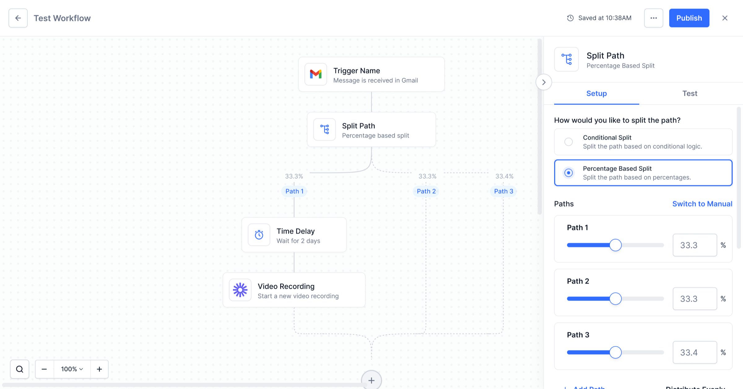
Percentage Split

For A/B testing or gradual rollouts, users can split traffic by percentage across multiple paths. Each path gets a slider and input field, and the system auto-distributes evenly or lets users set custom ratios. The canvas reflects the split with percentage labels on each branch.

The "Switch to Manual" and "Distribute Evenly" controls give users flexibility without forcing them to do math. Adding a third path automatically recalculates the distribution.
Three-way percentage split workflow showing 33.3%, 33.3%, and 33.4% distribution across Path 1, Path 2, and Path 3 with Time Delay and Video Recording action nodes
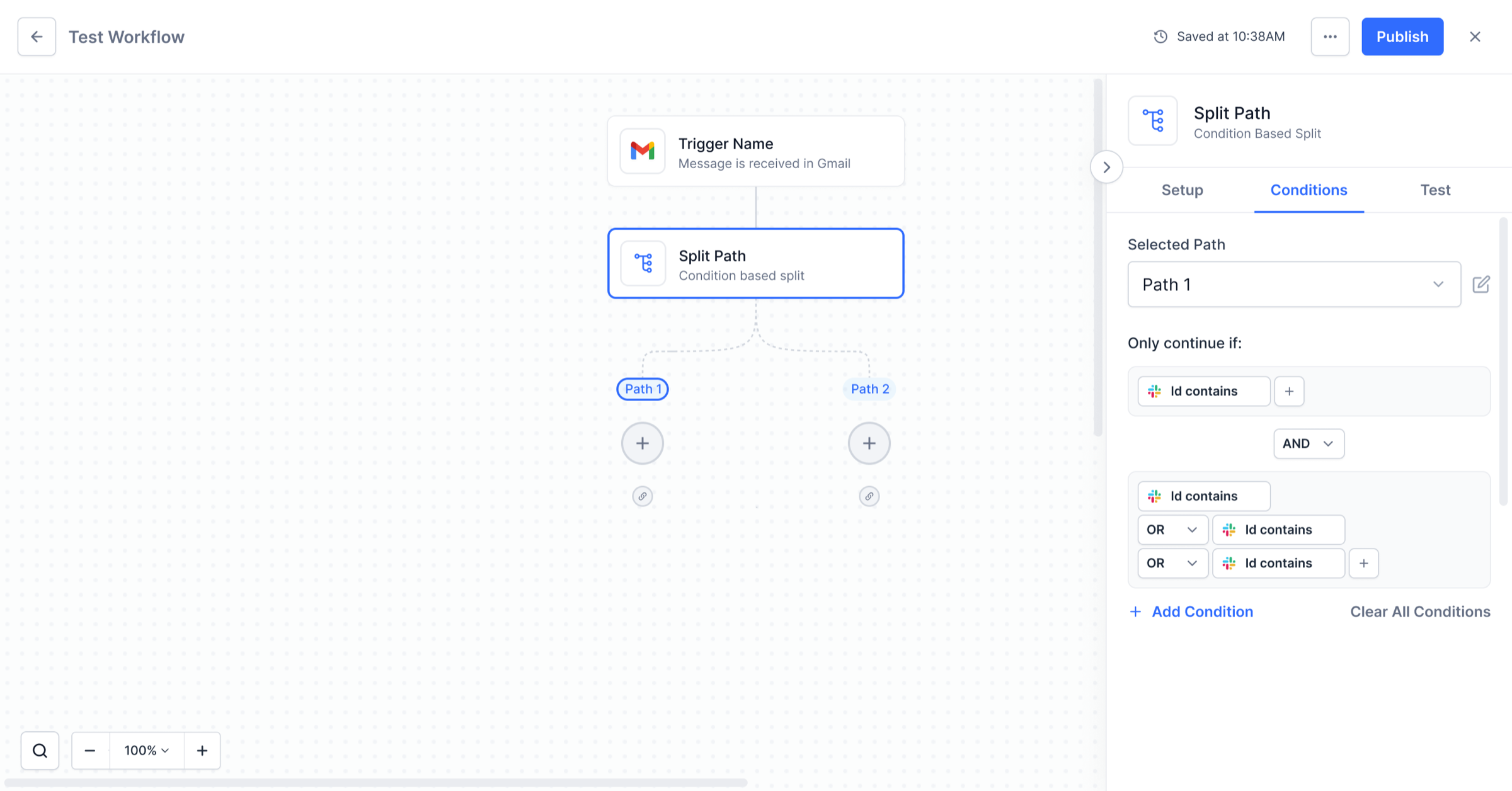
Conditions tab showing AND/OR logic builder with multiple condition rules for Path 1, including Id contains filters with Add Condition and Clear All options

Condition Builder

The Conditions tab lets users define exactly when each path should activate. Rules are built with AND/OR logic, and each condition can reference data from upstream nodes. The interface supports nesting, so complex routing logic stays readable.

Inline AND/OR toggles and the "+ Add Condition" button make it easy to build layered rules without navigating away from the canvas.

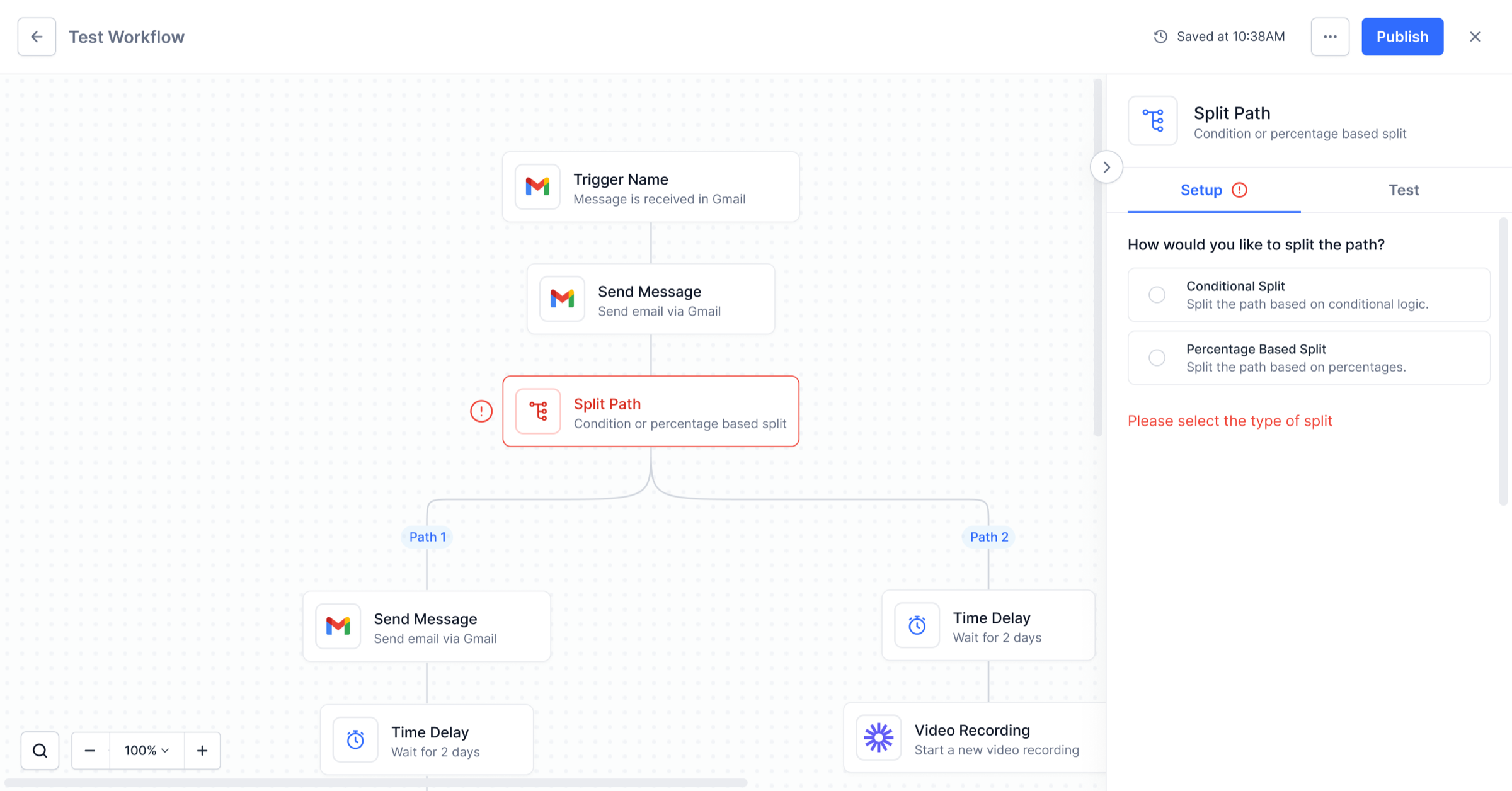
Split Path Validation

When a Split Path node is added but not configured, the system flags it with a red error border and a warning icon. The sidebar prompts the user to select a split type before the workflow can be published, preventing incomplete automations from going live.

Error states appear inline on the canvas and in the sidebar simultaneously, so users can spot and fix configuration gaps without hunting through the workflow.
Complex workflow with an unconfigured Split Path node highlighted in red, showing error state with warning icon and sidebar prompting split type selection
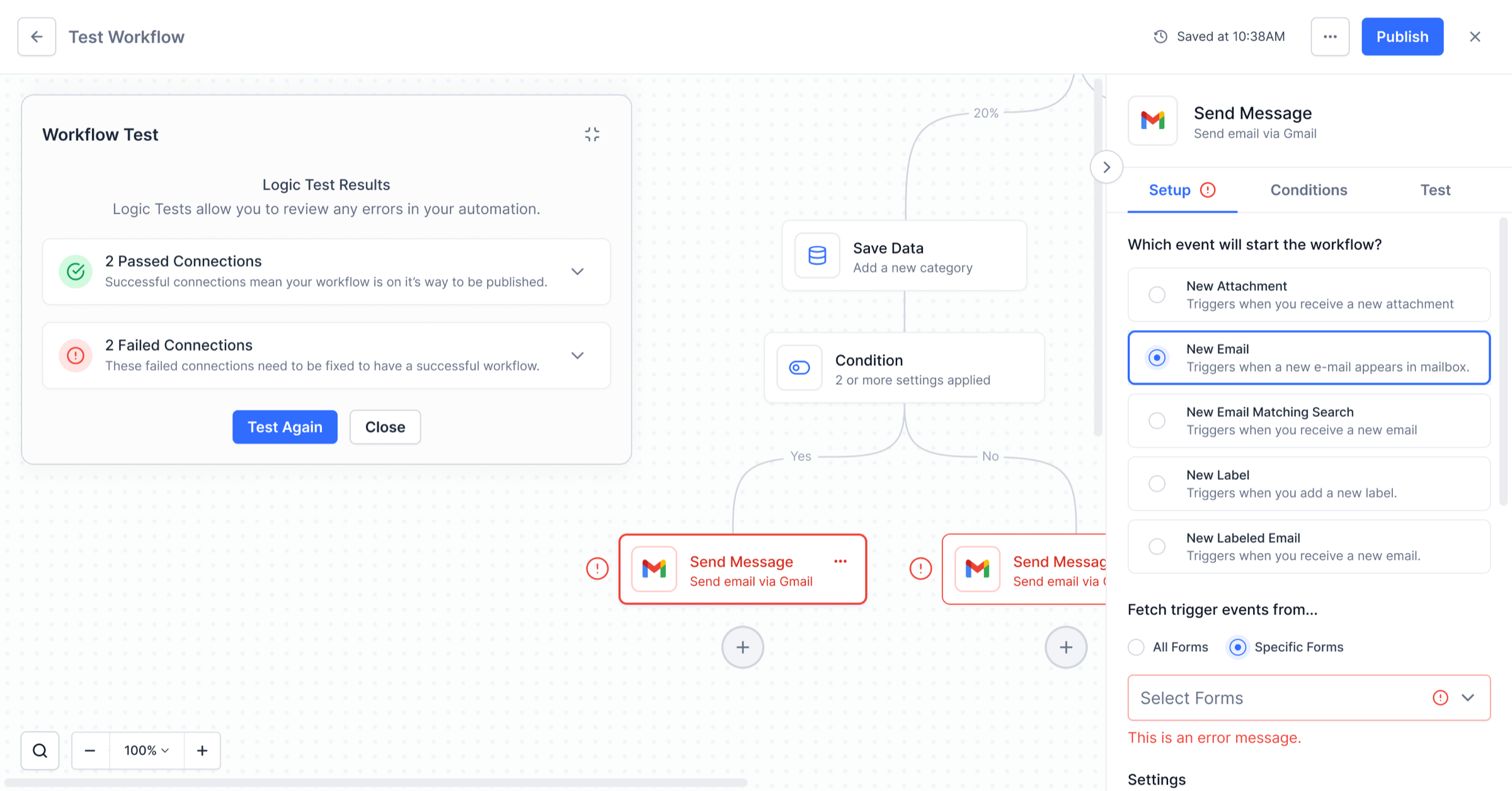
Workflow test results showing 2 passed and 2 failed connections, with error-highlighted nodes on the canvas and sidebar setup panel

Workflow Testing

Before publishing, users can run a logic test across the entire workflow. The test panel shows passed and failed connections with expandable details, while the canvas highlights which nodes have errors so users can fix issues in context.

Red-outlined nodes with error icons make failed steps immediately scannable. The "Test Again" button encourages iterative debugging.

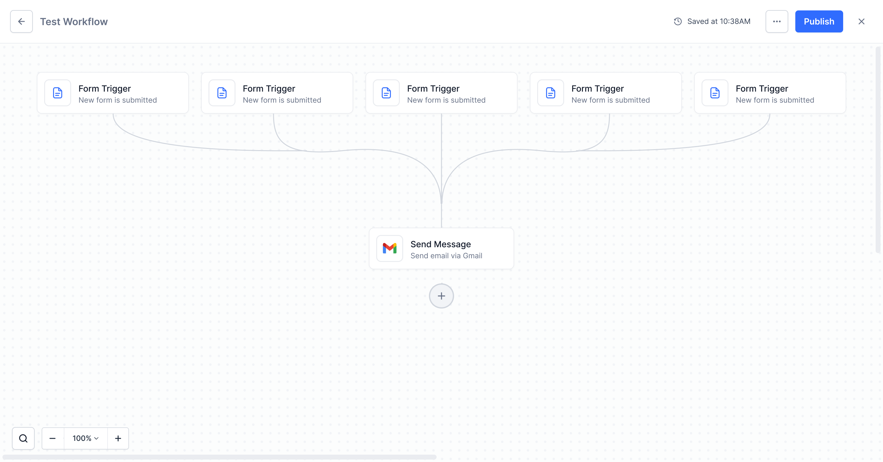
Multiple Triggers

A workflow rarely has one way in. Up to five triggers can fan into the same first action, with curved connectors converging cleanly instead of crossing. Once the fifth is placed, the Add Trigger affordance disappears rather than failing on click.

Fanning the connectors into a single convergence point keeps five entry points readable as one workflow, not five.
Workflow canvas with five Form Triggers fanning into a single Send Message action node
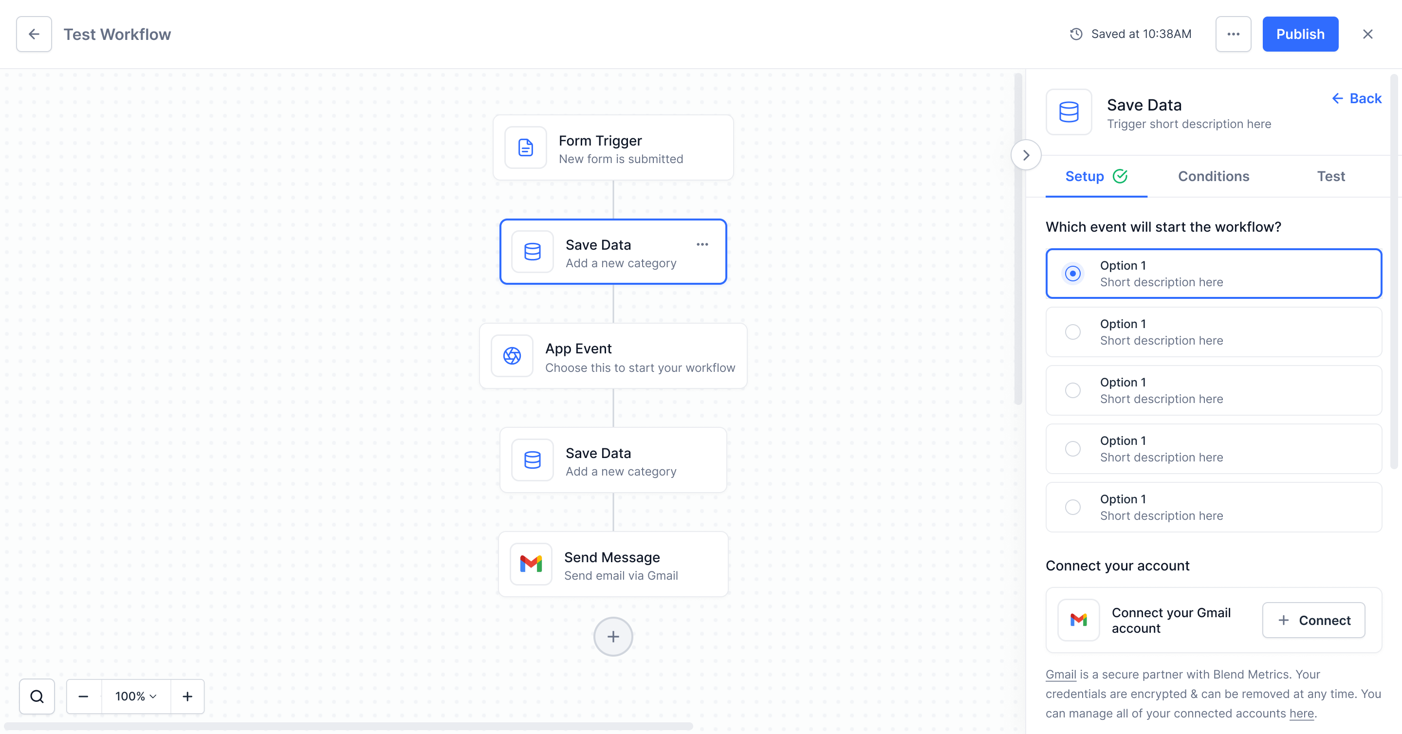
Sidebar showing Save Data setup with event options and an inline Connect your Gmail account panel

Account Connection

Most triggers and actions need a third-party account. Authorization happens inline in the sidebar, so users pick the event, connect the account and keep going, rather than bouncing out to a consent screen and back to a blank canvas.

A checkmark on the Setup tab confirms the connection, and the trust copy explains encryption and revocation before users are asked to commit.

Authorization Methods

Different services authorize differently, so the flow supports three: username and password, email with an API key, and a Google OAuth account picker. Each method reshapes the form rather than forcing one pattern onto every integration.

Supporting the service’s own auth method removes the most common reason a connection silently fails.
Three authorization methods: username and password, email with API key, and Google account picker
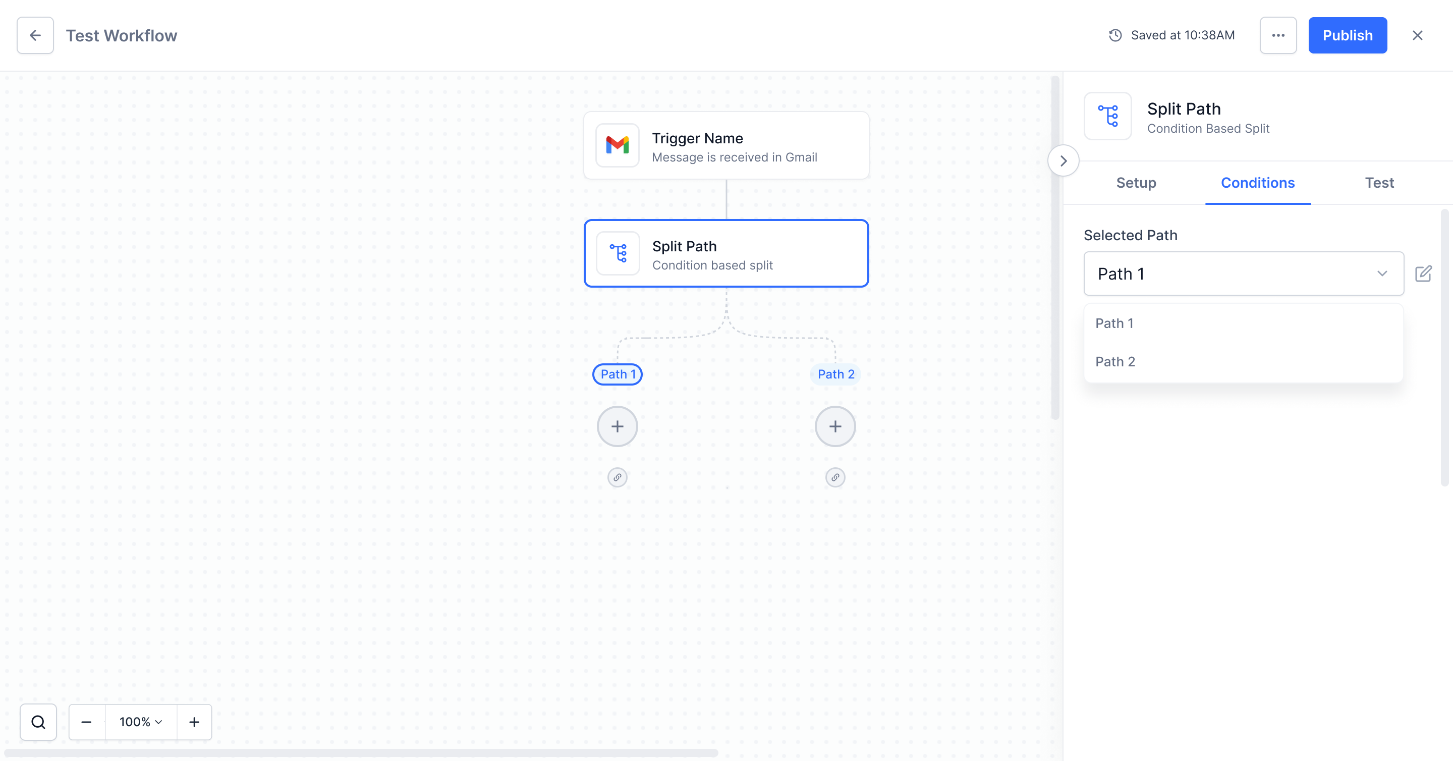
Conditions tab with the Selected Path dropdown open showing Path 1 and Path 2

Editing Path Conditions

Branching logic is never right the first time. The Conditions tab carries a Selected Path dropdown, so a specific branch can be reopened and edited directly instead of rebuilding the split from the start.

Users told us their fear was having to start over. Editing a path in place is what removed it.

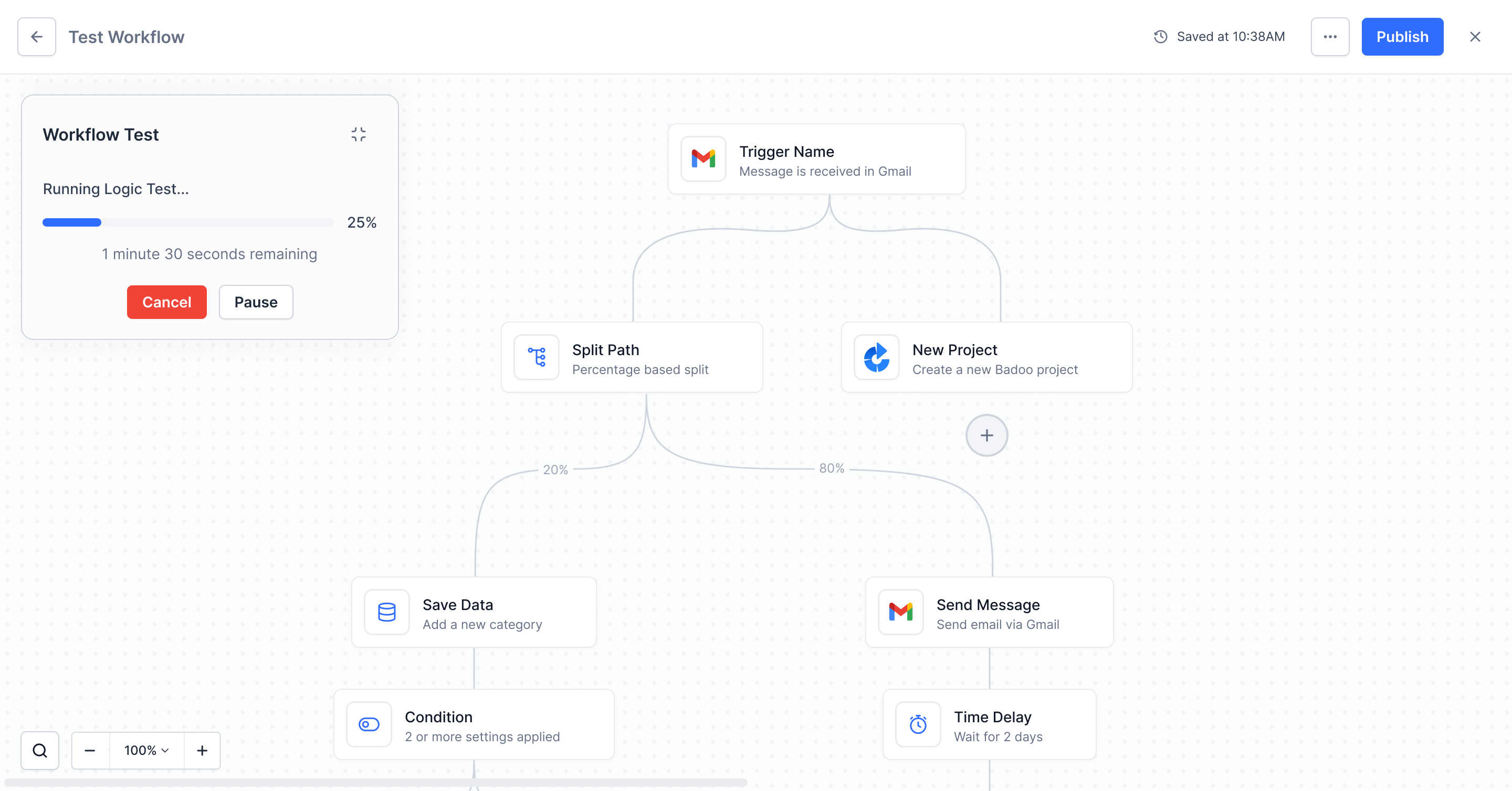
Test In Progress

A logic test on a large workflow is not instant, so the run has its own state: percentage complete, time remaining, and the ability to pause or cancel. Users are never left wondering whether the test is running or stuck.

Showing time remaining turned a black-box wait into something users would sit through rather than abandon.
Workflow Test panel running a logic test at 25 percent with time remaining and cancel or pause options
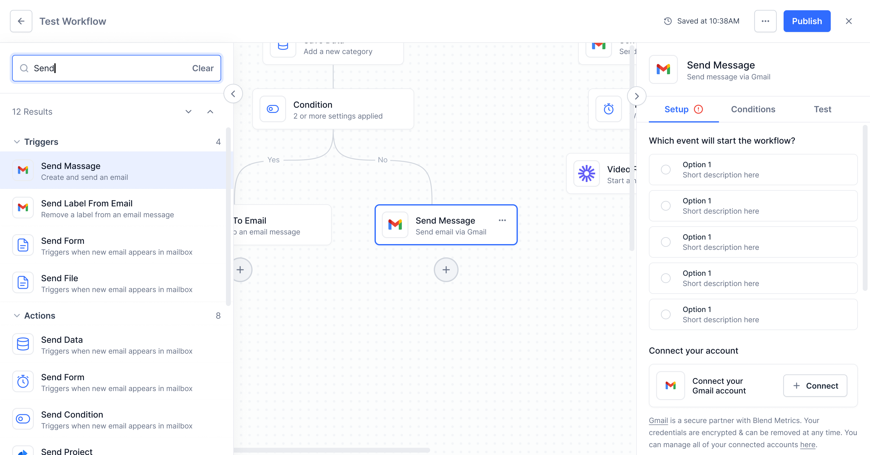
Workflow search panel showing 12 results grouped into Triggers and Actions with the matching node highlighted

Workflow Search

Once a workflow grows past a handful of steps, scrolling to find a node stops working. Search reads the whole canvas and returns matches grouped by type, with counts, so the right step is one click away.

Selecting a result highlights the node on the canvas and scrolls it into view. The canvas never resets, so users keep their place.

Workflow Options

Everything that acts on the workflow as a whole lives behind one menu: clone it, run a full logic test, or delete it. The destructive action sits apart from the routine ones rather than a mis-click away.

One menu for whole-workflow actions meant users never had to hunt for where a capability lived.
Workflow options menu open showing Clone Workflow, Run Workflow Test and Delete Workflow

User Testing

Before handing anything off, I ran moderated usability tests with 5 participants to validate the core builder flows. Each session lasted about 20 minutes and followed a structured test guide. I tracked completion rate, error rate, time to success, and satisfaction level, then assigned severity ratings (1 = cosmetic, 4 = must fix) to prioritize what needed attention.

5Participants
8Tasks Tested
91%Completion Rate
20 minAvg. Session

Task Results

TaskU1U2U3U4U5Rate
Create a new workflow, add a trigger, and connect it to an action step using drag-and-drop.5/5
Configure a trigger's event type and connect a third-party account in the sidebar.4/5
Add a conditional split path and define AND/OR conditions for two branches.5/5
Set up a percentage-based split with three paths and adjust the distribution manually.4/5
Identify and fix an error-highlighted node on the canvas using the test runner.5/5
Use the canvas toolbar to zoom in and search for a specific node in a complex workflow.4/5
Run the pre-publish test, review all results, and publish the workflow.1/5
Delete a step using the confirmation dialog and verify the auto-save indicator updates.4/5
Pass
Delayed
Failed

Key Findings

Severity 3Must Fix

Publish Flow Hesitation

3 out of 5 users hesitated at the publish step. They wanted to see test results summarized before confirming. We added a pre-publish check that shows pass/fail status alongside the confirmation dialog.
Severity 2Improve

Split Path Selection

1 user took extra time choosing between conditional and percentage splits. We added short descriptions under each option to clarify when to use which type.

Severity 1Cosmetic

Auto-save Visibility

1 user didn't notice the auto-save indicator in the header at first. We increased the contrast on the "Saved at" text and added a brief highlight animation when a save occurs.


Developer Handoff

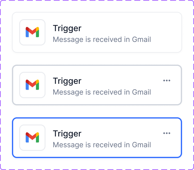
Every component in the workflow builder has a master component with clearly defined variants. All state management is laid out: default, hover, active, focused, and disabled states are accounted for across buttons, nodes, sidebar panels, and modals.

I organized every variant side by side so developers can reference them at a glance. The design files make front-end functionality and component architecture immediately clear.

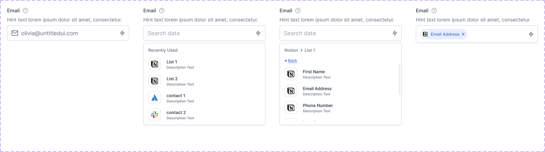
Form Fields

Email
Developer handoff spec: Email
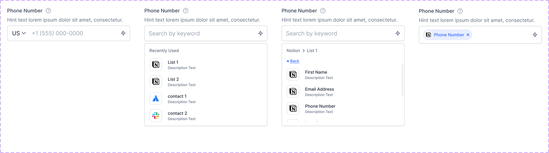
Phone Number
Developer handoff spec: Phone Number
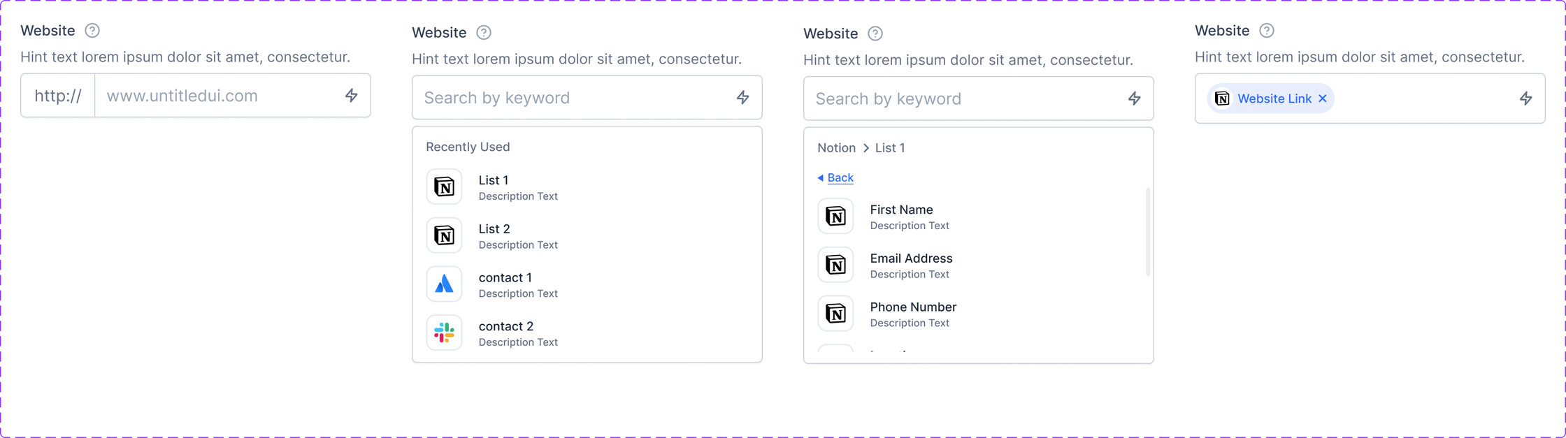
Website
Developer handoff spec: Website
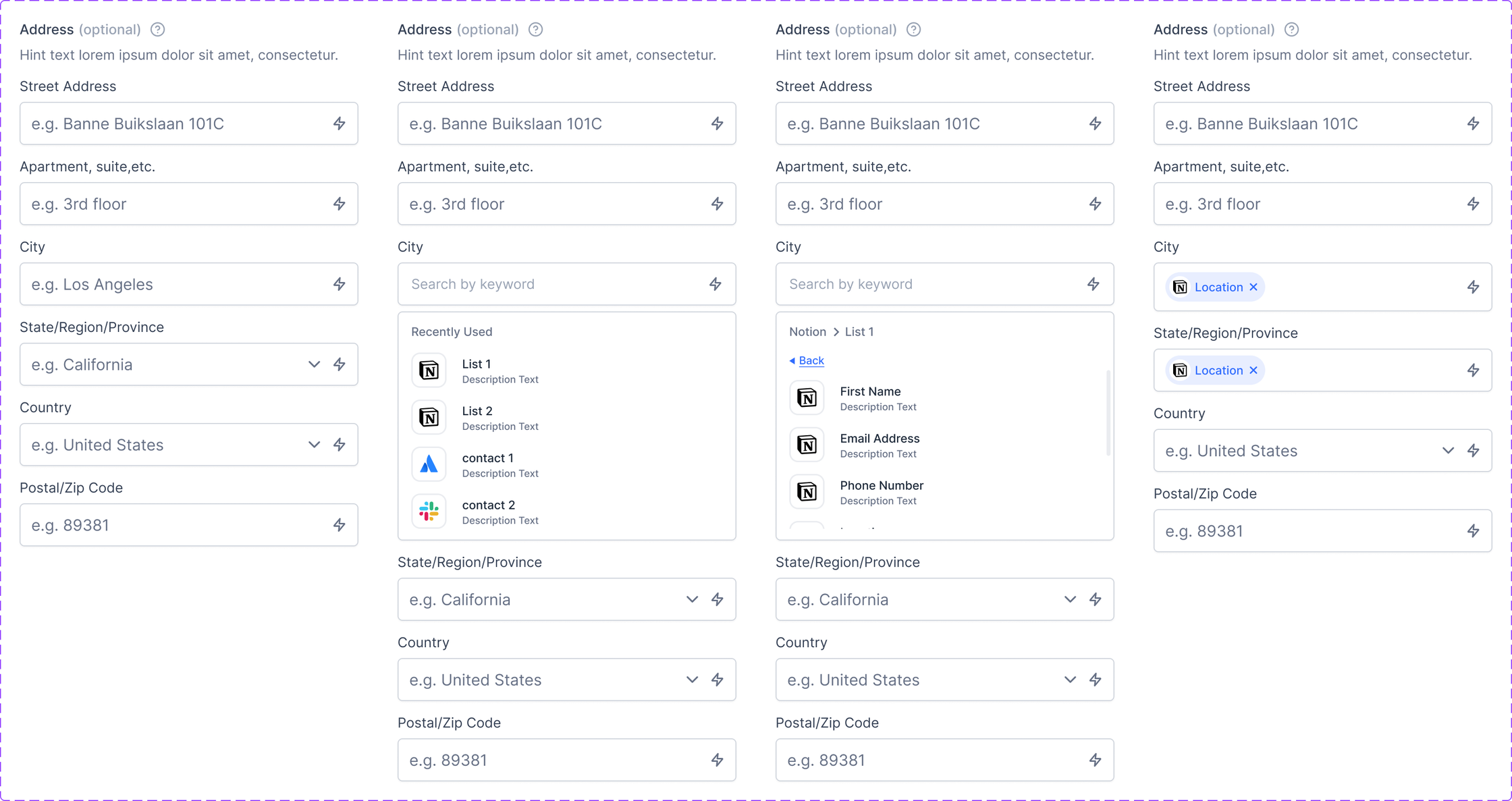
Address
Developer handoff spec: Address
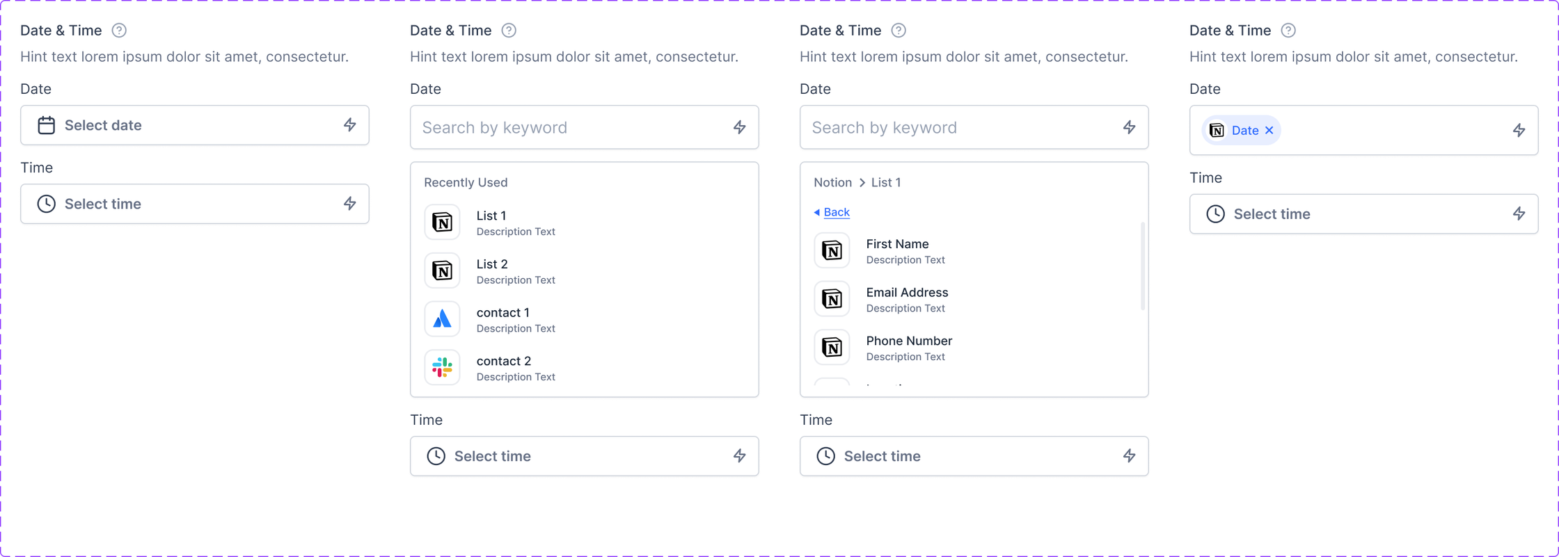
Date and Time
Developer handoff spec: Date and Time
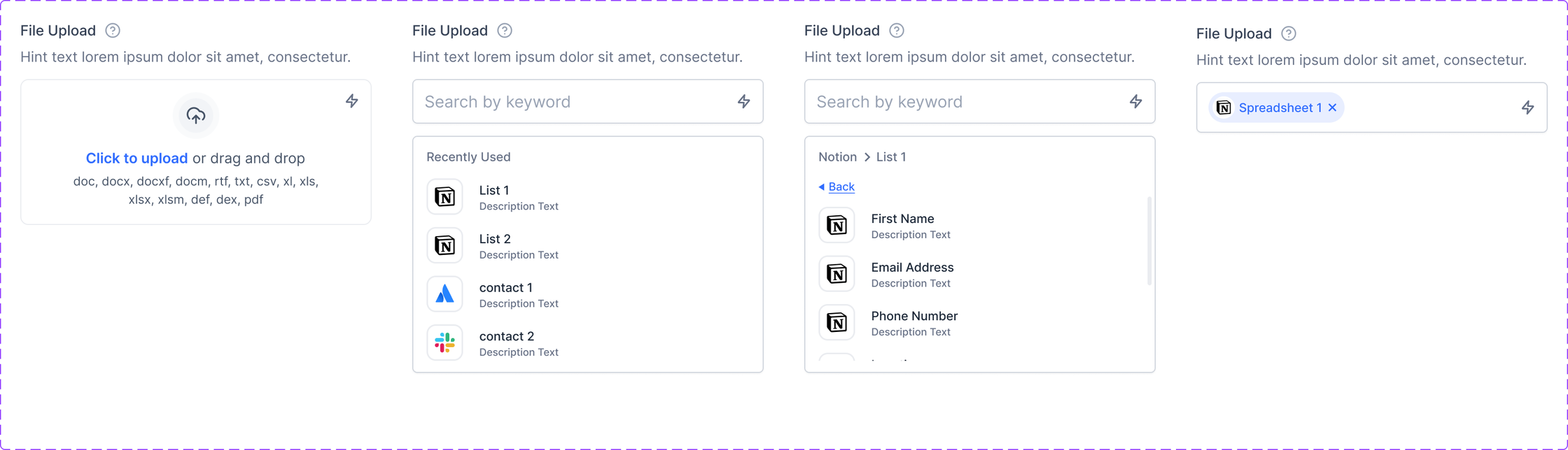
File Upload
Developer handoff spec: File Upload
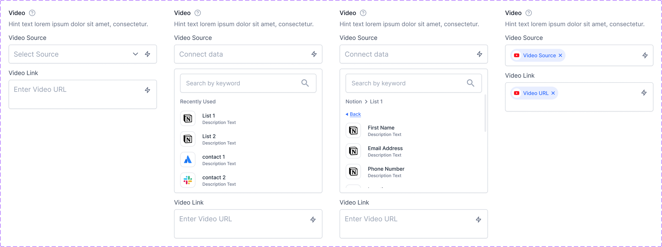
Video
Developer handoff spec: Video

Selection Controls

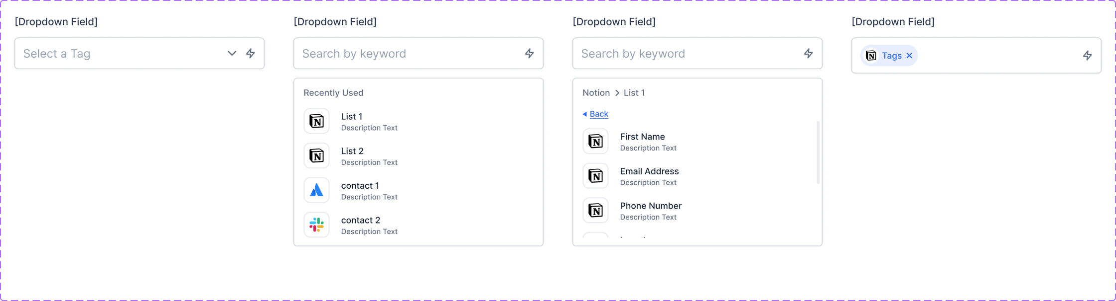
Dropdown
Developer handoff spec: Dropdown
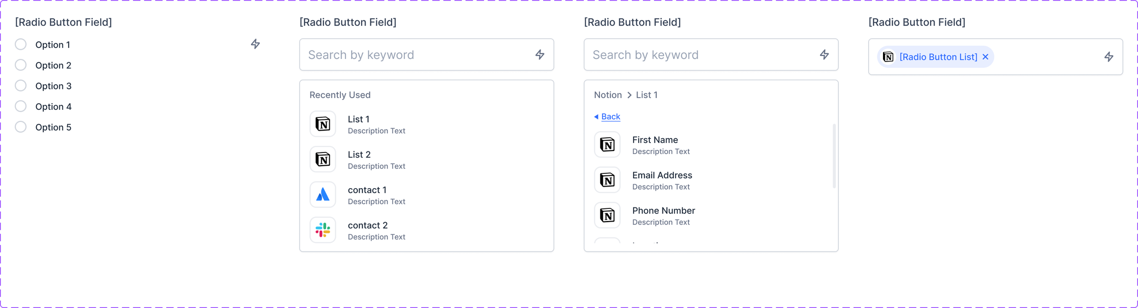
Radio Group
Developer handoff spec: Radio Group
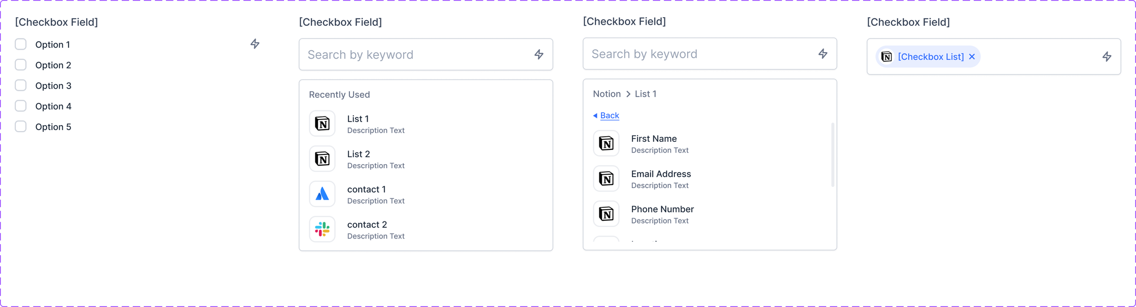
Checkbox
Developer handoff spec: Checkbox

Component Libraries

Input Components
Developer handoff spec: Input Components
Logic Test, Loading States
Developer handoff spec: Logic Test, Loading States
Alert
Developer handoff spec: Alert

Panels & Result States

Sidebar Master
Developer handoff spec: Sidebar Master
Version Row States
Developer handoff spec: Version Row States
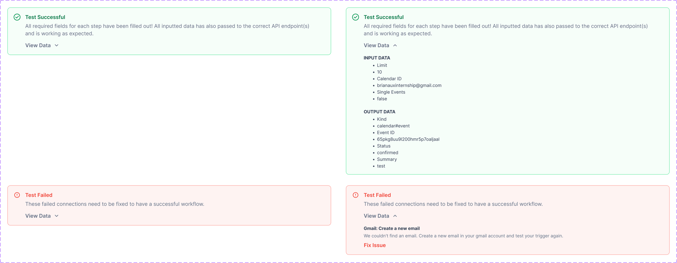
Passed Results
Developer handoff spec: Passed Results
Failed Results
Developer handoff spec: Failed Results

Alert Bars

Alert, Error
Developer handoff spec: Alert, Error
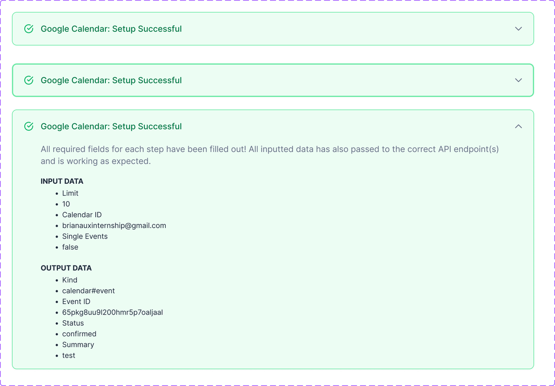
Alert, Success
Developer handoff spec: Alert, Success

Modals, Menus & Nodes

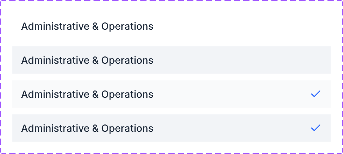
Dropdown Option States
Developer handoff spec: Dropdown Option States
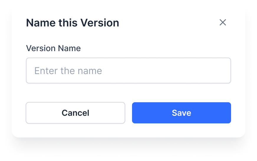
Name Version Modal
Developer handoff spec: Name Version Modal
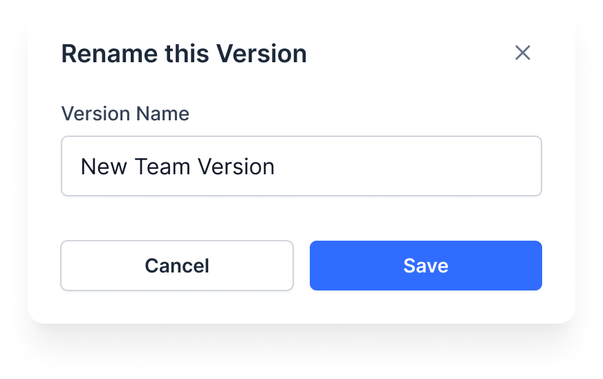
Rename Version Modal
Developer handoff spec: Rename Version Modal
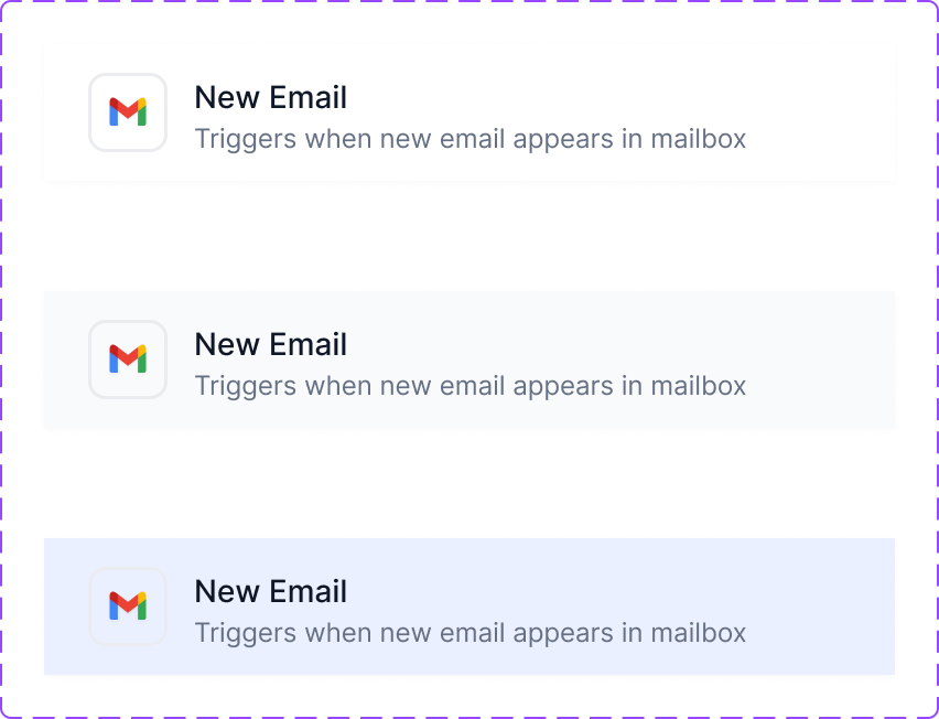
Trigger List Item States
Developer handoff spec: Trigger List Item States
Version Filter Menu
Developer handoff spec: Version Filter Menu
Tooltip
Developer handoff spec: Tooltip
Workflow Step, Default
Developer handoff spec: Workflow Step, Default
Workflow Step, Error
Developer handoff spec: Workflow Step, Error

Buttons, Icons & Small Elements

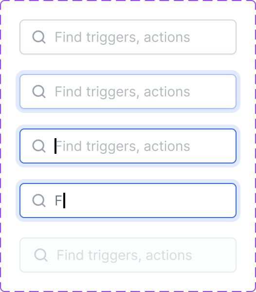
Search Field States
Developer handoff spec: Search Field States
Favourite Star States
Developer handoff spec: Favourite Star States
Workflow Options Menu
Developer handoff spec: Workflow Options Menu
Version Options Menu
Developer handoff spec: Version Options Menu
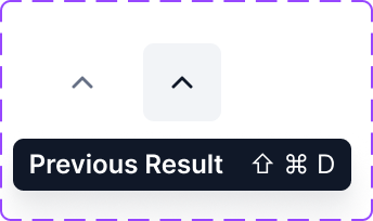
Previous Result Button
Developer handoff spec: Previous Result Button
Next Result Button
Developer handoff spec: Next Result Button
Expand Button
Developer handoff spec: Expand Button
Menu Item States
Developer handoff spec: Menu Item States
Collapse Button
Developer handoff spec: Collapse Button
Options Button States
Developer handoff spec: Options Button States
Help Icon
Developer handoff spec: Help Icon
Close Button States
Developer handoff spec: Close Button States

Final Takeaways

This project taught me that building powerful tools is only half the job. The other half is making people feel confident using them. What started as "let's improve the workflow builder" turned into a full UX rethink of how visual automation should feel. Every decision came back to the same principle: if users can see it, validate it, and trust it, they'll ship it.

What I Learned

Powerful features mean nothing if users can't tell whether they're configured correctly.

Inline validation and visual error states prevent more support tickets than any documentation ever will.

Auto-save and confirmation dialogs aren't just nice-to-haves. They're the difference between building with confidence and building with anxiety.

"Publish" should never feel like a gamble. It should feel like a milestone.

What's Next

If I had more time (or dev resources), I'd love to explore:

Workflow Templates

Pre-built automations users can clone and customize instead of starting from scratch.

Real-time Collaboration

Let multiple users build on the same canvas simultaneously with live cursors.

Node Analytics

Show per-node execution data so users can see which steps process the most volume.

AI Suggestions

Recommend next steps or flag potential logic gaps based on the workflow structure.

All of these would keep building on the same idea: give users more visibility and confidence so they can build better automations faster. This project was never about adding features for the sake of it. It was about making the builder feel trustworthy enough to ship real workflows.